3 More Ways to Overcome the Excel Barrier to Tableau Adoption
Yikes – I’m getting old in Tableau years. This week I clicked on a Tableau Public post I thought sounded interesting: 3 Tips to Overcoming the Excel Barrier to Tableau Adoption. Wow, I thought, the Tableau Public team is so in tune, and that sounds just like something I would say. Interested to hear their take, I clicked on the article to discover I had written it in May of 2016! Ah, May 2016. A time before I started Playfair Data, my Twitter handle was @OSMGuy, and the Kansas City Royals were defending World Series Champions.
I also had an epiphany. I thought back to all the posts I’ve shared and presentations I’ve delivered in hopes of evangelizing moving business users from a spreadsheet mentality to data visualization. What I realized is: this is just as relevant as ever. Now ten years into my career, my primary challenge remains convincing my stakeholders to leave the comfort of Excel behind for the value of self-service analytics and data visualization that Tableau thrives at. Something so seemingly obvious that has technically been available since William Playfair conjured up the bar chart and line graph in 1786, but which so few companies are doing well.
This post shares three more specific tactics for smoothing the transition from text tables to data visualization. We’ll start with the ‘gateway’ chart, the highlight table, learn how to leverage Viz in Tooltip to display trends or comparisons within crosstab cells, and I’ll share a hack for allowing your users to toggle between a text table and a data visualization. We’ve led the horse to water; now we’re going to give them a loving nudge in.
Convert text tables to highlight tables – but with a twist.
When I’m trying to educate on the benefits of data visualization, I show a crosstab of data and ask the audience to attempt to answer some basic business questions. I then convert the text table to a highlight table – which can be accomplished by clicking Show Me in Tableau and choosing the third option on the first row – to show how much easier it is to answer the questions. You can see a version of this exercise in the post, Why Do You Visualize Data?.
The comparison between a text table and a highlight table is not really a fair fight, and while the value is apparent, I’ve promised to continue conducting this exercise until companies stop relying on raw crosstabs to conduct their analyses. I feel morally obligated to start this list with the highlight table, but I’m not going to leave you with just that. Here’s a hack for supercharging your highlight table by making it do some of your analysis for you.
Let’s say we have this highlight table showing Profit by Year and Sub-Category in the Sample – Superstore dataset:
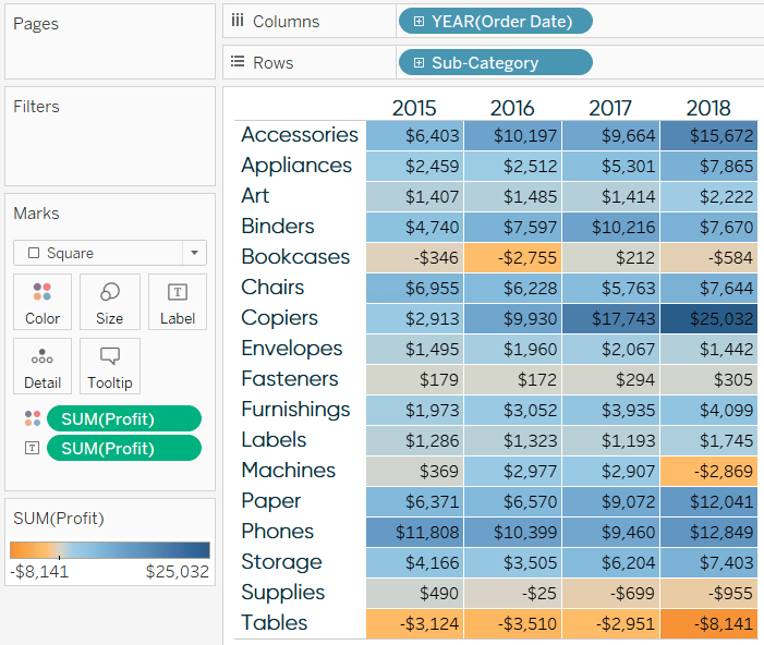
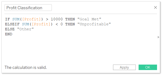
To make this highlight table work harder for us by boiling some of our insights up, let’s write a calculated field that classifies our cells into three categories: (1) Profit was above $10,000, (2) Profit was negative, and (3) everything else. We’ll eventually color the cells blue if our goal of $10,000 was hit, red if the combination of Sub-Category and Year was unprofitable and gray for “Other”. The formula is:
IF SUM([Profit]) > 10000 THEN “Goal Met”
ELSEIF SUM([Profit]) < 0 THEN “Unprofitable”
ELSE “Other”
END
Now, you would think just dropping this newly calculated dimension on the Color Marks Card would update the highlight table to color the cells by one of these three categories, but watch what happens when I try it:
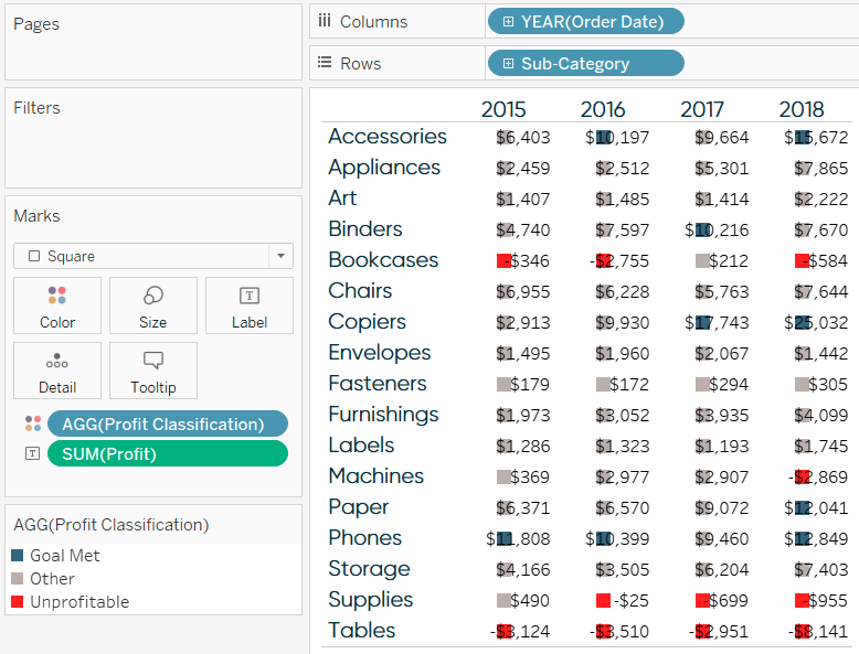
We see three different colors, one for each classification, but the nicely filled in cells have converted to small squares. The issue is we changed the continuous sales measure, which highlight table are typically created with, to this discrete classification. We can use the Size Marks Card to make the squares larger, but they are square and not rectangular, so you can’t make them fit the cells perfectly. In fact, drag the Size Marks Card slider too far to the right, and the squares will spill over into other cells:
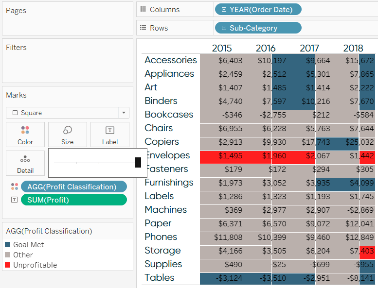
Here’s the trick. Simply double-click on the Columns Shelf to the right of the dimension that’s already there and type two tick marks: ‘’. Then double-click on the Rows Shelf to the right of the dimension that’s already there and do the same thing; type two tick marks: ‘’. This adds extra columns and rows to the highlight table and changes the structure in a way that the large squares no longer spill over into other cells.
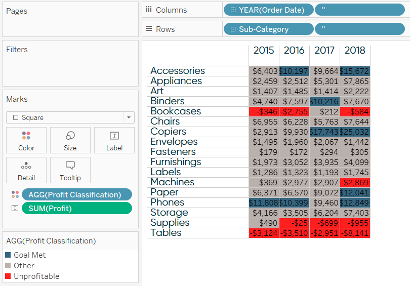
You’ll see extra blank column and row headers, but you can get rid of those by right-clicking on each one and deselecting “Show Header”. Here’s how my final highlight table looks after applying this hack, hiding the new headers, and cleaning up the formatting.
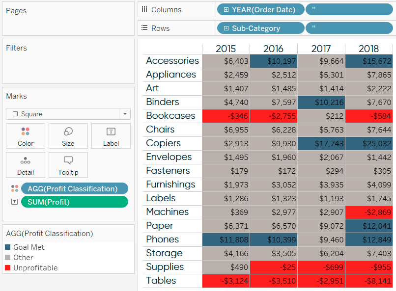
We’ve made not only a highlight table, but a highlight table that tells us when our goal was met or we lost money! For other tips on improving highlight tables, see 3 Ways to Make Handsome Highlight Tables in Tableau.
Use a top – down or bottom – up approach with Viz in Tooltip
The highlight table works so well because end users get the raw data they are accustomed to seeing in the cells, but they get to take advantage of the preattentive attribute of color to help them process the table more efficiently and accurately. If they still can’t admit that data visualization is more effective, you can use Tableau’s Viz in Tooltip feature.
Let’s say that our stakeholders didn’t like the Profit by Year by Sub-Category highlight table we shared and would like to remove the color:
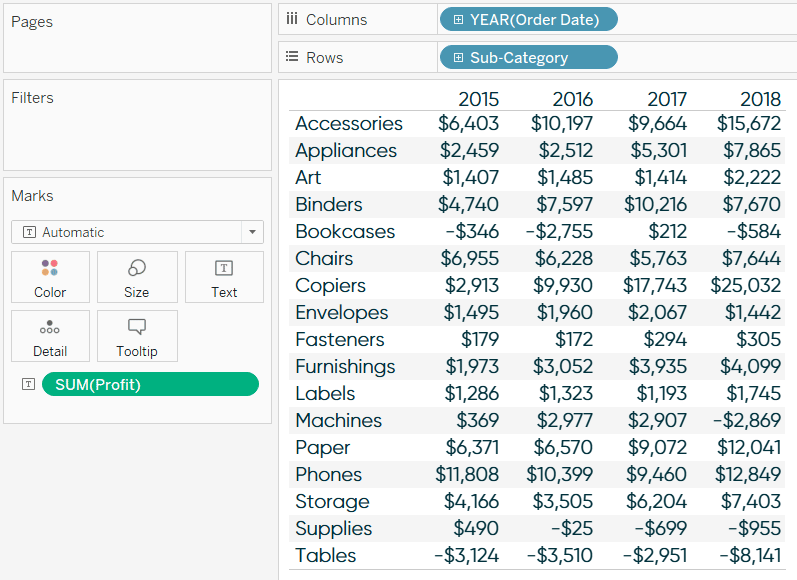
Being the astute analysts that we are, we know that the preattentive attribute of height can help us discover trends in the business, so we’ve also got this line graph:
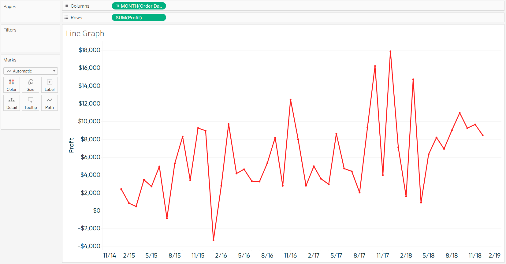
With Tableau’s Viz in Tooltip feature, we can make a visualization appear when a user hovers over cells in the crosstab view. I’m using a trend as an example, but this can also be used to show comparisons, further detail, a picture, or for that matter, just about anything. What I like about this approach is the user almost stumbles into the interactivity, and just like with the highlight table example, they benefit from data visualization whether they want to or not.
To add a visualization to a tooltip in Tableau, click on the Tooltip Marks Card of the sheet you want it added to, click the Insert button, hover over “Sheets”, and choose the visualization.
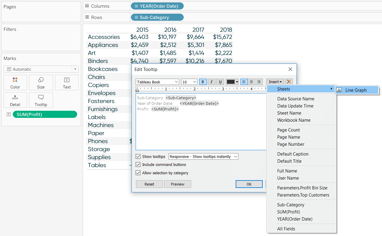
You’ll see some code showing you where the visualization will display within the tooltip when a user hovers. By default, the visualization will be 300 pixels wide, by 300 pixels tall, and filtered on all fields.
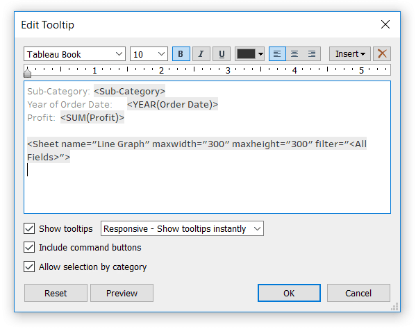
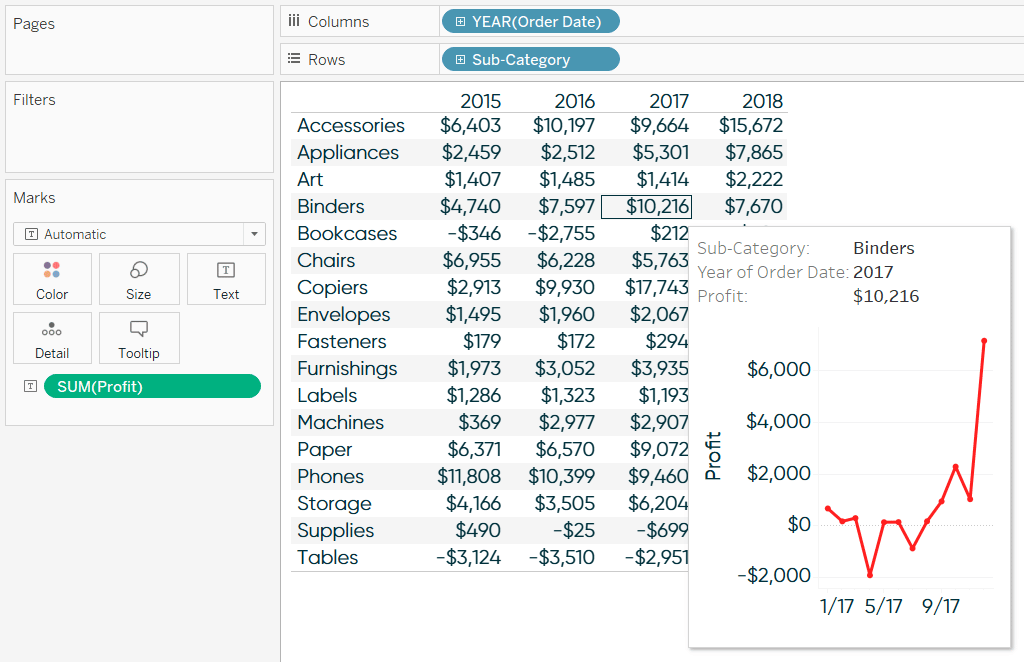
For example, if I leave the defaults and hover over the cell at the intersection of the Binders sub-category and year 2017, I’ll see my line graph, sized 300 by 300, filtered to the year 2017. Since my line graph was created using continuous months, the visualization is filtered to the 12 months for the Binders sub-category in the year 2017.
You can change the default sizes and the fields the visualization are filtered on by clicking on the Tooltip Marks Card again. Let’s say we want to see the entire trend for each sub-category that is hovered over (not just one year at a time), and we also want to make the Viz in Tooltip wider. I can change the width to 600 pixels and, instead of filtering on “All fields”, I’ll change that to just the Sub-Category dimension.
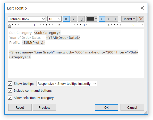
Now when I hover over Binders in 2017, the line graph is wider and I see every month represented in the trend line.
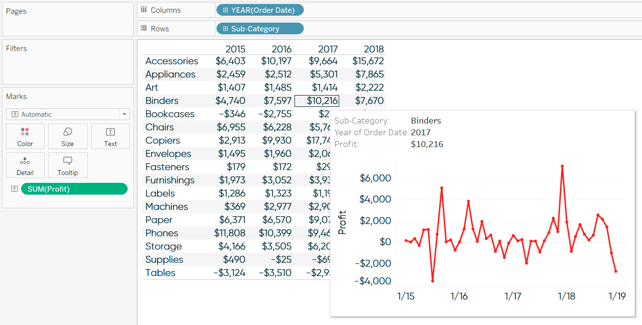
I would consider this a “bottom-up” approach to the analysis because we are leading with the raw detail, then rolling it up to a trend that is helping us understand how the sub-categories are trending. When your users become comfortable going the other direction, or starting with the visual and then drilling down to the raw detail, you can also employ a “top-down” approach. For an example, see How to Show Top 10 Lists in Tableau Tooltips.
Toggle between text tables and data visualizations for Tableau adoption
For my final tactic, we’ll use the same two sheets, Text Table and Line Graph, to let our users decide which one is displayed in a dashboard. There will be one dropdown menu and if they choose “Text Table”, the Text Table sheet will be displayed; if they choose “Line Graph”, the Line Graph sheet will be displayed. I’ve shared this tutorial before at How to Let Users Choose Between Chart Types in Tableau to toggle between different visualization types, but it also works great for flipping between data visualizations and raw crosstabs.
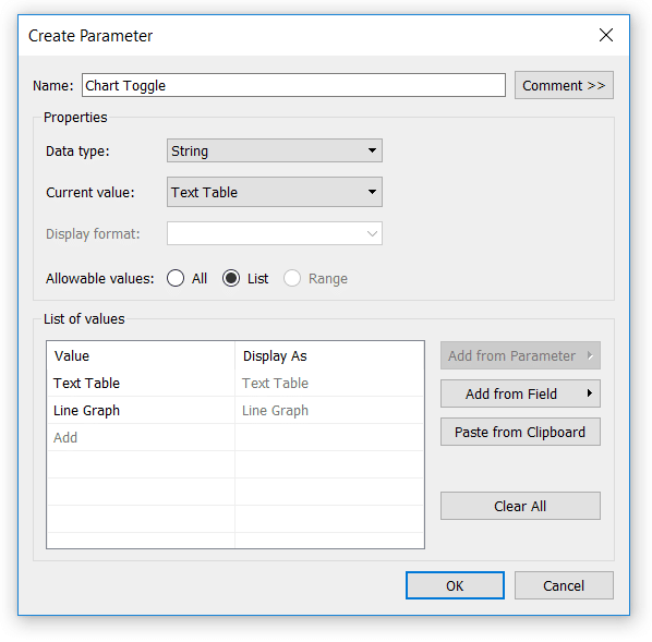
First, set up a parameter with a data type of String, and a list of allowable values containing your options.
Next, create a calculated field containing nothing but the parameter created in the first step.
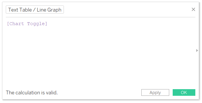
This is a Boolean formula which, when used as a filter, will only display the sheet if the filter is set to “True” and the value in the calculated field matches the current value selected in the parameter. To display just one chart a time, we must add the calculated field to the Filters Shelf of both sheets, but with one catch. We want to add the calculated field to the Filters Shelf of each sheet individually, and only when the respective allowable value is set in the parameter.
Since the default current value of the parameter is “Text Table”, I will add the filter to the Text Table sheet first.
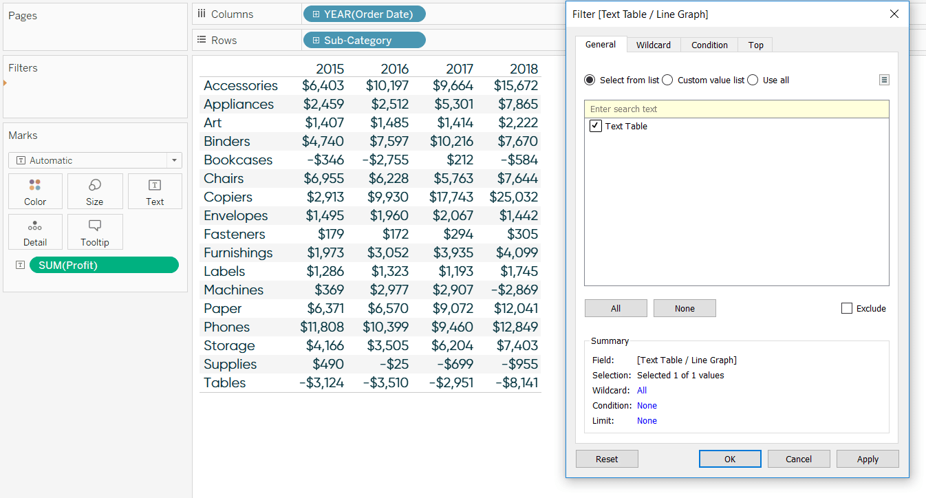
After clicking OK, I don’t see anything change, but this sheet will only be displayed when “Text Table” is selected in the parameter. If I change the current value of the Text Table / Line Graph parameter to “Line Graph”, which you can do by right-clicking on the parameter and choosing “Edit…”, the crosstab disappears.
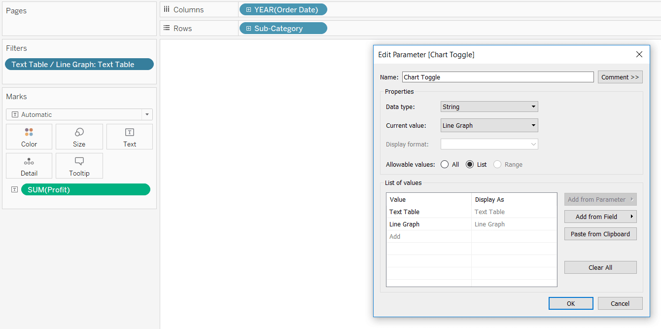
We’re now ready to add the Boolean calculated field to the second sheet. Since “Line Graph” is now the allowable value selected in the parameter, that will be the only choice when the filter is applied.
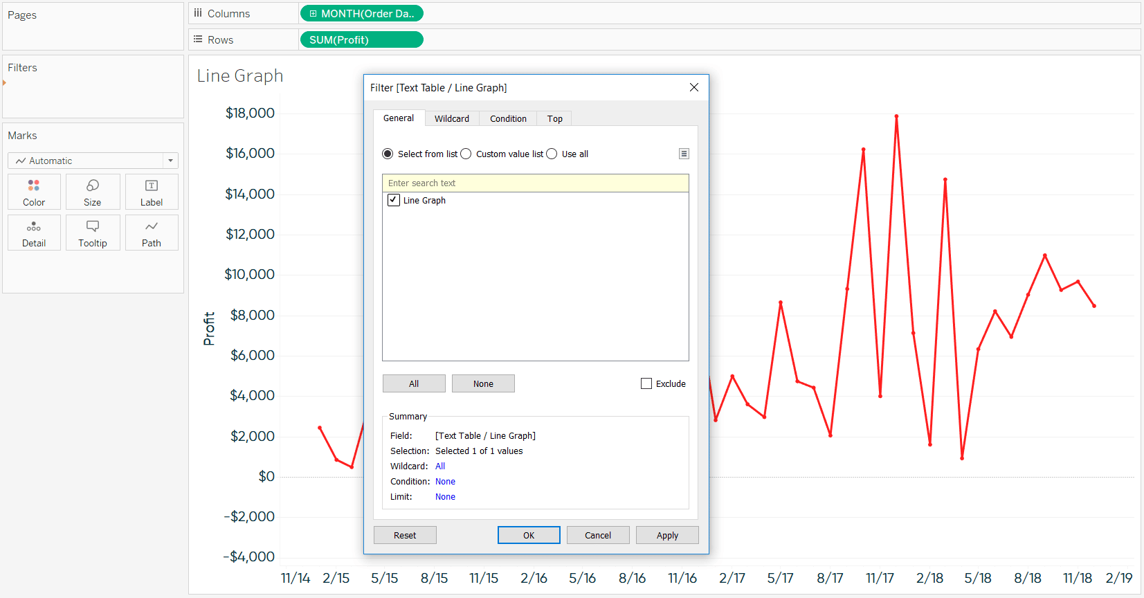
This is exactly what we want. Now when “Text Table” is selected in the parameter, the crosstab within the Text Table sheet will show up. When “Line Graph” is selected in the parameter, the crosstab will disappear, but the visualization within the Line Graph sheet will appear. The formula is Boolean so we can only select one option at a time, and thus, only one visualization is shown at a time.
The final step is to add both sheets to a vertical layout container on a dashboard. I’ve also shown the parameter control so you can see which allowable value is selected. When “Line Graph” is selected, the Text Table sheet contracts and the Line Graph sheet expands.
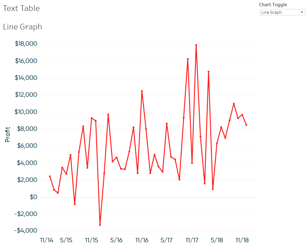
When “Text Table” is selected, the Line Graph sheet contracts and the Text Table sheet expands / becomes visible.
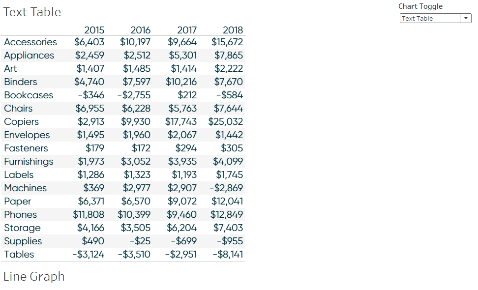
Both sheets are always there, but only one is visible at a time based on the filter being applied (which is populated by the allowable value selected in the parameter control). For best results, hide both sheet titles by right-clicking on each and choosing “Hide Title”.
All three of the tactics shared in this post help your end users evolve from spreadsheets to data visualizations without taking away access to the raw detailed data that helps them sleep at night!
Thanks for reading,
– Ryan
Related Content
Ryan Sleeper
Improve on the ‘gateway’ chart to data visualization Highlight tables help smooth the Excel transition by introducing the preattentive attribute…
Ryan Sleeper
Blurring the line between explanatory and actionable analytics Ryan shares one of his favorite tactics for helping users evolve from…
The Easiest Way to Make a Toggle in Tableau
Toggles in Tableau are useful anytime you want to provide your user the ability to filter certain data points, flip…


