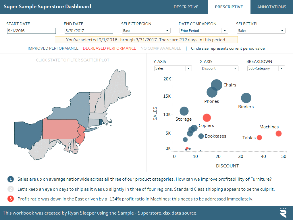
Dashboard Element 2: The Parameterized Scatter Plot
In the last post, I showed you how to build a current performance versus comparison performance index callout; one of my favorite descriptive tactics for communicating performance. One of my favorite prescriptive tactics is to provide a scatter plot that the user can build themselves – even if they don’t know how to use Tableau! The “parameterized scatter plot” is considered prescriptive because it helps us understand why something happened in the business, and ideally, prescribes something to do about it.
Scatter plots have several advantages including (1) they’re able to show many data points at once, (2) they help illustrate correlations, and (3) they create a natural four-quadrant segmentation. This post will show you how to make scatter plots even better by allowing your end user to choose the measure displayed on the y-axis, measure displayed on the x-axis, and dimensional breakdown of the marks on the view.
This is the second in a five-part series about my go-to elements of Tableau dashboards. For future updates, subscribe to our mailing list.
Watch the related video with Playfair+
How to create a parameterized scatter plot in Tableau
For this tutorial, we will be rebuilding the scatter plot from the prescriptive dashboard in the Super Sample Superstore workbook. In the scatter plot on the right side of the dashboard, the user can choose the measure on the y-axis, measure on the x-axis, and the dimensional breakdown of the circle marks.
To allow an end user to build their own scatter plot, we will use the tactic outlined in the post, How to Let Users Choose Measures and Dimension in Tableau.
First, you must set up a parameter with a data type of String for each of the three choices (y-axis, x-axis, and dimension breakdown). The allowable values for each will be the choices that the end user can eventually access to build their scatter plot. Here’s how each of the three parameters look:
Y-Axis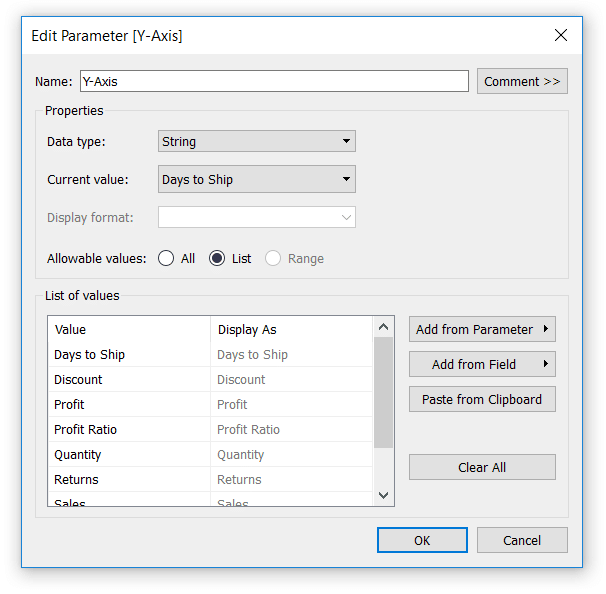
X-Axis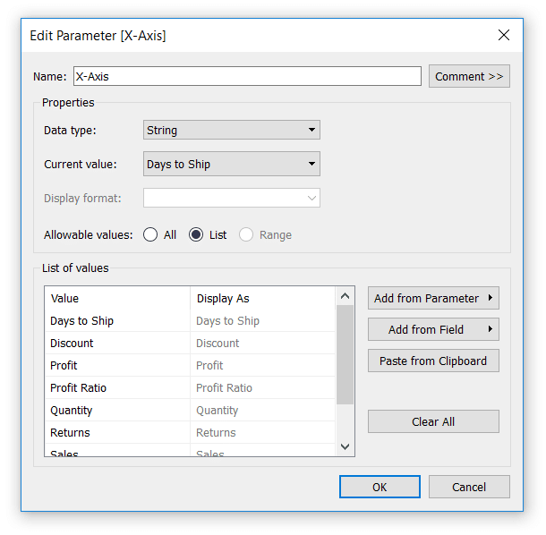
Scatter Plot Detail (the dimensional breakdown)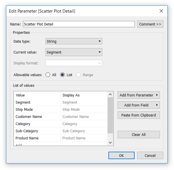
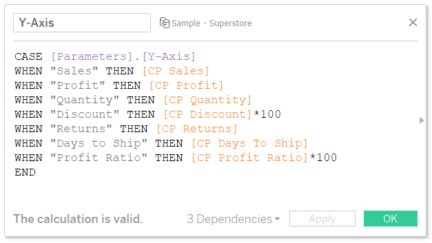
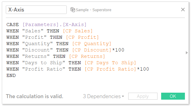
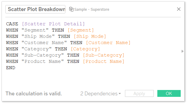
Parameters do almost nothing on their own, but I will share one useful application at the end of this post. Most often, parameters need to be used within a calculated field to give Tableau instructions for what to do with each allowable value. Here are the calculations for each of three parameters which use CASE / WHEN logic to display the appropriate measure or dimension when they are selected from our list of allowable values in the parameters.
Note when you see the measure multiplied by 100, I’m simply making ratios more readable by moving the decimal two places to the right.
Y-Axis
CASE [Parameters].[Y-Axis]
WHEN “Sales” THEN [CP Sales]
WHEN “Profit” THEN [CP Profit]
WHEN “Quantity” THEN [CP Quantity]
WHEN “Discount” THEN [CP Discount]*100
WHEN “Returns” THEN [CP Returns]
WHEN “Days to Ship” THEN [CP Days To Ship]
WHEN “Profit Ratio” THEN [CP Profit Ratio]*100
END
X-Axis
CASE [Parameters].[X-Axis]
WHEN “Sales” THEN [CP Sales]
WHEN “Profit” THEN [CP Profit]
WHEN “Quantity” THEN [CP Quantity]
WHEN “Discount” THEN [CP Discount]*100
WHEN “Returns” THEN [CP Returns]
WHEN “Days to Ship” THEN [CP Days To Ship]
WHEN “Profit Ratio” THEN [CP Profit Ratio]*100
END
Scatter Plot Breakdown
CASE [Scatter Plot Detail]
WHEN “Segment” THEN [Segment]
WHEN “Ship Mode” THEN [Ship Mode]
WHEN “Customer Name” THEN [Customer Name]
WHEN “Category” THEN [Category]
WHEN “Sub-Category” THEN [Sub-Category]
WHEN “Product Name” THEN [Product Name]
END
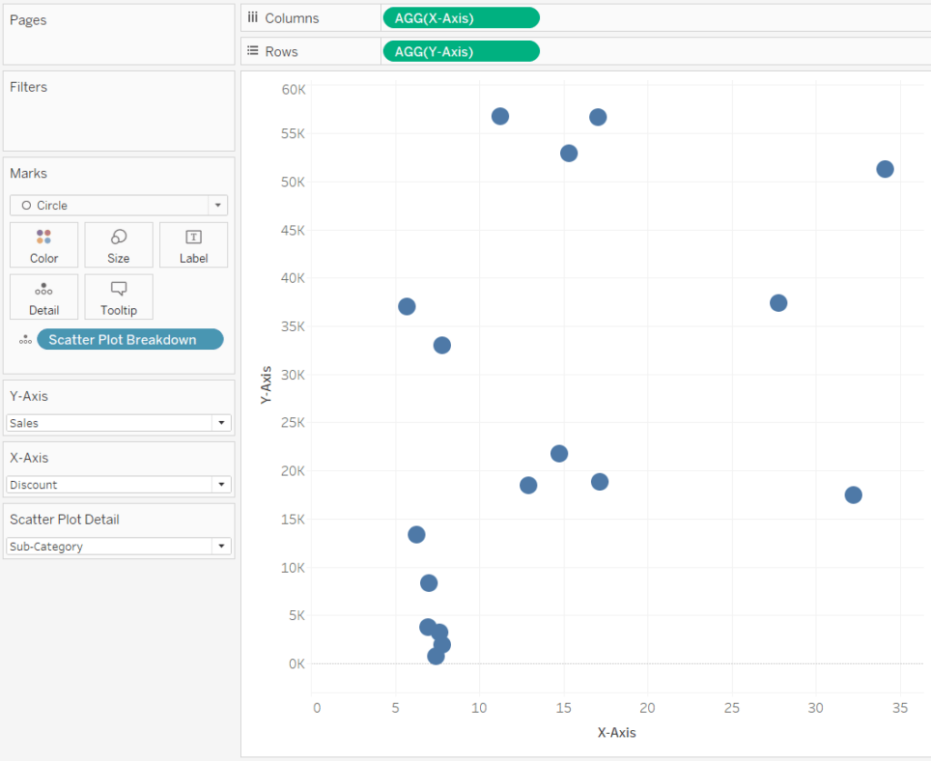
We now have all of the elements needed and can build the scatter plot! To do so, put the Y-Axis calculated field on the Rows Shelf, the X-Axis calculated field on the Columns Shelf, and the Scatter Plot Breakdown calculated field on the Detail Marks Card. I’ll also change the mark type to Circle and increase the size of the marks using the Size Marks Card so we can see them better.
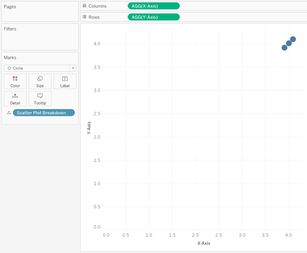
Everything is working so far, but the current value of both the Y-Axis and X-Axis parameters is “Days to Ship”, so we’re looking at the same metric on both axes broken down by Segment (the current value of the Scatter Plot Detail parameter). To allow our end users to build their own scatter plot and choose the measures and dimensions that are relevant to them, we must right-click on each of the three parameters and select “Show Parameter Control”. This will display three dropdown menus where the end user can now select from the full list of allowable values coded in the parameters.
Here’s how my view looks after showing the parameter controls and choosing Sales for the y-axis, Discount for the x-axis, and Sub-Category for the dimension breakdown.
The next step is optional, but in the final version of my parameterized scatter plot, I colored the circles by period over period change and sized the circles by a fourth parameter selection.
Lastly, I mentioned earlier that parameters do almost nothing on their own. One thing they can do is provide axis labels by placing them on the appropriate shelf. For example, if I place the Y-Axis parameter on the Rows Shelf and X-Axis parameter on the Columns Shelf, each axis label will display the name selected in the respective parameter.
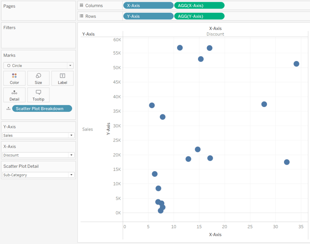
Of course, this can be formatted further by rotating the labels, hiding the words “X-Axis”, etc.
Now that you can build one of my favorite prescriptive dashboard elements, take a look at these 3 tips for making stunning scatter plots in Tableau.
Thanks for reading,
– Ryan
Related Content
3 Ways to Make Stunning Scatter Plots in Tableau
When it comes to my favorite chart types, scatter plots are a close third behind bar charts and line graphs.…
Ryan Sleeper
‘Connect the dots’ to help your audience read scatter plots This video will show you how to make connected scatter…
Ryan Sleeper
Drill In and Out of Segments with a Single Click We’ve shown you before how scatter plots create a natural…
