Dashboard Gauge 1: How to Make Bullet Graphs in Tableau
Speedometer-like dashboard gauges that show an arrow moving across a semi-circle consume an unnecessarily large amount of valuable real estate and are not ideal for communicating or interpreting magnitude. This series aims to provide five alternative dashboard gauges to help illustrate comparisons to prior periods or goals. I feel legally obligated to start the series off with Stephen Few’s, bullet graphs, as he really helped pioneer the idea of making gauges more streamlined and effective. Bullet graphs build onto bar charts and provide context in the form of lines and shading that represent a comparison point. They work well because they make an efficient use of space, leverage the preattentive attribute of length, and can illustrate comparisons beyond 100% (i.e. 20% above goal). This post and video will show you two different ways to make bullet graphs in Tableau.
This is the first in a five-part series on dashboard gauges in Tableau. For future updates, subscribe to our mailing list.
Watch the related video with Playfair+
Create the baseline and comparison measures
Bullet graphs are created with a measure that you are analyzing and a comparison measure. The comparison measure is typically a prior period but can also be a benchmark or a goal if those are defined in your business. For this illustration, we will imagine we want to analyze the Sales measure, the current month is May, and our comparison is April. The first thing we need to do is isolate the sales performance for the months of May and April. This can be accomplished by creating calculated fields.
The Sample – Superstore dataset has four years of data in it, but to simplify, let’s pretend it has just one. The calculation to isolate May sales would then be:
SUM(IF MONTH([Order Date]) = 5 THEN [Sales] END)
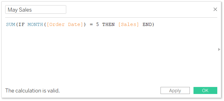
The formula for April sales is:
SUM(IF MONTH([Order Date]) = 4 THEN [Sales] END)
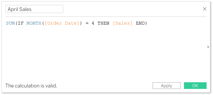
How to create bullet graphs using Show Me
Bullet graphs can be made with Show Me, so I will show you that first, but later we will build this chart type from the ground up to show you how it works and some options for customization. If I were wanting to look at sales by sub-category month over month, I could do a multi-select of those three fields and navigate to the Show Me menu in the top-right corner of the authoring interface.
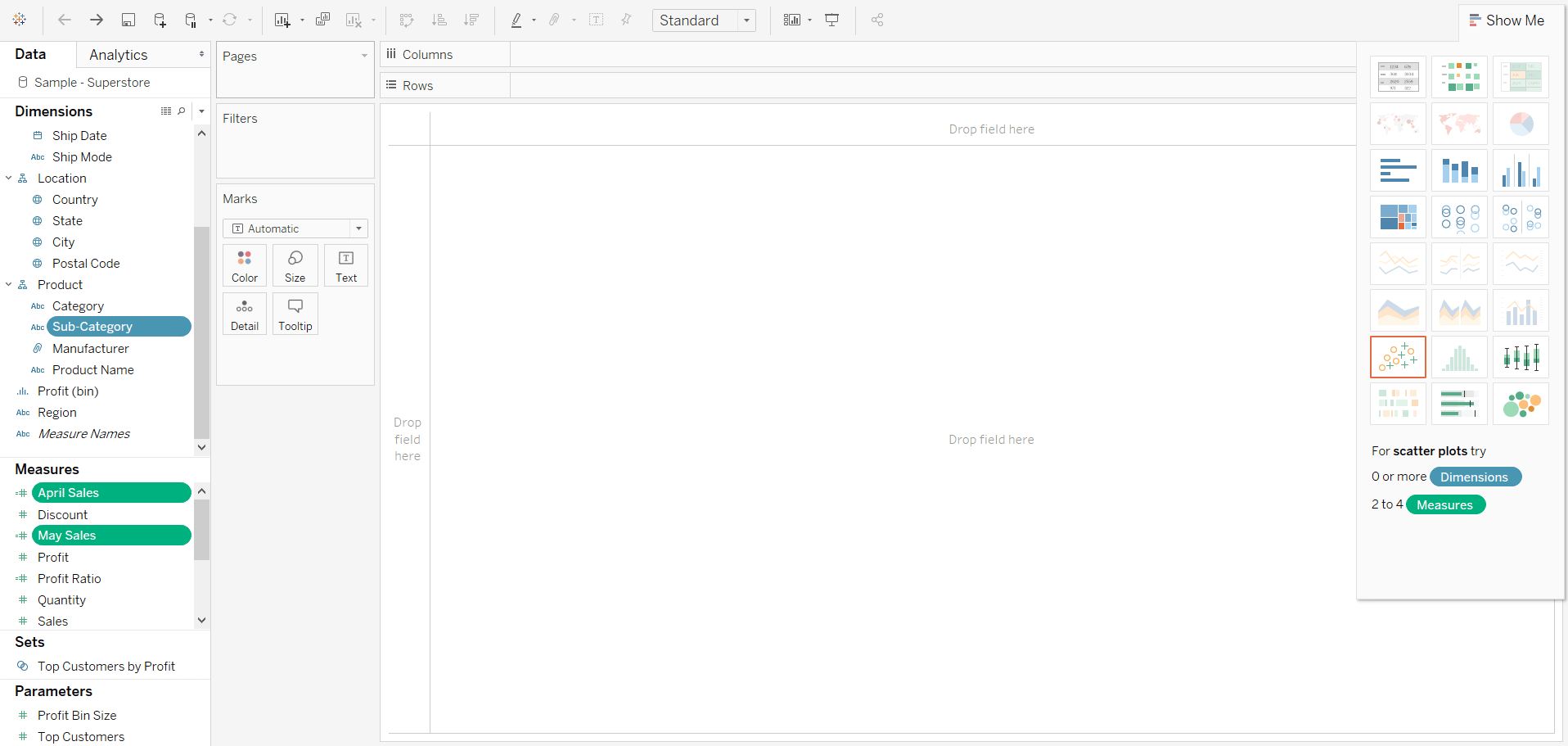
Tableau draws an orange border around its recommended chart based on the fields being used on the view. In this case, it’s suggesting a scatter plot, but we actually want to build bullet graphs; the second choice on the eighth and final row of options. After clicking on the bullet graphs thumbnail image, Tableau creates this chart:
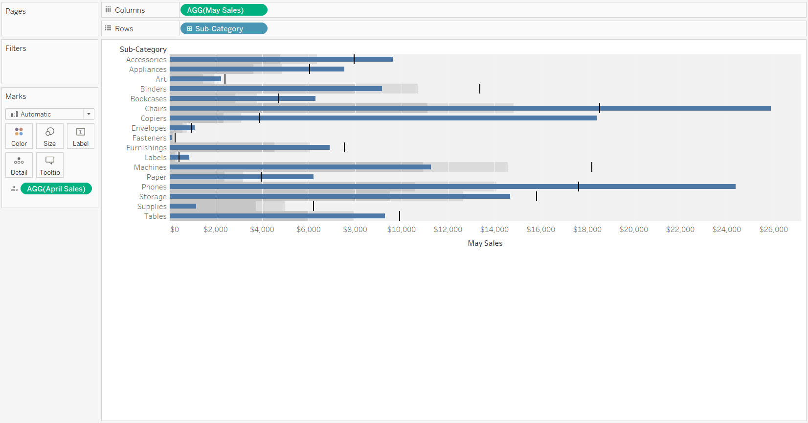
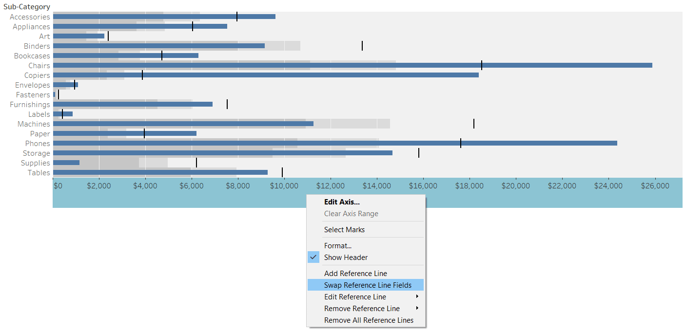
This worked great this time because the bars represent the current month’s sales and the lines and shading represent the prior month’s sales. However, these results do not always end up as you expect depending on the comparisons you are creating. If the fields you are using end up being reversed, so the bars represent your comparison, and your current performance is drawing the lines, you can swap the fields by right-clicking on the axis and choosing “Swap Reference Line Fields”.
How to create bullet graphs manually
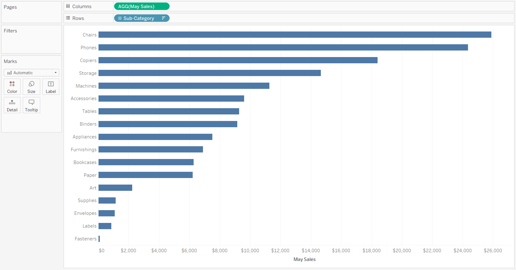
To provide more flexibility, and to show you the inner-workings of Tableau bullet graphs, I’ll also show you how to build this chart type manually. First, make a bar chart with the current performance measure. Here’s a bar chart looking at May Sales by Sub-Category. I’ve also sorted the bar chart so we can easily decipher the rank between the seventeen sub-categories.
Bullet graphs are made with two reference lines; a line that represents the comparison data point and a distribution that shades 60% and 80% of the comparison data point. To use a data point as a reference line, it must either be a parameter, a constant, or be used somewhere on the view. We want to compare May Sales to April Sales, but April is not yet represented on the view. To ensure the April Sales measure is available to add as a reference line, add it to the Detail Marks Card.
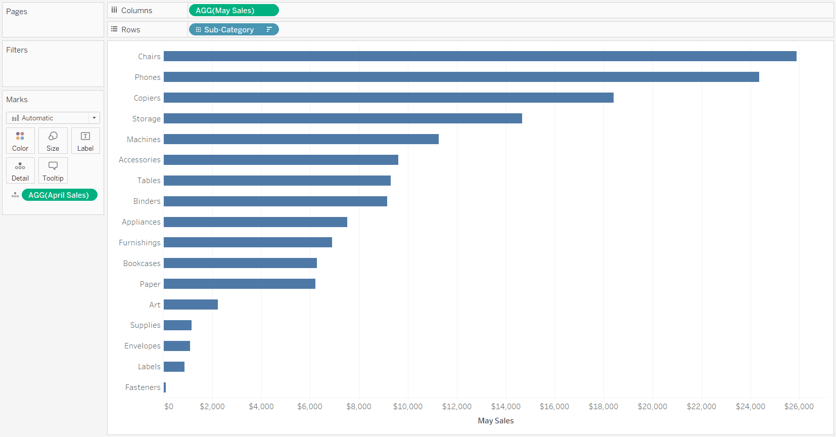
This does not change the view, but now April Sales will be available to use as a reference line. The easiest way to add a reference line is to right-click on the axis you want the line added to and choose “Add Reference Line”. This will open a dialog box where you can define the reference.
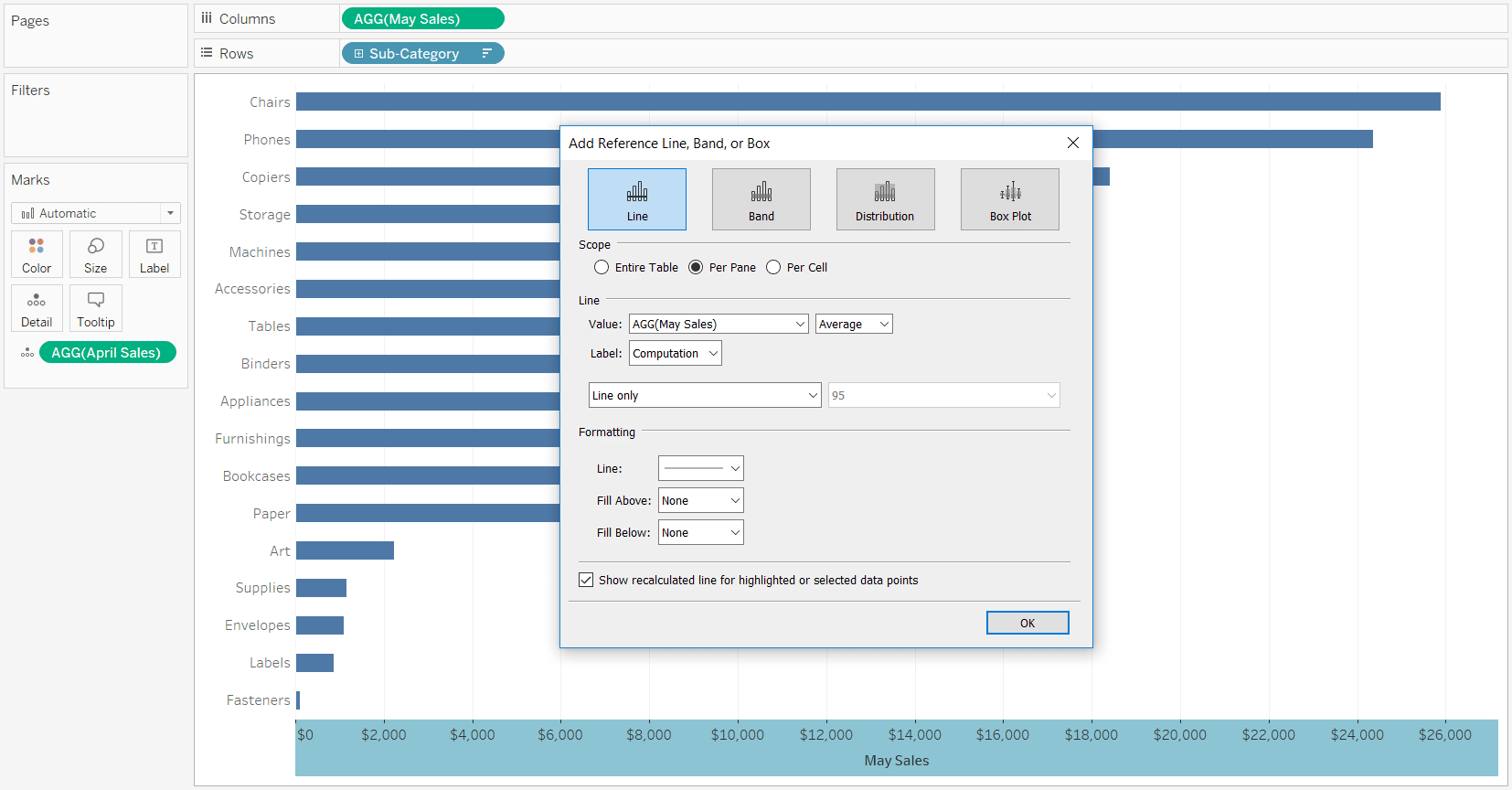
In our case, the line is based on April Sales, so I’ll change the Value dropdown to April Sales. It’s also important to change the scope of the line to Per Cell so you see the comparison point for every dimension member. After changing the scope, you will see a lot of repetitive ink in the form of labels; I typically turn these off. Lastly, I like to make the reference line a brighter color so it stands out on the view. Here are my settings for the first reference line.

I like the context these comparisons provide and the minimalist look of this chart, so I typically stop here with bullet graphs. I can already see which months outperformed and underperformed the comparison, but to add extra context, you can add a second reference line to represent 60% and 80% of the comparison. To do so, right-click on the axis again and choose “Add Reference Line”.
This reference line is a distribution, so choose the Distribution tab at the top of the dialog box. We again want to change the scope of the reference to Per Cell and turn the labels off. The Value drop-down should be set to “60%,80% of Average”, but it’s very important to click into that dropdown and ensure the 60% and 80% are based on April Sales, and not the default, May Sales.
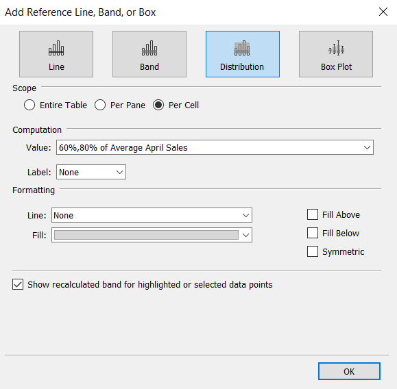
So far, this reference distribution would show gray shading between 60% and 80% of the comparison data point for each sub-category. To see gray shading from 0% to 60% and 60% to 80%, check the box that says “Fill Below”. Here are my settings for the second reference line:
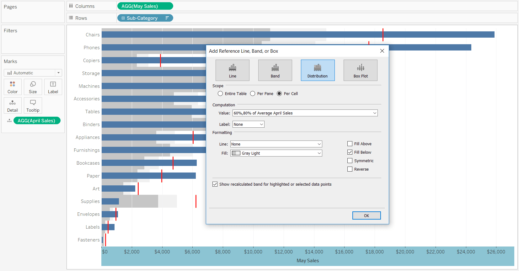
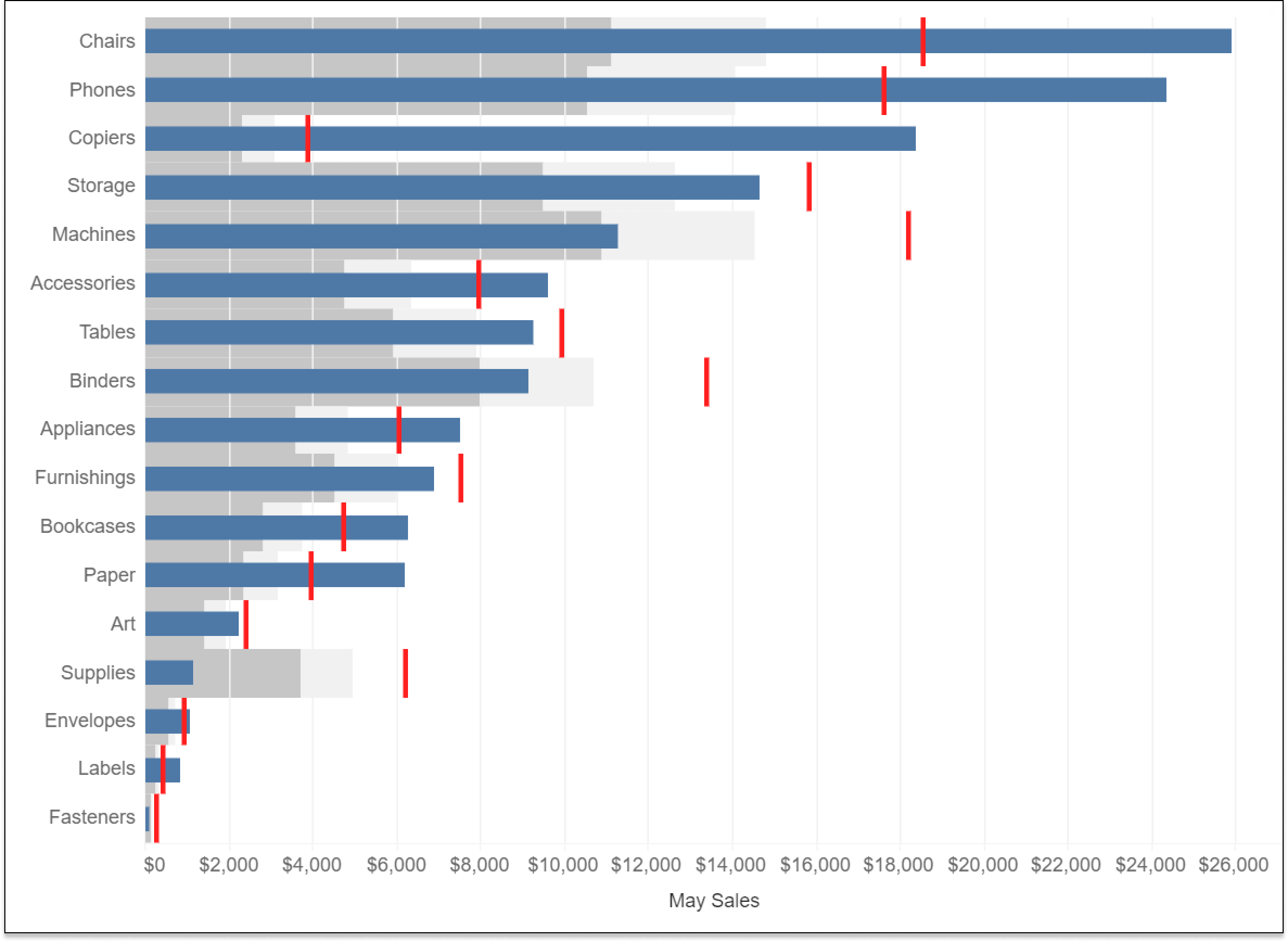
Of course, the lines and shading can be customized to your liking, but here is my final bullet graph for this example:
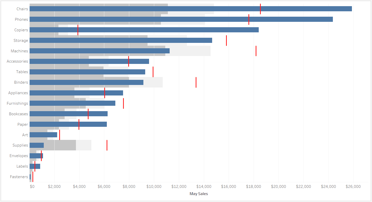
We’ve just added context in the form of a comparison to a bar chart, and these are very easy to read. If the blue bar is past the red line, we outperformed the comparison. If the blue bar falls short of the red line, we underperformed the comparison. In the case of underperformance, the shading informs us how far below the dimension member was versus the comparison.
With a sales by sub-category bar chart alone, I would not have known that not only were Copiers in the top three, but they also had the most dramatic month-over-month improvement. Also, I might have been excited to see that Machines was in the top five, but the bullet graph has helped me uncover an area in the business I need to explore further.
Thanks for reading,
– Ryan
Related Content
3 Ways to Make Brilliant Bullet Graphs in Tableau
Setting goals and measuring progress is a common activity for many people. Maybe someone wants to read 25 books, travel…
Ethan Lang
Benchmarking, Modeling, Forecasting, and More In this live webinar on the Analytics pane in Tableau, join Ethan as he does…
Introducing “Gap” Charts in Tableau
In Practical Tableau, we introduced the concept of a pace chart, an alternative bullet graph that normalizes progress to goal…
