Dashboard Gauge 4: How to Make a ‘Stock Ticker’ in Tableau
The next gauge I will show you how to build in Tableau was inspired by the stock ticker gauges seen on major news networks and stock portfolio apps. The visualization typically features the positive or negative change of a stock or index, preceded by an up or down colored triangle, and is occasionally enclosed by a colored rectangle to reinforce the change. You may not initially think of this as a gauge, but in this series, gauges are defined as chart types that show progress to a goal or comparison point.
While stock tickers aren’t the best choice for visualizing the magnitude of a change, I like them because they: (1) clearly indicate a positive or negative performance, (2) have a minimalist design, (3) are encoded by both color and shape; an approach to double-encoding that is colorblind-friendly. If you’re looking to try a slightly different approach, the stock ticker gauge is a good alternative to callout numbers across the top of your dashboards. This post will show you how to use Gantt charts in a unique way and the up (▲) and down (▼) alt code characters to create a ‘stock ticker’ in Tableau.
This is the fourth in a five-part series on dashboard gauges in Tableau. For future updates, subscribe to our mailing list.
How to Make a Stock Ticker Gauge in Tableau
Introduction + foundation
By the end of this post, you will be able to make a ‘stock ticker’ gauge with an up or down triangle and rectangular indicator that changes color based on performance.
This gauge requires four elements: (1) a calculated field that computes the comparison between the current performance and your comparison point, (2) a calculation that creates the up triangle, (3) a calculation that creates the down triangle, and (4) a Gantt mark (optional).
The Gantt mark is mostly aesthetic, but when used in a series displaying multiple KPIs, it has the practical purposes of enclosing the gauge and providing a visual separation. This is like how column dividers separate text in crosstabs or pipe symbols (|) provide a visually appealing separator. But in Tableau, using a bit of trickery, we can give the mark more value by dynamically coloring it based on performance. You can also use the Gantt mark by itself instead of triangles, but you lose the encoding by shape which helps colorblind audiences.
[This element is optional. If you prefer to only display the text and triangles, skip down to the next element of the gauge and place the calculations on the Text Marks Card.]
To lay the foundation for my stock ticker, I’m going to create what I refer to as a “placeholder” field. I often create a calculated field for my placeholder, but this time, I’ll show you how to make a placeholder field in the flow. On a new sheet, double-click on the Columns Shelf, type MIN(0), and hit Enter. While the number zero technically does not need an aggregation, it will be important to have an aggregation of minimum later if we change this value to properly align our Gantt mark.
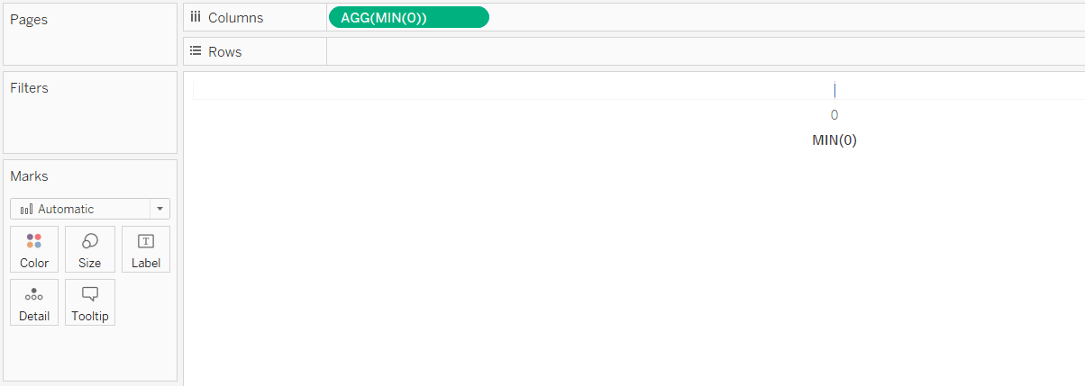
Next, change the mark type from Automatic (Bar) to Gantt Bar by using the dropdown menu on the Marks Shelf.
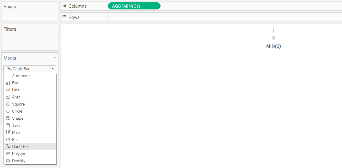
Create a Gantt mark for stock ticker gauges
Gantt bars must be sized by something, and whatever we size our Gantt mark by will end up being the size of our colored rectangle indicator. This is completely arbitrary, but I’ll size my mark by the value of 1. This is another calculation that you can build in the flow by double-clicking any blank space on the Marks Shelf, typing MIN(1), and clicking Enter. By default, this new calculation will be placed on the Detail Marks Card. If you drag it from its default location to the Size Marks Card, the Gantt bar (i.e. our indicator) will be sized by 1.
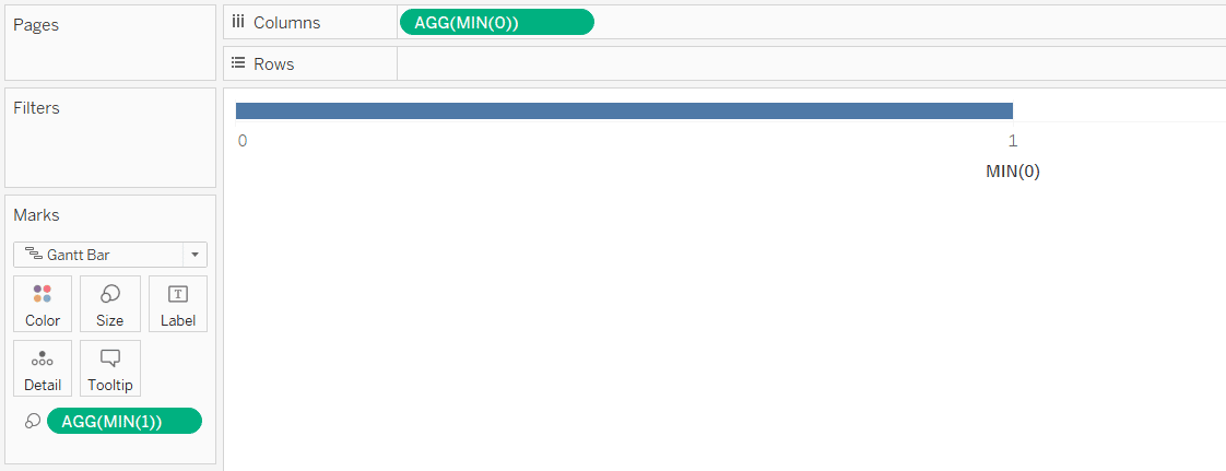
As you can see, the Gantt mark is spanning from 0 to 1. From here, you can edit the value we used to create the placeholder on the Columns Shelf and or the axis range (by right-clicking on the axis and choosing “Edit Axis”) to resize the indicator. Here’s how mine looks after changing the placeholder value to 9 and my axis range from -10 to 10.
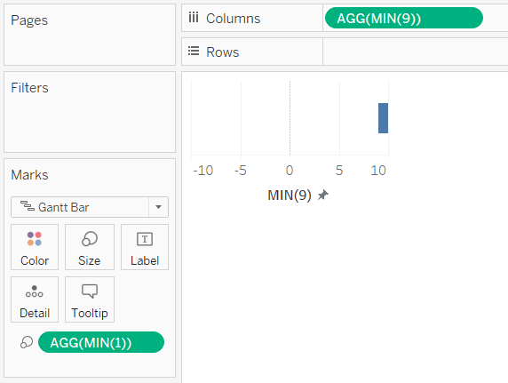
You will also want to remove all the lines by right-clicking anywhere on the view and choosing “Format…”; then navigate to the Lines tab and turn off grid lines, zero lines, and axis rulers.
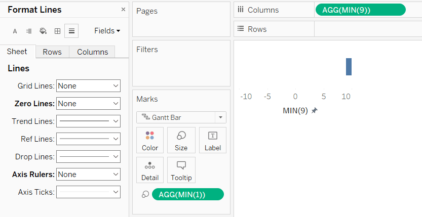
We’ve laid the foundation for our stock ticker gauge without even creating a calculated field so far. The rest of the gauge is completed by adding the change value and triangles as labels to the “Gantt chart” being used as our indicator. I personally like the effect that the mark creates but admit that if you’re using triangles in addition to the Gantt mark, this is not required and sometimes the ‘juice is not worth the squeeze’.
So I don’t blame you if you skip the foundation step we just went through, but you will still need the following calculations to create a stock ticker gauge without the Gantt mark. If you would prefer to make something similar, but exclusively using triangles, simply start a new worksheet and place the following calculations on the Text Marks Card instead of the Label Marks Card.
First, the change calculation. For ease of illustration, I have parameterized a calculated field, but you will likely need to create a calculation that computes either a period-over-period change or comparison to goal. The calculation for percent change is: ([Current Performance] / [Comparison Performance]) – 1.
How to create dynamic up and down triangles
We then need a calculated field that creates an up triangle and a calculated field that creates a down triangle. These need to be separate for two reasons: (1) they’ll allow us to independently format the triangles and the change value on the label (so the triangles can be a smaller font size), and (2) we can color the up and down triangles different colors.
The calculation for the up triangle is:
IIF([Change]>0,’▲’,NULL)
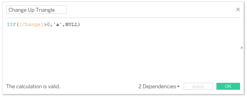
This is saying that if the change is greater than zero, display the up triangle; otherwise the value should be null.
The calculation for the down triangle is:
IIF([Change]<0,’▼’,NULL)
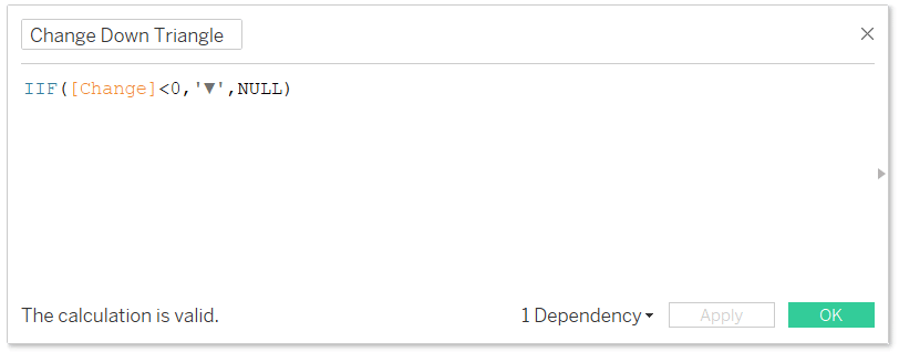
This is saying that if the change is less than zero, display the down triangle; otherwise the value should be null.
Finalize the stock ticker gauge
We’re now ready to place all our fields onto the Label Marks Card of our Gantt chart (or Text Marks Card if you skip the rectangular indicator). After placing the calculated fields on the appropriate Marks Card, format the label as appropriate. I’ll make my triangles a smaller text than the change value, color the up triangle blue, and the down triangle red.
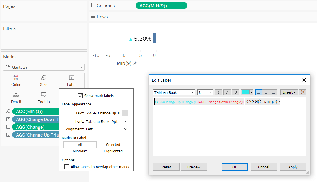
The way that our triangle-calculated fields are set up, only one triangle will show up at a time. When the change is positive, the up triangle will show up and the down triangle will be null; when the change is negative, the down triangle will show up and the up triangle will be null.
Next, place the Change measure you are using onto the Color Marks Card, which will color the rectangular indicator. Modify the diverging color legend (by double-clicking on it) so the stepped colors are 2 and the center is 0; this will display one color for positive values and a separate color for negative values. I recommend you make these colors match the colors used for the triangles.
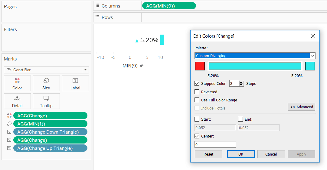
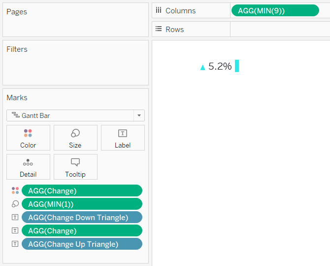
To finalize the view, format the number of decimal places to your liking, use the Size Marks Card to change the height of the rectangle, and/or hide the axis by right-clicking on it and deselecting “Show Header”.
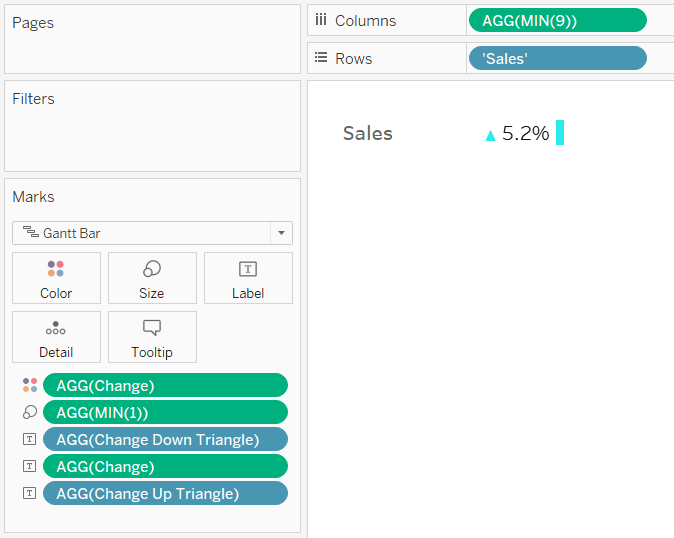
There are several ways to get the measure name the stock ticker gauge is related to onto the view including adding a sheet title, adding a text object to a dashboard, using the Measure Names field and editing the alias, just to name a few.
But I’ll give you one more sneaky idea. You can add the measure name by adding a calculation in the flow just like we did earlier with the placeholder field. Here’s how my final view looks after double-clicking on the Rows Shelf, typing ‘Sales’, and hitting Enter.
Thanks for reading,
– Ryan
Related Content
3 Ways to Use Alt Code Characters (▲,★,■) to Enhance Your Tableau Dashboards
ASCII, or American Standard Code for Information Interchange, is the standard when it comes to computers converting numbers into readable…
Ryan Sleeper
3 ways to take command of Tableau number formatting Learn how to (1) easily format positive and negative changes with…
Dashboard Gauge 5: How to Make Indicators with Custom Shape Palettes
Like the stock ticker gauge, most shapes are not the best choice for visualizing magnitude, but just like sometimes when…


