How to Create a Bilingual Dashboard in Tableau
As a consultant, I have come across several occasions when my partners needed the ability to display their Tableau dashboard in multiple languages. For example, I’ve worked with a non-profit organization serving children in South America. The company’s offices are in the US and most employees speak English, but their field workers are in South America where Spanish and Portuguese are the primary languages. I also recently gave a presentation in Ottawa, Ontario, Canada where they have a similar challenge of needing to display English to some users, but French to others. I was even asked if it’s possible to create a bilingual dashboard in Tableau.
According to Tableau, their software has been localized to Chinese, English, French, German, Japanese, Korean, (Brazilian) Portuguese, and Spanish. This means that navigation options will be translated, dates will show up in the appropriate format, and currency will have local formatting. What this post will show you is how to design entire dashboards in two (or more) different languages and allow your end users to choose which language is displayed throughout a workbook.
How to create a bilingual dashboard in Tableau
The trick to creating bilingual dashboards involves replicating each dimension, translating the dimension members to the second language, and creating a parameter that will allow the end user to choose which dimension (i.e. language) is being displayed. To help illustrate, I will make the following bar chart looking at the Quantity measure by the Region dimension into a bilingual visualization.

The first thing you need to do is duplicate the dimension and translate its dimension members. There are two ways to do this. First, you can prepare this in the data before it gets to Tableau. Here’s how the Region dimension looks in the underlying Sample – Superstore dataset if I were to replicate the dimension and translate the dimension members to Spanish.

A second – and possibly more efficient method – is to duplicate the dimension from within the authoring interface and translate the aliases of the dimension members to the language of your choosing. To do this, start by right-clicking the dimension that you want to translate and choose “Duplicate”.

Next, rename the copy of the dimension by either slowly double-clicking on the dimension or right-clicking on the dimension and choosing “Rename”. Lastly, right-click on the newly created dimension and choose “Edit…”. The calculated field dialog box will open where you can code your customized values.

Note that Tableau also allows you to change the aliases of dimension members by right-clicking on a dimension and choosing “Aliases…”, but the calculated field method ensures the correct values will be displayed when we use a parameter later in this post.
Whether you follow the first approach of creating a translated dimension in the underlying data or duplicating the dimension from within the authoring interface, you will now have a dimension for each language.

Now that we have the dimension in both languages, we have to create a parameter that will eventually allow ourselves and our end users to decide which language the dimensions are displayed in. The parameter should have a data type of String and a list of allowable values for the languages you want to include. If you’re new to parameters, see An Introduction to Parameters in Tableau. Here’s how the logic for my parameter looks at this point.

Parameters do very little on their own. In order for Tableau to display the language based on the parameter selection, we must integrate the parameter into a calculated field that gives Tableau instructions for how to handle each option. To do so, I will create a new calculated field with this code:
CASE [Language Selector]
WHEN “English” THEN [Region]
WHEN “Spanish” THEN [Región (Spanish)]
END

To be clear, you would need to set up a calculated field for each bilingual dimension you wanted to use. However, you would only need to set up the Language Selector parameter one time because it can be used across calculated fields and even across data sources. Changing the parameter value once will change the language being displayed everywhere.
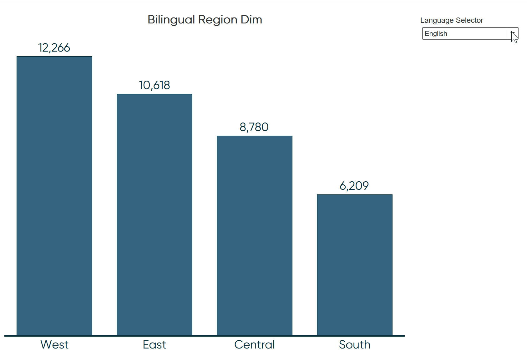
To finalize my sample quantity by region view, I will replace the Region dimension on the Columns Shelf with my newly created Bilingual Region Dim calculated field.

Lastly, in order to have one-click access to choose whether the dimension members are displayed in English or Spanish, I must show the parameter control by right-clicking on the Language Selector parameter and choosing “Show Parameter Control”. Now when the user chooses English, quantity is broken down by the Region dimension and the regions are displayed in English.

When the user chooses Spanish, quantity is broken down by the Región (Spanish) dimension and the regions are displayed in Spanish.

We recreated one chart to illustrate this tactic, but you could roll out a similar approach to translate an entire dashboard. This method can also be used to white label dimension members. For example, say you wanted to show an employee on your team how they are stacking up in context of the rest of the team, but don’t want to display the names of every individual. You could copy the “Employee” dimension and change the aliases to something like Employee 1, Employee 2, and so on. One parameter option would allow you to evaluate the entire team, but then you can toggle to the white labeled version when having your one on one meetings.

Finally, if you are displaying measures that require different formats based on the language being selected, you will also benefit by reading my post, How to Dynamically Format Numbers in Tableau.
Thanks for reading,
– Ryan

Written By
Ryan Sleeper
Related Content
How to Do Currency Conversion in Tableau with Google Sheets

With many organizations operating in different countries, the topic of currency conversion becomes more important for data visualization specialists. Despite…

Ryan Sleeper
Toggle On the Fun with 3 Techniques and 3 Practical Applications In this exclusive Playfair+ webinar, Ryan shares techniques for…
How to Dynamically Switch Data Sources Using Tableau Parameters
As an analyst, dashboard engineer, or even data engineer, we are generating more and more data that needs to be…