How to Make a Custom Polygon Map in Tableau
In the last two tutorials about mapping, we have discussed path maps and custom symbol maps. There is a third type of map in Tableau called a polygon map that allows you to map custom shapes. These types of visualizations are what we’re making anytime we’re making a “filled map”. Imagine a map of sales by U.S. state where each state is colored by their respective sales volumes. With these filled maps, Tableau is essentially looking up the latitude and longitude coordinates all the way around the border of each state, and plotting a custom polygon for each territory. With custom polygons, we’re not limited to a prepared set of polygons like state borders—we can define shapes for anything we can imagine from custom geographic dimensions, to your favorite theme park, to your local dog park, to grocery store shelves, or anything else!
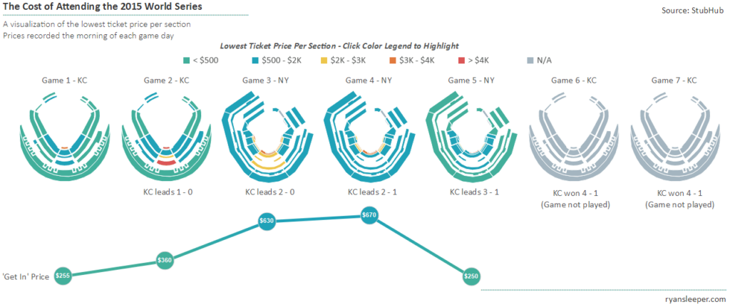
This tutorial will use one of my most asked about visualizations, The Cost of Attending the 2015 World Series, to illustrate how you can create custom polygon maps with any shapes—including stadiums!
Watch the related video with Playfair+
First, let’s take a look at the screenshot of the original viz:

Polygon maps VS. path maps in Tableau
Polygon maps in Tableau are created by looking up the coordinates of the shape you want to draw, and then connecting the dots by drawing a path between them. I encourage you to read the first two chapters in this series mentioned in the opening paragraph if you are not familiar with these concepts. The main difference between a polygon map and a path map is that you “close the loop” around the dots by choosing a polygon mark type instead of a line mark type. Here are the steps for making custom polygon maps in Tableau:
1. Find an image of what you want to draw in Tableau. Being a visualization about the 2015 World Series, I used Kauffman Stadium in Kansas City and Citi Field in New York.
2. Follow the steps in How to Map Any Background Image in Tableau to set up your map in Tableau and record the coordinates for your shapes.
Providing a “point order”
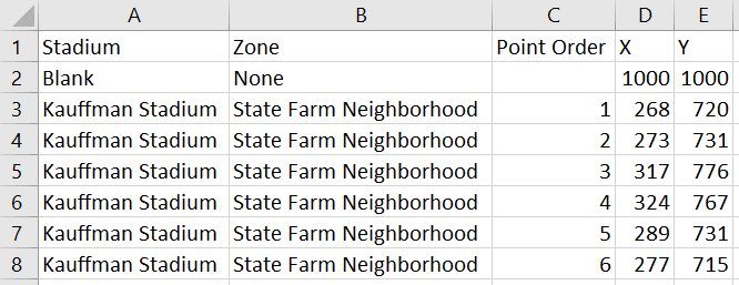
3. Similar to mapping a sequential path, each combination of coordinates should be given a “point order”. This is a field in your underlying data that tells Tableau what order the “dots” are connected. At this point, my underlying data for one section of Kauffman Stadium looks like this:

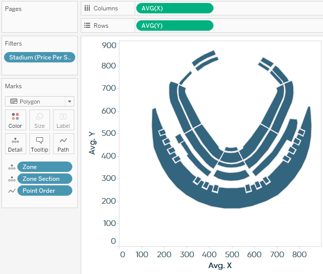
4. Once you have the X and Y coordinates for each point of each shape you want to plot, we are ready to build the polygon map in Tableau. To start, put your X measure on the Columns Shelf and Y measure on the Rows Shelf; both with an aggregation of AVG.
5. Change the mark type from Automatic to Polygon, and place your Point Order dimension on the Path Marks Card.
Drawing the custom polygon map
6. Place the section dimension (and/or the dimension with the most granular level of detail) on the Detail Marks Card. Note that my maps are actually plotted by zone and zone section (which was required when the same zone name existed in two places in the stadium) so I had to add both of these to the Detail Marks Card. If your granularity isn’t reflected on both sides of your polygon, you would just place the most granular dimension on the Detail Marks Card. At this point, my map looks like this:

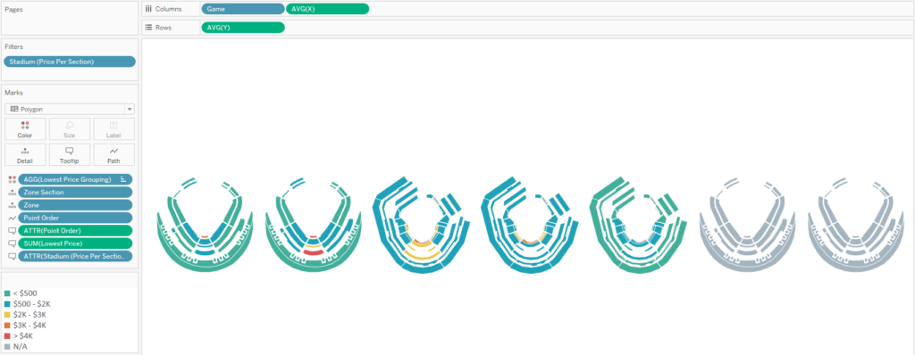
7. This can now be made into a small multiples view by “slicing” the map coordinate measures by a dimension. In my case, I was looking at the maps for each game of the World Series, so I put Game on the Columns Shelf to create a column for each game with a stadium in each cell.
From here, you can hide the axes and encode each section by putting a measure on the Color Marks Card. Here’s what my final product looks like under the hood:

I admit that this map creation process requires painstaking attention to detail, but this step only has to be done once. The map coordinates can then be used over and over in future analyses and the results are great!
The approach provided in this post requires no additional software or resources (outside of Excel and some elbow grease). I would be remiss if I did not mention that there are other paid programs including Adobe Illustrator and Alteryx that can help make this process more efficient.
Thanks for reading,
– Ryan
This content is excerpted from my book Practical Tableau: 100 Tips, Tutorials, and Strategies from a Tableau Zen Master published by O’Reilly Media Inc., 2018, ISBN: 978-1491977316. Get the book at Amazon.
Related Content
3 Ways Psychological Schemas Can Improve Your Data Visualization
Whether you are aware of it or not, you are constantly recognizing and processing patterns in your everyday life. Think…
How to Make a Sequential Path Map in Tableau
As with most features in Tableau, maps are flexible enough to meet many different analysis needs. One of the most…
3 Ways to Make Magnificent Maps in Tableau
Maps are one of the most effective chart types in Tableau and are also among the easiest chart types to…


