Introducing Pace Charts in Tableau
Pace charts are an alternative bullet graph design that normalize progress to goal visualizations across KPIs, even if the KPIs have different data formats, scales, and/or seasonal trends. They are useful for providing an ‘apples to apples’ pace to goal comparison in businesses that have KPIs that span different categories such as revenue, social media followers, attendance, etc.
With KPIs such as revenue, social media followers, and attendance, not only are the metrics in different formats, but they are often on very different scales and have varying seasonality. For example, you may gain social media followers throughout an entire year, but if you are an NFL team, your attendance won’t start until August. Further, your growth on social media might be on a scale of thousands, while revenue may be on a scale of millions.
Pace charts normalize KPIs by comparing them all on an axis that ends at 100% (the goal). In addition to showing how much progress each KPI has made toward the goal, a linear or seasonal pace is displayed to illustrate whether progress to goal is on pace to reach goal. To enhance the illustration, the marks can be colored to show how current progress to goal for each respective KPI compares to its pace to goal.
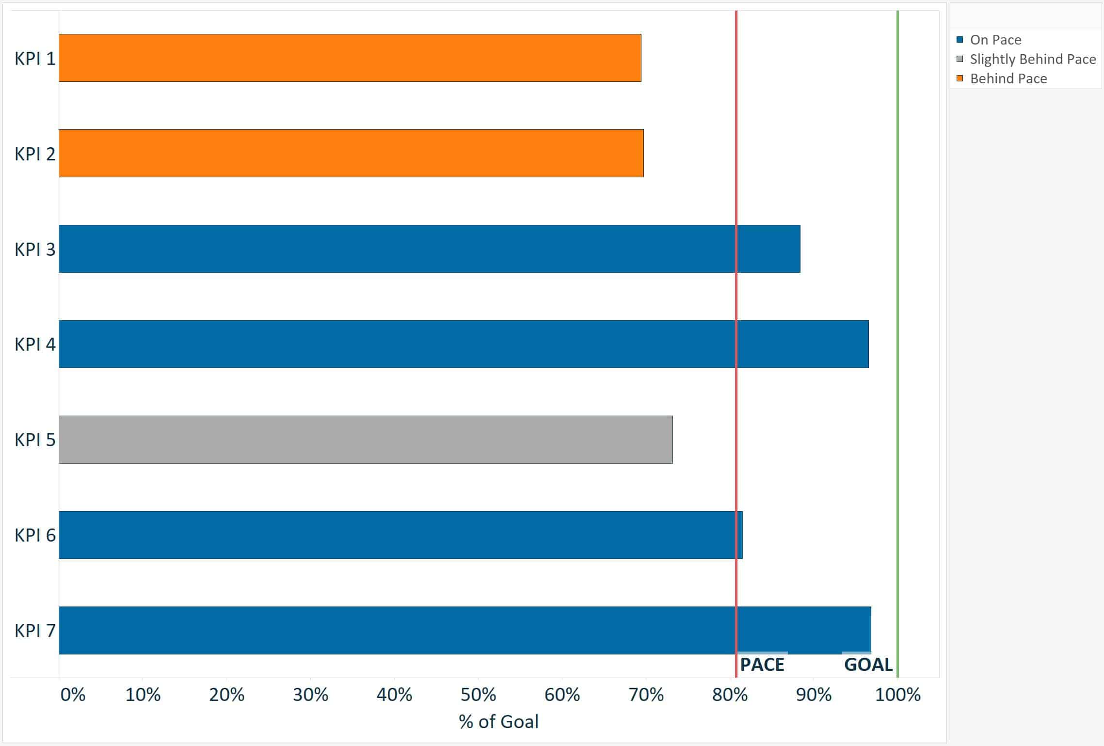
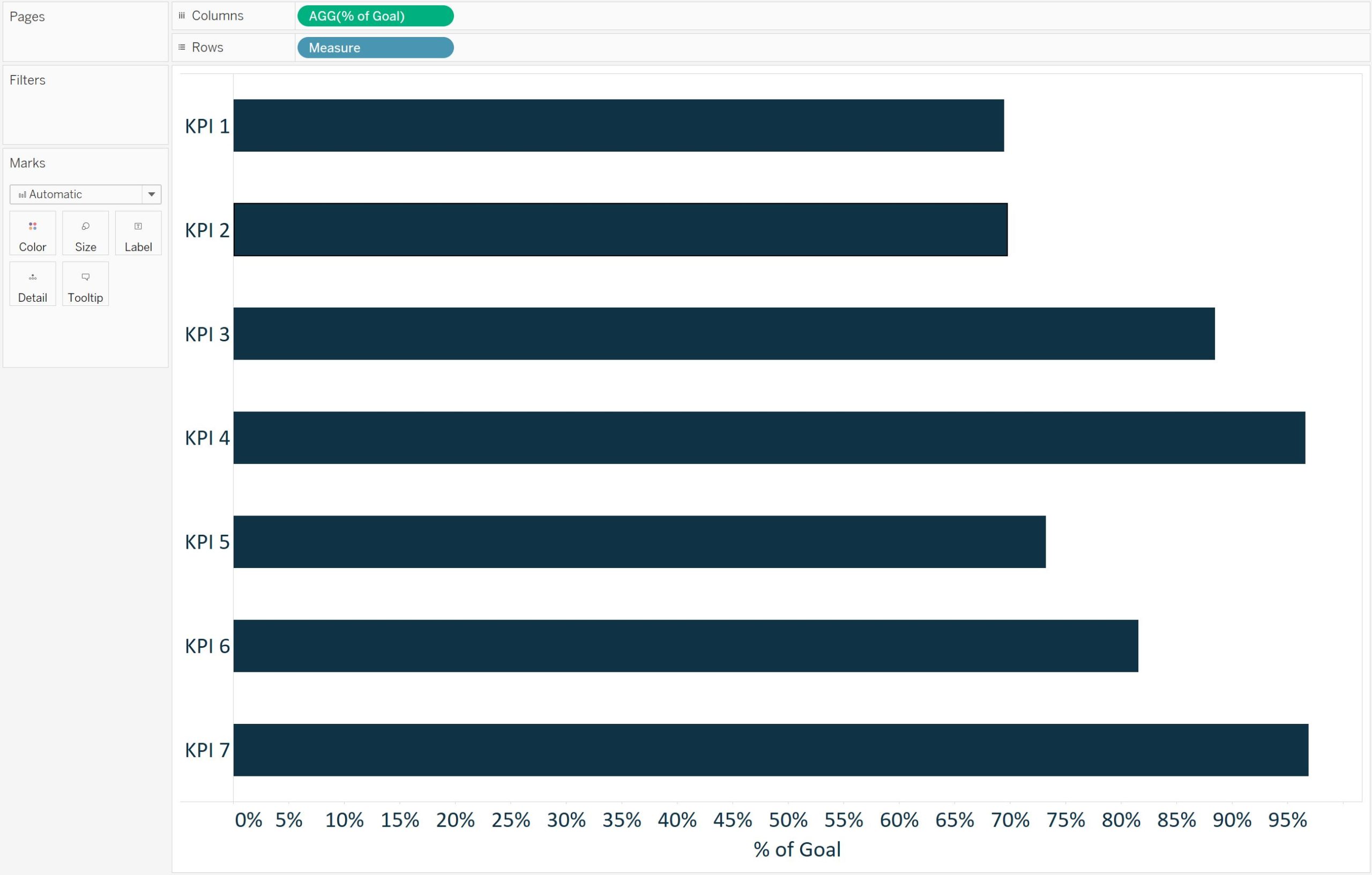
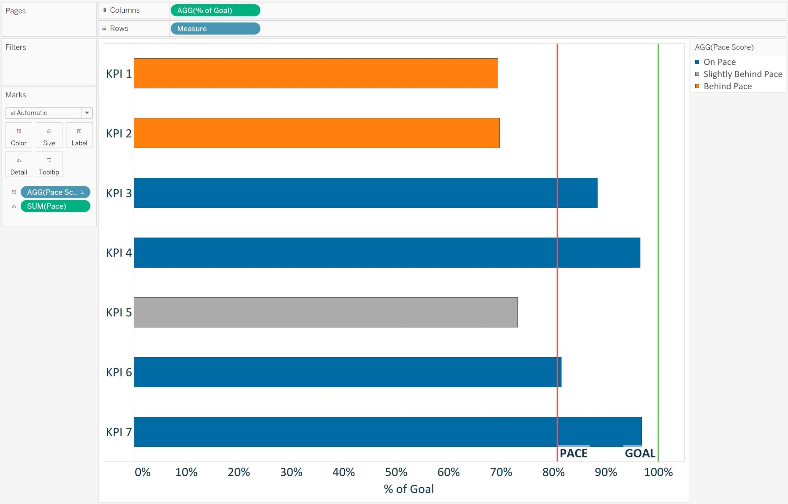
To illustrate how to create a pace chart in Tableau, I will start by recreating this pace chart showing a variety of KPIs that are on a linear pace (i.e. they should all be at the same progress to goal at this point in the year):
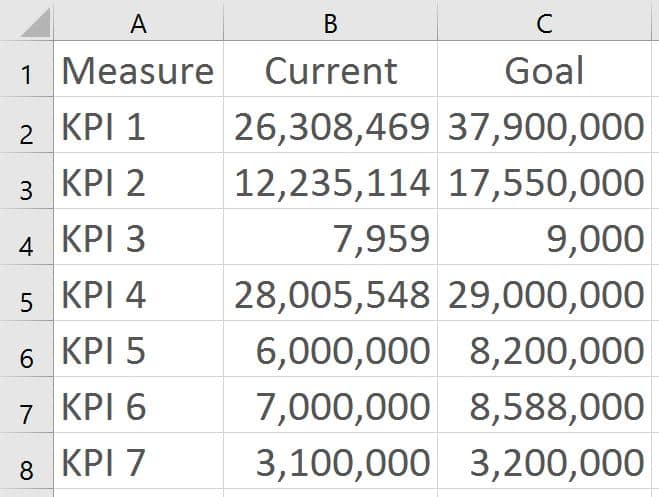
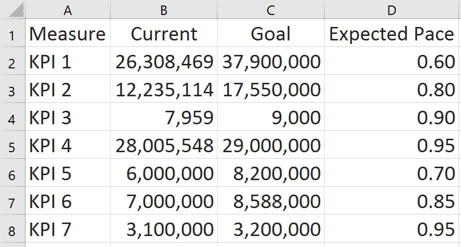
The underlying data set used to create this pace chart looks like this:
Even though the KPIs are on very different scales, it is easy to compare them to determine which are on pace, slightly behind pace, or behind pace.
![]()
To affirm this point, here is the same data using a traditional bullet graph:
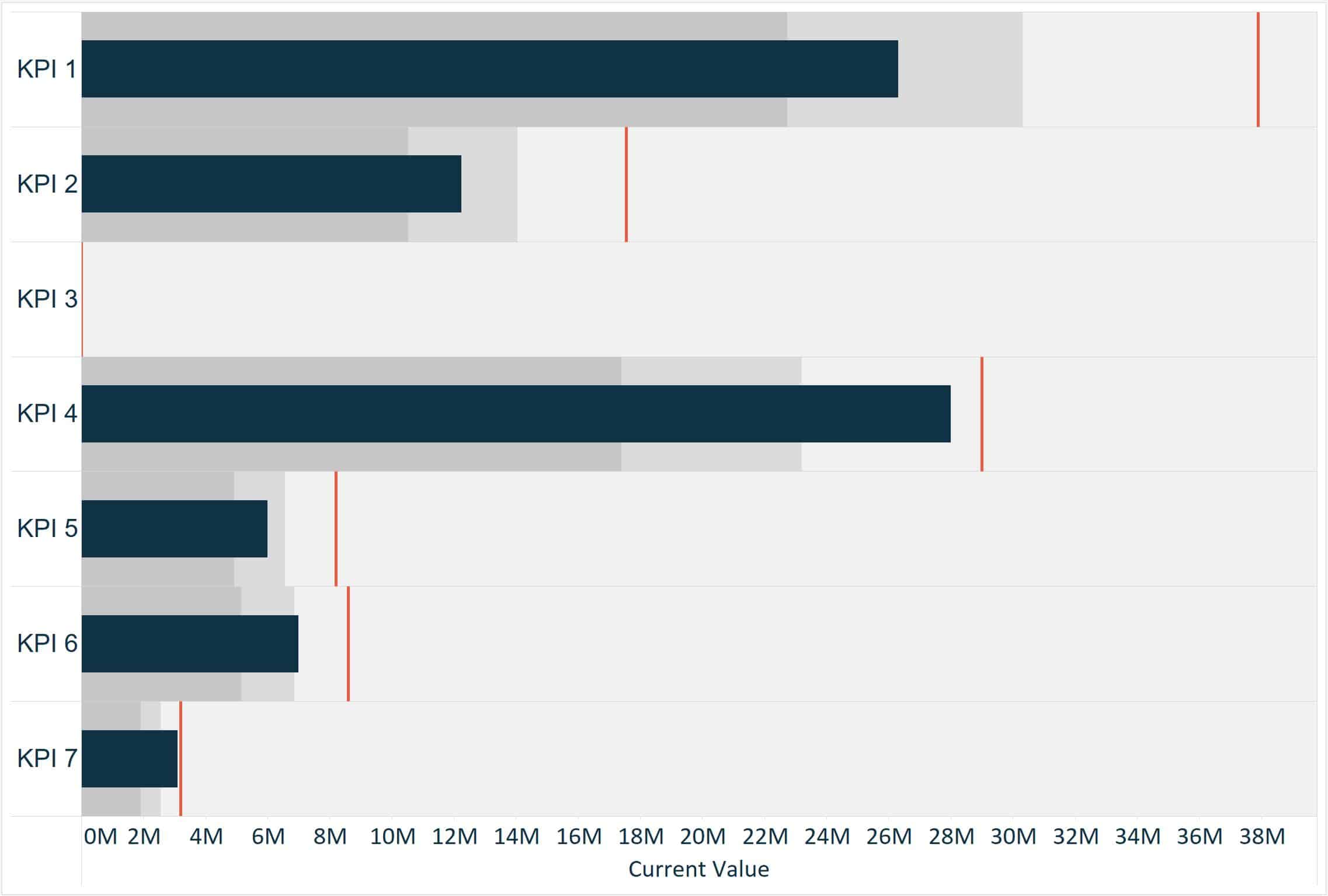
With this visualization, it is impossible to compare the progress to goal of KPI 3, which is on a much smaller scale than the other KPIs. It is also challenging to determine the progress to goal of KPI 7, because it is on the same scale as KPI 1, which has the largest goal and is extending the X-axis. While you could break this graph up into seven different parts to fix the scaling, there is a better way to normalize the data.
How to create a pace chart with a linear pace in Tableau
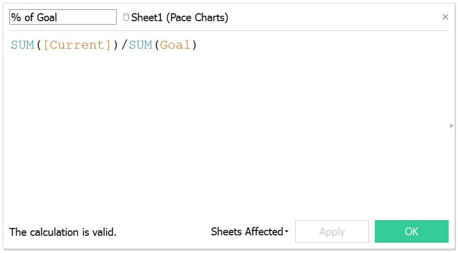
To normalize the bars in a pace chart, create a calculated field which calculates the progress to goal. This is used to represent the bars instead of the current values. The formula for this calculation is [Current Value] / [Goal]
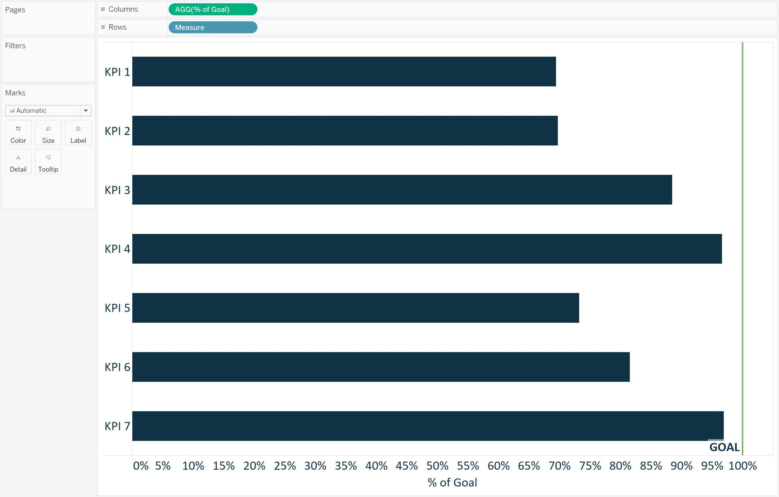
After you have created the Progress to Goal calculated field, create a horizontal bar chart showing the progress to goal for each KPI:
With a pace chart, the goal line is always normalized across every KPI at 100%. To add this reference to the visualization, simply add a reference line with a constant of 1 (which equals 100%):
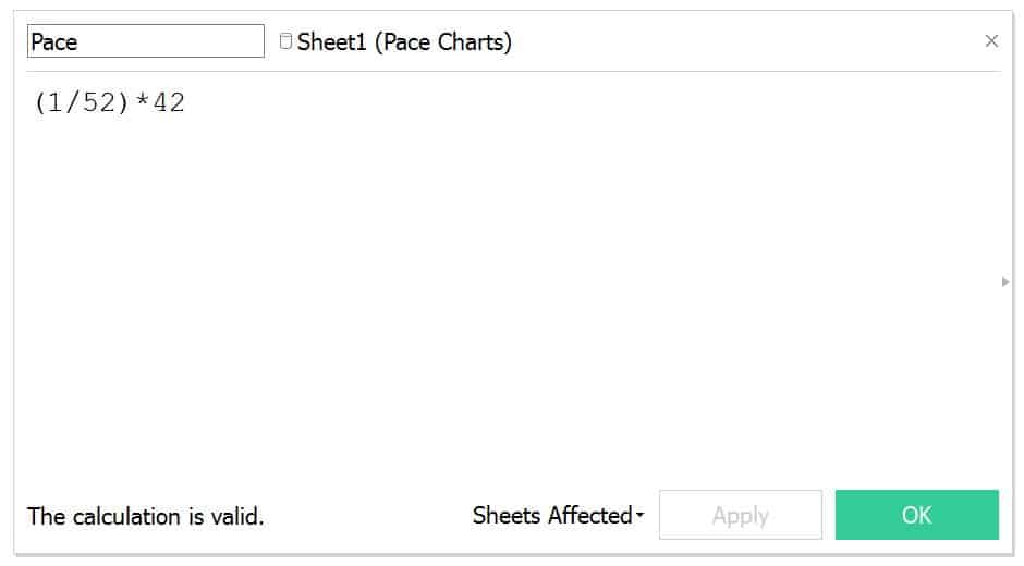
For this illustration, we will pretend that the pace to goal should be the same across all seven of our KPIs. When using a linear pace, a calculated field can be created to calculate how far to goal each KPI should be at the current point in the year. For example, if we are in week 42, the pace calculation would be:
(1/52) * 42
This calculation is dividing the year into 52 equal parts (i.e. weeks), then multiplying that fraction by the number of weeks that have passed in the year.
In Tableau, you have the option to replace the 42 with a parameter that allows the end user to change the multiplier.
Once you have the Pace calculated field, add it to the Detail Marks Card so it can be used as a reference line. Then add a reference line that shows where the pace should be at this point in the year:
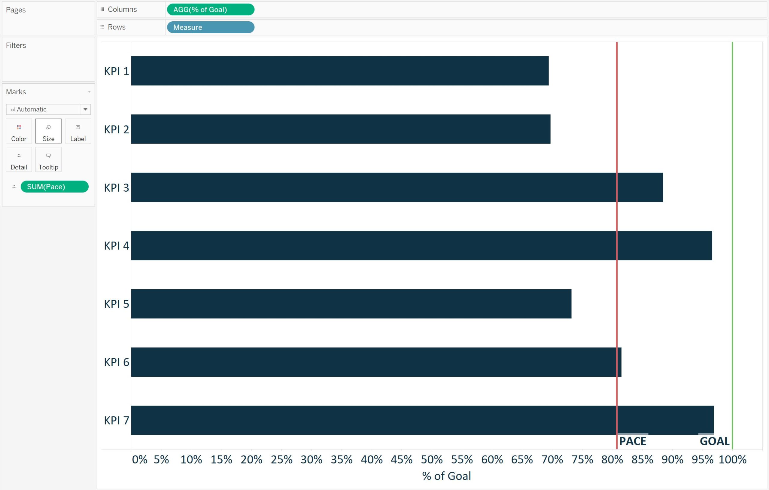
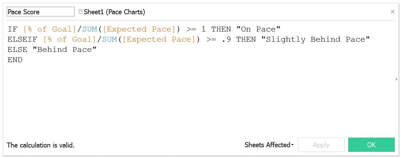
Lastly, to color the bars to illustrate whether each KPI is on pace, slightly behind pace, or behind pace, create a calculated field with the scoring logic. This will vary based on your own requirements, but as one example, I’ll pretend that 100% or above is on pace, 90 – 99.99% is slightly behind pace, and anything less than 90% is behind pace:
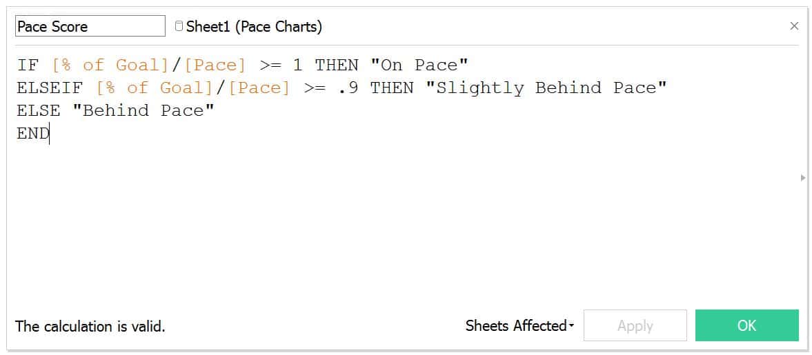
This pace score is then dragged to the Color Marks Card to color each bar by its progress to goal classification:
In this tutorial, we used a linear pace that was calculated by taking 1/52 of the year multiplied by the current week of the year. However, this pace can be replaced with a different metric such as the value for each KPI at this point last year, or a goal for each respective KPI at this point in the year.

Here is one more example using a different expected pace for each respective KPI. In this example, I have the expected pace at this point in the year as an additional field in my underlying data:
The seasonal pace chart using this data looks like this in Tableau:
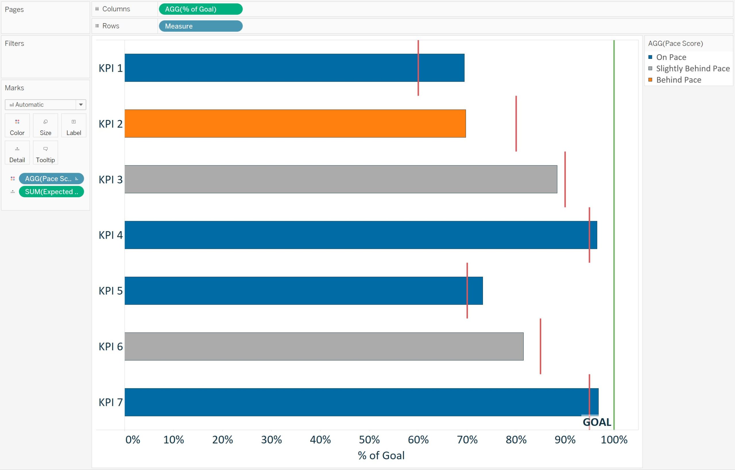
To create this version, I replaced the calculated linear pace reference line with a reference line for expected pace, which shows the expected pace for each respective KPI. I also replaced the linear pace calculation in the Pace Score calculated field with the Expected Pace measure from the underlying data:
Notice how this seasonal pace chart tells a different story regarding the progress to goal for each KPI than the pace chart with the linear pace. But in both cases, pace charts were used to normalize progress to goal calculations across KPIs to get a more effective visualization about the business.
Thanks for reading,
– Ryan
This content is excerpted from my book Practical Tableau: 100 Tips, Tutorials, and Strategies from a Tableau Zen Master published by O’Reilly Media Inc., 2018, ISBN: 978-1491977316. Get the book at Amazon.

Written By
Ryan Sleeper
Related Content
Introducing “Gap” Charts in Tableau
In Practical Tableau, we introduced the concept of a pace chart, an alternative bullet graph that normalizes progress to goal…
3 Ways to Normalize Data in Tableau


While performing data analysis, you might find yourself needing to transform your data to further unlock some insight. One way…

Ryan Sleeper
Convert your bar charts into useful gauges Avoid the question, “So What?”, by adding valuable context to your bar charts.…