Tableau Legends Per Measure and Conditional Formatting Like Excel
Almost every Tableau user has also been, or still is, a heavy Excel user. Being that we almost all learned Excel first, it is natural to approach a tool like Tableau for the first time with some preconceived notions about how we think it should work. While there is some overlap between the reporting outputs of the two software programs, it can take some time to understand how the two programs differ as well as best fit together. While there are tremendous advantages to using both programs, I’ve seen firsthand how learned behavior for Excel can become a barrier to adoption of Tableau. One such example relates to Tableau conditional formatting, and the ability to modify individual rows or columns. This is very easy to do in Excel because you can modify every single individual cell exactly as you wish. While Tableau certainly has many encoding options available through the Marks Cards, it can seem a little “all or nothing”. For example, if you place a measure on the Color Marks Card, then all marks on the view are colored.
This post shows you how to use the new “legends per measure” feature in Tableau 10.2 (currently in beta) and a trick to conditionally format in Tableau like you can in Excel.
How to Conditionally Format Individual Rows and Columns in Tableau Like You Can in Excel
How to use legends per measure in Tableau 10.2
One of the new features being released soon with Tableau 10.2 helps solve the current limitation of “all or nothing” encoding. With legends per measure, if you build a highlight table with multiple measures, then color the marks by the Measure Values field, you can create a color legend for each measure on the view.
The first step to use legends per measure in Tableau is to set up a table that uses the Measure Names field. Next, place the Measure Values field on the Color Marks Card. In the past, this would result in one color legend for the measure values, with the same colors being applied across the entire table of different measure names. With legends per measure, simply clicking on the Measure Values field on the Color Marks Card and choosing “Use Separate Legends” will result in independent legends for each measure in the table.
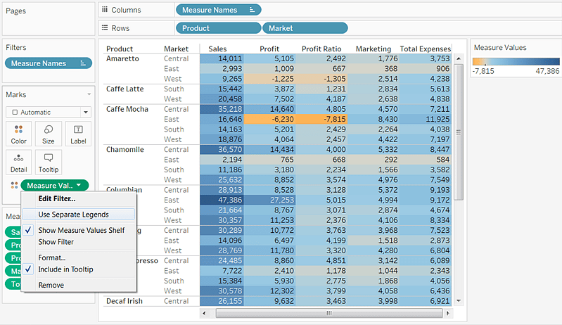
Here is how the highlight table looks with legends per measure applied:
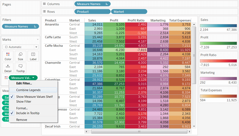
Note you can also recombine the legends by clicking on the Measure Values field on the Color Marks Card again and choosing “Combine Legends”.
![]()
How to conditionally format in Tableau like Excel
Legends per measure is a nice step towards providing flexible formatting for highlight tables, but it still doesn’t allow you to conditionally format the individual columns for measure names. For example, what if you wanted to color the cells for each measure name based on whether a condition was met for each respective measure. Fortunately, there is a trick that leverages a placeholder field to allow you this level of Excel-like conditional formatting in Tableau.
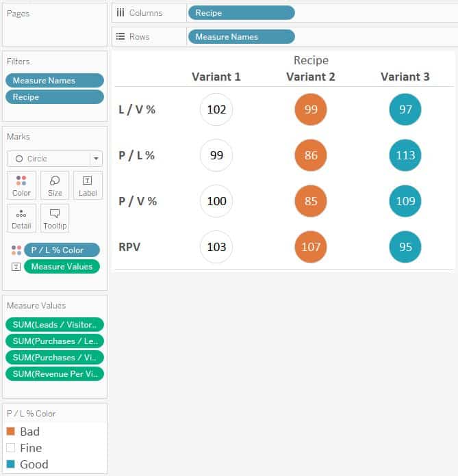
To illustrate the need for this trick and provide a tutorial on how it’s used, we will be using this Tableau dashboard that is used to evaluate results for A-B split tests on a company’s website:
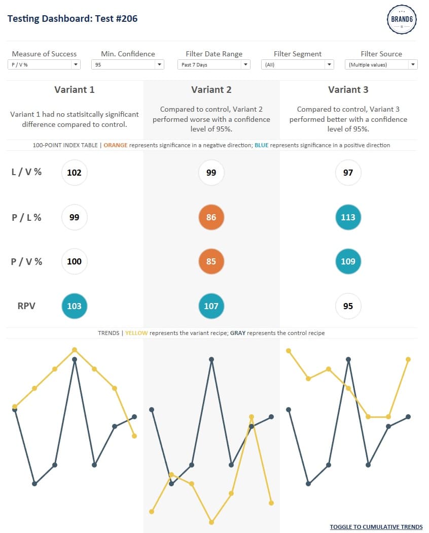
We will be focusing on the 100-point index table in the middle. The table has a column for each variant recipe in a split test and rows for common web KPIs such as Leads / Visits Rate, Purchases / Leads Rate, Purchases / Visits Rate, and Revenue Per Visit. The label on each circle is a 100-point index score with a score of 100 indicating the variant performed the same as the control recipe; scores above 100 indicate higher performance; scores below 100 indicate lower performance.
The special aspect of this table is that the circles are colored by whether or not the variant recipes performed differently than the control recipe with statistical significance. There is a parameter at the top that allows the end user to choose their minimum confidence level, then statistical significance is calculated for each recipe and each KPI.
Normally to create a table with different measures, you would use the generated fields for Measure Names and Measure Values. Here’s how this table might normally be constructed (control recipe is filtered out for consistency):
So far so good, but the issue comes when I go to conditionally color the circles for statistical significance. With this default set-up, I can only color the circles by one field at a time. Further, every row will be colored by that same field. So which one do I pick? Here’s what the table looks like if I color the table by statistical significance for P / L %:
The color is correct for the P / L % row, but because the Color Marks Card is coloring every mark on the view by the same thing, all four KPI rows receive the same color treatment. What I really want is to conditionally format each KPI row independently of each other so that the color indicators are applied only to their respective KPI.
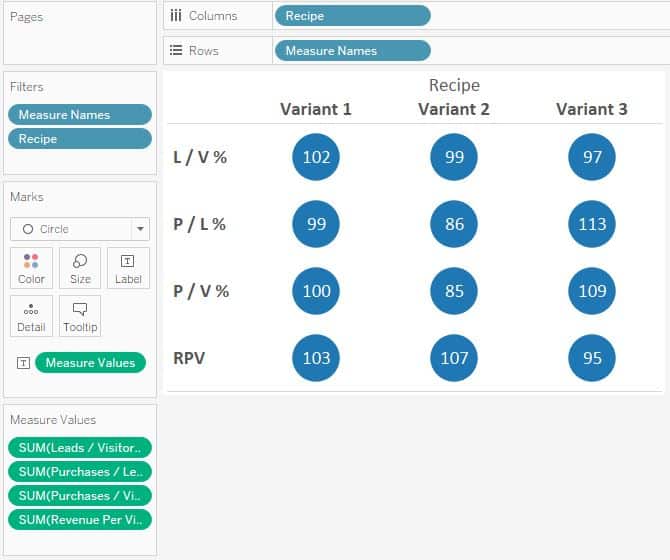
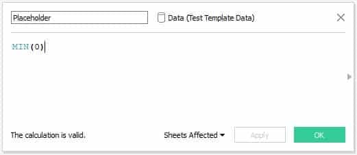
The Solution: A calculated “placeholder” field
The trick for conditionally formatting the rows independently of each other is to create separate Marks Shelves for each row. This is achieved through a simple calculated field that looks like this:
MIN(0)
Now if the table is built with a Placeholder for each of the four rows instead of the Measure Names field, the rows can be modified independently of each other. Here’s how my final table looks under the hood:
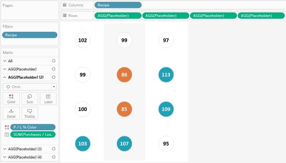
Notice that there are now four different sets of Marks Cards, one for each Placeholder field, or in this case, each KPI. Since there are independent Marks Cards, you can independently modify each row. This way, the P / L % row can be colored by the statistical significance for P / L %, while the row for L / V % can be colored by the statistical significance for L / V %, and so on!
Note that this example modified rows, but the same exact approach can be used for columns.
The one big drawback from this approach is that you lose the row headers, but it is fairly easy to add text boxes for each row on the dashboard as pictured above.

This is just one example of conditional formatting in Tableau like you can in Excel, but you can format the rows with any of the options available to you on the Marks Cards. For example, one row could be just text, while the other rows could be circles. Some rows can have different shapes. You could have different sized marks to highlight a key finding. The list goes on and on…
Thanks for reading,
– Ryan
This content is excerpted from my book Practical Tableau: 100 Tips, Tutorials, and Strategies from a Tableau Zen Master published by O’Reilly Media Inc., 2018, ISBN: 978-1491977316. Get the book at Amazon.


Written By
Ryan Sleeper
Related Content

Ryan Sleeper
Help your audience evolve from spreadsheets to data visualizations How to convert a text table to a highlight table, leverage…
3 More Ways to Overcome the Excel Barrier to Tableau Adoption
Yikes – I’m getting old in Tableau years. This week I clicked on a Tableau Public post I thought sounded…
Ryan Sleeper
Improve on the ‘gateway’ chart to data visualization Highlight tables help smooth the Excel transition by introducing the preattentive attribute…