Advanced Analytics in Tableau Series: One-Way ANOVA Tests

You may be wondering why we would want to perform an ANOVA test in Tableau, as you can do it in excel or use a calculator found online. Tableau provides the flexibility to easily update your data without needing to rerun everything while also giving you the option to explore other important statistical values in one view. It gives an overall fuller picture that will appeal to a wide range of stakeholders with just a little bit of extra effort up front.
An ANOVA, or Analysis of Variance, is a common statistical test that tests if the results of some sort of experiment are significantly different. An ANOVA looks at the variance means for some dependent variable within and between different levels of the independent variable(s). There are both one-way and two-way ANOVAs. A one-way Anova looks at one dependent and independent variable while a two-way looks at one dependent and two independent variables.
In this example, we are going to be working with a one-way ANOVA to determine if there is a statistically significant difference in the lengths of bean sprouts based on the amount of time they were submerged in water. The length of the bean sprout is our dependent variable and time is our independent variable.
This is the fifth post in a series on statistical analysis in Tableau. For other applications, see How to Analyze A/B Tests in Tableau Using Z-Tests.
Preparing the data
There are two data sets that I am working with. One is the experiment data with different observations of bean lengths based on different time groups. The other is a F-distribution table that I manipulated into a linear format.
![]()
The F-distribution table is universal for all experiments. I am going to walk through the steps to replicate it yourself, but you can also load your data in the following forward and use my dashboard as a template

After we load both data sets in, I want to right-click on time and convert it into a dimension as opposed to a measure. This may not be applicable to all experiments, but in this specific one we want to look at time as a categorical variable even though it is numeric.
ANOVA calculations
Sum of Squares
To begin the ANOVA test, the first step is to calculate the total sum of squares (SS total). The total sum of squares is denoted as

It is the sum total of the squared difference between each observation and the grand mean. In order to calculate the SS total, we will first need to calculate the grand mean. To make the value the same regardless of the level of detail in the view, wrap the average length in a fixed LOD function.

Now to calculate the SS total in Tableau, we are going to use the following formula:

Next calculate the sum of squares of the group means from the grand means (SS between):

This is calculating the sum of squares for the difference between each mean length of each time group and the grand mean. First step is to calculate the mean and number of observations for each time group. Create two calculated fields for the average length and the number of observations fixed on time:


With the group means, create a calculated field similar to the SS total, replacing the “Length” with the field “Group Mean” and multiplying it by the number of observations.

The last sum of squares we need to calculate is the sum of squares within each group (SS within). That is the sum of squared differences between each observation within a group and the group mean for that same group. That formula is denoted as:

While you may do that calculation in tableau, the easier way to do it would just be to subtract SS between from SS total as SS total = SS between+SS within.
Degrees of Freedom
Now it is time to calculate the degrees of freedom for both between and within groups.
To calculate between groups, it is the total number of groups minus 1. For within groups, it is the total number of observations minus the total number of groups. Those formulas in tableau are as follows
DF between:

DF within:

To get the total degrees of freedom, subtract 1 from the total number of observations or just add DF between and DF within or add DF between and DF within:

Mean Squared
With the sum of squares and degrees of freedom, we can now calculate the Mean Square(MS) for between and within groups. There formulas are denoted as:

In Tableau, calculate the MS between groups:

Calculate the MS within groups:

F-Ratio
Now calculate the F-ratio which is the MS between groups divided by the MS within groups.

That is the end of the calculations. Now it is time to reference the F-table to find our F critical value. This is what we use to compare to our F-ratio to determine if the experiment results were statistically significant.
Determine the significance
There are three components we need: DF between, DF within, and the alpha. The alpha value is chosen by the researcher and it represents the probability of type 1 error (rejecting the null hypothesis when it is true).
There are plenty of online resources for tables to find the F critical value or even calculators that generate it. I went ahead and unpivoted a table using Tableau prep and loaded it into the tool. The F critical values change for every alpha value, so I chose the values of 5%, 10% and 15% to load into this tableau workbook to give the user options.
To determine if we are going to accept or reject the null hypothesis, create a calculated field where the logic is: if the F-ratio is greater than the F critical value, the null hypothesis is rejected. If the F-ratio is less than the F critical value, the null hypothesis is accepted.

To get this logic to produce one answer that we can add to the dashboard, create a new sheet. The primary data source on this sheet will be the F distribution table that I had created. Drag the fields Alpha, Numerator, and Denominator to the rows shelf. Right click on each and convert them to dimensions. Now drag your Stat Sig field to text. As you can see, that generated a result for each combination of Alpha, Numerator and Denominator. To fix that, I am going to create three calculations that will filter the view only to the correct result.
First is the alpha filter. This will filter the view to the alpha selected. Create a parameter with the data type float that uses a list of values. Input the three different alpha values that I had hard coded into the data. I named mine significance level.

Now create the alpha filter which produces a Boolean based on whether or not the significance level is equal to the alpha value.

Drag that calculation into the filters shelf and select True.
Next create the numerator filter. It is another Boolean now based on whether or not the numerator from the F-table equals the DF between. I am wrapping the numerator in a sum function so that we are comparing aggregate functions.

Drag it to the filters shelf and select True.

Lastly, create the denominator. It is a Boolean based on whether or not the denominator from the F-table equals the DF within. Wrap the denominator in a sum function to compare aggregates.

Drag it to the filter shelf and select True.
Now right click on Alpha, Numerator and Denominator in the rows shelf and uncheck Show Header. Format the text as you would like. Now you have a simple statement. In our case, the F ratio is greater than F critical value so the null hypothesis is rejected

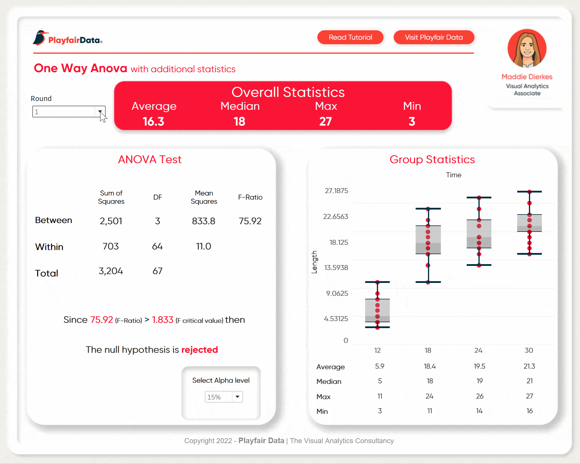
Assemble the Dashboard
Next up, assemble the dashboard. I am going to add some additional metrics and a box plot to round out the analysis. For the ANOVA metrics, I am going to format the same as you would see in most softwares ANOVA outputs.

Make sure to add the final result statement as well as the parameter to change alpha values to the view.

Here is my final dashboard. If you take your experiment and put the data into the same format, you can load it into this templated dashboard to analyze your own results. Some minor formatting might be necessary (maybe removing my animation in the top right corner) but other than that it is flexible enough for a wide range of experiments.
Stay after it,
Maddie

Written By
Maddie Dierkes
Related Content
Statistical Tableau: Using MAD to Detect Outliers in Non-Normalized Data

I recently wrote a tutorial on 3 ways to visualize outliers in Tableau. This tutorial assumes a normal distribution of…
Statistical Tableau: How to Analyze Distribution with Histograms
There are many times when performing data analysis when we may want to view the distribution of our data. One…

Ryan Sleeper
Separate overlapping marks to reveal more underlying data Learn how to improve charts like box-and-whisker plots that have lots of…