How to Make a Polygon Scatter Plot in Tableau

Scatter plots are a great way to explore correlations and visually identify outliers in your data. But what if your end user is tired of the traditional scatter plot? It’s time to upgrade your scatter plot to a Polygon Scatter Plot. A Polygon Scatter Plot can make your chart more inviting and engaging to your end user. It expands the analytical benefits of a traditional scatter plot by emphasizing the scope of change through the varying sizes and dimensions of the polygons.
This post will show you how to build a Polygon Scatter Plot in Tableau, including how to structure your data and how to develop the chart in your workbook.
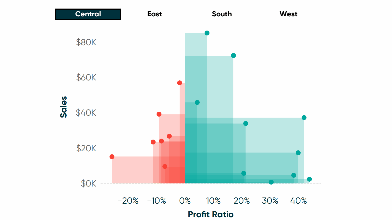
How to draw rectangular polygons on a Tableau scatter plot
By the end of this post, you will be able to recreate this Polygon Scatter Plot chart from Tableau’s Sample – Superstore. You will learn how to aggregate your data set and how to create the chart. The user will have the ability to visualize Sales vs Profit Ratio for each Sub-Category in the Sample – Superstore data set.
How to structure data for a polygon scatter plot in Tableau
To get started, you will need to structure your data in a specific way for this chart. I suggest creating a separate data set for this chart that you can then join back, or link, to your main data source.
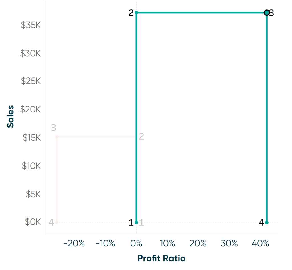
If you take a look at the completed chart above, each polygon represents one Sub-Category and the polygon is shaped to a rectangle. To get the polygon to path as a rectangle, each sub-category needs four points with an anchor to the axis (an anchor of 0). Below is an example of the four points of the sub-category “copiers” when filtered to the Central Region. Point 1 has a sales of 0 and a profit ratio of 0, point 2 has a sales of $37K and a profit ratio of 0, and so on.
Continue reading with a free account, or login.
Unlock this tutorial and hundreds of other free visual analytics resources from our expert team.
Already have an account? Sign In
By continuing, you agree to our Terms of Use and Privacy Policy.
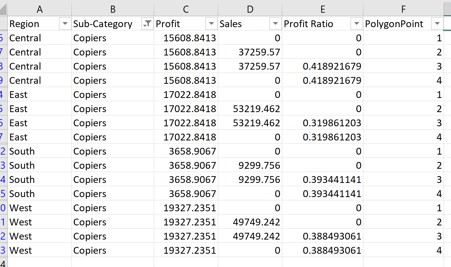
To force these anchor points to 0, you will need to duplicate your data by four at the lowest level of detail. Let’s use copiers as an example. If we were to look at the raw data feeding this view for copiers, we would see four rows for copiers for each region (I will use Region as a filter). To achieve this structure, you will need to duplicate each row of your data to add three duplicated (dummy) rows. I’ve gone ahead and calculated profit ratio sum(profit)/sum(sales) into the data as well. Once duplicated, each row needs a polygon point identifier field numbered 1 -4. You will then adjust your Sales field and Profit Margin fields to anchor your points with 0s – see example below for the anchor data layout and where to insert 0s. Make sure you do the same pattern of 0s for each Polygon point throughout the data.
An Introduction to Alteryx to Generate Rows
Develop this chart type in Tableau Desktop
Once you have your data prepped, connect it into Tableau Desktop and open up a fresh sheet. We will continue with the Tableau Sample – Superstore prepped data set.
Start by pulling in our two measures, Sales will go on Rows and Profit Ratio will go on Columns. You can keep Tableau’s defaults of SUM() and its automatic conversion to a scatter plot.
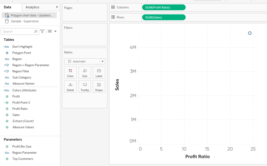
Next, take a look at the Marks Shelf. Change the mark type to Polygon via the Mark Type drop down. Add Sub-Category from your dimensions to the Detail Marks Card.
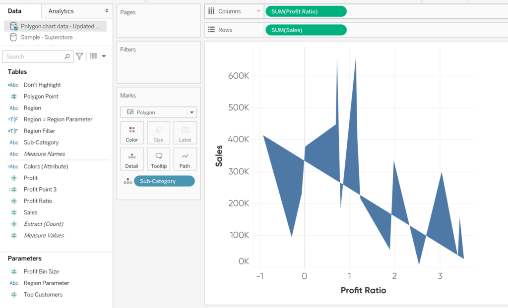
Now we can form that rectangle polygon shape. Start by changing Polygon Point from a continuous measure to a discrete dimension. To do this, from within your list of fields, hover over Polygon Point until you get the drop down arrow in the pill. Select Convert to Discrete. Hover to get the drop down again and select Convert to Dimension. Drag the discrete dimension Polygon Point pill onto the Path Marks card.
We can start to see our polygon chart taking shape. Thanks to our prepped data, it is plotting four points per sub-category and anchoring all but one point back to the axis. We will see this pop out in the next step.
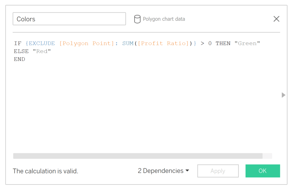
Next, we will be adding a field onto the Color Marks Card. With your own data, this may be as simple as dragging a pill over onto the Color Marks Card. However, for our example, I thought it would be interesting to call out positive vs negative profit ratio for the end user. To do this, I created a level of detail calculation where I exclude the polygon point to get a Sum of Profit Ratio. You may be asking, why not do a Max instead of Sum? – Keep in mind that we have anchor points in our data with a value of 0, so those would actually throw off your Max if your measure has negatives, which our profit ratio does.
IF {EXCLUDE [Polygon Point]: SUM([Profit Ratio])} > 0 THEN “Green” ELSE “Red” END
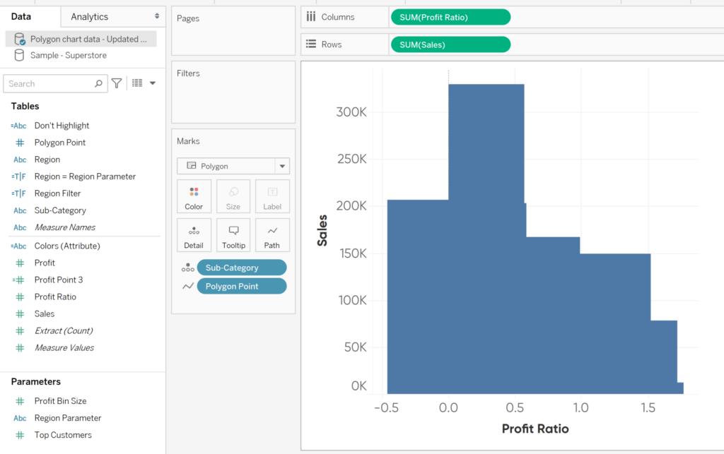
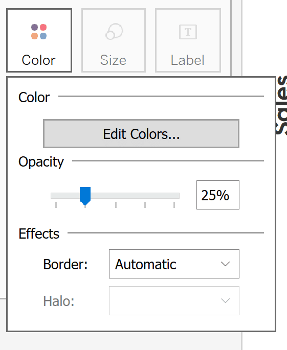
Go ahead and add your colors field onto the Color Marks Card. Change the opacity to 25% and assign your colors.
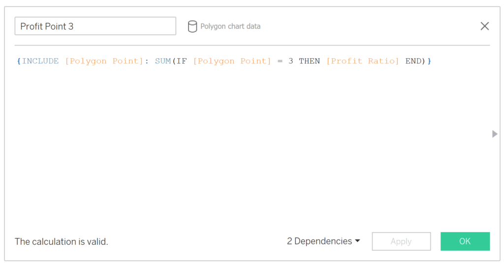
You should have a fully formed Polygon Scatter Plot chart now, but let’s take it one step further and add our scatter plot points back in. To set this up, create another level of detail calculation. We can call it Profit Point 3. If you recall from our structured data, Polygon Point = 3 is the row of data that does not have a 0 anchor point filled in. This is where we want our scatter plot point to be and we want to NULL out the other points so they will not show up.
{INCLUDE [Polygon Point]: SUM(IF [Polygon Point] = 3 THEN [Profit Ratio] END)}
Take your Profit Point 3 calculation onto your Columns and use that same pill to convert the chart to dual axis.
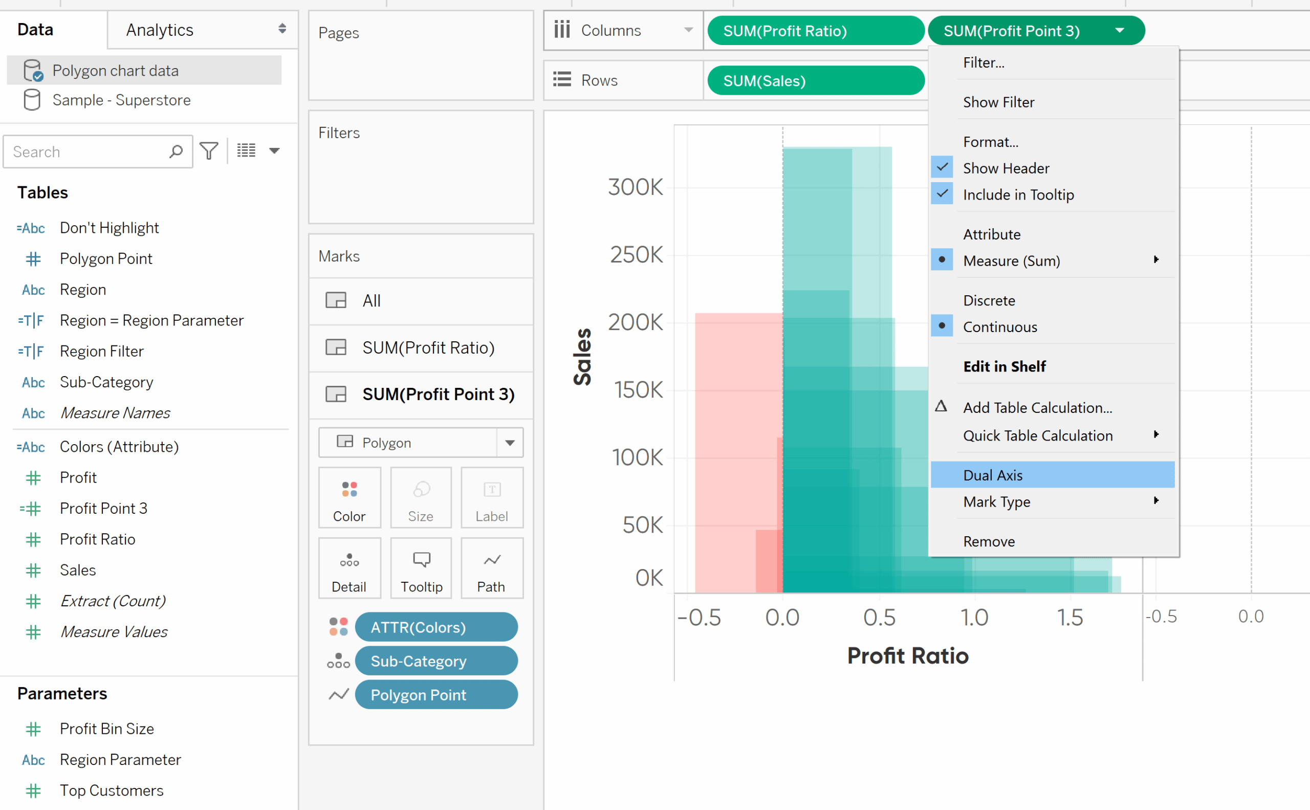
How to Make Dual-Axis Combination Charts in Tableau and Some Creative Applications
Now we can make the last few following adjustments. On your Profit Point 3 Marks Shelf, change the mark type to circle (via the drop down) and change Colors to 100% opacity. On the All Marks Shelf, remove Measure Names from the Color Marks Card. Hide the Nulls indicator on your view by right-clicking the grey Nulls indicator box in the bottom-right corner of your view.
An option to Hide Indicator should pop up when you right click; go ahead and select this. Finally, hide the Profit Point 3 header by right-clicking on the Profit Point 3 pill and de-selecting Show Header.
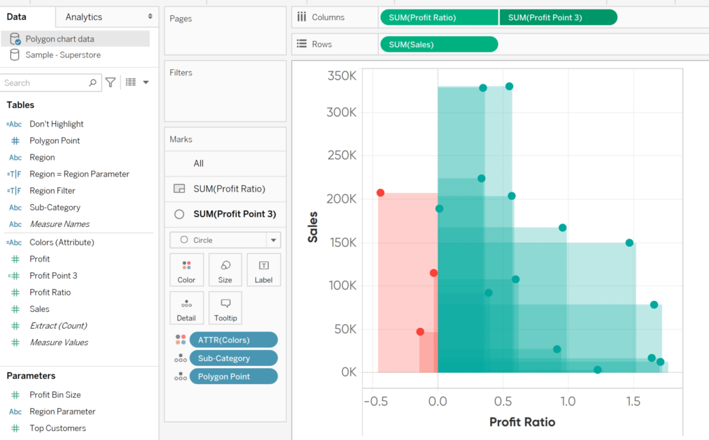
You now have a finished Polygon Scatter Plot! From here you have your additional formatting and filtering options available. For my final dashboard, I’ve decided to add Region as a filtering option for the end user and I’ve changed up some formatting as well. Check out the article below for more ways to enhance up your scatter plots.
3 Ways to Make Stunning Scatter Plots in Tableau
Keep delivering more than expected,
Ariana

Written By
Ariana Cukier
Related Content
An Introduction to Alteryx Generate Rows
The Generate Rows tool in Alteryx is a great tool to explore when you need to expand your dataset. When…
3 Ways to Make Stunning Scatter Plots in Tableau
When it comes to my favorite chart types, scatter plots are a close third behind bar charts and line graphs.…

Ryan Sleeper
‘Connect the dots’ to help your audience read scatter plots This video will show you how to make connected scatter…