3 Creative Ways to Visualize Outliers in Tableau
There are many ways to detect outliers in your data, but flagging them for your end users may present some challenges. Understanding the logic to clearly communicate it to your stakeholders, finding the right method to use, implementing it in a visual format, and the list goes on. To help you overcome these challenges, I am going to walk you through three ways to identify outliers in Tableau and how to visualize each.
By the end of this tutorial, you will be able to use standard deviations, median with quartiles, and Z-scores to flag outliers in your data and present them visually to your stakeholders.
Learn How to Do Anomaly Detection with Playfair+
FAQs answered in this post:
How do I use standard deviations to identify outliers in Tableau?
Add distribution bands from the Analytics pane, select Standard Deviation from the Value dropdown, and enter “-2,2” in the Factors box to show plus or minus two standard deviations. Roughly 95% of data falls within two standard deviations, so values beyond these bands represent outliers. Add a second distribution band with “-1,1” factors for context, then apply conditional formatting using WINDOW_AVG and WINDOW_STDEV calculations to highlight anomalies.
What is an interquartile range and how does it help detect outliers?
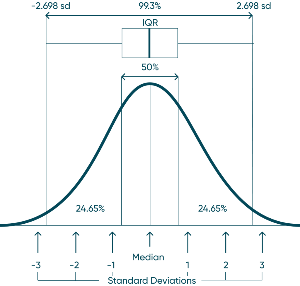
The interquartile range (IQR) represents the middle 50% of your data between the first and third quartiles. Add Median with Quartiles from the Analytics pane, then add a distribution band representing approximately 2.698 standard deviations above and below to create outlier detection bounds. Values falling outside these bounds are outliers, providing a more intuitive visual method than traditional box plots.
How do I calculate and visualize Z-scores in Tableau?
Calculate Z-scores using (SUM([Measure]) – WINDOW_AVG(SUM([Measure]))) / WINDOW_STDEV(SUM([Measure])), which returns how many standard deviations each mark is from the mean. Add the Z-score calculation to Text on the Marks card, include an average reference line for context, and add distribution bands at “-2,2” standard deviations. Z-scores above 2 or below -2 are typically considered outliers, though this threshold depends on your data and accuracy requirements.
What sample size do I need for accurate Z-score outlier detection?
A minimum of 30 marks provides a decent sample size for Z-score calculations, though this depends on your specific data characteristics. The best practice is to verify your data follows a normal distribution by creating a histogram first. If your data is skewed or doesn’t follow a normal distribution, Z-scores may produce misleading results, and alternative methods like median with quartiles might be more appropriate for detecting outliers.
Why should I avoid using default box-and-whisker plots for outlier detection?
Default box-and-whisker plots limit formatting options and can intimidate stakeholders unfamiliar with statistical visualizations. Building outlier detection manually using reference lines and distribution bands provides greater formatting control, allows customized color coding, and presents statistical information in a more accessible line chart format. This approach improves user experience while maintaining statistical rigor.
How can Playfair Data help implement advanced statistical analysis in Tableau?
Playfair Data specializes in advanced Tableau techniques including statistical modeling, outlier detection, and decision science applications using distribution bands, Z-scores, and table calculations. Our experts teach best practices for appropriate statistical methods and stakeholder-friendly visualizations. Schedule a strategy call to learn how our Statistical Tableau workshops can help your team master data distributions, advanced calculations, and analytical visualization techniques.
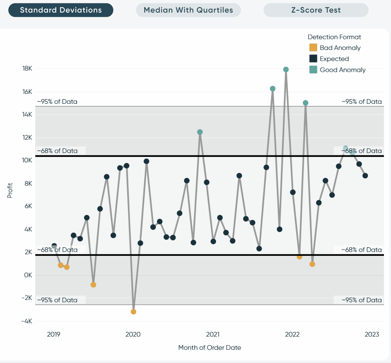
Standard deviations
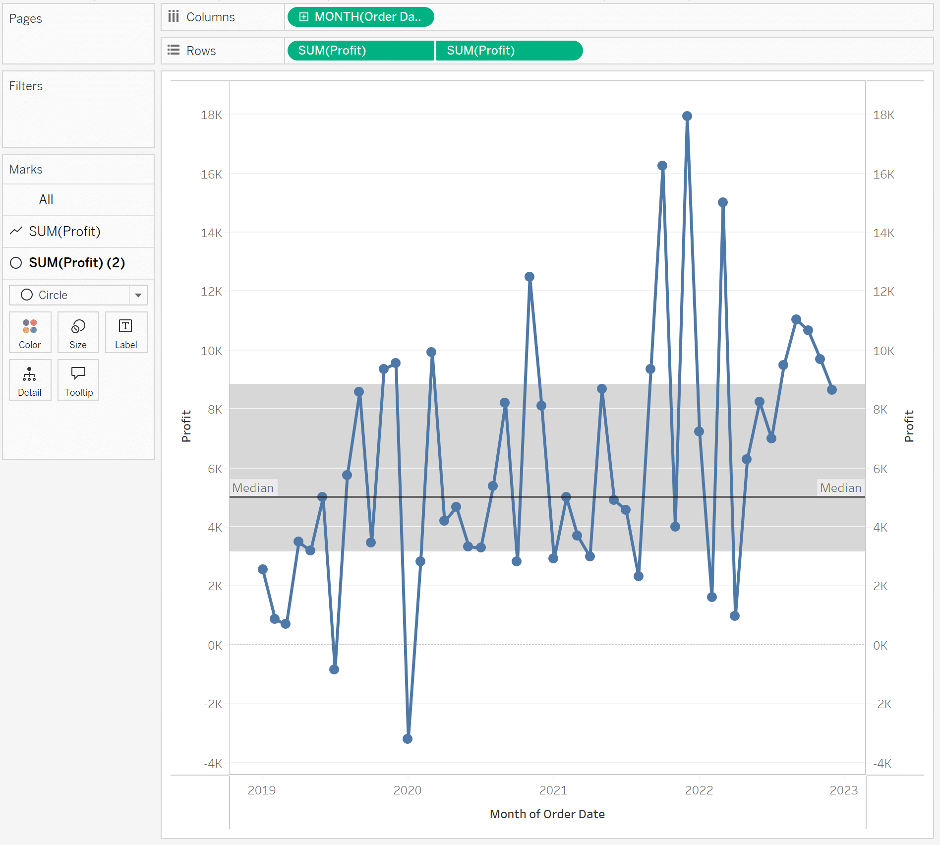
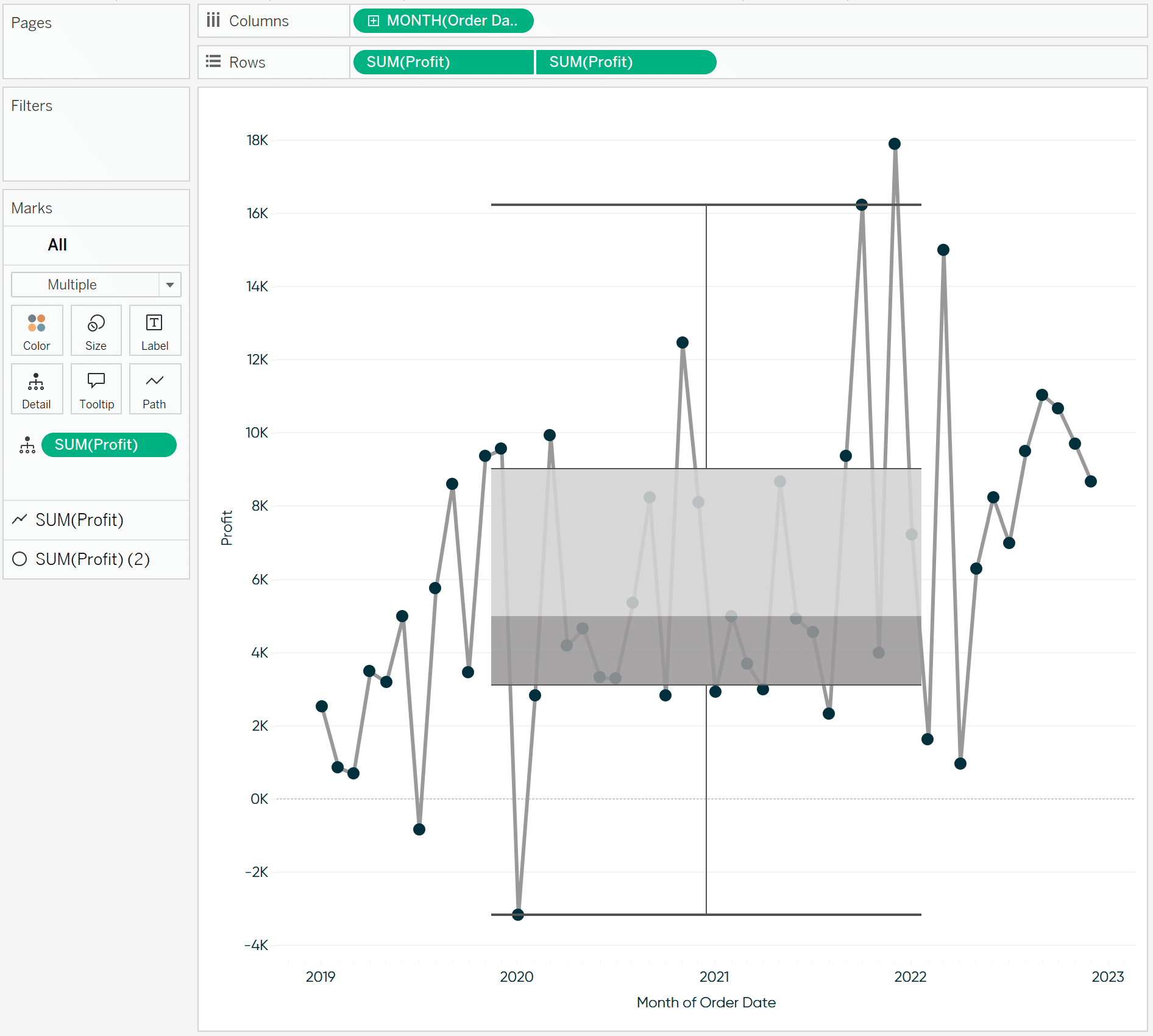
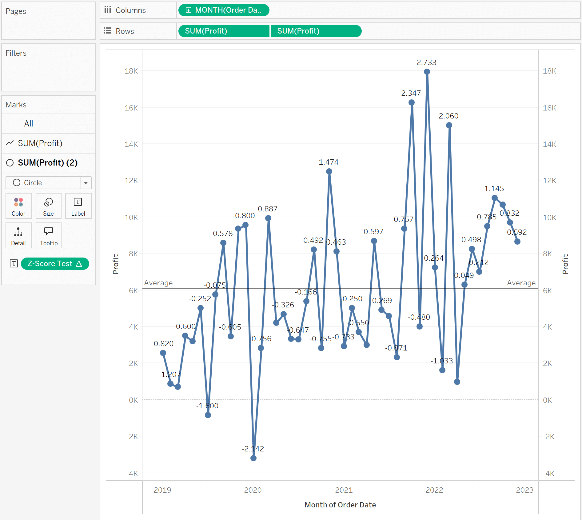
For this first method, I am going to use standard deviations to identify outliers. To kick us off, I have plotted a dual-axis line chart of the SUM of profit.
My intention here is to flag everything above 1 standard deviation from the average, which I would consider an anomaly. Then, visually show everything above 2 standard deviations as an outlier.
![]()
To begin, I will add reference lines that will show +/- 2 standard deviations.
Note: I want to start with the wider distribution band first for formatting purposes, but you could go either way here.
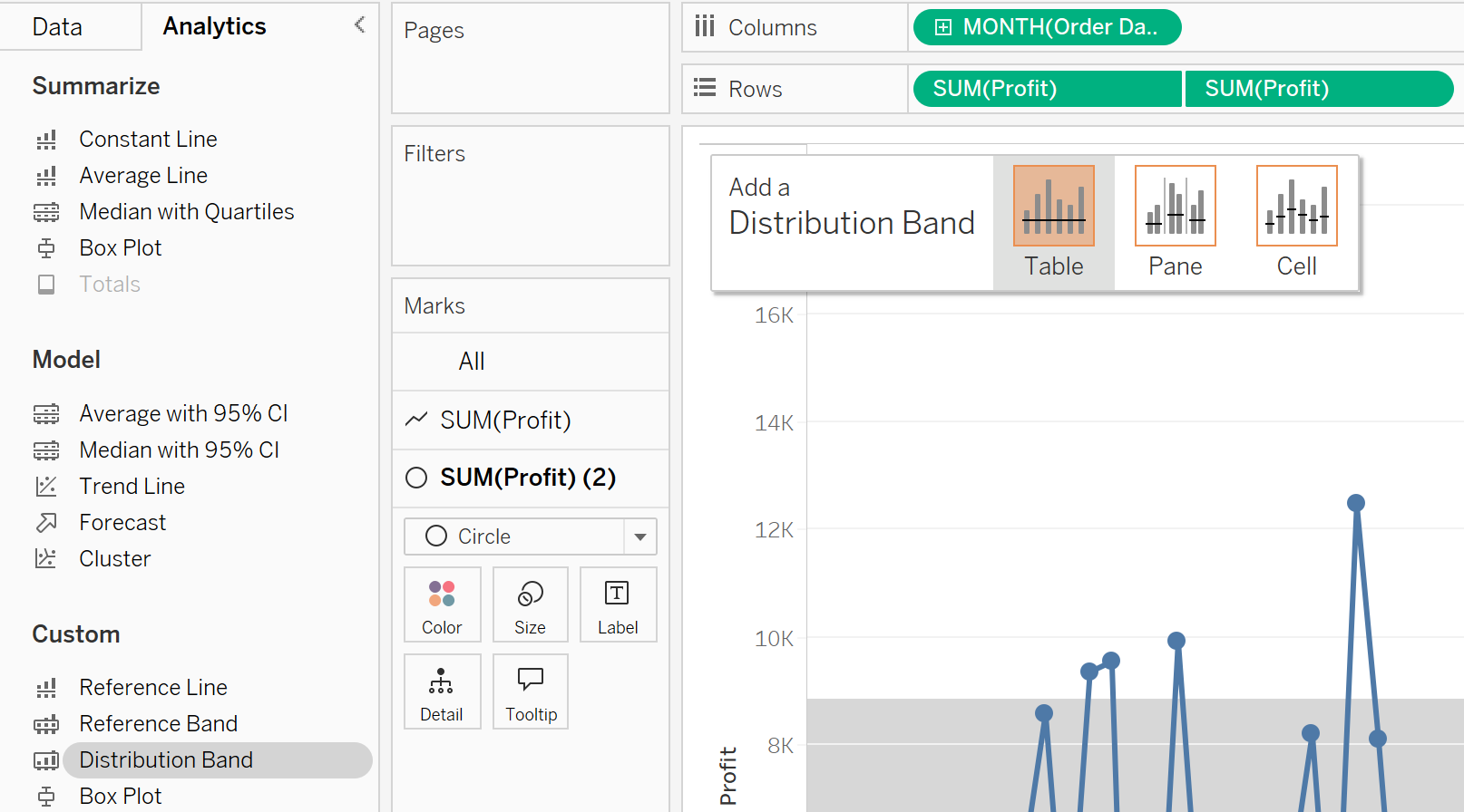
To add that set of reference lines, I will toggle to the Analytics Pane by clicking on that pane in the top left of the authoring interface.
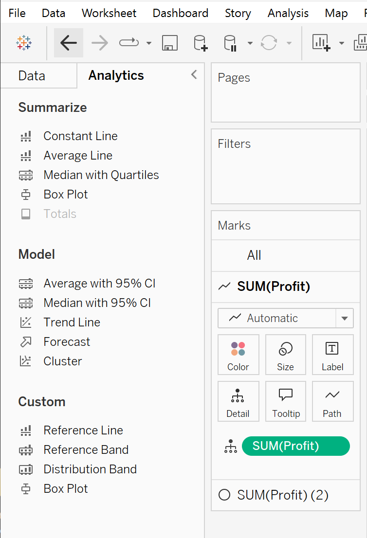
Then I will click and drag Distribution Band onto the view.
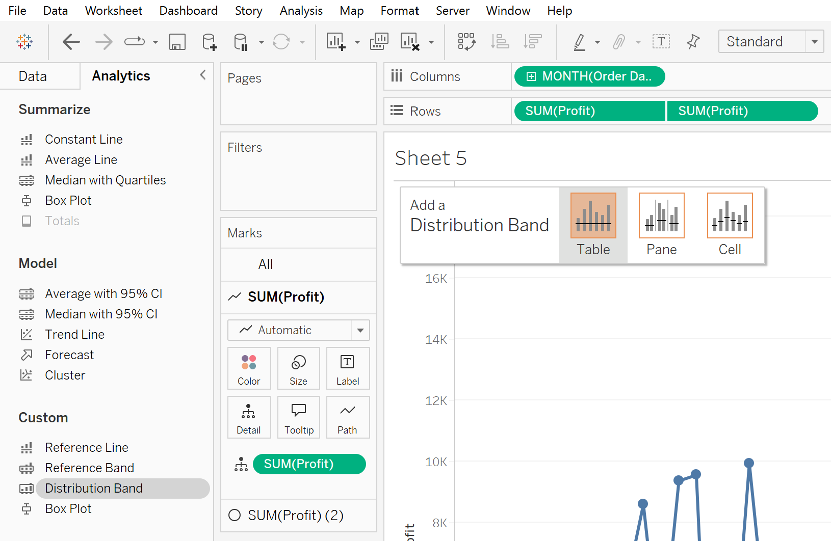
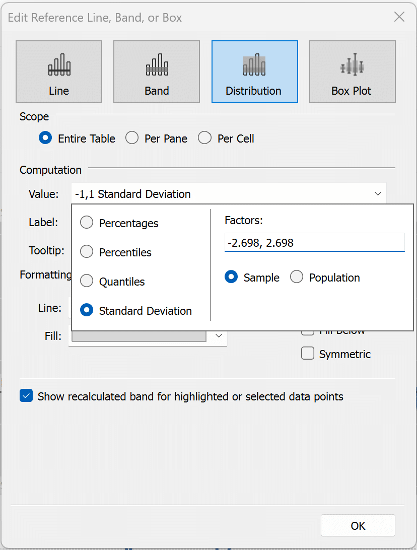
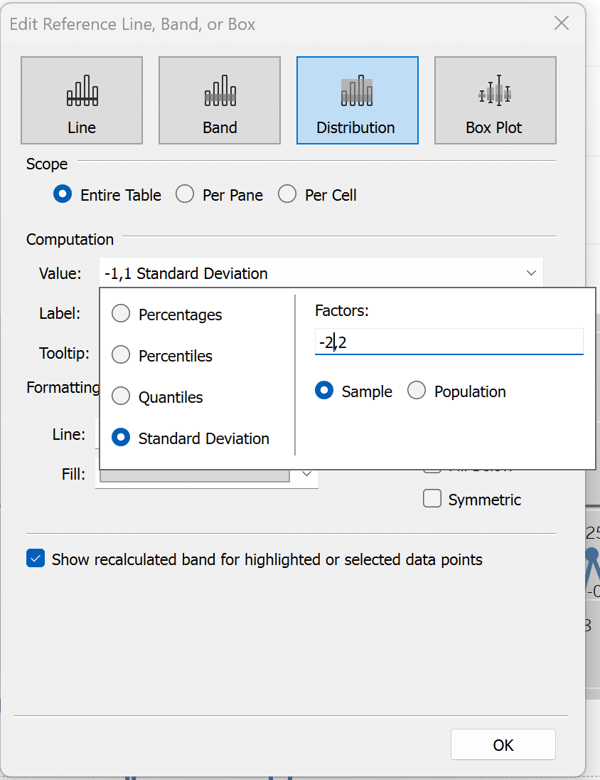
After adding the band to the view, you will be presented with the editing menu. Click the Value dropdown and select the Standard Deviation radio button. Then in the Factors box type “-2,2”. This signifies plus or minus 2 standard deviations. After that click OK to close the menu.
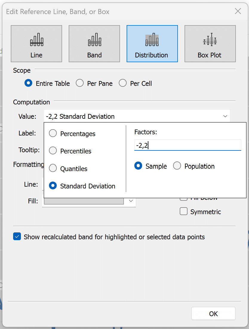
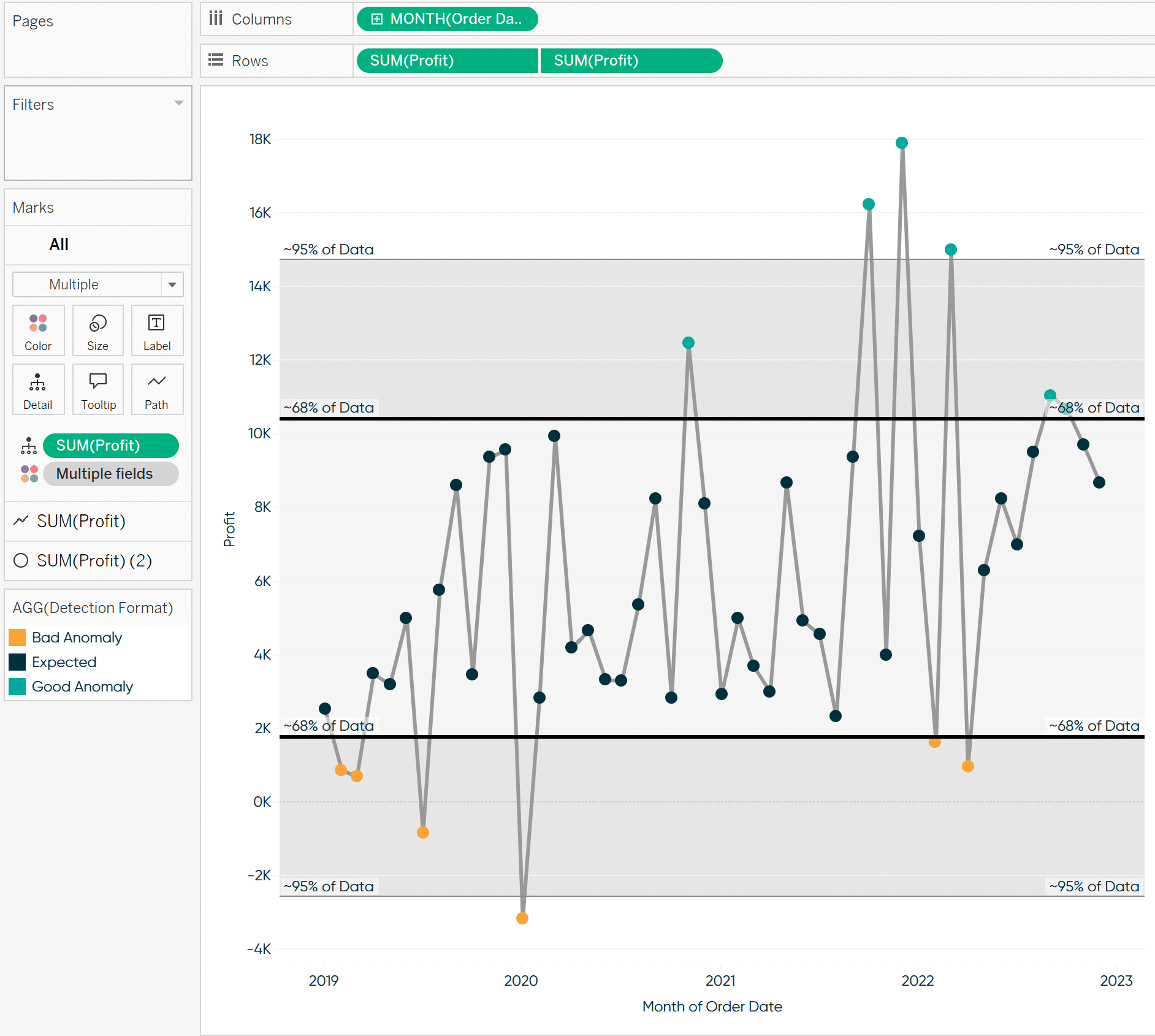
We will now see those bands appear in our view.
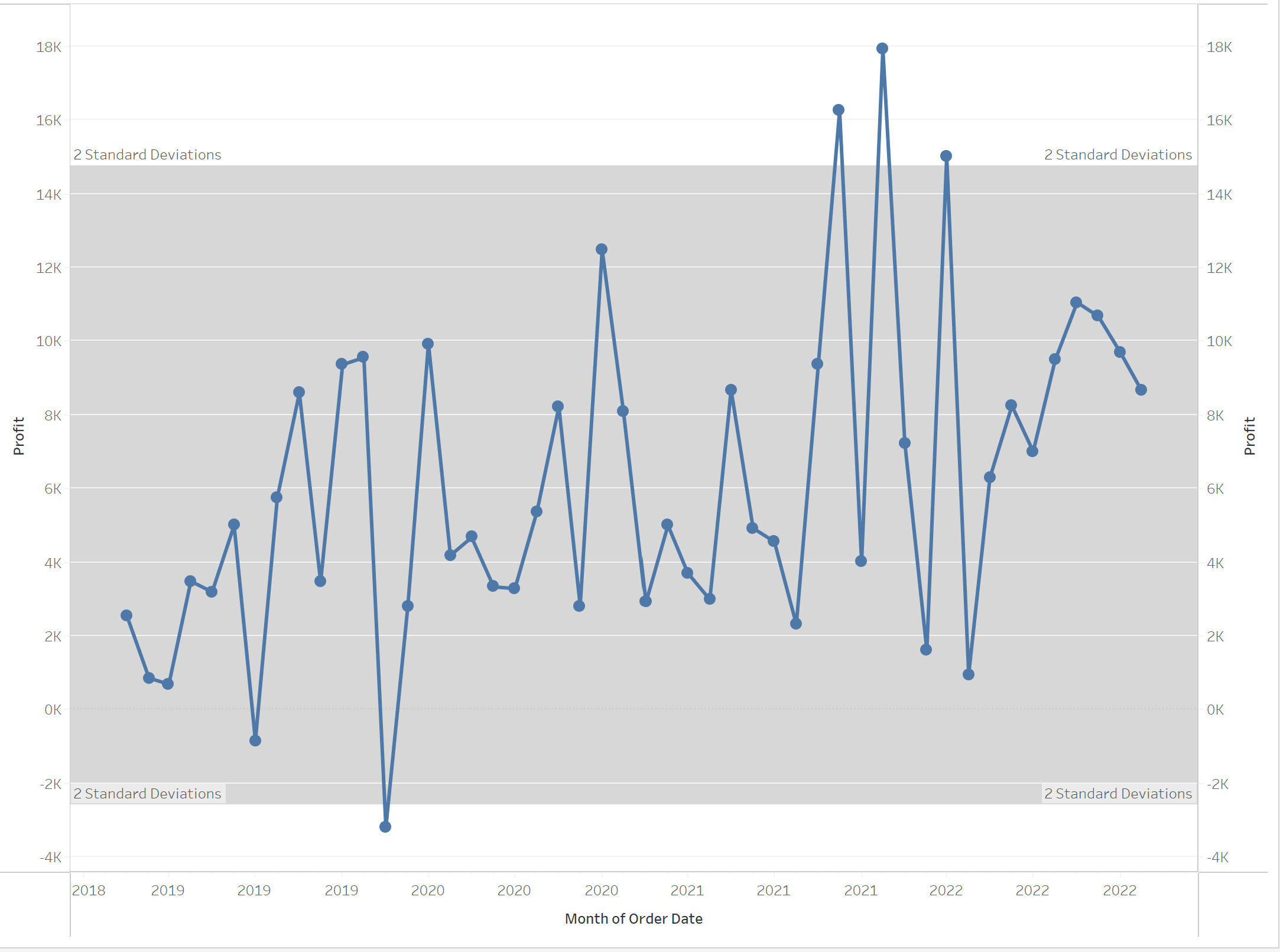
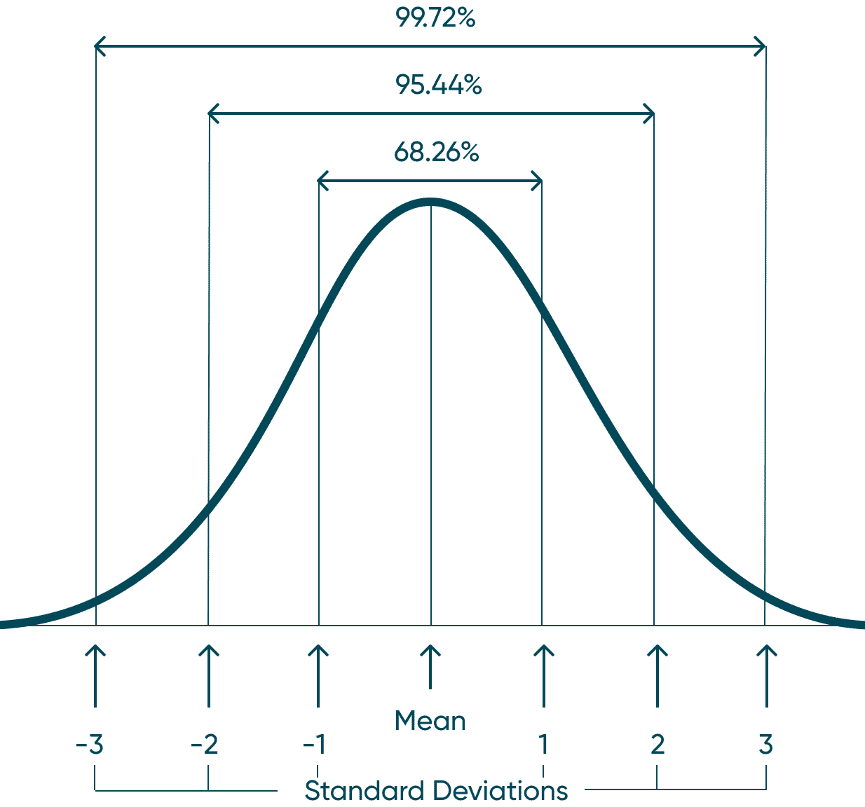
Again, anything above or below these bands I would consider an outlier in your data. Roughly 95% of your data should fall within 2 standard deviations, as seen in the helpful graphic below.
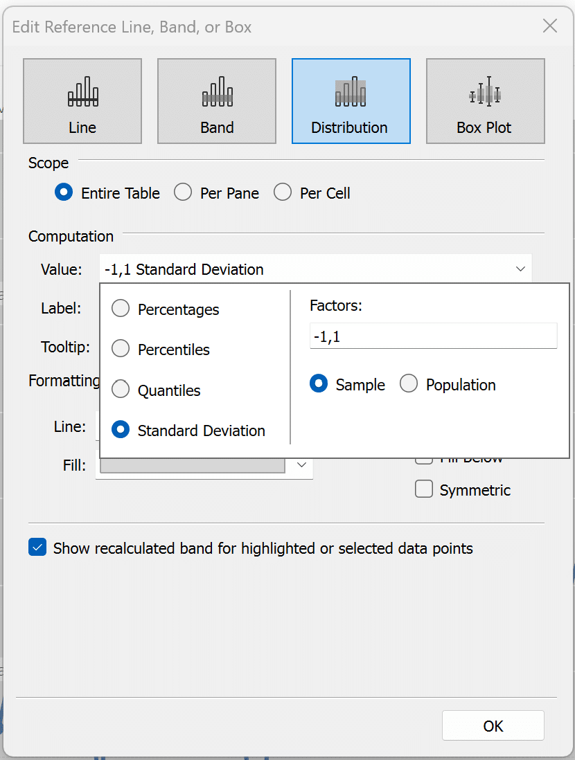
Next, I want to add another set of reference lines to signify plus or minus 1 standard deviation. This is not required, but I think it cleans up the view and gives your end users more context. I will repeat the steps I completed above, but I will leave the “-1,1” in the factors section of the menu.
Last, I am going to clean up the view a little and add conditional formatting on the marks in my view. Use this calculation below for the same formatting.
IF SUM([Profit]) < (WINDOW_AVG(SUM([Profit])) – WINDOW_STDEV(SUM([Profit]))) THEN ‘Bad Anomaly’
ELSEIF SUM([Profit]) > (WINDOW_AVG(SUM([Profit])) + WINDOW_STDEV(SUM([Profit]))) THEN ‘Good Anomaly’
ELSE ‘Expected’
END
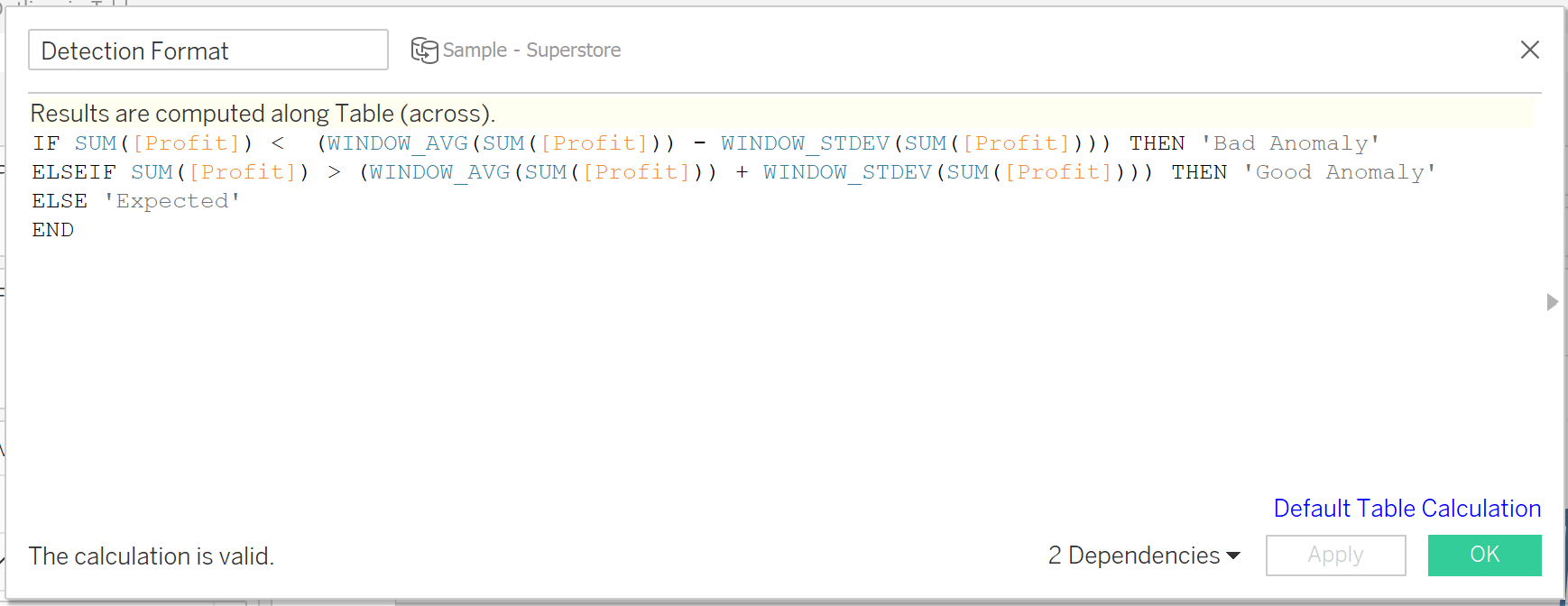
In this calculation, I am basically flagging anything +/- 1 standard deviation and marking it as an anomaly. After formatting, I landed on the following view.
Median with quartiles
For this method to visualize outliers, I am basically creating a box-and-whisker plot manually using reference lines. However, while you would get the same data points by applying a box-and-whisker plot, it limits our formatting options. It is also far less intimidating to your stakeholders to see it displayed with clear reference bands when compared to the box-and-whisker. At the end, I will display both side-by-side so you can see the difference that building it out yourself has on the overall UX.
To get a feel for the end result, I have created a graphic that you can reference to explain how we are flagging outliers. First, we are going to add a median line with quartiles. This will show us the Median as well as the upper and lower bounds. This band will represent about 50% of your observable data. This 50% band is called an interquartile range – also known as IQR – and would make up the “box” of a traditional box-and-whisker plot. Next, we will be adding a reference band of +/- 2.698 standard deviations. This is going to give us roughly the upper and lower whiskers. The one drawback of this implementation is a box-and-whisker plot will place the bounds directly on the min and max value within the whisker. Check out the side-by-side comparison to get a sense for what I am talking about.
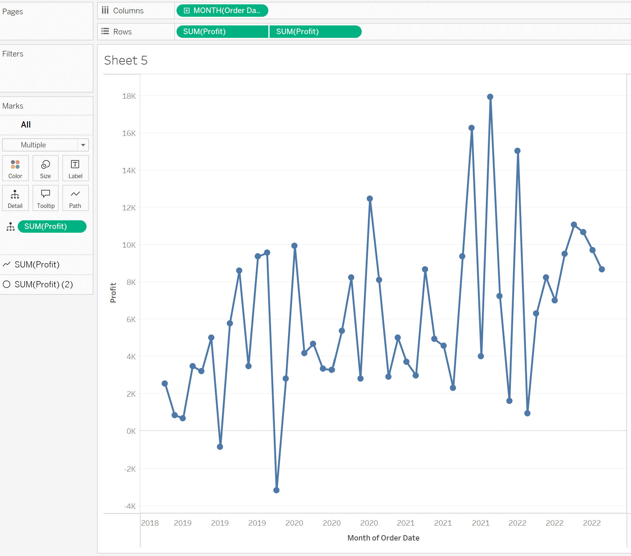
To start, I am going to use the same dual-axis line chart as before.
I’ll toggle to the Analytics pane again and drag Median with Quartiles onto the view.
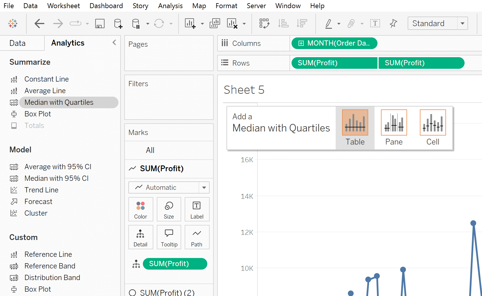
This will display our median and our interquartile range on the view.
In a traditional box-and-whisker plot, this would be the “box.” Basically, about 50% of our data would fall in this range. We are missing the “whisker” which would represent our upper and lower bounds and would show us what would be considered outliers using this method.
To add the “whisker,” I will drag Distribution Band from the Analytics pane onto my view.
In the menu that pops up, I will click on the Value dropdown, select Standard Deviation, and enter “-2.698,2.698” into the Factors text box.
Then I will click OK to close the menu and format it similarly to the last section.
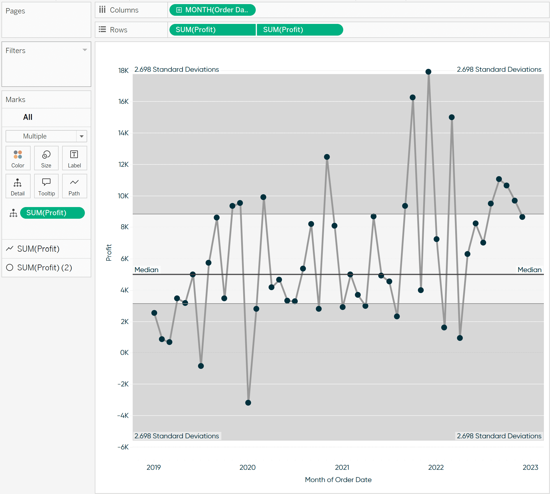
We can see only one mark on the view fell above our upper bounds. Compare that to our traditional box-and-whisker plot below.
While we do get the same data points, the view is pretty poorly laid out and could raise more questions than answers.
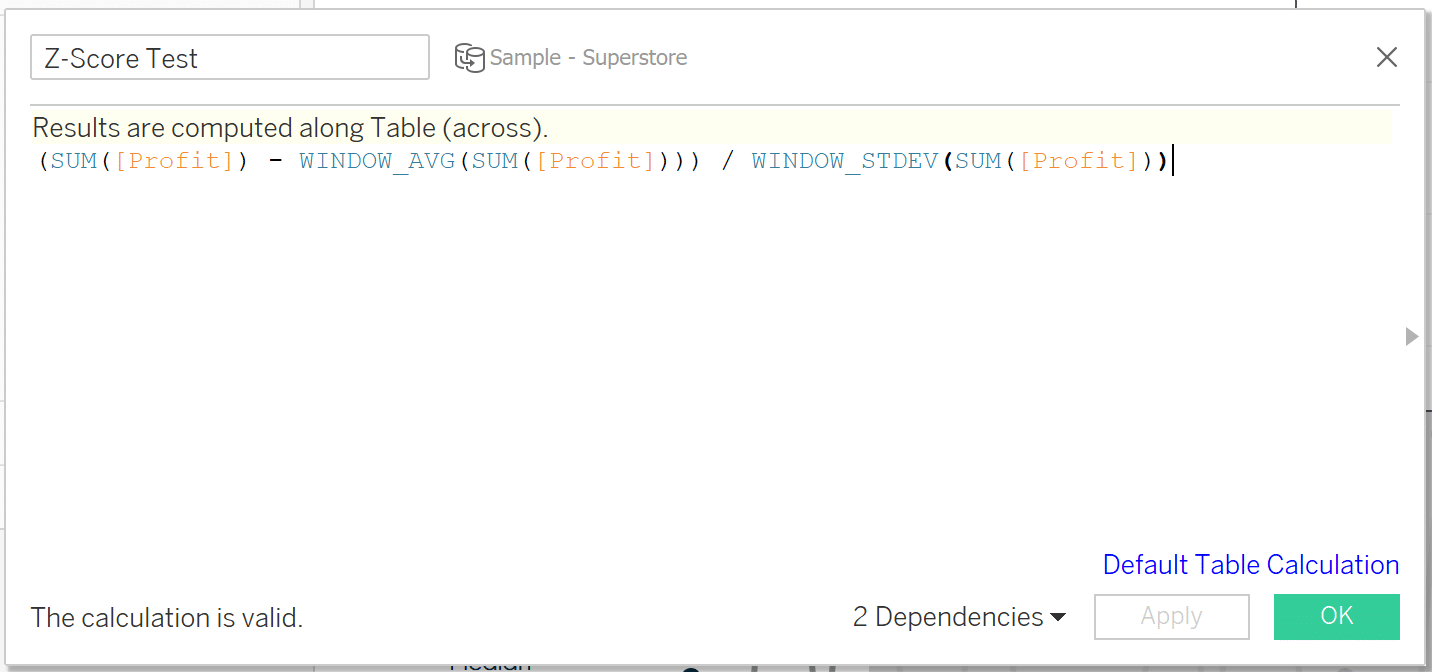
Z-score testing
For the final method to visualize outliers, I will show you how to implement Z-scores. Calculating out a Z-score is a great way to index the marks in your view and gives you a simple way to explain outliers to your stakeholders. To calculate a Z-score, take the value of the mark, subtract the average, and then divide by the standard deviation. The mathematical formula is:
z = (x – μ) / σ
standard score = observed value – mean of sample / standard deviation of the sample
This formula will return how many standard deviations above or below that mark is from the mean. For instance, if the Z-score of a mark is two that means that mark is two standard deviations from the average. If a Z-score is zero that means the mark equals the average.
Continue reading with a free account, or login.
Unlock this tutorial and hundreds of other free visual analytics resources from our expert team.
Already have an account? Sign In
By continuing, you agree to our Terms of Use and Privacy Policy.
A few final things to note about Z-scores. You need to have a decent sample size to get accurate results using this method. My rule of thumb is at least 30 marks in the view to get a decent sample size. However, this depends on your data. The best practice is to see if your data follows a normal distribution by plotting a histogram. For more on that check out the related content below.
Using Median Absolute Deviation in Tableau to Detect Outliers
Last caveat; it’s standard to consider any Z-score +/- 3 as an outlier but, as I mentioned in the other sections, this is up to interpretation and pretty arbitrary depending on how accurate you want to be. For this demonstration, I will flag anything +/- 2 as an outlier.
![]()
To calculate a Z-score in Tableau, we will use the following formula:
(SUM([Profit]) – WINDOW_AVG(SUM([Profit]))) / WINDOW_STDEV(SUM([Profit]))
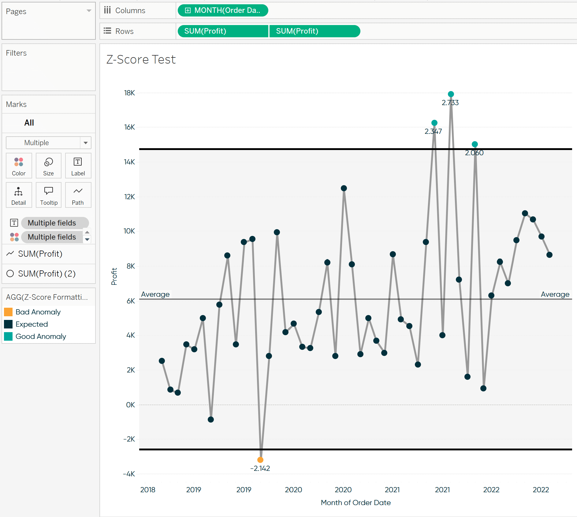
To see this method in action, I will add it to the Text property of my Marks card using the same dual-axis line chart from the other examples.
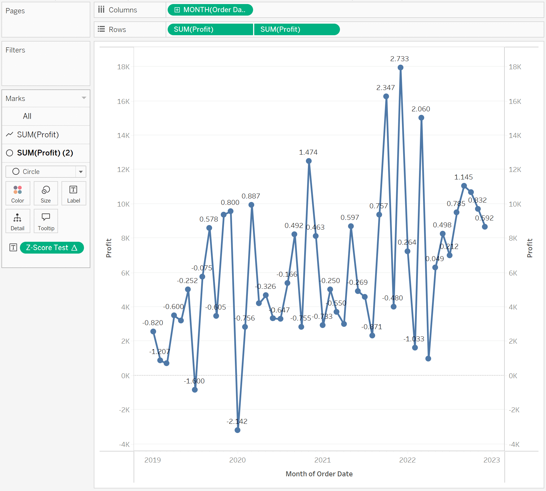
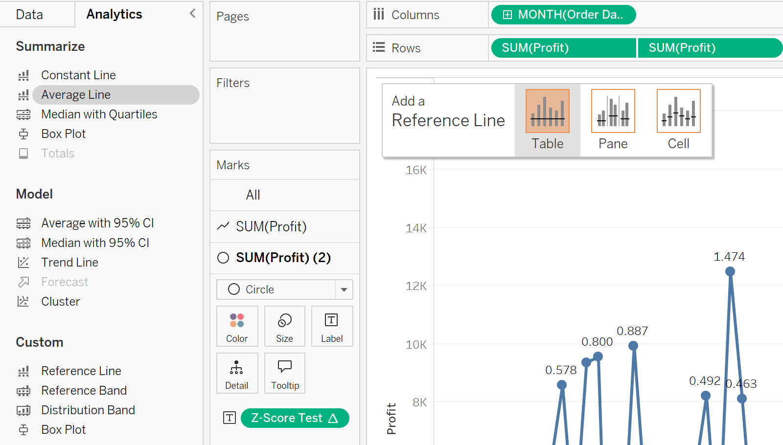
To give users context, I will add an average line by toggling to the Analytics pane and dragging Average Line to the view.
You can see that the positive and negative Z-scores oscillate around that line. This is a good pressure test for the formula.
Next, I want to add some more reference lines to indicate what is outside of the +/- 2 range. To do this, I will drag Distribution Band onto the view. In the menu, I will click the Value dropdown, select Standard Deviation, and change the Factors to “-2,2”
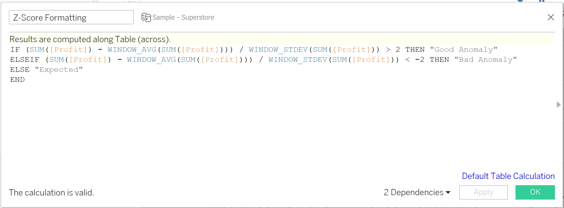
My view is starting to come together. Next, I’ll format the band fill, remove the text labels, and add some conditional formatting that will highlight my outliers. The formula for the conditional formatting is the following:
IF (SUM([Profit]) – WINDOW_AVG(SUM([Profit]))) / WINDOW_STDEV(SUM([Profit])) > 2 THEN “Good Anomaly”
ELSEIF (SUM([Profit]) – WINDOW_AVG(SUM([Profit]))) / WINDOW_STDEV(SUM([Profit])) < -2 THEN “Bad Anomaly”
ELSE “Expected”
END
Here is where I landed with my new formatting.
In closing, there are many methods out there to visualize outliers in your data. Each approach has its pros and cons, but my recommendation is to keep it as simple as possible and to visualize it.
Until Next Time,
Ethan Lang
Director, Analytics Engineering
[email protected]


Written By
Ethan Lang

Peer Review
Maddie Dierkes
Manager, Decision Science
Related Content
Understanding Advanced Tableau Calculations Like Standard Deviation, Moving Average, and More
Tableau is a useful tool for an analyst to have in their repository, with its drag and drop interface allowing…
Introducing Sankey Bump Charts in Tableau
For a while now, I have been thinking of ways to show how a single dimension member ranks over several…

Ethan Lang
Understanding a Key Distribution Visualization and Preparing Data for Modeling In this video, Ethan will show you how to create…