Introducing Sankey Bump Charts in Tableau

For a while now, I have been thinking of ways to show how a single dimension member ranks over several measures. I ran across several chart types as I was doing some research such as Sankey charts, bump charts, and alluvial plots. However, for one reason or another they didn’t quite get what I wanted. For example, Sankey charts are great at showing the flow of a single measure through multiple dimensions but not the other way around. Bump charts are great at showing how a dimension ranks over time but it does not allow each column to show a separate measure. The list goes on.
Then I found a blog post from the Flerlage Twins that gave me the foundation needed to build what I was looking for. The blog was on proportion charts which compares the percent total of a dimension member across two measures. This was it, I thought! Only one problem. I wanted to show how the dimension in question ranked moving from one measure to the next. Using the blog from the Flerlage Twins as the foundation, I started working on a chart that combined several techniques which I am calling a Sankey bump chart.
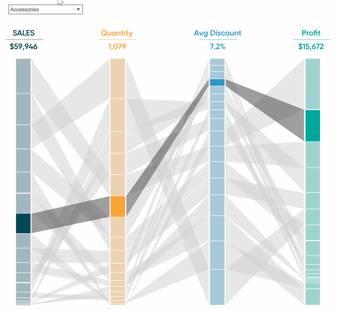
In this tutorial, I will show you how to build a Sankey bump chart in Tableau. The goal of this chart is to compare how a single dimension member ranks over several measures.
Structuring the Sankey bump chart data in Tableau Prep
To start, I will first show you how to structure the dataset needed to create this chart. To do this, I will be using Tableau Prep Builder and walking through the steps. For your convenience, we’ve also created a shared location with the downloadable workflow. While I’m using Tableau Prep, know that if you follow the same steps you can structure this dataset using any other data prep tool (i.e. Alteryx, Excel, SQL).
Continue reading with a free account, or login.
Unlock this tutorial and hundreds of other free visual analytics resources from our expert team.
Already have an account? Sign In
By continuing, you agree to our Terms of Use and Privacy Policy.
First, open Prep and connect to the Orders data file located within My Tableau Repository. The dimension I ultimately want to visualize is Sub-Category and I want to rank this dimension by Sales, Quantity, Discount, and Profit. I also want to be able to filter on different years to look for trends so I am also going to include Year of Order Date. With this schema in mind, I need to select those fields from the primary dataset. To do this, add a Clean step and hold Ctrl while clicking on those fields, then click Keep These Fields Only.

Next, I want to aggregate my measures to this new level of detail. For this, add an Aggregate step in the flow and choose to group the measures by Sub-Category and Year of Order Date. On this step, be aware of the aggregation that is being applied to your measures. For instance, everything defaults to SUMs in Tableau Prep and you’ll want to make adjustments as needed. In my case, I will change Discount to an aggregation of AVG instead of the default SUM.

In the last step, I am going to duplicate my dimension member by how ever many measures we have. In my case, I have four measures, so I need to duplicate Sub-Category three times to have four total Sub-Category dimensions. This is very redundant but the need will become clear once we begin building our chart. After that, the last thing I will do is rename some of my fields and add an Output step.
This concludes my data prep but there is one other data source I need which you can download at the shared file location. Lastly, if you are new to Tableau Prep, be sure to come back and check out this great crash course from my colleague Nick Cassara, Tableau Prep Builder Essentials.
![]()
Engineering the columns of the Sankey bump chart in Tableau
Switching to Tableau Desktop, I will first connect to my primary dataset I built in Tableau Prep. Then I will click Add at the top left of the Data Source interface and select the Model dataset you downloaded in the previous step. Next, I will drag the sheet containing that model data into the view and create a relationship by clicking the dropdown, selecting create calculation, and typing 1 into the calculation editor. You should end up with a clean relationship like this.

Bringing Tables Together: Tableau Relationships
After you connect to the data, you need to create the calculated fields needed to bring your visual to life. There are quite a few for each measure you want displayed. In my example, I have four measures in the dataset so I will need to follow these steps four times to create all the calcs I need. For simplicity, I will walk us through creating all of the global parameters and calculated fields first which you only need one of. Then I will walk through the calculated fields needed for a single section. You can then follow these same steps for each measure you have in your data.
Note: Working with Polygons can be tricky; your first instinct may be to duplicate the calculated fields for each section but the slightest deviation from these steps can result in your polygon mapping incorrectly. If you are building your visual and come across something weird or your lines going off track; delete the calculated fields and rebuild them following these steps. It will save you a lot of headaches.
Global calculated fields
Linear: – calculated field
(([T]/6) + 1) / 2

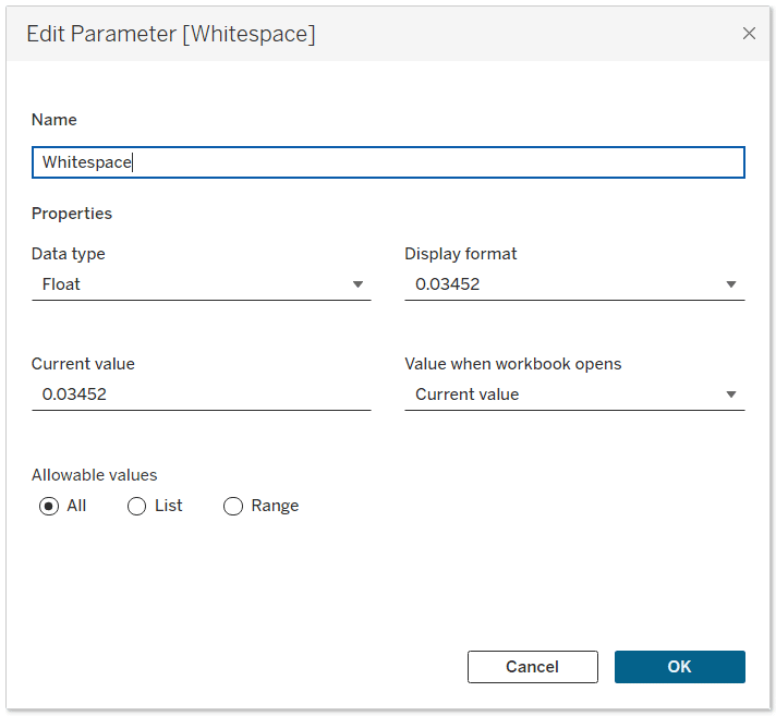
Whitespace: – Float Parameter with the following value
0.03452
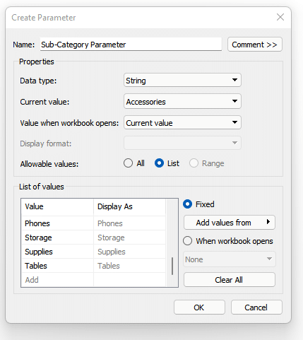
Sub-Category Parameter: – String parameter with all the Sub-Categories in the list of allowable values
Polygon Whitespace: – Calculated Field
[Whitespace]/SIZE()

[Measure 1 Highlight]
[Sub-Category 1] = [Sub-Category Parameter]

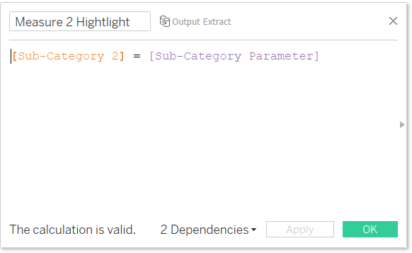
[Measure 2 Highlight]
[Sub-Category 2] = [Sub-Category Parameter]
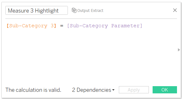
[Measure 3 Highlight]
[Sub-Category 3] = [Sub-Category Parameter]
[Measure 4 Highlight]
[Sub-Category 4] = [Sub-Category Parameter]

[Highlight Slopes]
[Sub-Category 1] = [Sub-Category Parameter]

Steps to create calculated fields for column sections
Now let’s go through the steps needed to create the calculated fields for a single column. As I said in the prior section, I would follow these steps exactly even when creating your fields for another section. It is tedious but will save you some headache down the road.
The first step is to create a calculated field Called Measure 1 Flow Size. Once you enter the calculated field into the editor you will then need to click on Default Table Calculation at the bottom right of the editor and select Sub-Category 1 from the dimension dropdown.
(SUM([Measure 1 Sales])*(1-SIZE()*[Polygon Whitespace]))/TOTAL(SUM([Measure 1 Sales]))

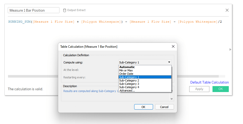
Next is a calculated field called Measure 1 Bar Position. You will need to select Sub-Category 1 as the default table calculation as well.
RUNNING_SUM([Measure 1 Flow Size] + [Polygon Whitespace]) – [Measure 1 Flow Size] – [Polygon Whitespace]/2
Next is a measure called Measure 1 Index. Same as before you will need to select the Sub-Category 1 as the default table calculation.
INDEX()

The next calculation is called Measure 1 Position. Again, you will need to set the default table calculation to Sub-Category 1.
RUNNING_SUM([Measure 1 Flow Size]) – [Measure 1 Flow Size] + [Measure 1 Index] * [Polygon Whitespace] – [Polygon Whitespace]/2

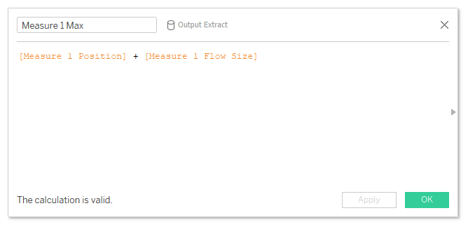
Two more to go, the next is called Measure 1 Max. You will not need to set a default table calculation this time.
[Measure 1 Position] + [Measure 1 Flow Size]
The last calculation is called Measure 1 Min.
[Measure 1 Position]

That wraps up the calculations needed to create one of the bar sections. You will need these calcs for each measure you brought into the data. The easiest way is to just swap out the number value in each calculation and calculation name. For example, once I start working on the other columns, I will need a calculation labeled “Measure 2 Min”, “Measure 3 Min”, and so on. All while changing the calculation in the editor as well, so the values would be “[Measure 2 Position]”, “[Measure 3 Position]”, etc.
A few tips that will make this a faster process. If you follow a similar naming convention like “Dimension 1”, “Dimension 2”, and so on it will help keep you aligned. Similarly for measures, notice I have “Measure 1 Sales”, “Measure 2 Profit” which helps keep everything a bit more organized. Another tip is to complete one section at a time, then build the visual, then move to the next section. If something breaks, you want to find out early rather than troubleshooting every individual calculation.
Engineering the first column of the Sankey bump chart in Tableau
First, I will create a new sheet and select Gantt Bar from the Marks Card drop down.

Next, I will add Measure 1 Sales and Sub-Category 1 to the Detail property of the Marks card. Then I will add Measure 1 Highlight to the Color property and the Measure 1 Flow Size to the Size property. After that I will need to right-click on the Measure 1 Flow Size and click Edit Table Calculation.

As you may recall, we defined the default table calculation on Measure 1 Flow Size as Sub-Category 1. However, on the view we have added another level of detail by including Measure 1 Highlight to the Color property of the Marks card, so we will need to include this dimension in the table calculation. To do so, we need to select Measure 1 highlight in the list of specific dimensions.

Now we also have some nested table calcs in these measures. Next, we need to click the dropdown for the Nested Table Calculations at the top of this editor and select Polygon Whitespace. Then check Specific Dimensions and choose both Sub-Category 1 and the Measure 1 Highlight.

Next, we will add Measure 1 Bar Position to the Rows shelf and edit the table calculations just like the previous step. For the Measure 1 Bar Position it will have three nested calcs. Make sure you edit each of them and select both dimensions from the list of specific dimensions for each.

Our last step is to sort the Sub-Category 1 dimension on the Detail property of the Marks card by the SUM of Measure 1 Sales.

We will need to repeat those steps for each measure in your dataset now. In my case, I have four measures, so I will need to create a bar for each one. The only difference is you will use the corresponding dimensions for that measure. For example, I just completed Measure 1’s bar. Next I will create Measure 2’s bar and I will use Measure 2 Flow Size and Measure 2 Bar Position to set up my view. Once you have your sheets completed, you can lay them out on your dashboard and you should have something like this.

Creating the polygons that connect each bar in Tableau
Now we have to create the polygons that connect all the bars. Just like the previous section, I will walk you through creating the connection between bars one and two then you can follow the same steps for the next two polygon sections. Let’s start by creating a few more calculated fields.
The first calculation is called Curve Min 1-2 and the syntax is as follows:
[Measure 1 Min] + (([Measure 2 Min] – [Measure 1 Min]) * ATTR([Linear]))

The second calculation is called Curve Max 1-2 and the syntax is as follows:
[Measure 1 Max] + (([Measure 2 Max] – [Measure 1 Max]) * ATTR([Linear]))

The third calculation is called Polygon 1 and the syntax is as follows:
CASE ATTR([Min or Max])
WHEN “Min” THEN [Curve Min 1-2]
WHEN “Max” THEN [Curve Max 1-2]
END

Just like before, these are the calculated fields needed for the polygon that will connect our first bar to our second bar. We will need to create additional fields for each connection. Once I am done, I will have three polygon fields, one to go between each bar we set up in the previous section.
![]()
Engineering the polygon visualizations in Tableau
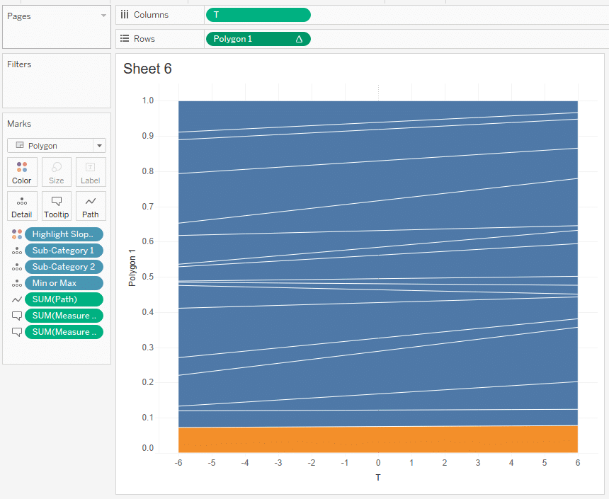
To start building the visualization, open a new sheet and change the Mark Type to Polygon. Then add Sub-Category 1, Sub-Category 2, and the dimension Min and Max to the Detail property of the Marks card. Next, l move Path to the Path property and Highlight Slope to the Color property. Last, move Measure 1 Sales and Measure 2 Quantity to the Tooltip. With those changes you should have something like this on the view.

The next step is to add T to the Columns shelf as a continuous dimension. We can do that by right-clicking on the pill and then selecting dimension from the list of options.

Now I will add our new Polygon 1 calculated field to the Rows shelf. We need to edit the table calculations of this field. If you click on the Nested Calculations dropdown in the editor, you will see there are quite a few nested calculations for this measure. We will need to edit each of them in a specific way. I will include a screenshot of each table calculation. Pay close attention to the order of the dimensions from the list.

After all the nested calculations have been edited you should end up with something like this.
Our last step is to sort each Sub-Category by its corresponding measure. I will sort Sub-Category 1 by Measure 1 Sales and Sub-Category 2 by Measure 2 Quantity. To clean things up, I will also adjust the colors and move the opacity down to about 50%. I really want to see when everything crosses as we move into the next measure.
With our polygon engineered, you can now follow these same steps for the other polygons. Remember to map each measure to its corresponding dimension and vice versa.
Once you have everything created and laid out, you should have a Sankey bump chart showing you how rankings are changing across different measures!
Until next time,
Ethan Lang
Director, Analytics Engineering

Written By
Ethan Lang

Peer Review
Felicia Styer
Assoc. Director, Analytics Solutions
Related Content
Statistical Tableau: Using MAD to Detect Outliers in Non-Normalized Data
I recently wrote a tutorial on 3 ways to visualize outliers in Tableau. This tutorial assumes a normal distribution of…

Ryan Sleeper
An Engaging Option for Comparing Two Dimension Members As opposed to a dot plot alone, dumbbell charts help communicate what…
How to Create a Dynamic Spider Web Background for Radar Charts

Radar charts can be a good option to make comparisons with your data, but one of the problems with this…