Statistical Tableau: Using MAD to Detect Outliers in Non-Normalized Data

I recently wrote a tutorial on 3 ways to visualize outliers in Tableau. This tutorial assumes a normal distribution of your data. However, there are times when you are working with data that is non-normal. Meaning it does not follow that bell-shaped curve we would expect. There are several techniques out there you can use to overcome this challenge. In this tutorial, I will be showing you how to implement the Median Absolute Deviation (MAD) in Tableau to detect outliers in non-normal data.
How to Analyze Data Distributions Using Histograms in Tableau
To get started, l will first introduce you to the logic behind the MAD technique by briefly explaining the function.
Median Absolute Deviation (MAD) in Tableau
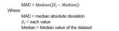
The Median Absolute Deviation is a statistical measure that quantifies the dispersion or variability of a dataset. It is calculated by finding the absolute deviation of each data point by subtracting the median from each value and taking the absolute value. Then you find the median of the absolute deviations giving us the MAD. The mathematical formula to calculate the MAD is as follows.
The steps to find the MAD are very simple when you break this formula down into plain English. Let’s start off with a simple example. Consider this dataset: 5, 10, 12, 15, 18. Here are the steps to find the MAD from this sample dataset.
Continue reading with a free account, or login.
Unlock this tutorial and hundreds of other free visual analytics resources from our expert team.
Already have an account? Sign In
By continuing, you agree to our Terms of Use and Privacy Policy.
-
-
- Find the median: In this dataset, you can see that the median value is 12.
- Next, you will calculate the absolute deviations from the median:
-
|5 – 12| = 7
|10 – 12| = 2
|12 – 12| = 0
|15 – 12| = 3
|18 – 12| = 6
3. Now calculate the median of the absolute deviations: the absolute deviations are 7, 2, 0, 3, 6. When arranged in ascending order, you can see that the median is 3 (0,2,3,6,7).
Following these steps, you can see that the Median Absolute Deviation (MAD) for this dataset is 3.
Using the MAD statistic, we can then calculate an upper and lower bound. Anything that falls outside of this range could be considered an outlier. The formulas for those calculations are as follows:
Lower MAD = Median – k * MAD
Upper MAD = Median + k * MAD
Where k is a constant value which is typically set to 3.
While the execution of this approach may seem simple, this technique is very efficient at detecting outliers in a dataset due to its unique properties. Since the primary measure used is the median, this technique is less affected by extreme values in the dataset.
![]()
This technique is also an example of a non-parametric method. Non-parametric models are flexible and can handle a wide range of data distributions without assuming a specific functional form.
To sum that up, this method is simple to implement and is a powerful method that has a wide range of applications.
How to implement Median Absolute Deviations in Tableau
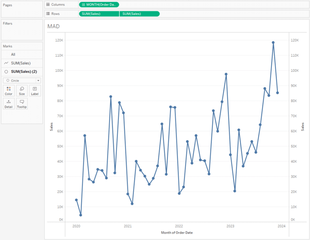
To implement this method in Tableau, I will first connect to the Sample Superstore dataset and create a line chart of the SUM of Sales by Month of Order Date. I also like to add a dual axis of the same measure and encode those marks as circles. This will come in handy later when implementing conditional formatting to visualize the outliers.
Next, I will add a reference line of the Median SUM of Sales to the view. However, just like everything in Tableau, there are multiple ways to do this. To show you one way, right-click on the y-axis and select Add Reference Line from the options that appear.
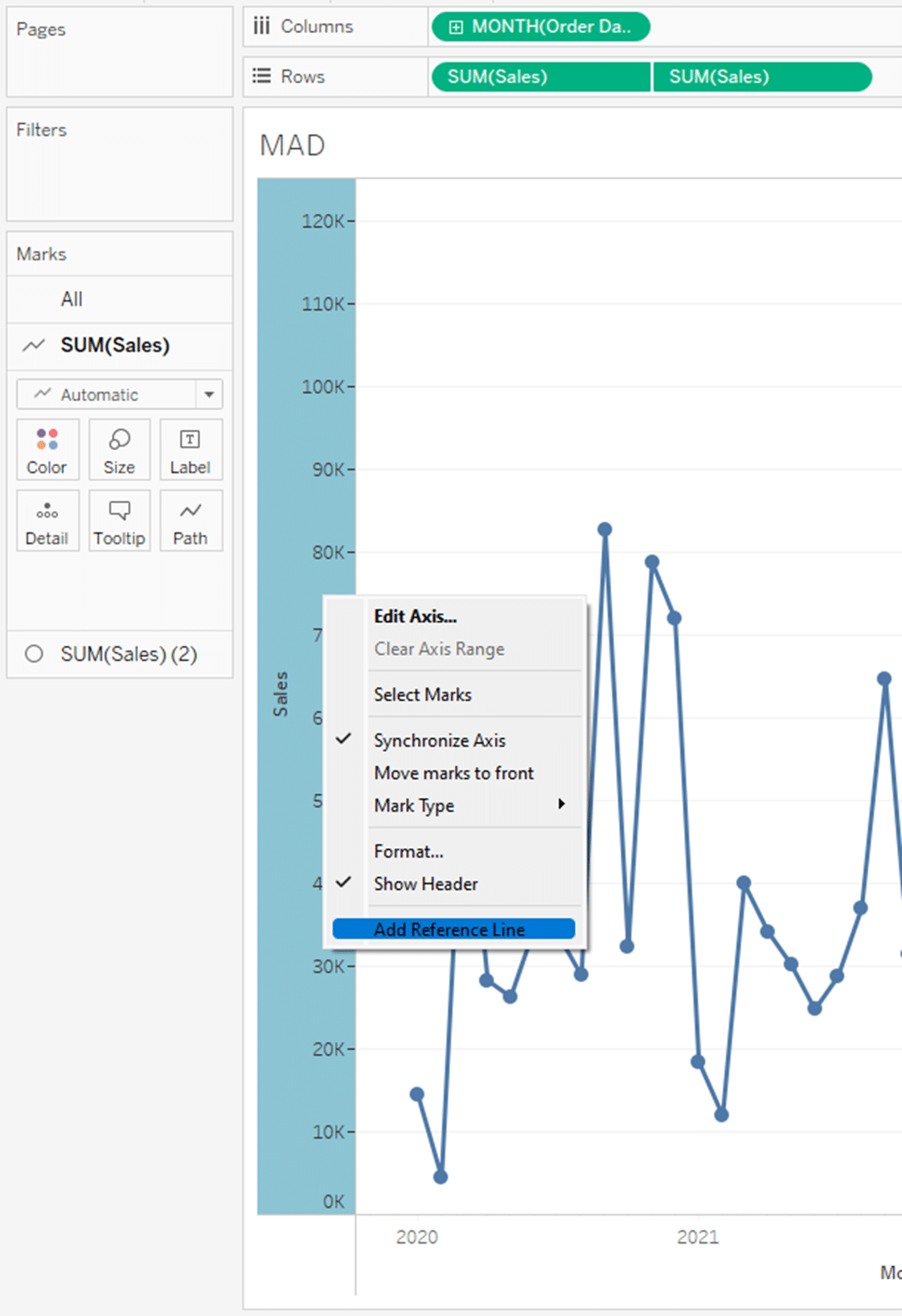
After you make this selection, you should see the Add Reference Line, Band, or Box menu appear. I will choose Median as the aggregation of the reference line. You will see that line appear on the view behind the menu after making the selection. Once I am done, I will click OK to close the menu.
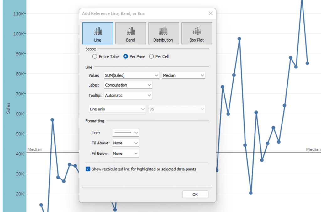
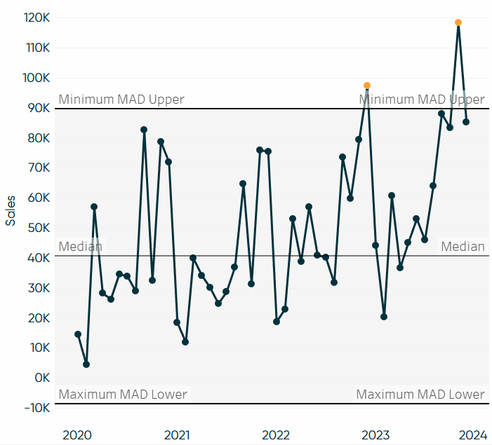
This reference line will help visualize the outliers later and gives us the median value so we can validate our calculations in the following steps.
Now we can begin creating the calculated fields needed to execute this method. Recall from the example at the beginning of this section we have three calculations we need to create, the MAD, Lower Bound, and Upper Bound. I will start by creating the MAD statistic.
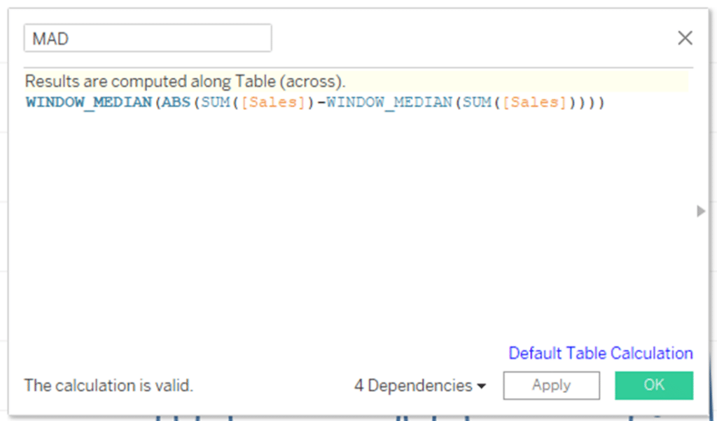
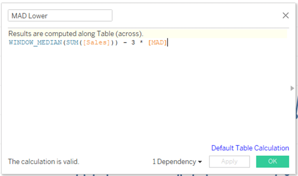
This gives us a median absolute deviation of $16,370. Next, I need to create the lower and upper bounds. I will start with the lower bounds, which you can see the calculation for that in the next screenshot
Next, I will create the upper bound calculation, which you can reference below.
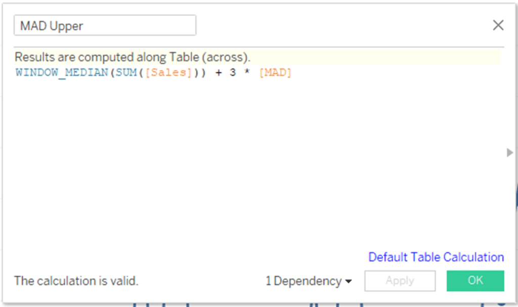
You can see that this calculation is basically the same as the lower bound, but it adds the constant vs. subtracts it.
With that, I am ready to visualize this technique by adding my upper and lower bound calculations to the view using reference lines. To begin, I will add them to the Detail property of the Marks card.
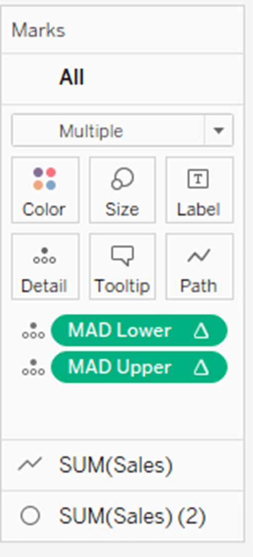
Next, I will right-click on the y-axis and select Add Reference Line. With those calculations in the Detail property of the Marks card, you will be able to select them as options from this menu. In the Line section, click on the dropdown next to value and select MAD Lower from the dropdown.
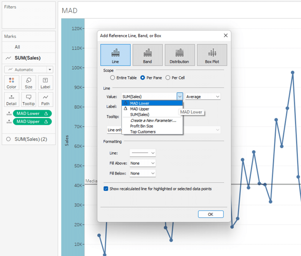
You will see the lower bound reference line appear on the view. I will now follow the same steps for the upper bound line. You can see both implemented in the view below.
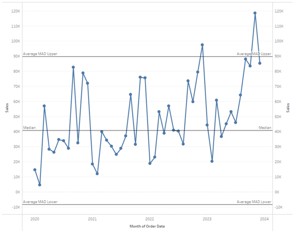
You can see that there are two values that exceed the upper bound. We could consider those outliers or deviations from the norm with this data and conduct a more in-depth analysis of those months.
3 Ways to Conditionally Format Numbers in Tableau
The last steps would be to apply some conditional formatting and provide some professional polish to the view. Here is where I landed. Feel free to download this workbook and re-engineer any of the formatting.
Until next time,
Ethan Lang
Director, Analytics Engineering
[email protected]
This content is excerpted from my book Statistical Tableau: How to Use Statistical Models and Decision Science in Tableau published by O’Reilly Media Inc., 2023, ISBN: 9781098151775. Read the book at O’Reilly.


Written By
Ethan Lang

Peer Review
Maddie Dierkes
Manager, Decision Science
Related Content
3 Creative Ways to Visualize Outliers in Tableau
There are many ways to detect outliers in your data, but flagging them for your end users may present some…
Statistical Tableau: How to Analyze Distribution with Histograms
There are many times when performing data analysis when we may want to view the distribution of our data. One…

Ryan Sleeper
3 ways to take command of Tableau number formatting Learn how to (1) easily format positive and negative changes with…