3 Innovative Ways to Highlight Selections in Tableau

In this tutorial I will demonstrate three ways to use different mark types with transparent sheets to highlight a selection within Tableau. I have found that implementing these techniques creates a great user experience within dashboards and helps bridge the gap between Excel-based text tables and starting to visually analyze data.
Each of these tactics can be implemented using the default settings within Tableau (no custom images required!). I will show you how to (1) create a simulated check box using the default shapes provided in Tableau, (2) create a single selection highlight using a bar chart, and (3) highlight multiple rows based on a selection using Gantt marks.
By the end of this post, you will know how to use shapes, bar charts, and Gantt marks to highlight a selection in Tableau.

How to use shapes to highlight a selection in Tableau
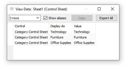
To get us started I am going to use one of my favorite tactics which is to create secondary data source for the Tableau parameter actions. In this post I have already created the control sheet and connected to it. Here is a preview of what that data looks like. If this tactic is new to you, I highly recommend checking out the related content link below.
How to Use Control Sheets for Better Parameter Actions
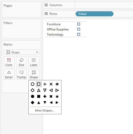
Using my secondary data source, I will start a new sheet and drag Value to the Rows Shelf and change the mark type to Shape. By default, Tableau uses a circle as the shape. I am going to click on the Shape Marks Card and select the square from the default shapes.
Continue reading with a free account, or login.
Unlock this tutorial and hundreds of other free visual analytics resources from our expert team.
Already have an account? Sign In
By continuing, you agree to our Terms of Use and Privacy Policy.
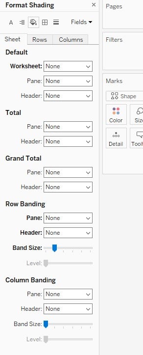
Now I will right-click in the sheet and select Format from the menu. I will click on the Format Shading tab, which is represented by a paint bucket, and turn the worksheet shading to None. This will make the sheet transparent on the dashboard. I will also make sure that Column and Row Banding is also toggled to None.
After formatting the sheet appropriately, I am going to right-click on the sheet name in the bottom of the Authoring interface and choose Duplicate. Before we build out the next sheet, we want to create a new parameter and calculated field.
![]()
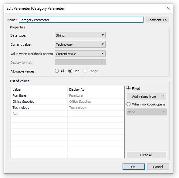
To do this I am going to use a shortcut by right-clicking on Value in the Data pane, navigating to Create, then choosing Parameter. This will give me a prepopulated parameter with the values from my control sheet. I will title this parameter Category Parameter and click OK.
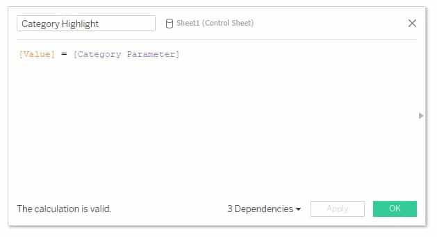
Next, I will right-click on the new Category Parameter, navigate to Create, then Calculated Field. In the calculated field dialog box, I will type in the following formula, title it Category Highlight, and click OK.
[Value] = [Category Parameter]
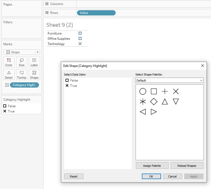
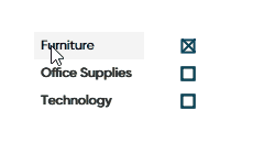
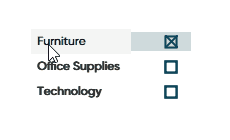
Now I will drag the Category Highlight calculated field to the Shape Marks Card and edit the shape so when Category Highlight is True, we see an X shape.
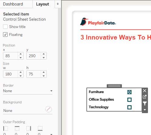
To bring these sheets together, I will create a new dashboard and float the sheets onto the view by selecting the Floating toggle at the bottom of the Dashboard pane and dragging the sheets onto the view. The trick now is to layer them on top of each other. The easiest way to do this is to navigate to the Layout pane and edit the Position and Size coordinates of the sheets to match.
With the sheets now stacked on top of each other we have created a checkbox using the default shapes in Tableau. I think its important to mention that you can also use custom shapes for this tactic by loading those imagines into your Tableau Repository.
How to Make Indicators with Custom Shape Palettes in Tableau
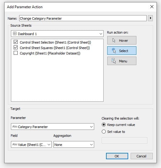
Now I will create a dashboard action that will update the parameter when the user clicks on a different Category. To set this up, click Dashboard in the top navigation, then Actions, Add Action, and select Change Parameter. I will title this action Change Category Parameter, select both sheets as the source sheet, change the target parameter to Category Parameter, set Value as the target field, and then click OK.
My sheets will now change the Category Parameter when selecting them from the dashboard.
How to use a bar chart to highlight selections in Tableau
Building on the first approach I will duplicate the Control Sheet Selection sheet and change the mark type to Bar. I will now drag Sheet1 (Count) onto the Size Marks Card. This is a default value generated by Tableau and in previous versions had been called Number of Records. Once you drag the appropriate measure to the Size Marks Card, you will be left with the following:
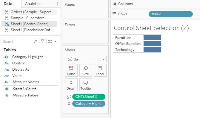
I will now drag Category Highlight to the Colors Marks Card and edit the colors so False is the color of my dashboard background and True is a color of my choice. I will also adjust the opacity down to about 40%.
Now we can drag this sheet onto the dashboard and stack it on the other two sheets by floating the sheet on the view and using the Layout pane to position it. Once we have it centered on the others we need to select that sheet on the dashboard, click the arrow in the grey outline box to the right, navigate to floating order, and choose send to back. This will place the bar behind the other sheets on the dashboard and is another reason we changed the background of the main sheet to “None” in a previous step.
How to use a Gantt mark to highlight selections in Tableau
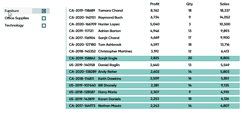
To drive this tactic home, I am going to connect to the Sample-Superstore dataset and create a quick text table by dragging Order ID and Customer Name to the Rows Shelf, then double-clicking Profit, Sales, and Quantity to add them to the view.
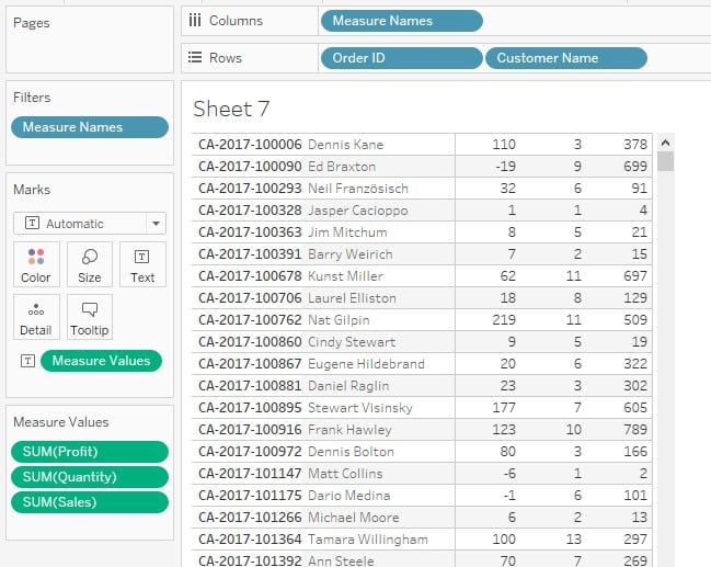
Next, I am going to filter this sheet to the top 15 orders by the SUM of Profit. To do this I will right-click on Order ID from the Rows Shelf, click Filter, then click the Top tab. From the Top tab I will click the By field: radio button, enter 15 as the amount, and choose Profit from the measures dropdown.
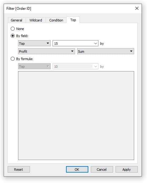
I’ll click OK, right-click in the sheet, and choose Format. Just like before we want to select None for the worksheet shading and banding. Once the sheet is formatted appropriately, right-click the sheet name at the bottom of the Authoring interface and choose Duplicate.
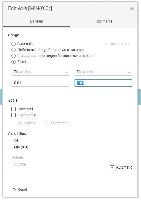
In the new sheet I am going to remove Measure Names from the Columns Shelf, Measure Values from the Text Marks Card, and change the mark type to Gantt Bar. Then I am going to double-click on the Columns Shelf which will open a blank pill where I can “work in the flow”. I will enter MIN(0.0) in the pill and hit Enter.
This will give us an axis. I am going to right-click on the axis and select Edit Axis. By defining this MIN value with a decimal, we can now edit our axis in decimal points as well. I am going to fix the axis and set the start at 0.01 and the end at 1.01.
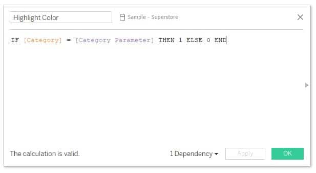
Next, I will create a calculated field, title it Highlight Color, and enter the following formula:
IF [Category] = [Category Parameter] THEN 1 ELSE 0 END
I will then click OK and drag this new field to the Size Marks Card and Category to the Details Marks Card. Now if you right-click the Highlight Color pill and change the aggregation to Minimum you will see bars populate across the view.
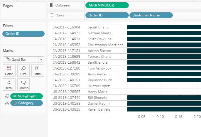
I will drag both of those sheets onto the dashboard with my Category Control sheets and position and size them appropriately so they are aligned on top of each other.
Now when I select a Category using my control sheet, the Orders table will highlight and display orders that contained a product from that Category dimension. To finish up I am going to format out grid lines, row dividers, and edit the colors of my highlight features.
![]()
With all the sheets in the dashboard, we can see each highlighting technique working in tandem. When I select a category, my shape will check the box of the selection, my bar graph is highlighting the category selected, and the Gantt mark is highlighting orders that contained that category.
Just like everything in Tableau, there are almost infinite use cases for these techniques!
Until next time,
Ethan Lang
Director, Analytics Engineering
[email protected]


Written By
Ethan Lang

Graphic Design
Jason Penrod
Director, Information Design
Related Content
How to Completely Customize Multi-Select Filters in Tableau

Filters play a crucial role in allowing users the flexibility to manipulate dashboards to their liking. Multi-select filters can be…

Ryan Sleeper
Two ideas for bringing attention to minimum and maximum values Make Tableau answer business questions for you automatically using a…
How to Do Button Swapping with Parameters in Tableau

One of the best ways to take a dashboard to the next level is to incorporate interactivity beyond what’s available…