3 More Ways to Make Lovely Line Graphs in Tableau

Tableau line graphs are one of the most widely used visualizations on dashboards today – it’s hard to beat a line graph when it comes to showing trends over time. As Ryan Sleeper mentioned in his previous tutorial on line graphs, they were created by our company’s namesake, William Playfair, in the 18th century. That’s over 200 years of line graph use!
So let’s add a few more line graphs to our visualization toolkit. I’ll walk you through three examples in this blog: highlighting a dimension group member, toggling historical data on and off, and coloring based on a measure category.
FAQs answered in this post:
How do I use Tableau’s Line Pattern feature to emphasize specific trends?
Tableau 2023.2 introduced Line Pattern, which lets you apply dashed or solid line styles at the measure level. Create a calculated field for your priority dimension, add both measures to Rows with dual-axis, then set secondary lines to dashed while keeping your focal line solid and thicker. This directs attention to key business metrics without losing comparative context.
What is date normalization and why would I use it in Tableau line graphs?
Date normalization aligns different time periods on the same axis for direct visual comparison. Using a Date Equalizer calculated field, you can shift historical dates forward to overlay current and past performance side-by-side. This is particularly effective for year-over-year analysis where stakeholders need to quickly identify whether current trends outpace historical baselines.
How do I create interactive toggles for historical data in Tableau?
Build a Boolean parameter controlling data visibility, create calculated fields for Current/Comparison classification, then construct a toggle button using shapes and parameter actions. This gives users control over whether to show simplified current-only views or full historical comparison. The pattern balances clarity with depth without cluttering your dashboard interface.
Why would I color measures differently based on whether they’re positive or negative metrics?
Positive metrics improve when increasing (revenue, conversions) while negative metrics improve when decreasing (churn, costs). Color-coding prevents misinterpretation—rising red signals problems for negative metrics, while upward green indicates success for positive ones. This visual language is critical when different stakeholders view metrics with varying expertise levels.
How do I implement dynamic measure selection with categorical coloring in Tableau?
Create a parameter for available measures, build a CASE statement returning selected values, and add a second CASE statement classifying measures as positive or negative. Place the value calculation on Rows and classification on Color, enabling users to switch between metrics while maintaining consistent visual encoding. This consolidates multiple views into one interactive visualization.
How can advanced Tableau training from Playfair Data accelerate our analytics maturity?
Playfair Data’s training teaches advanced techniques like date normalization, parameter-driven interactivity, and dashboard actions that transform static reports into analytical applications. Our Tableau Visionaries and published authors deliver practical enterprise implementation experience through Flagship and Advanced Statistical Tableau workshops. Schedule a strategy call to learn how our programs elevate team capabilities and improve dashboard adoption across your organization.
Adding dotted line patterns in Tableau
With the release of Tableau 2023.2, a nifty feature, Line Pattern, was added. It allows us to choose between a solid or a dashed line when creating a line graph. This allows us to emphasize or minimize certain lines in our view. There are virtually endless use cases for this feature, and some of the examples in this blog will utilize this feature.
3 Ways to Make Lovely Line Graphs in Tableau
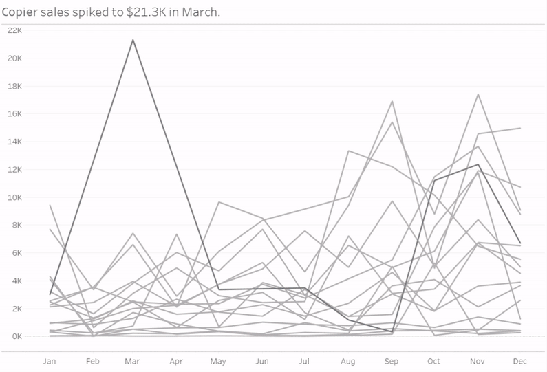
In this first example, we’ll apply Tableau’s new Line Pattern feature to add some additional visual encoding to a line graph to help our viewers focus on important information. In this case, highlighting a particular Sub-Category’s Sales from the Sample Superstore dataset.
![]()
First, add Order Date to the Columns Shelf with continuous month as the granularity. Add Sales to the Rows shelf, then add a filter where Order Date = 2022. Last, add Sub-Category to the Detail property of the Marks card. Your view should look similar to this:
For this example, let’s say that Copiers are one of the priority Sub-Categories for our business, so we want to highlight it.
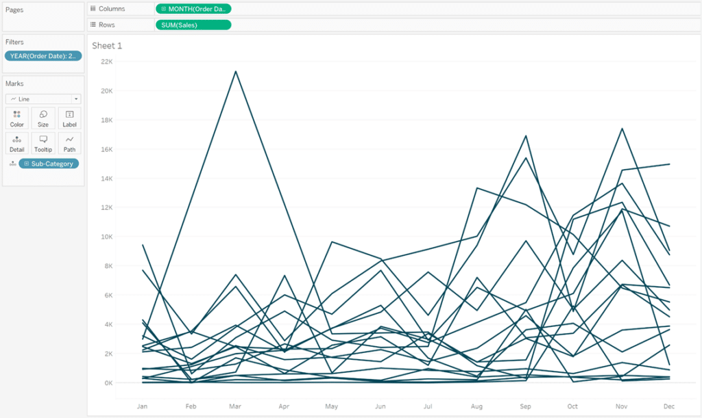
Currently, Tableau’s Line Pattern feature can only be applied at the measure level, so we need to add an additional measure to our view in order to differentiate between Copiers and all other Sub-Categories. To do this, we need a calculated field:
SUM(IF [Sub-Category]=’Copiers’ THEN [Sales] END)
Add the new Copiers Sales to your Rows Shelf. Right-click on the measure and select Dual Axis. Then right-click on one of the axes and check Synchronize Axis. Your view should look like this:
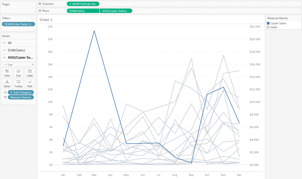
Now, to further emphasize Copiers, let’s do two things. First, set the line pattern for all other Sub-Categories to dashed. To do this, select the SUM(Sales) Marks card. Click the Path property of the Marks card, and under Line Pattern, choose one of the dashed options. Second, let’s increase the size of the Copier line. Select the AGG(Copiers Sales) Marks card, and click the Size property of the Marks card. Increase the size until the line stands out – I went to the second hash mark on the slider.
3 Ways to Use Dual-Axis Combination Charts in Tableau
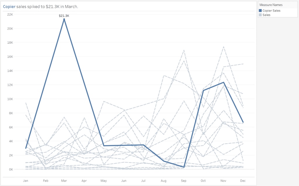
After a bit more formatting and creating a custom title, we now have a view that emphasizes the Copiers Sub-Category with some help from Tableau’s new Line Pattern feature. My final view looks like this:
Toggle historical data on and off
Sometimes long-term historical data provides useful context, but other times it hides or pulls attention away from important recent trends. Toggling historical data on and off offers the best of both worlds.
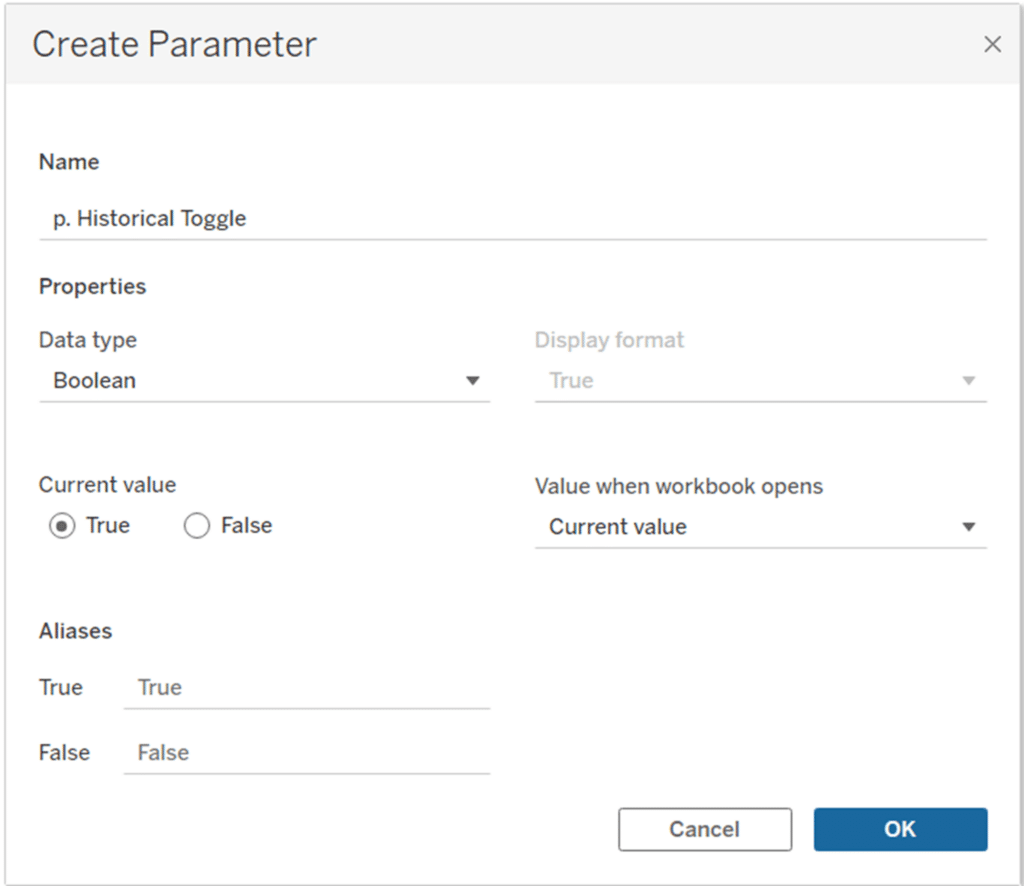
To start, let’s create a toggle parameter. This will control whether the historical data appears in our view. Since it will either be on or off, we’ll use a Boolean parameter:
To make our comparison easier for the user, let’s show our two date ranges on the same axis rather than in chronological order. To bring these two date ranges onto the same view, we need to normalize the date ranges.
How to Normalize Current and Prior Dates on the Same Axis in Tableau
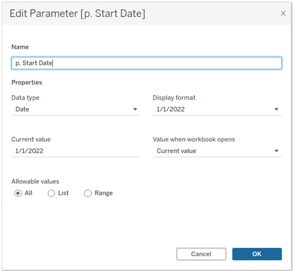
First, create Start and End Date parameters where the Data Type = Date and Allowable Values = All.
Next, create a calculated field called Days in Range. We’ll use this to normalize our comparison period:
DATEDIFF(‘day’,[p. Start Date],[p. End Date])+1
For the next calculation, we need to tweak the formula to allow the user to toggle on or off the historical data, or comparison period. The calculation is as follows:
IF [Order Date] >= [p. Start Date] AND [Order Date] <= [p. End Date]
THEN “Current”
ELSEIF [Order Date] >= [p. Start Date] – [c. Days in Range]
AND [Order Date] <= [p. End Date] – [c. Days in Range]
AND [p. Historical Toggle]
THEN “Comparison”
ELSE “Not in Range”
END
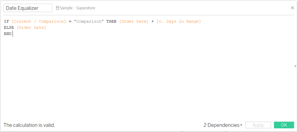
Last, we need a calculation that pushes the historical dates forward so that they are on the same axis in our view.
IF [Current / Comparison] = “Comparison”
THEN [Order Date] + [c. Days in Range]
ELSE [Order Date]
END
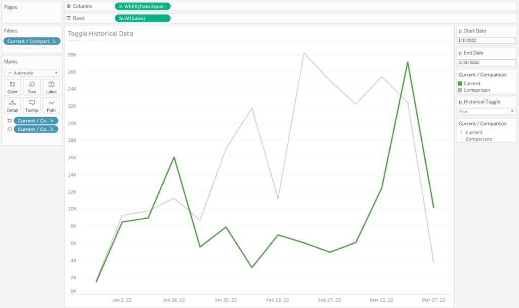
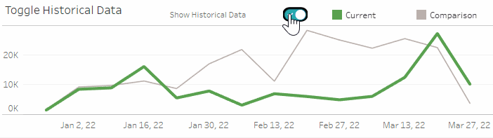
To create our view, pull Date Equalizer onto the Columns shelf. I chose week as the date granularity, but you can choose whatever makes sense for your data. Add Sales to the Rows shelf, then add the Current / Comparison field to the Filters shelf and exclude the data for “Not in Range”. Then add Current / Comparison to the Color property of the Marks card. If you show the Parameter Control for the p. Historical Toggle, you should be able to turn on and off the historical data on your view.
To complete our view, let’s make a toggle button. Create the following calculated field. This will change our parameter as the user clicks the toggle button on the dashboard:
IIF([p. Historical Toggle] = TRUE, FALSE, TRUE)
On a new sheet, change the mark type to Shape and add your calculated field to the Shape property of the Marks card. Double-click in the blank space at the bottom of the Marks card and type “TRUE”. Double-click again and type “FALSE”. Add your toggle images to your Shapes Repository, and then map the correct toggle image to each state. Note that you will need to adjust the sizing for the toggle to render appropriately on your dashboard.
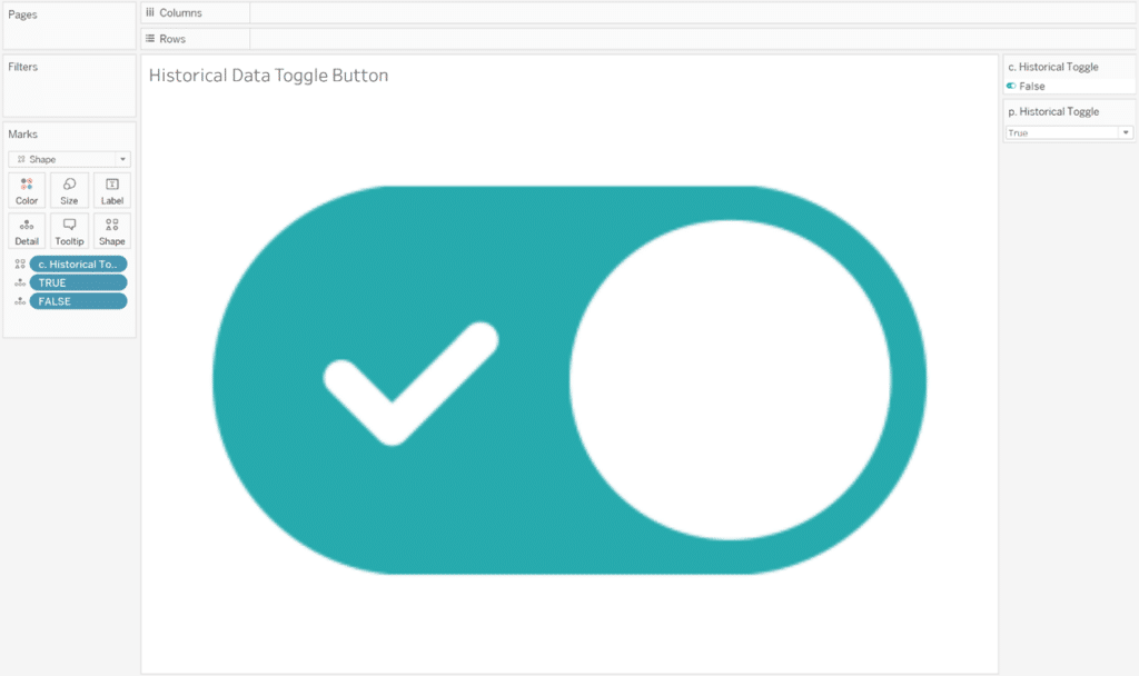
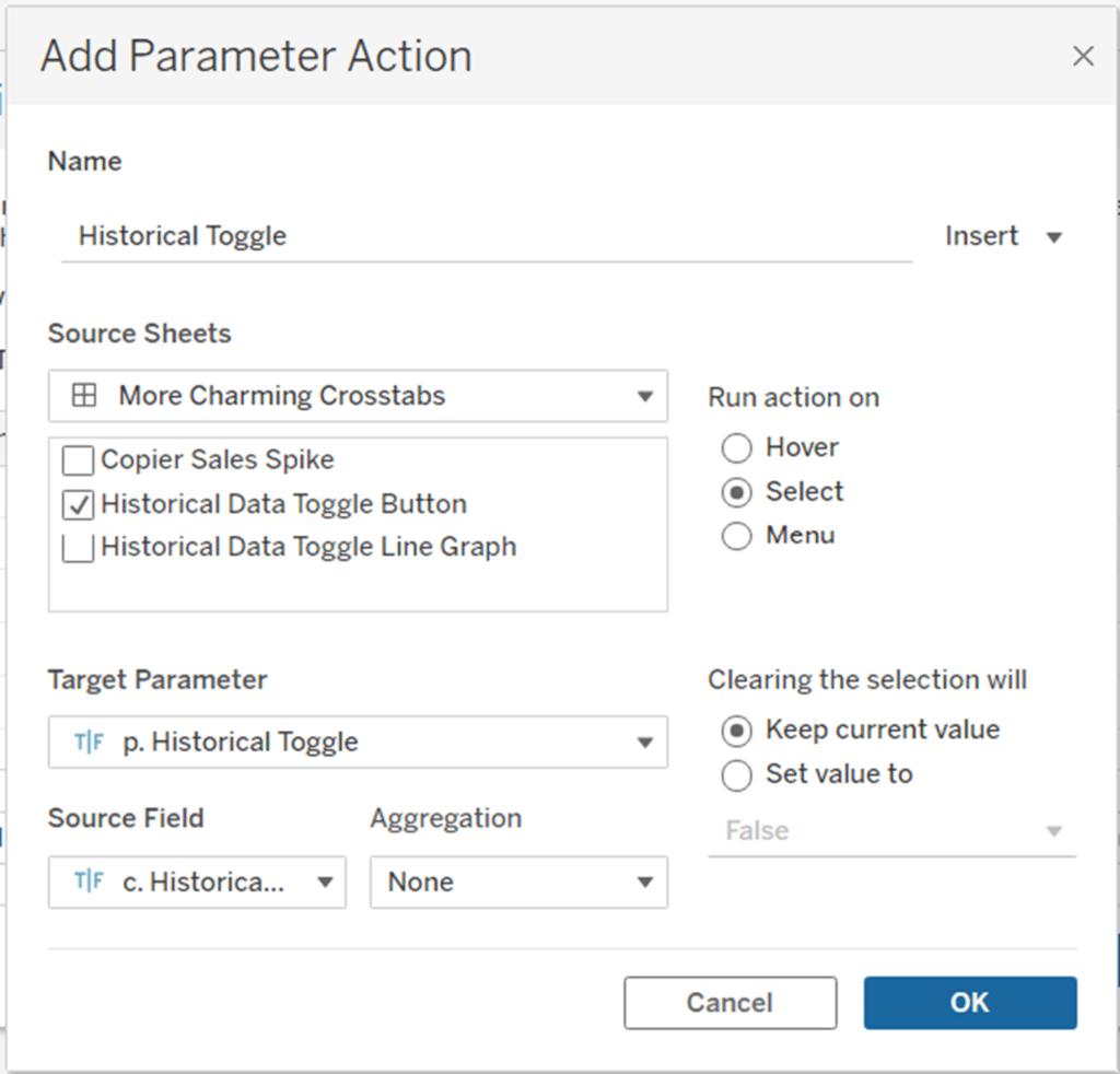
Add your toggle to the dashboard. For our toggle to function, we need to add a dashboard action; in this case, it will be a parameter action set up as follows:
Et voila! You can now toggle historical data on and off in the same view!
3 Ways to Make Terrific Toggles in Tableau
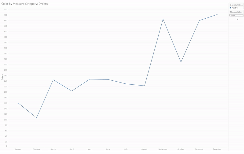
Color based on measure category
For the final piece of this tutorial, we’ll explore coloring measures based on assigning them to two categories – either positive or negative. What do I mean by a positive or negative measure? Positive measures refer to metrics that improve when they increase period over period, such as sales, unique users, or subscriber counts. Negative measures are those that improve when they decrease period over period, such as load time, bounce rate, unsubscribes. In other words, we want these metrics to be as low as possible.
Continue reading with a free account, or login.
Unlock this tutorial and hundreds of other free visual analytics resources from our expert team.
Already have an account? Sign In
By continuing, you agree to our Terms of Use and Privacy Policy.
In our use case, we will color negative measures differently than positive ones to indicate to the user that their trends cannot be interpreted the same way as positive metrics. The measures we will use are:
- Orders (positive)
- Returns (negative)
- Discount (negative)
- Sales (positive)
Create a new sheet, add Order Date to the Filters shelf, and filter by Year = 2022. Then add the continuous month of Order Date to the Columns shelf. We’re going to make our measure dynamic, so to do this we need to create a parameter for the four measures mentioned above.
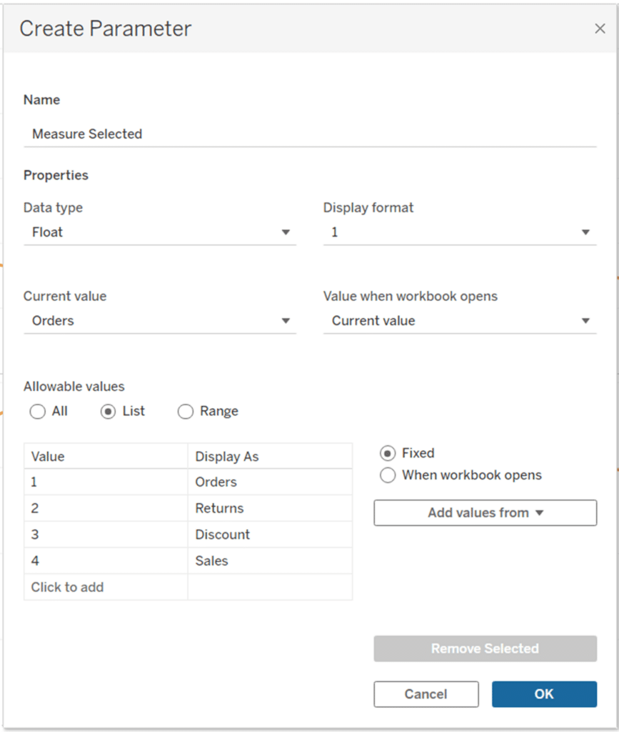
Next, create a calculated field that will return the values for the measure selected:
CASE [Measure Selected]
WHEN 1 THEN COUNT([Orders])
WHEN 2 THEN COUNT([Returns])
WHEN 3 THEN AVG([Discount])
WHEN 4 THEN SUM([Sales])
END
![]()
Add this measure to the Rows shelf on your sheet. Next, create a calculated field that colors the measures according to whether they belong to the positive or negative category. Click and drag this field to the Color property of the Marks Card:
CASE [Measure Selected]
WHEN 1 THEN “Positive”
WHEN 2 THEN “Negative”
WHEN 3 THEN “Negative”
WHEN 4 THEN “Positive”
END
I also created a dynamic measure label for my view, but it’s not necessary. Here’s the calculation in case you’d like to use it:
CASE [Measure Selected]
WHEN 1 THEN “Orders”
WHEN 2 THEN “Returns”
WHEN 3 THEN “Discount”
WHEN 4 THEN “Sales”
END
I added this calculated field to my title and added it as the axis label so both would be dynamic. Once you’ve selected the colors you want to assign to positive and negative, and made any formatting adjustments, you’re done! You can also consider adding an indicator for the coloring difference, which I would definitely advise if you plan to use this in a dashboard.
I hope you’ve enjoyed reading about three new ways to make lovely line graphs.
Happy vizzing,
Alyssa


Written By
Alyssa Huff

Peer Review
Felicia Styer
Assoc. Director, Analytics Solutions
Related Content
3 Ways to Make Lovely Line Graphs in Oracle Analytics Cloud

As far as I’m concerned, boring chart types are always in style. The problem-solving principle of Occam’s Razor states that,…
3 Ways to Make Lovely Line Graphs in Tableau

Due to the popularity of 3 Ways to Make Beautiful Bar Charts in Tableau, I’ve decided to follow it up…
3 Ways to Make Lovely Line Graphs in Power BI

If you read the first installation in this series on how to make Power BI bar charts more engaging, this…