3 Ways Psychological Schemas Can Improve Your Data Visualization
Whether you are aware of it or not, you are constantly recognizing and processing patterns in your everyday life. Think about when you go to dinner at a sit-down restaurant that you’ve never been to before. Even though you’re trying the restaurant for the first time, you will have some expectation about the order of events, which usually looks like this:
– You walk in and are greeted by a host or hostess who shows you to a table
– The waiter comes by to introduce themselves and takes your drink order
– After returning with your drinks, the waiter takes your dinner order
– Throughout the meal, the waiter may stop by every once in a while to make sure you’re doing okay and refill your drinks
– After the meal, the waiter will make a bad joke about ‘saving room for dessert’
– After declining, they will either produce your bill from their pocket or run over to the register to get it for you
– You pay and go on your way
This is one of many examples of a psychological schema (not to be confused with database schema) in your everyday life. These patterns help society align diverse audiences and help us process varying situations very efficiently. These schemas are so powerful and ingrained that a disruption to the pattern can be confusing and challenging to overcome. As one extreme example, imagine showing up to the restaurant from above and having the waiter bring you a check before you’ve sat down.
The restaurant pattern goes in an intuitive order so it is unlikely to vary much, but you also create schemas that are personal to you based on your own life experiences and worldview. These expectations help you avoid ‘reinventing the wheel’ because you’ve experienced the same or similar situation before and know how to handle it.
Schemas play an important role in data visualization because they have the ability to make or break the two biggest benefits of visualizing data: reducing time to insight and improving the accuracy of insights. Tap into your audience’s schemas and you improve their experience; disrupt their schemas and you run the risk of leading your audience in the wrong direction.
This post shares three ways to leverage schemas to improve your data visualization.
Triple Crown Framework for Data Visualization: Psychology
Continue reading with a free account, or login.
Unlock this tutorial and hundreds of other free visual analytics resources from our expert team.
Already have an account? Sign In
By continuing, you agree to our Terms of Use and Privacy Policy.
Schema 1: Spatial Context
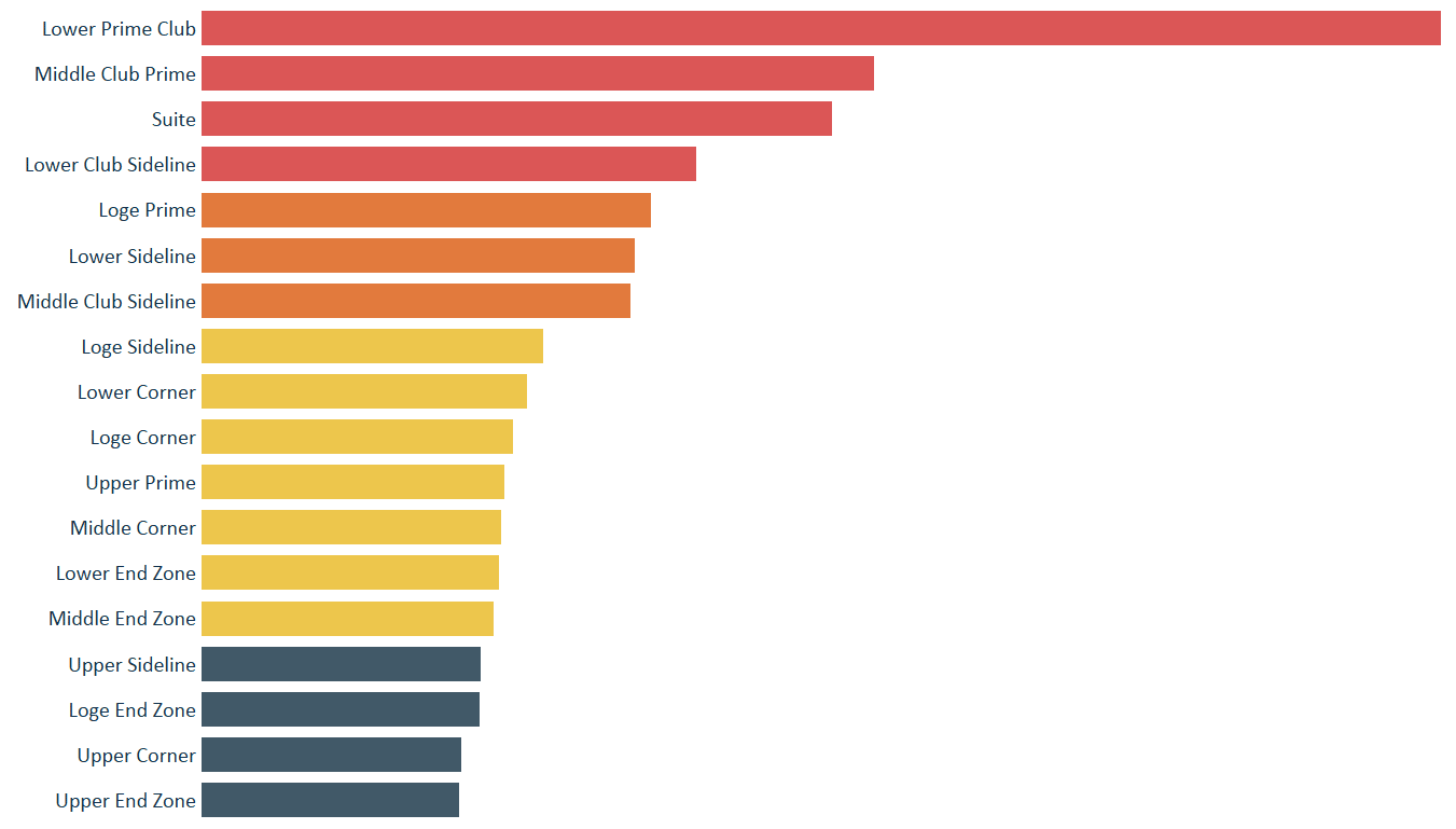
Maps help us process data because in addition to the data point, they provide spatial context that help our analyses. Consider the following bar chart showing the lowest cost per section to attend Super Bowl 50:
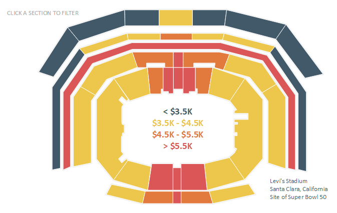
This a good data visualization within best practices, and there are definitely insights to be found in this chart. However, adding spatial context immediately helps the analysis make sense, even if you are not familiar with the stadium where this game was played:
I can use the schema I’ve constructed in my mind from my experiences buying tickets to many sporting events over my lifetime to know that the lower and closer to midfield you are, the more expensive the ticket will be. This will help reduce my time to insight because it’s much faster for me to determine if the numbers on the bar chart make sense to me intuitively or if there is a disruption to my schema, which in this case would also lead to insight (i.e. if lower bowl tickets are going for less money than the upper deck). Depending on what story you are trying to tell, it may make sense to display a map like this in addition to, or even instead of, the bar chart. For my Cost of Attending Super Bowl 50 visualization, I chose to show the stadium map and a line graph.
Schema 2: Icons / Shapes / Symbols
A picture tells a thousand words. The second schema that can improve your data visualization is the use of icons, shapes, and/or symbols. There’s a thin line between graphics that enhance a data visualization and chartjunk, but when done tastefully, graphics have the ability to provide much more information than words alone.
At the most basic level, think about how much value a “+” or “-” sign adds when it precedes a number on a dashboard. When used to show if there was a positive or negative change in a KPI, just one character reduces the time to insight and increases the accuracy of insights. Arrows or triangles pointing up or down work the same way.
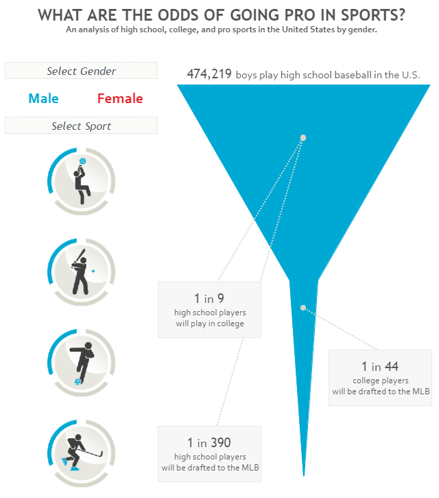
That’s a basic example, but many graphics work in this way because we have preconceived notions about what they mean. Take a look at the navigation I used on my visualization, The Odds of Going Pro in Sports:
[click image to view full interactive version]
I used icons instead of words to display the different sport options. In my opinion, this makes the view more engaging, but icons also provide the advantage of reducing, and often eliminating, language barriers.
In another example, I used a polygon map of a football player to help illustrate what body parts cause the most collisions in the NFL:
[click image to view full interactive version]
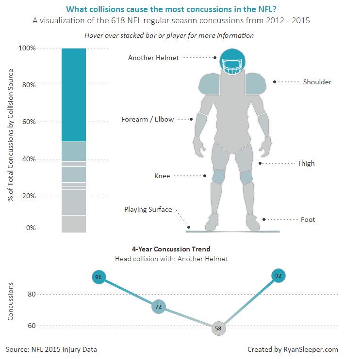
I could have simply made a bar chart by collision source, which would be a fine approach, but by overlaying the heat map onto the player’s shape, the viewer can tap into their existing schemas to process the view and discover insights.
Schema 3: Color
For better or worse, I bet you associate green with good and red with bad. I’m not exactly sure where that preconception was born, but it seems to be with us to stay. It is a schema. You don’t have to teach your audience what red and green mean; they know (or think they know, so be careful!).
I don’t recommend this color combination for both scientific (color blindness) and personal reasons (I believe it’s ugly), but this is an example of a schema you can leverage to help your audience make sense of your data visualizations.
Being aware of your audience’s existing associations can help you help them decrease their time to insight and improve the accuracy of their insights. It works both ways though, so be careful not to completely disrupt their schemas. If you’re making a visualization about fruit, don’t color oranges purple and grapes orange.
If you’re using color outside of the common green/red or blue/orange color palettes, be consistent so your audience becomes conditioned to understand your use of color.
Leveraging these three schemas in a thoughtful way can go a long way toward maximizing the two biggest benefits of data visualization: decreasing the time to insight and improving the accuracy of insights. At the very least, be aware that your audience has their own preconceptions, and disrupting them can make it more challenging for your audience to find value in your data visualization.
Thanks for reading,
– Ryan
This content is excerpted from my book Practical Tableau: 100 Tips, Tutorials, and Strategies from a Tableau Zen Master published by O’Reilly Media Inc., 2018, ISBN: 978-1491977316. Get the book at Amazon.
Related Content
Ryan Sleeper
Create and Encode Custom Shapes Using Any Image We’ll have some fun mapping custom polygons on a baseball stadium. You’ll…
3 Ways to Make Magnificent Maps in Tableau
Maps are one of the most effective chart types in Tableau and are also among the easiest chart types to…
Ryan Sleeper
Leverage color to improve your designs and help communicate insights Color tips include reducing the saturation of marks, keeping color…
