3 Ways to Make Spectacular Sparklines in Tableau

Minimalist chart types like Tableau sparklines are a great addition to most dashboards because they can add value without overcrowding your view or distracting stakeholders from the main visualization. Sparklines provide a high-level view of data, which is often a good starting point of an analysis because insights can be gleaned and comprehended very quickly. Because sparklines are minimalistic in nature, they are often best paired with KPIs or some other feature that provide additional context. Keep following along to learn three tricks that add value and context to sparklines while maintaining the integrity of this minimalist chart type.
1. How to add a dot indicator to Tableau sparklines
Start with simple sparklines
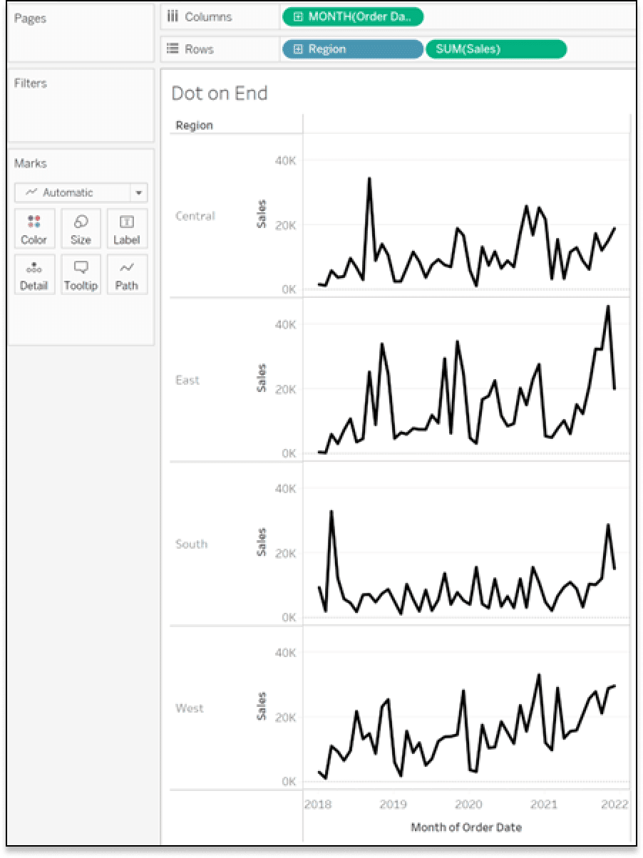
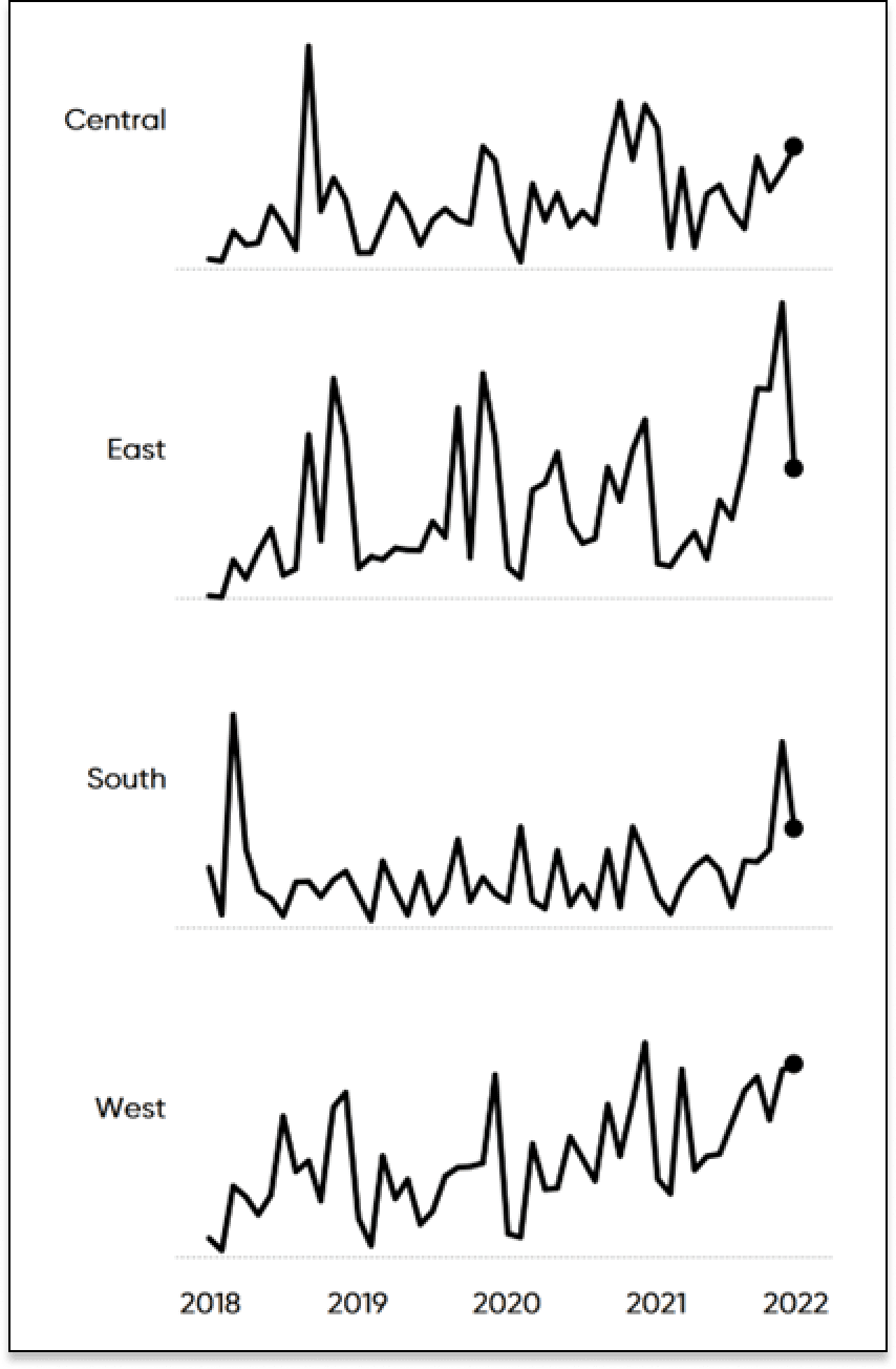
To start, we’ll connect to the Sample-Superstore dataset using the Orders data. The first step to creating sparklines with a dot indicator is to assemble our view with a simple sparkline chart of the monthly sum of sales for each region. Drag the Sales measure with the default Sum aggregation and Region dimension to the Rows shelf, then right-click and drag Order Date to the Columns shelf and choose continuous Month (green). Resize the sparklines by sliding the chart to the left. This condenses the chart into a smaller view which achieves the key characteristic of sparklines, high volatility.
Continue reading with a free account, or login.
Unlock this tutorial and hundreds of other free visual analytics resources from our expert team.
Already have an account? Sign In
By continuing, you agree to our Terms of Use and Privacy Policy.
Add the dot indicator
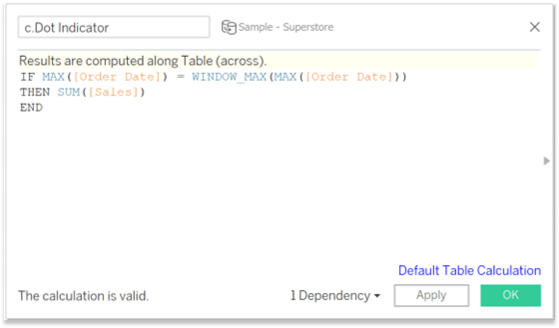
Next, we need to create a calculated field which will be used to create the dot at the end of our sparklines. The logic for this calculated field tells Tableau to place a mark on the view where the most recent order date occurred, which in our case should be at the end of each sparkline. This is a Table Calculation, which means we need to ensure that it is computed using “Table (across)”. I named this calculated field “c.Dot Indicator”. Everyone has their own style of naming and labeling fields in Tableau, my personal style is to place a “c.” before all my calculated fields so they are automatically sorted together in the Tables pane. The logic for “c.Dot Indicator” is as follows:
IF MAX([Order Date]) = WINDOW_MAX(MAX([Order Date]))
THEN SUM([Sales])
END
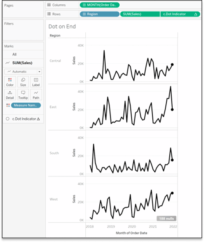
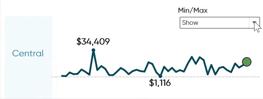
Add the newly created calculated field next to the SUM(Sales) measure on the Rows shelf, change the Mark type to Circle, right-click SUM(Sales), select Dual Axis, and synchronize the axis.
Format the view
Since these sales amounts are measured in dollars, we want to edit the number formatting so our view displays currency. Right-click anywhere on the axis and select Format. Under Numbers, select Currency Custom and change the decimal places to 0.
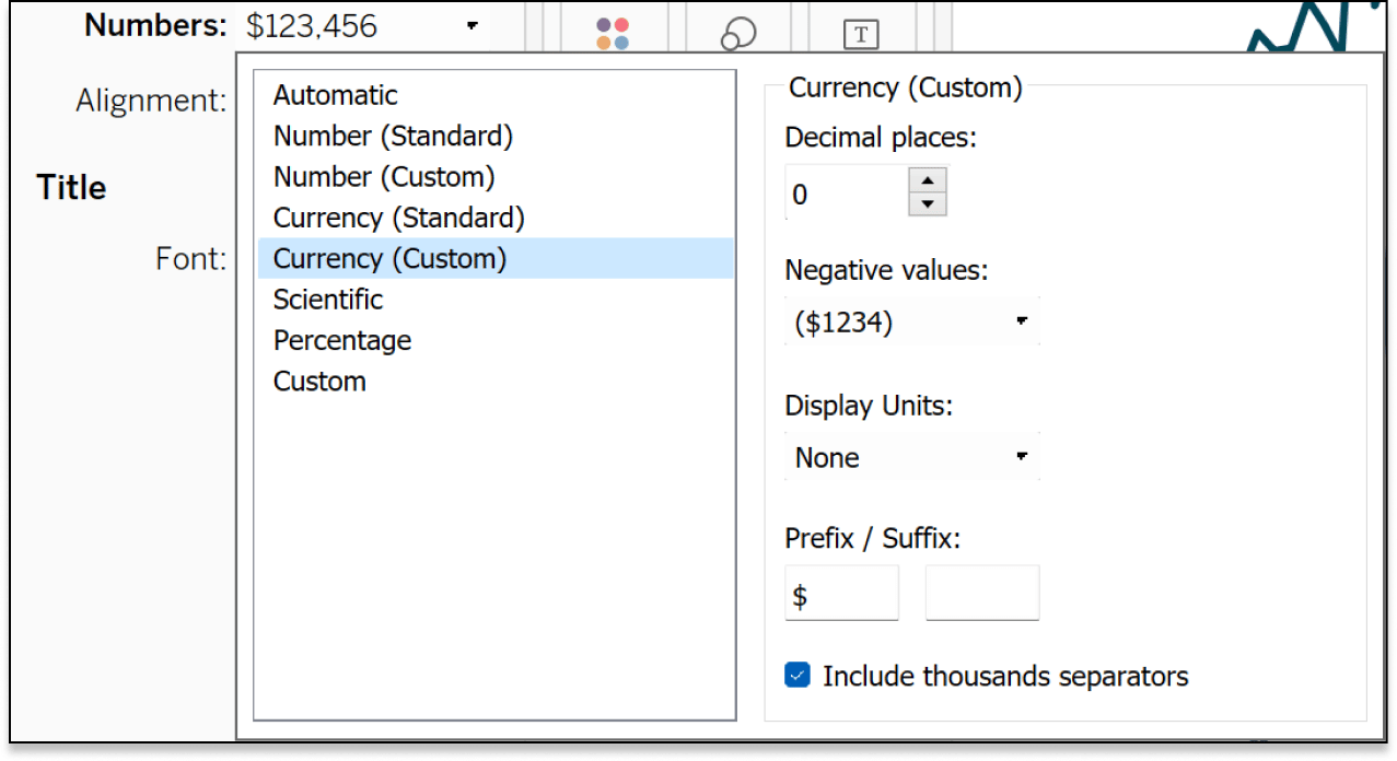
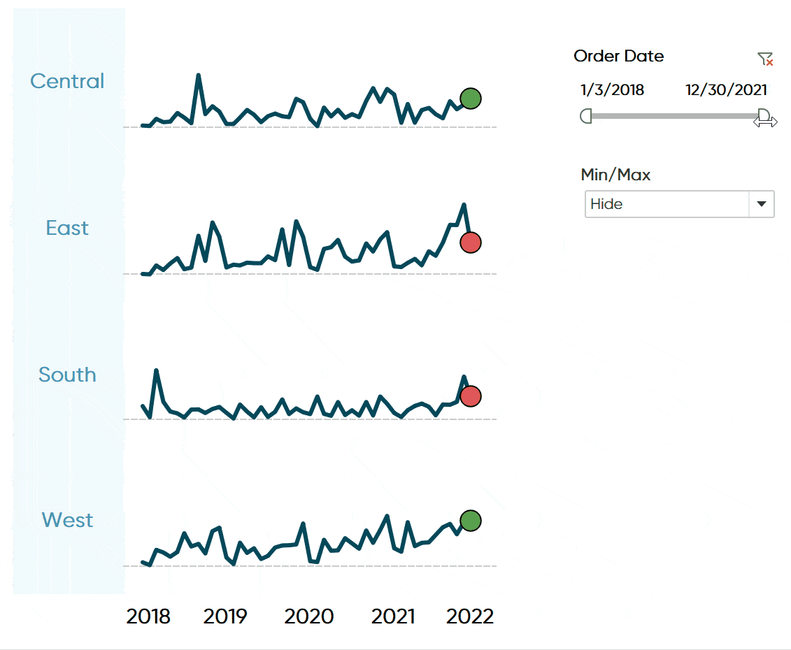
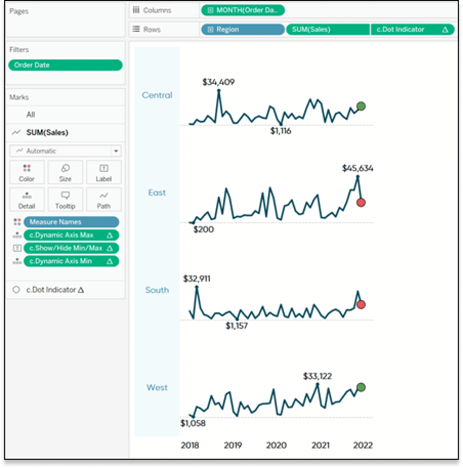
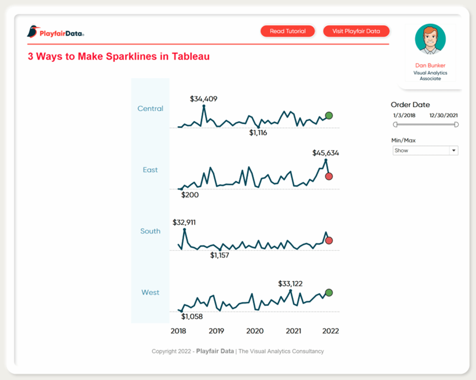
Lastly, clean up the view by hiding unnecessary headers, borders, and lines. As a bonus you can also add Order Date to the Filters shelf to make the date field dynamic. After all these steps are completed, you should end up with a Tableau sparklines view similar the image below.
2. Color by month over month performance
Coloring the dot by performance can be useful to show which way your sparkline is trending. It’s also a good UX trick because having the single dot rather than the whole sparkline colored by performance will give your dashboard a much cleaner, polished look and will maintain the simplicity of this chart.
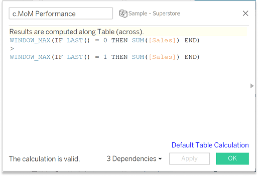
First, create a calculated field named “c.MoM Performance”. The logic for this table calculation is:
WINDOW_MAX(IF LAST() = 0 THEN SUM([Sales]) END)
>
WINDOW_MAX(IF LAST() = 1 THEN SUM([Sales]) END)
The “LAST()” function returns the number of rows from the current row to the last row in the partition and the “WINDOW_MAX” function returns the maximum of the expression within the window. When this calculation is added to the Color property of the Marks card, Tableau will compare the last date to the second to last date in the view and color the mark.
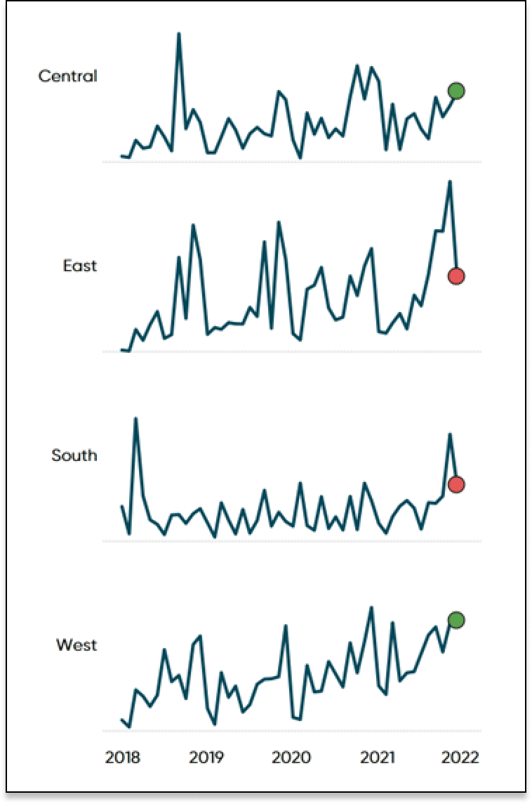
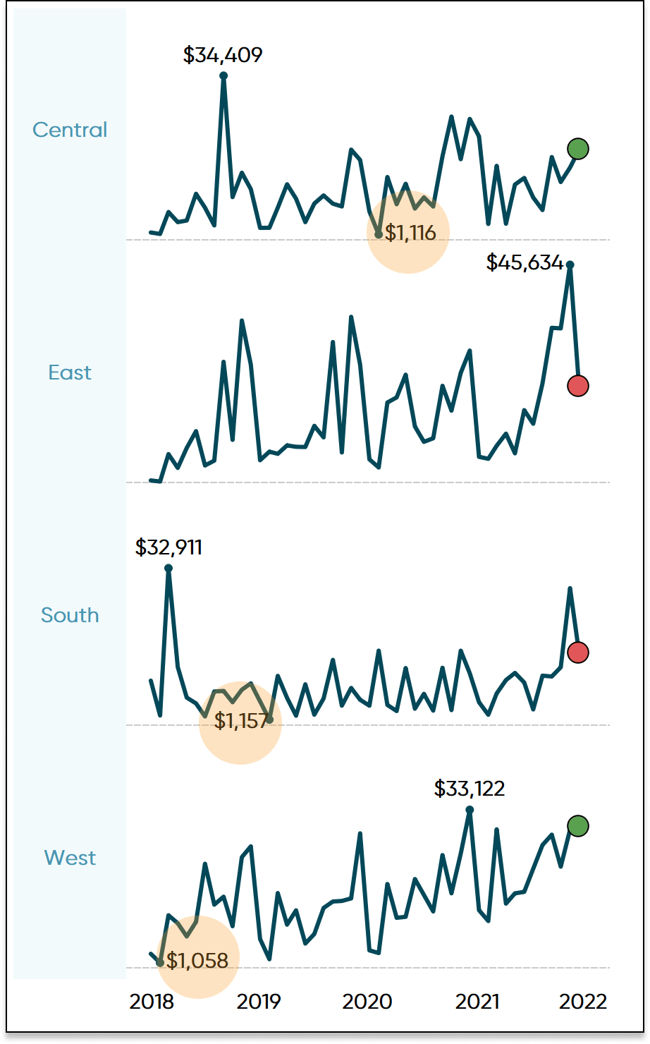
Now that the calculation has been created, add it to the Color Property of the Circle Marks card. The dots at the end of your sparkline will turn one color for positive and another for negative month over month performance.
How to Color Entire Tableau Charts Based on Current Performance
3. Dynamic MIN and MAX labels
Calculations for the min/max labels
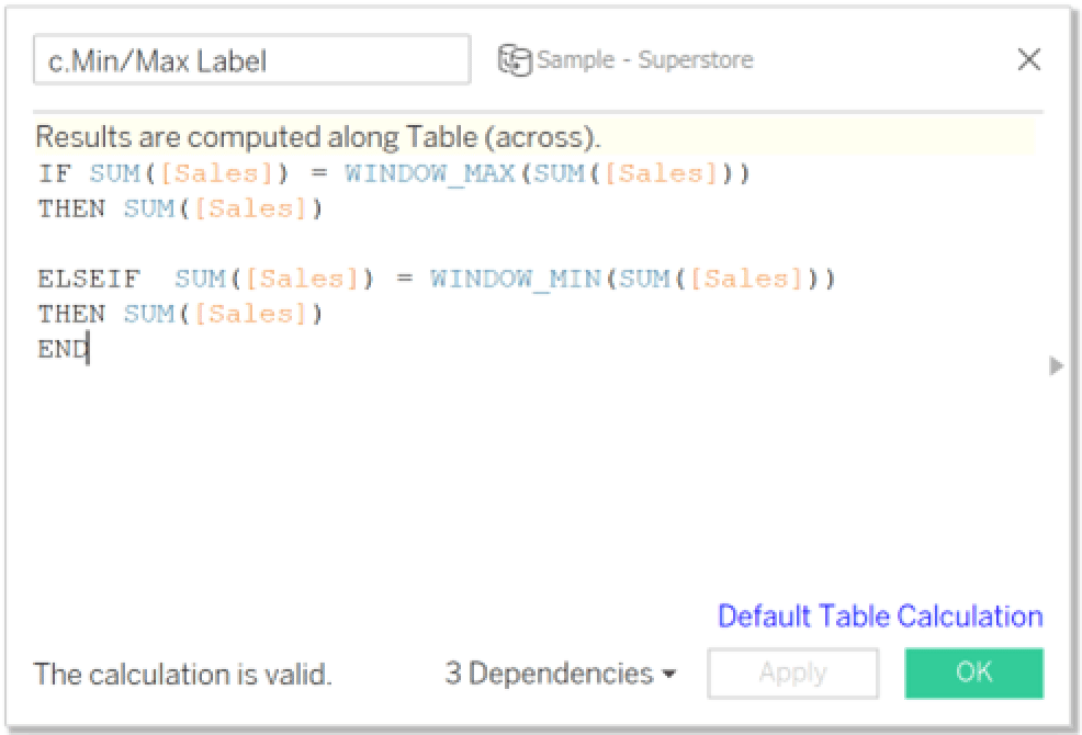
Tableau sparklines provide a great way to get a high-level view of our data but as I said before, they often need some context. This section will teach you how to use calculated fields to dynamically label the minimum and maximum values so the end user can better understand the axis range. While it would be easier to simply use the Label property of the Marks card to label the min and max values, I will show you how to use a calculated field to label the min and max so we can then use a parameter to either show or hide the labels.
![]()
First, create a calculated field called “c.Min/Max Label”. This is the calculated field that will be added to the Label property of the Line Marks card and will tell Tableau to place labels in the view where the maximum and minimum sum of sales occurs within our view. It is also important to note that because this is a table calculation, we must ensure that it is being computed along “Table (across)”. The logic is as follows:
IF SUM([Sales]) = WINDOW_MAX(SUM([Sales]))
THEN SUM([Sales])
ELSEIF SUM([Sales]) = WINDOW_MIN(SUM([Sales]))
THEN SUM([Sales])
END
Once this calculated field has been created, place it on the Label property of the Line Marks card and your view should resemble the image below
Creating the show/hide parameter
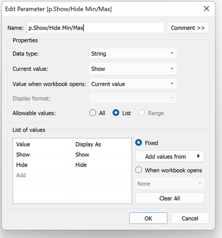
Sparklines are most effective when they remain simple and minimalistic, which is why it may be beneficial for our stakeholders to have the ability to show or hide the min and max labels so they don’t overcrowd the view. Let’s first create the parameter which will be called “p.Show/Hide Min/Max”. This parameter will have a Data type of String, select the List radio button under Allowable values, type out your two List of values as “Show” and “Hide”, and select OK.
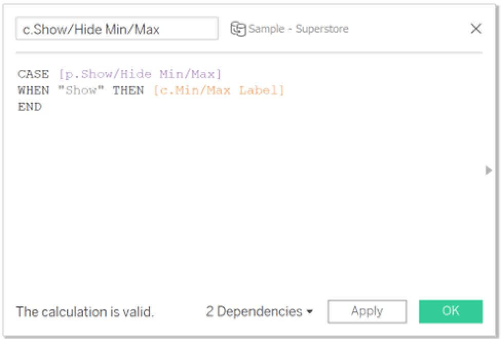
Next, we need to create a calculated field named “c.Show/Hide Min/Max” that will be passed through our newly created parameter to give it functionality. There are several ways you could write this logic, but the way I chose is as follows:
CASE [p.Show/Hide Min/Max]
WHEN “Show” THEN [c.Min/Max Label]
END
We will now want to replace “c.Min/Max Label” calculated field with “c.Show/Hide Min/Max” on the Label property of the Line Marks card. This can be achieved by simply dragging c.Show/Hide Min/Max directly over the top of c.Min/Max Label and dropping and Tableau will automatically swap the two calculated fields. Your view should now have the functioning show/hide parameter as shown in the GIF below.
Bonus: How to avoid overlapping labels on Tableau sparklines
When assembling the view, it’s often the case that due to lack of real estate in the view, our labels get pushed into the chart making the labels difficult to read. To improve the UX/UI of our dashboard, we can use a few calculated fields to better align our labels. These calculated fields multiply the max and min values by over 100% then are added to reference lines to create a padding for the labels to align as they should.
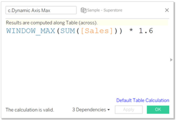
Our first calculated field will be named “c.Dynamic Axis Max” and the logic is:
WINDOW_MAX(SUM([Sales])) * 1.6
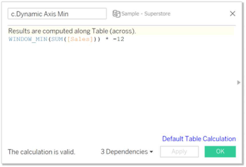
The second calculated field is named “c.Dynamic Axis Min” and the logic is:
WINDOW_MIN(SUM([Sales])) * -12
Add both calculated fields to the Detail property of the Marks card.
3 Ways to Make Beautiful Bar Charts in Tableau
Right-click the SUM(Sales) pill in the Rows shelf, select Show Header. Then right-click the Sales axis and select Add Reference Line.
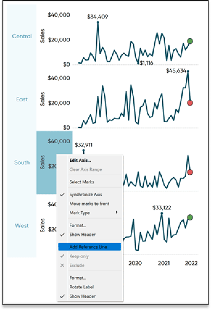
Choose the Line option, the Per Pane radio button, and under the Value drop-down choose c.Dynamic Axis Max. We don’t want any Labels, Tooltips, or Lines shown so select None for all options and select OK.
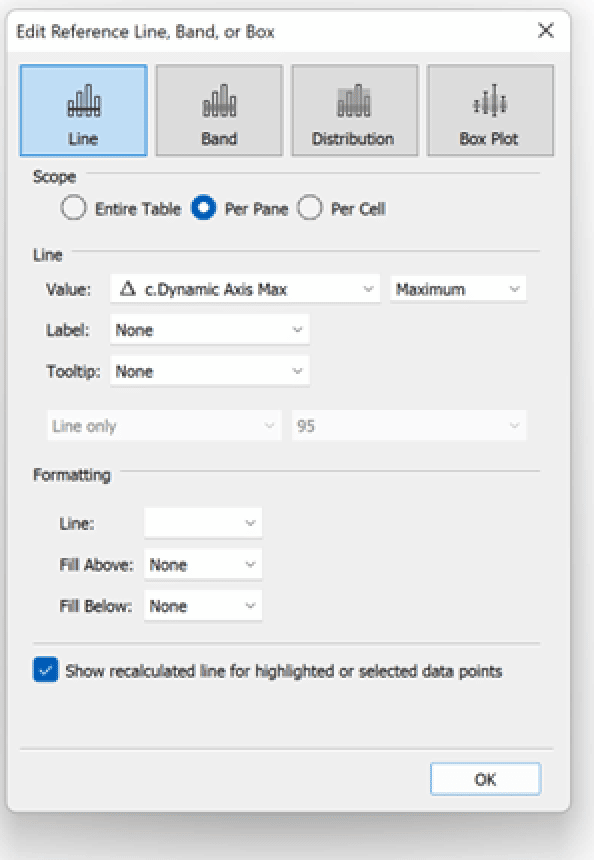
Duplicate this process a second time, only create the reference line for the calculated field c.Dynamic Axis Min. Lastly, hide the Sales axis and you will be left with a clean view similar to the image below.
And that’s it! We now have sparklines that show a high-level trend of the data, an indicator of our month over month trend, and dynamic min and max values to give context to our axis range which can be shown or hidden. I hope you have found this tutorial helpful and as always, feel free to reach out to me if you have any questions about this tutorial.
Thanks,
Dan Bunker
Senior Visual Analytics Associate
[email protected]


Written By
Dan Bunker

Peer Review
Alyssa Huff
Assoc. Director, Information Design
Related Content
The Beginner’s Guide to Tableau Table Calculations
Tableau table calculations, while very powerful, can be both tricky and confusing to work with. There are some great benefits…
How to Color Entire Tableau Charts Based on Latest Performance
I often see stock ticker gauges that show a trend for a symbol or index, but where the entire chart…

Ryan Sleeper
Display high-level trends to provide a starting point for analysis Learn how to use the generated fields, Measure Names and…