How to Color Entire Tableau Charts Based on Latest Performance
I often see stock ticker gauges that show a trend for a symbol or index, but where the entire chart is colored green or red based on the overall daily performance. I’ve shown you in the past how to highlight the latest trends, but highlighting an entire chart based on the latest trends is trickier because of the default way data is aggregated in Tableau.
I’ve also previously covered how to color entire charts based on a single comparison using level of detail calculations and Tableau’s order of operations – but I’m happy to report that I have found a much better way! This post shows you how to use the WINDOW_MAX and LAST functions to highlight entire charts based on a single comparison (i.e. this month compared to last month).
By the end of this post, you will be able to color each row (or column) in a chart based on whether the most recent performance was positive or negative.
How to Color Entire Tableau Charts Based on Current Performance
Create the sparklines to color by latest performance
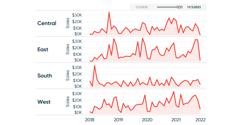
This technique works with any continuous date part including Year, Quarter, Month, Week, Day, Hour, Minute, or Second. This means you could truly recreate the stock ticker sparklines described in the introduction, but so you can follow along using the Sample – Superstore dataset, we will start with these sparklines that look at Sales by Region by Month.
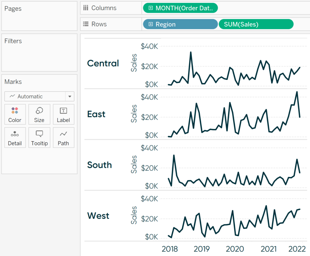
How to Make Sparklines in Tableau
Now let’s say we want to color the sparkline for each region green when the latest month-over-month change was positive and red when the latest month-over-month change was negative. This tactic requires a single calculated field that leverages the WINDOW_MAX and LAST() functions – a significant improvement compared to the three calculated fields that would be needed to do the same thing with level of detail expressions!
![]()
Continue reading with a free account, or login.
Unlock this tutorial and hundreds of other free visual analytics resources from our expert team.
Already have an account? Sign In
By continuing, you agree to our Terms of Use and Privacy Policy.
Using table calculations to determine month-over-month performance
The formula for the calculated field is:
WINDOW_MAX(IF LAST() = 0 THEN SUM([Sales]) END)
>
WINDOW_MAX(IF LAST() = 1 THEN SUM([Sales]) END)
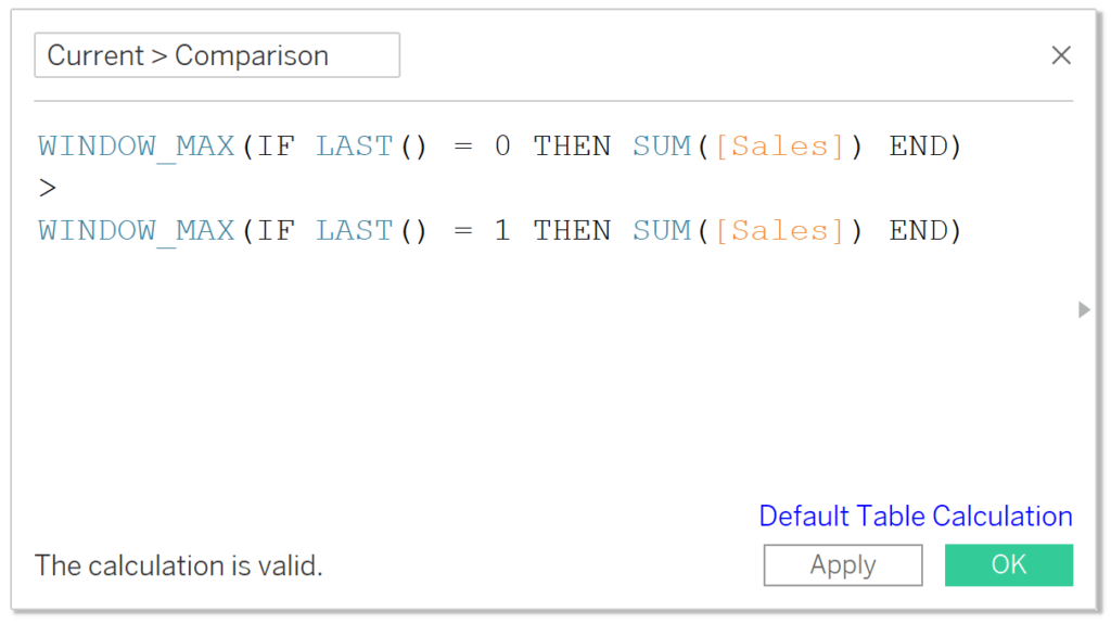
Note that you will need to replace [Sales] with whatever measure you are using in your own analysis.
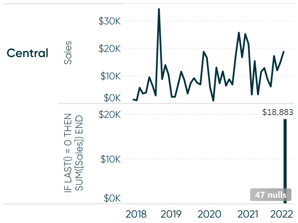
The LAST() function computes the difference between the current and last row in the partition. When a table calculation is computed by its default, Table (Across), from left to right in this case, a difference of 0 would represent the last value on the right. By using the portion of the calculation in parentheses, IF LAST() = 0 THEN SUM([Sales]) END, we are isolating the sales value for the most recent month we have data for.
That is a good start, but that portion of the formula by itself will be computed at the visualization level of detail, Month of Order Date, in this case. Well, there is only one month in the view that matches the expression LAST() = 0, December 2021 in the Sample – Superstore dataset, so we would only get December 2021’s sales values for each of the four regions.
Globally apply color to Tableau charts
Since that value will only show up on the final month, we would not be able to do the math that compares the most recent month to a previous month. By wrapping the calculation in the WINDOW_MAX function, the value of the last row will be rolled out across every date on the view.
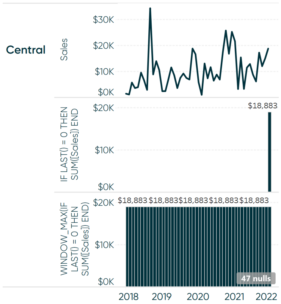
When we do the same thing for the sales values at LAST() = 1 – which represents the second-to-last value in each row – we can compare the most recent month to the second-to-last month and color the entire chart accordingly!
To do so, place the calculated field from above onto the Color property of the Marks card:
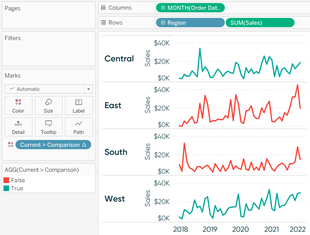
When the latest month outperformed the previous month, the entire line is colored green; when the latest month underperformed the previous month, the entire line is colored red!
![]()
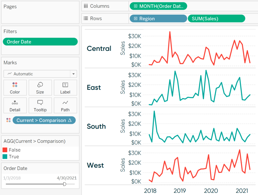
This is even dynamic when using a date filer, as seen below when I have added a filter for Month of Order Date and excluded the last eight months in the Sample – Superstore dataset.
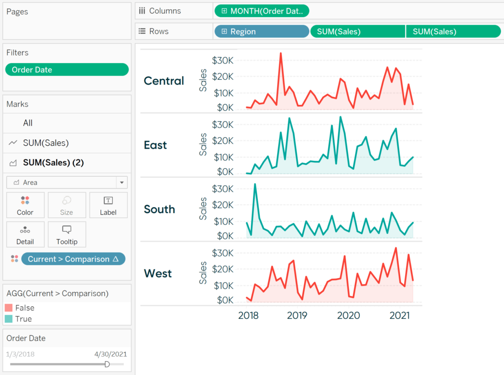
While I used sparklines as my example, this tactic works with other chart types. Here’s how the view looks after converting the sparklines to a dual-axis combination chart with a mark type of Line on one axis and a mark type of Area on the secondary axis.
Thanks for reading,
– Ryan


Written By
Ryan Sleeper
Related Content

Ryan Sleeper
Rounded Trend Bars, Custom Color Indicators, and a Labels Trick You’ll learn how to use the generated Measure Values field…
The Beginner’s Guide to Tableau Table Calculations

Tableau table calculations, while very powerful, can be both tricky and confusing to work with. There are some great benefits…
Ryan Sleeper
Leverage color to improve your designs and help communicate insights Color tips include reducing the saturation of marks, keeping color…