3 Ways to Make Magnificent Maps in Tableau
Maps are one of the most effective chart types in Tableau and are also among the easiest chart types to create. They are effective because they help us decode latitude and longitude combinations almost instantly, allowing us to see patterns between geographic locations that may otherwise be challenging to discover. They are easy to create because Tableau comes prepackaged with thousands of geographic coordinates all over the world. This makes it so that simply double-clicking on a dimension that Tableau recognizes as geographic will create a map on the view.
What’s more, Tableau maps are technically scatter plots with points at the combination of each latitude-longitude pair and an image of a map in the background. This unlocks even more applications including the ability to map anything – even if it’s not related to geography. This post will use a map of my top 10 favorite barbecue restaurants to share three ways to take your Tableau maps to the next level. Tips include a formatting trick, instructions for how to unlock additional map styles, and how to create a dual-axis map using a combination of generated and custom coordinates.
This content is excerpted from my book, Innovative Tableau: 100 More Tips, Tutorials, and Strategies, published by O’Reilly Media Inc., 2020, ISBN: 978-1492075653. Get the book at Amazon.
Tip 1: Using a dual-axis to format marks
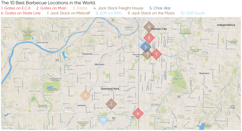
For the following three tips, we will start with this symbol map showing the locations of my top ten barbecue spots around Kansas City.
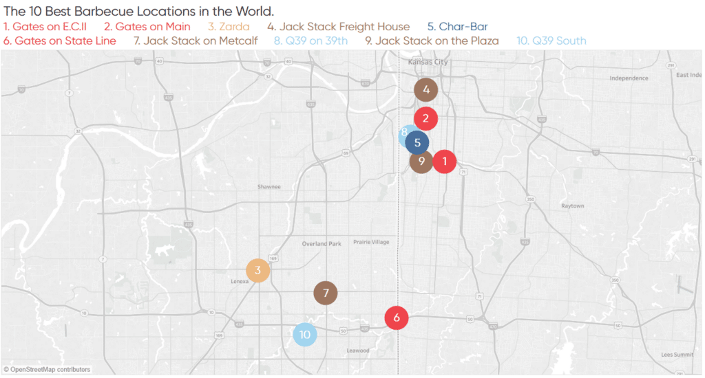
One of the effects that I like to add to symbol maps are borders and/or halos around the marks; both can be found by clicking on the Color Marks Card.
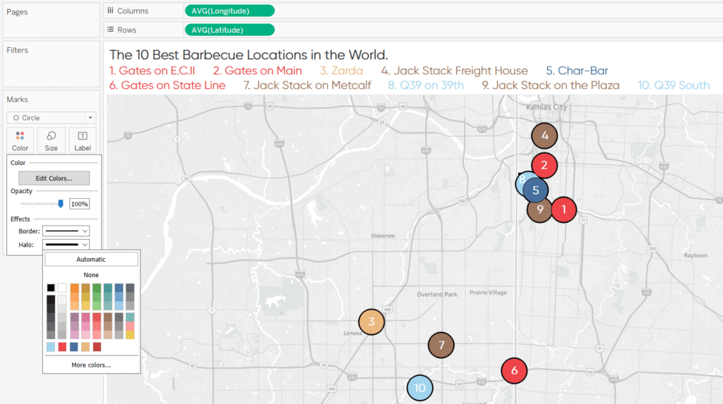
While these effects can provide a subtle professional polish to the marks, they have several limitations. Most notably, you can only choose one color at a time for both borders and halos (i.e. you can’t have a different color for each mark). Also, a tip that I always recommend is to reduce the saturation of marks by reducing the opacity to 85%, but borders and halos inherit the same transparency of the marks themselves (i.e. you can’t reduce the transparency of marks without reducing the transparency of effects). To make matters worse, halos disappear completely once the opacity is reduced to less than 90%.
Continue reading with a free account, or login.
Unlock this tutorial and hundreds of other free visual analytics resources from our expert team.
Already have an account? Sign In
By continuing, you agree to our Terms of Use and Privacy Policy.
All of these limitations can be overcome by leveraging a dual-axis to format the marks. This is a trick I picked up from my friend, Matt Hoover, who is a data scientist at Flywheel. To begin, I’ll place the Latitude measure on the Rows Shelf a second time. This creates the same map on two rows.
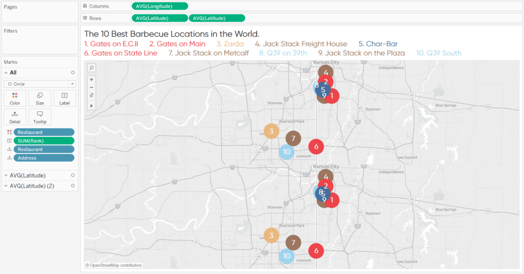
Now that there are two measures on the Rows Shelf, they each have their own Marks Shelf that can be edited independently of each other. That means I can leave the first map as is but change the mark type for the second row to Shape, choose open circles for the shape, and remove the ranking labels.
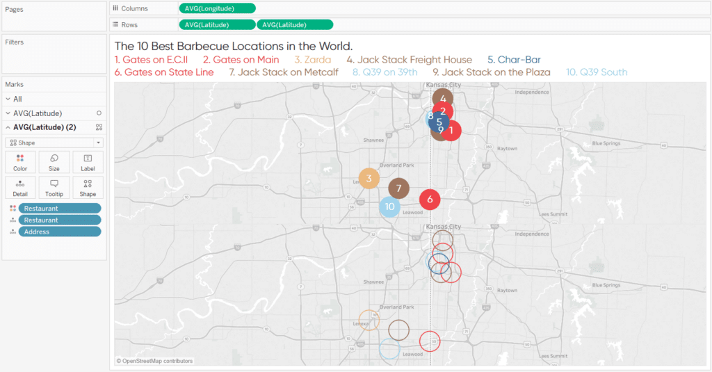
Next I will combine the maps into a dual-axis map by clicking on the second pill on the Rows Shelf and selecting “Dual Axis”.
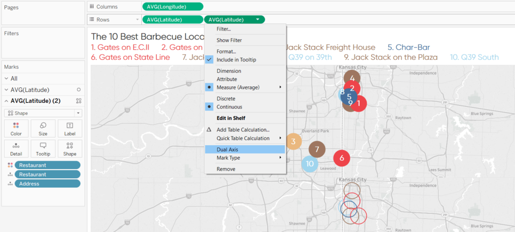
When you convert a map to dual-axis, the default behavior is for the second map to lay on top of the original map in the first row. To change the order of the marks, simply drag one of the Latitude pills in front of the other on the Rows Shelf.
Here’s how my final view looks after changing the opacity of the interior circles to 50%:
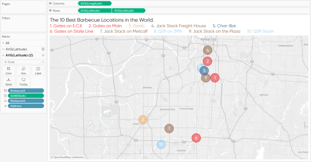
There are several design possibilities now that the marks and their borders can be edited independently of each other.
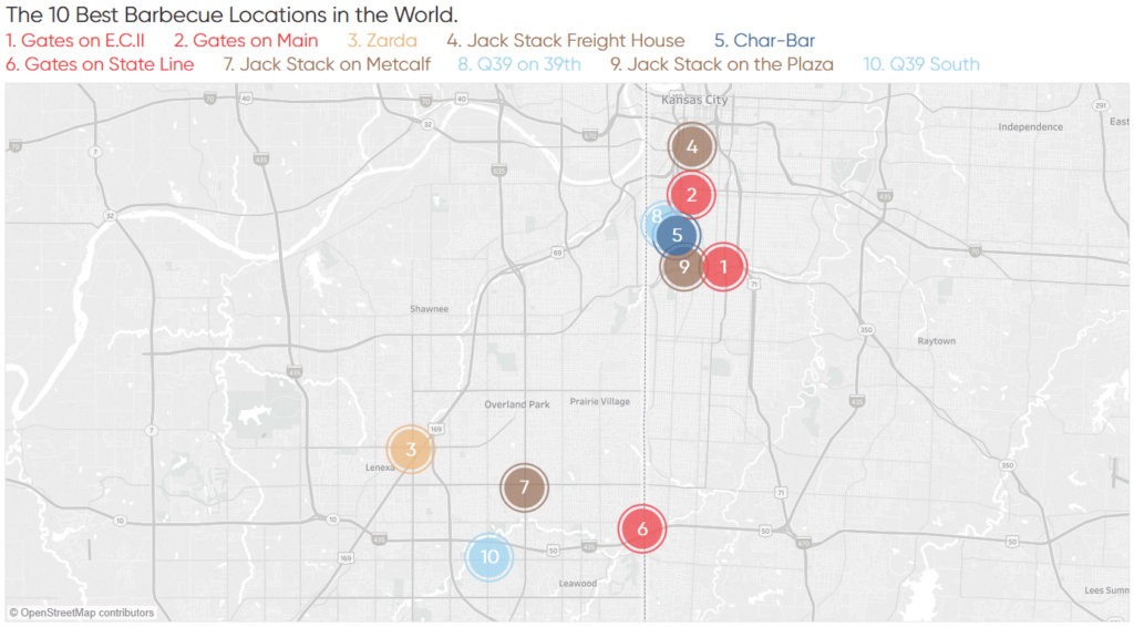
First, you can make the size of the borders larger than the size of the interior marks, creating a layered, ‘target’ effect.
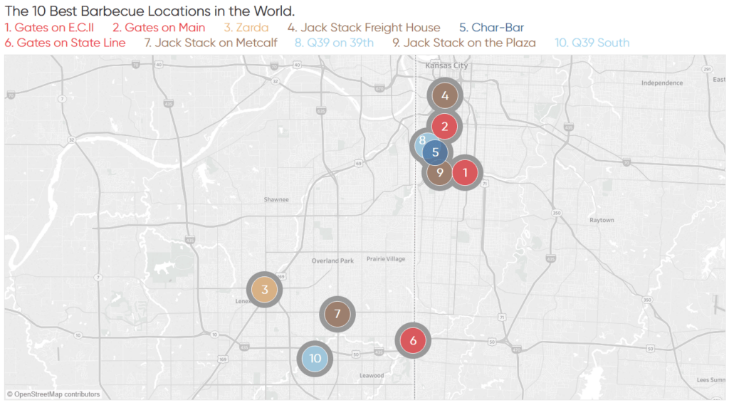
If you are simply looking to increase the size of the borders, you can change the mark type for the borders to Circle (which is the same as the interior marks), remove the dimension on the Color Marks Card for the borders, make both marks opaque, and increase the size of the borders as much as you would like.
Lastly, the dual-axis formatting effect works with any mark type. Here’s how the same map looks with closed diamonds for the interior marks and open diamonds for the borders:
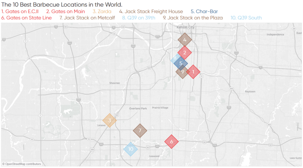
A Formatting Trick for Tableau Scatter Plots and Maps
Tip 2: Unlock 14 additional map styles by integrating Mapbox
Tableau comes out of the box with three different map styles that can be accessed by navigating to Map > Map Layers in the top navigation. The three styles in the Style dropdown menu found on the Map Layers pane are Light (the default), Normal, and Dark. A lot of Tableau users don’t know that you can access up to 14 additional styles with a simple and free integration to Mapbox.
To begin, sign up for a free account at mapbox.com.
After you’ve got an account and are signed in, find the ‘Access tokens’ tab and take note of your default access token. You will need this in Tableau to access the alternate map styles. Here’s where the token is located in my account (I have not included the token in the screenshot).

To add a Mapbox style to your map, in Tableau navigate to Map > Background Maps > Map Services.
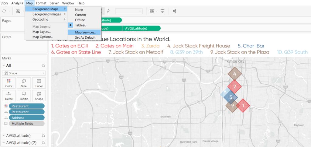
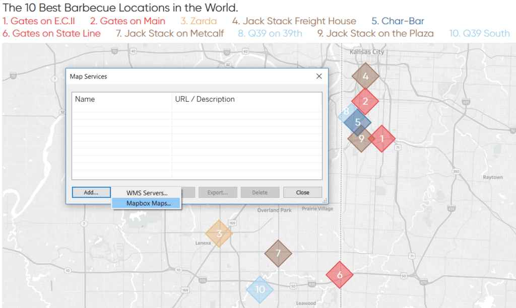
A new dialog box will appear where you need to click “Add” and then “Mapbox Maps”.
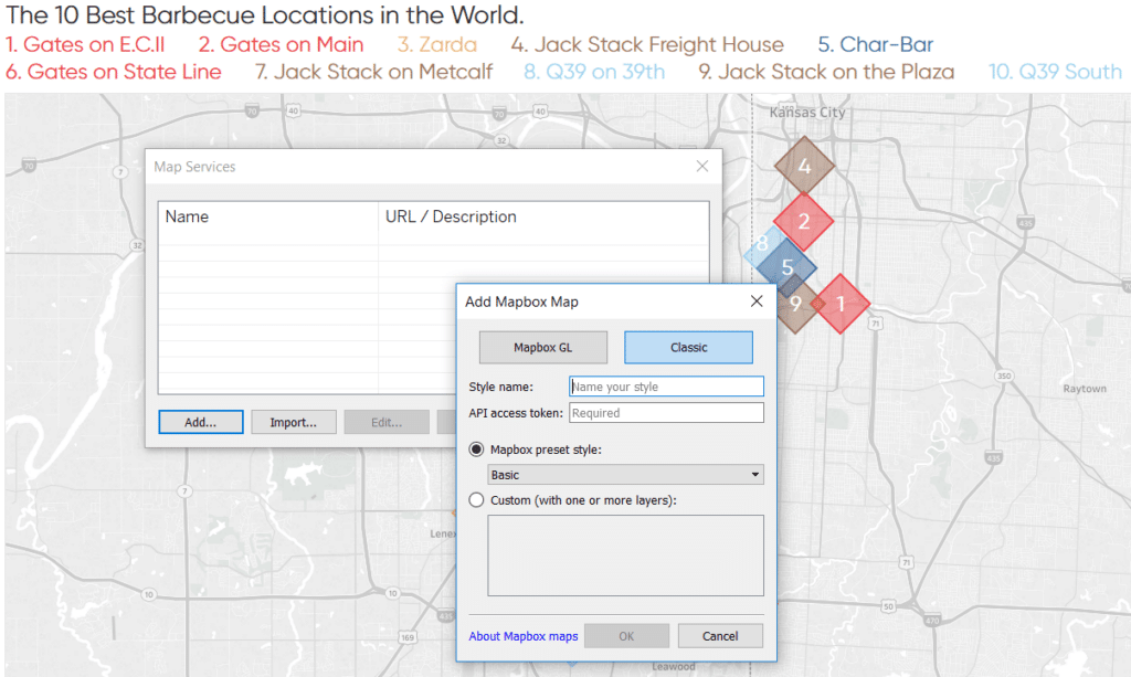
When Tableau asks you to add a Mapbox map, navigate to the Classic tab, give your name a style, and paste your default access token. The ‘Mapbox preset style:’ dropdown is where you can choose from 14 additional styles.
Click “OK” to close the first dialog box and “Close” to return to the authoring interface. Here’s what my map looks like after applying the custom “Streets” map.
Tip 3: Create dual-axis Tableau maps
As of Tableau version 2018.1, you can create a dual-axis – or layered – map, even with a combination of generated and custom latitude – longitude coordinates. This makes it possible to combine specific addresses that require custom latitude and longitude pairs in the underlying data with less granular geographic data that uses the generated coordinates in Tableau.
This has many applications. One of my favorite examples is when I worked with a client that sold their product exclusively online but had competitors that had traditional brick-and-mortar locations. We created a dual-axis map with our sales on one axis and the store locations of our competitors to identify threats and opportunities.
Let’s keep going with this barbecue example to illustrate how this is done. Let’s pretend the year is 2036. I have retired from writing about Tableau and have got the crazy idea to compete with the greatest barbecue restaurants on the planet by shipping Kansas City barbecue via drone. I’ve got a data file that shows my online orders by city and another file with the restaurant locations from the previous two tips.
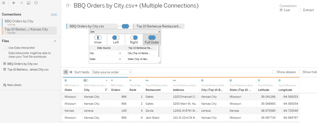
If you are in a similar situation with two separate files, the first thing you have to do is a full outer join to bring the dataset with the custom coordinates into the dataset that will use the generated coordinates. Here’s how the data prep piece looks within Tableau.
To get this to work, the first map must use the generated Latitude and Longitude measures from Tableau. These will be in your dataset automatically if you are using any field that Tableau recognizes as geographic. In my case, this is my online order data. I don’t have specific addresses that require custom latitude and longitude coordinates, but Tableau generated coordinates for me because the dataset has the City and State dimensions. I’ll make a symbol map by just double-clicking on City and adding Orders to the Size Marks Card.
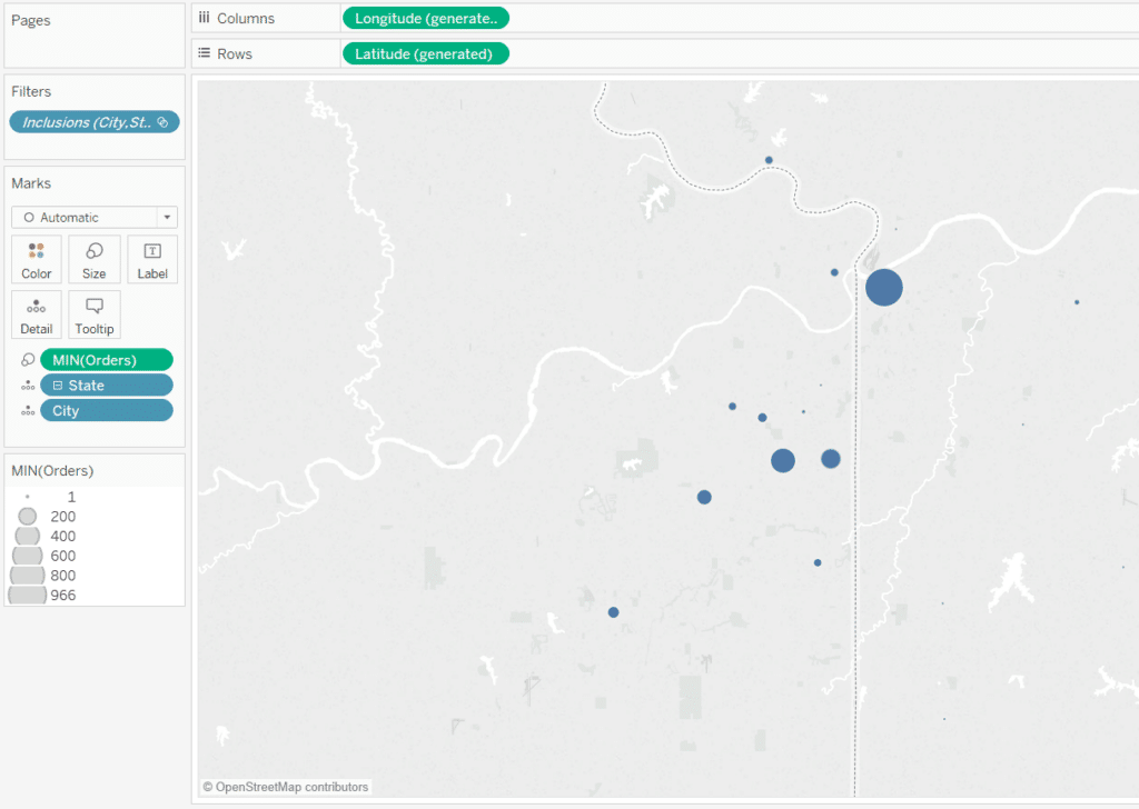
Beware that joining data sources can create duplicate rows. You may have noticed that the aggregation of my Orders measure on the Size Marks Card is Minimum, which takes the smallest number from each City-State pair to deduplicate the rows.
Next, duplicate the map by placing the generated Latitude measure on the Rows Shelf a second time.
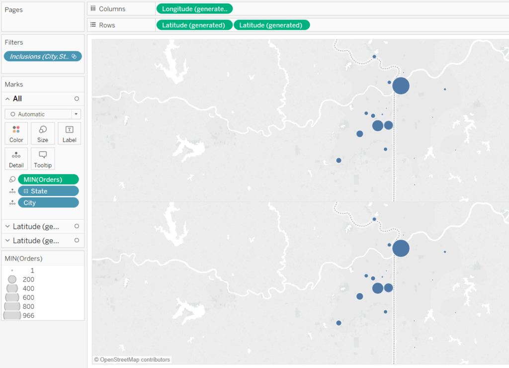
At this point, I’ve got the same map on two rows, but each row has its own Marks Shelf. This means that I can edit the maps independently of each other.
If your custom coordinates are named something other than Latitude and Longitude, you will have to take the extra step of assigning a geographic role to your custom measures. This is accomplished by right-clicking on each measure, hovering over ‘Geographic Role’, and making your selection.
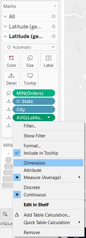
The trick to combining generated and custom geographic coordinates is to place the custom Latitude and Longitude measures on the Detail Marks Card and convert them to dimensions. You can convert measures to dimensions by right-clicking on them and choosing “Dimension”.
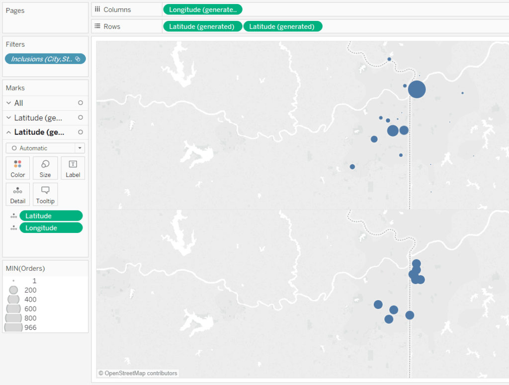
Here’s how my maps look after updating the Marks Cards for the second row to include only the custom Latitude and Longitude measures as dimensions.
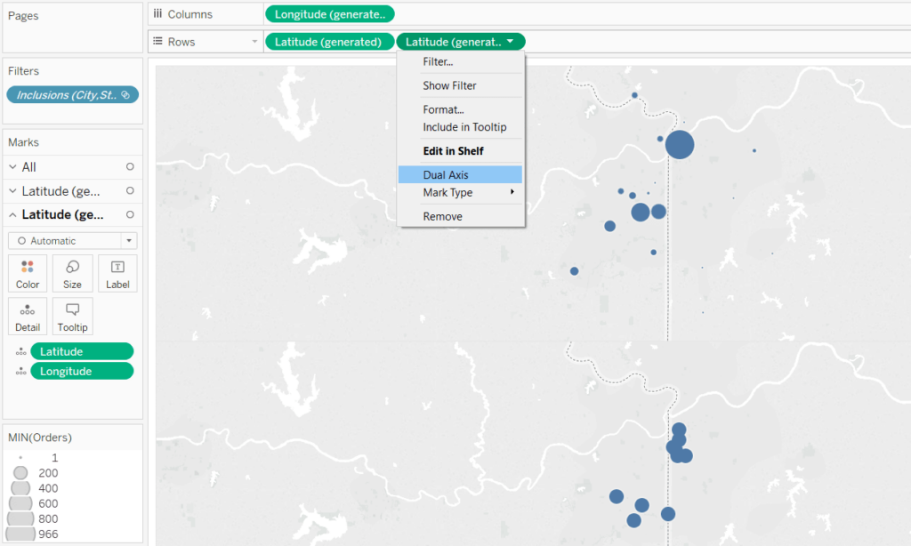
At this point, my top row is showing our online sales by city and the second row is showing the physical locations of my competitors. What’s special is we are using a combination of generated and custom latitude – longitude pairs! I will now combine the layers into a dual-axis map by clicking on the second Latitude measure on the Rows Shelf and selecting “Dual Axis”.
Here’s what my final map looks like after changing the formatting so the circles are my online orders – sized by sales – and the black diamonds are the competing restaurants.
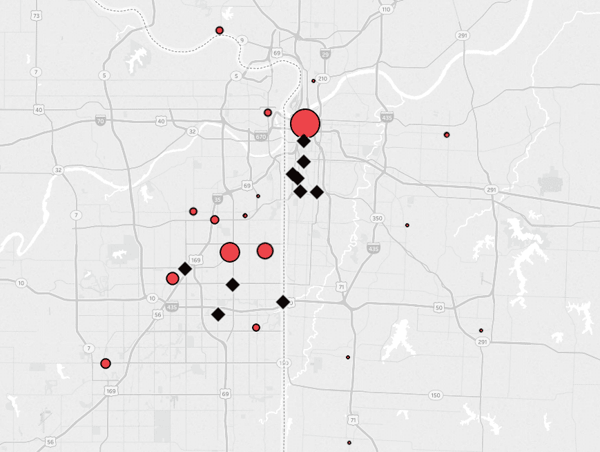
It looks like the biggest opportunity is far north where the competitors do not have a presence. Maybe I’ll buy a billboard in this area. We’re also doing fairly well down south in the empty space between physical restaurants. Maybe we should advertise in the popular mall that’s located near there. Both of these are insights and actions that would not have been visible without this dual-axis map using a combination of generated and custom latitude – longitude coordinates!
An Introduction to Mapping in Tableau
Thanks for reading,
– Ryan
Related Content
Ryan Sleeper
Create Perfect Marks and Borders by Leveraging a Dual Axis Mark effects like borders and halos (for maps) have limitations…
Ryan Sleeper
Create and Encode Custom Shapes Using Any Image We’ll have some fun mapping custom polygons on a baseball stadium. You’ll…
Ryan Sleeper
Drill from State to City (and Back!) on One View Learn how to use sheet swapping in Tableau to seamlessly…

