3 Ways to Make Stunning Scatter Plots in Tableau
When it comes to my favorite chart types, scatter plots are a close third behind bar charts and line graphs. In several industries, and especially scientific journals, scatter plots are the favorite choice because of their ability to reveal and communicate correlations. Another benefit of this chart type is it is one of the few visualizations that allow you to view many marks in a small space. No, you cannot analyze every individual mark because they will likely overlap, but scatter plots in Tableau make it easy to identify outliers and the aforementioned correlations.
But wait – there’s more! Due to the way scatter plots in Tableau are set up with a measure on each axis, adding reference lines for the average of each axis creates a natural four-quadrant segmentation. This is a great technique for isolating different groups so you can act on them individually.
This post will show you how to make scatter plots in Tableau and take them to the next level in three ways. We’ll cover (1) a formatting trick to make your scatter plots stand out, (2) ideas for maximizing the data-ink ratio in the context of scatter plots, and (3) a calculated field that will automatically break your dimension members into four usable segments.
This content is excerpted from my book, Innovative Tableau: 100 More Tips, Tutorials, and Strategies, published by O’Reilly Media Inc., 2020, ISBN: 978-1492075653. Get the book at Amazon.
FAQs answered in this post:
When should I use scatter plots for business analytics?
Scatter plots work best when you need to reveal correlations between two measures, identify outliers, or analyze many data points in a compact space. By adding reference lines for the average of each axis, you create a natural four-quadrant segmentation that lets you isolate different groups and act on them individually—like identifying high-performing products versus underperforming ones that need different strategies.
How do I create a scatter plot in Tableau?
Place your dependent measure on the Rows Shelf to form the y-axis and your explanatory measure on the Columns Shelf to form the x-axis. Add a dimension to the Detail Marks Card to make your analysis more granular, then change the mark type to Circle. You can also create a scatter plot by double-clicking the first measure, then double-clicking the second measure—Tableau automatically creates a scatter plot when starting with two measures.
How do I format scatter plot borders independently from the marks?
Place your dependent measure on the Rows Shelf twice, then convert to a dual-axis scatter plot by clicking the second occurrence and selecting “Dual Axis.” Right-click either y-axis and choose “Synchronize Axis” so both plots overlay perfectly. Now each measure has its own Marks Card—reduce opacity on the first set of marks and change the second to Circle mark type. This creates borders that match the underlying mark colors with independent formatting control.
What is data-ink ratio and how does it apply to scatter plots?
Data-ink ratio, introduced by Edward Tufte, means maximizing the proportion of ink devoted to data versus non-data elements. For scatter plots, this means removing redundant axis tick marks by fixing them at meaningful intervals, eliminating unnecessary borders and zero lines, and using lighter dotted grid lines. The goal is to focus attention on the data itself rather than chart decoration, making insights easier to spot at a glance.
How do I create four-quadrant segmentation in Tableau scatter plots?
Add average reference lines to both axes by dragging “Average Line” from the Analytics pane onto your view. To make this segmentation permanent and actionable, create a calculated field using WINDOW_AVG that assigns each dimension member to a quadrant based on whether it’s above or below the average for each measure. Place this calculated field on the Color Marks Card and change the addressing to compute at your dimension level. Schedule a complimentary strategy call to learn how Playfair Data helps organizations implement advanced segmentation strategies.
What are table calculations and how do I use WINDOW_AVG?
Table calculations are computations applied to values already in the view, rather than at the data source level. WINDOW_AVG calculates the average across a specified scope or “window” of data. By default, table calculations compute from left to right, but you can change the addressing by clicking the delta symbol on the pill, hovering over “Compute Using,” and selecting your dimension. This makes WINDOW_AVG perfect for comparing individual values against the average to create dynamic segmentation.
How to make a scatter plot in Tableau
Scatter plots are created with two to four measures, and zero or more dimensions. The first two measures form the y-axis and x-axis; then the third and/or fourth measures as well as dimensions can be used to add context to the marks. For all three of the following tips, we will start with this default scatter plot comparing profit ratio and sales by sub-category in the Sample – Superstore dataset.
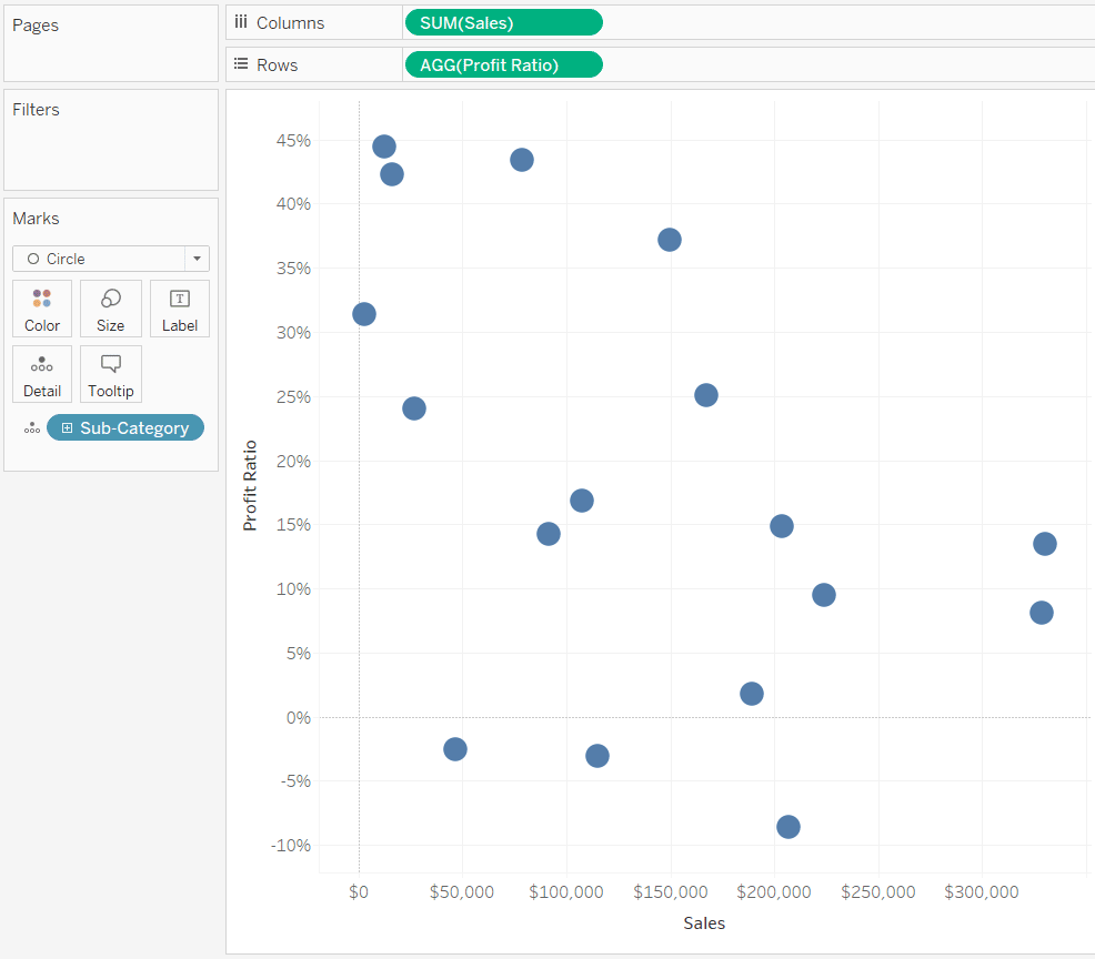
This chart was built by putting my dependent measure of Profit Ratio on the Rows Shelf to form the y-axis, and my explanatory measure of Sales on the Columns Shelf to form the x-axis. I then put the Sub-Category dimension on the Detail Marks Card to make my analysis more granular and changed the mark type from Shape to Circle.
Scatter plot in Tableau is the default chart type when starting with two measures, so I could have started this chart by simply double-clicking on the Profit Ratio measure from the Measures area of the Data pane and then double-clicking on the Sales measure from the Measures area of the Data pane. Since it is best practice to put the dependent measure on the Y-axis, and the explanatory measure on the X-axis, Tableau will place the first measure you double-click onto to the Rows Shelf and second measure you double-click on the Columns Shelf.
You can immediately see a correlation showing that as profit ratio increases, sales tend to decrease, but we’re going to keep building on this scatter plot to make it more engaging and functional.
Exercise – Make a Scatter Plot in Tableau
Tip 1 – A formatting trick for better mark borders
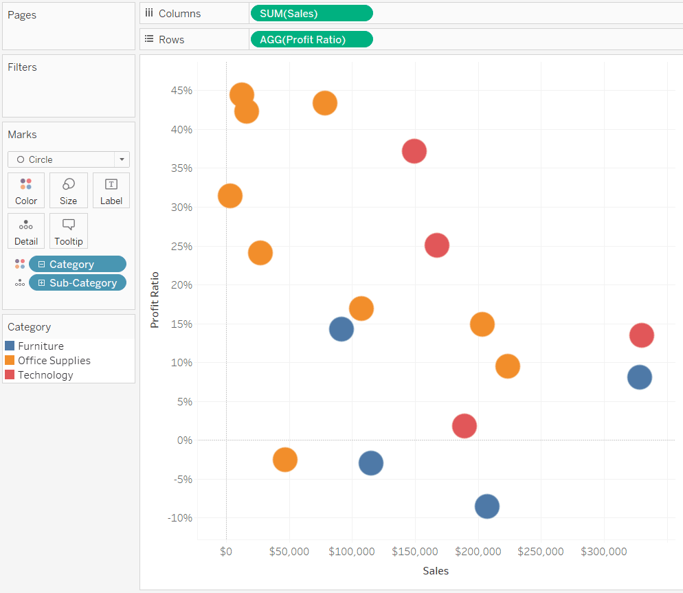
As mentioned in the introduction to this post, one of the benefits of scatter plots is that you can evaluate a lot of marks in a small space. However, this often creates overlapping marks. This is easy to alleviate by clicking on the Color Marks Card and reducing the opacity of the marks, but it doesn’t work great with mark borders. Borders are an effect on the Color Marks Card that I often like to add, but they do not inherit the opacity of the underlying mark and you can also only pick one color for all marks. The following trick allows you to control the marks and their borders independently, unlocking a great deal of formatting flexibility. To help demonstrate, I’ve added the Category dimension to the Color Marks Card of our default scatter plot and made the marks slightly larger.
To format marks and their borders independently, place the dependent measure on the Rows Shelf next to itself a second time. This will create the same chart on two rows. Convert the two rows to a dual-axis scatter plot by clicking on the second occurrence of the measure on the Rows Shelf and clicking “Dual Axis”.
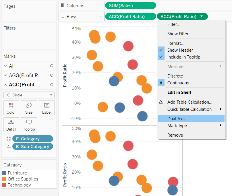
Lastly, ensure the dual axes are synchronized by right-clicking on either y-axis and choosing “Synchronize Axis”. Both scatter plots are now laying right on top of each other. What’s important here is now that we’ve added a second measure to one of the shelves, they each have their own set of Marks Cards which can be edited independently of each other. This means we can do things like reduce the opacity of the original marks and change the mark type of the second set of marks to Circle.
Check it out – borders that match the color of the underlying mark!
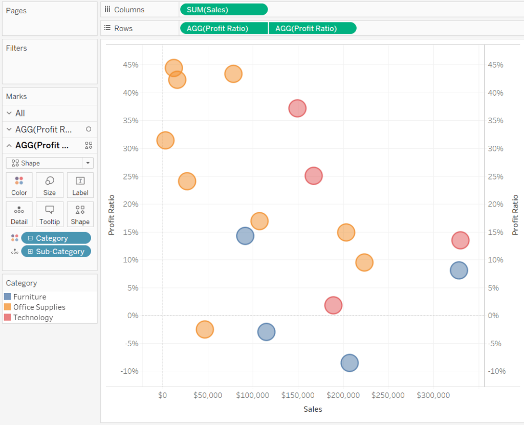
We obviously don’t need to see the second y-axis any more so you can hide that by right-clicking on it and deselecting “Show Header”.
A Formatting Trick for Tableau Scatter Plots and Maps
Tip 2 – Maximize the data-ink ratio
Many of my tips for improving the design of Tableau dashboards are related to Edward Tufte’s “data-ink ratio”. One of the tenets of the data-ink ratio is that you should remove redundant data, which in my opinion, often shows up in the form of too many axis tick marks. This is easy to clean up in Tableau by right-clicking on an axis, choosing “Edit Axis…”, and making the “Fixed” selections on the “Tick Marks” tab.
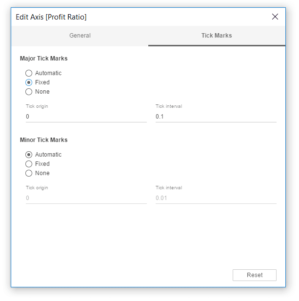
Here’s how my scatter plot in Tableau looks after fixing the tick marks of the y-axis at 10% increments and the x-axis at increments of $100,000.
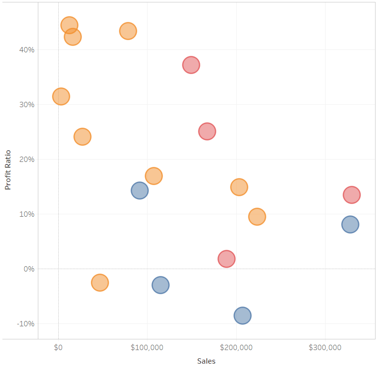
Beware that once you fix tick marks, they are truly fixed. This is okay for static charts or axis ranges that do not fluctuate much but can cause issues if the values on your axes vary widely.
In this case, fixing the tick marks improved the design of our chart, but with scatter plots, I like to take this concept a step further. First, I’ll remove all extra lines including borders and zero lines (optional depending on your analysis). You can do this by right-clicking anywhere on the chart, clicking “Format…”, and making your changes to the “Borders” and “Lines” tabs; these are the fourth and fifth icons at the top of the Formatting pane. Here’s how the scatter plot in Tableau looks after changing the Row Dividers, Column Dividers, and Zero Lines to None.
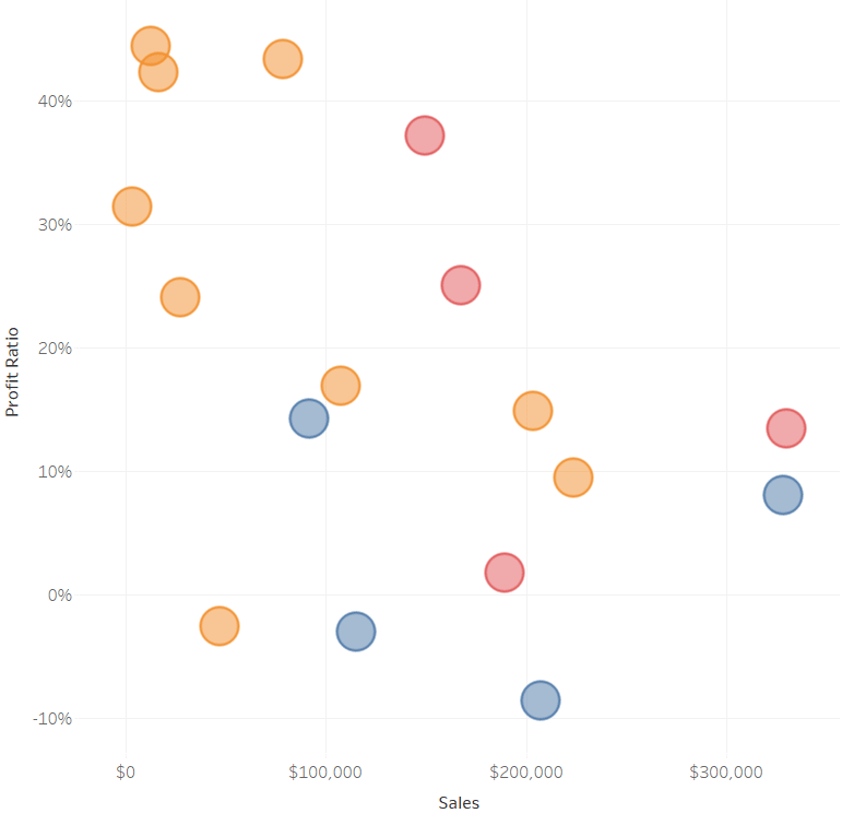
Lastly, I’ll change the Formatting of the Grid Lines so they are dotted and have a heavier weight. Here’s how my final view looks after making this change and putting the fonts in brand.
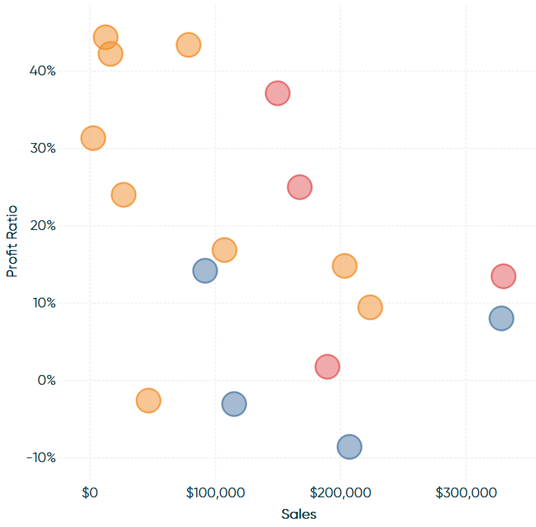
Compare this version to the default scatter plot at the beginning of this post!
Tip 3 – Make the scatter plot functional with a segmentation calculated field
I mentioned in the post introduction that adding reference lines for the average of each axis creates a natural four-quadrant segmentation. Next, I will share a way to make that segmentation permanent through a calculated field. This will allow you to isolate the four segments so you can evaluate and act on them individually based on their behavior. To begin, I’ll add an average reference line to each axis by navigating to the Analytics pane (just to the right of the Data pane on the left) and dragging Average Line onto the view.
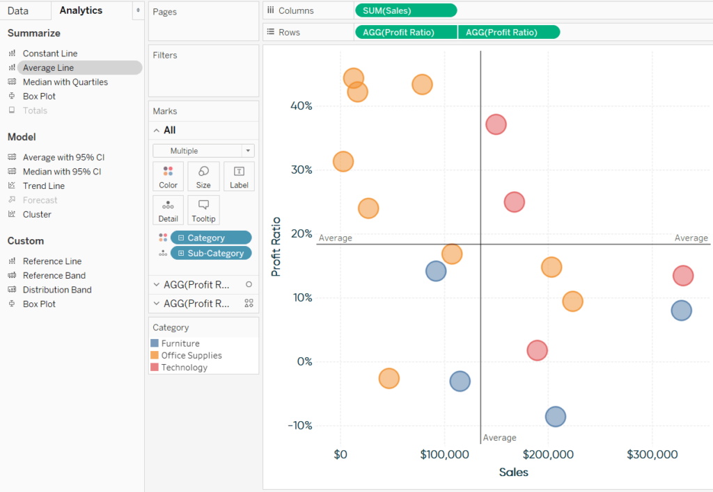
Depending on the number of axes on the view, dragging Average Line from the Analytics pane to the view can be a little confusing. This is because you must choose both the axis and the scope of the reference line. If you prefer, you can also add reference lines by simply right-clicking on each axis and choosing “Add Reference Line”.
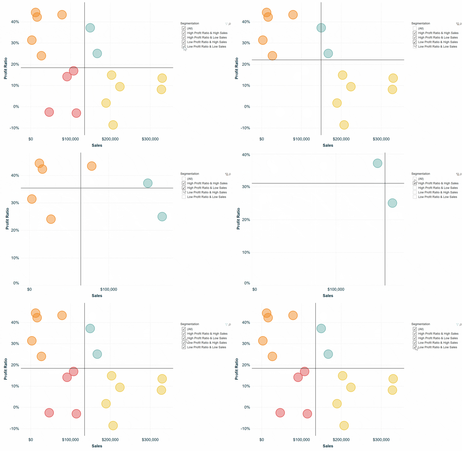
Notice we now have four quadrants on the view. The top-left corner are the sub-categories with a high profit ratio and low sales; the top-right are those with a high profit ratio and high sales; the bottom-right are those with a low profit ratio and high sales; the bottom-left are those with both a low profit ratio and low sales. Depending on the dimension members in your analysis, you very likely may want to act on these four groups in different ways.
To isolate each group, you could select the dimension members in each quadrant by dragging a box around them and creating sets. A better method would be to write a calculated field to match the four-quadrant segmentation being shown, then place the calculated field on the Color Marks Card. This has several advantages including (1) makes it apparent to you and your end users what segmentation you’re evaluating (2) guarantees you are placing the correct dimension members into the correct sets (which can be difficult if some dimension members are close to the reference lines), and (3) provides a means for filtering for easier set creation.
Continue reading with a free account, or login.
Unlock this tutorial and hundreds of other free visual analytics resources from our expert team.
Already have an account? Sign In
By continuing, you agree to our Terms of Use and Privacy Policy.
As always, there is more than one way to accomplish the same objective in Tableau, but I think the easiest approach in this use case is to create a calculated field using the WINDOW_AVG table calculation. Here’s the formula for our four-quadrant segmentation:
IF [Profit Ratio] > WINDOW_AVG([Profit Ratio]) AND SUM([Sales]) < WINDOW_AVG(SUM([Sales])) THEN “High Profit Ratio & Low Sales”
ELSEIF [Profit Ratio] > WINDOW_AVG([Profit Ratio]) AND SUM([Sales]) > WINDOW_AVG(SUM([Sales])) THEN “High Profit Ratio & High Sales”
ELSEIF [Profit Ratio] < WINDOW_AVG([Profit Ratio]) AND SUM([Sales]) > WINDOW_AVG(SUM([Sales])) THEN “Low Profit Ratio & High Sales”
ELSE “Low Profit Ratio & Low Sales”
END

You could also use this calculation to parameterize the measures being used and/or give the segments aliases that are relevant to your business (i.e. rising stars, cash cows, dogs, etc.).
Once you’ve got the calculation, place it on the Color Marks Card.
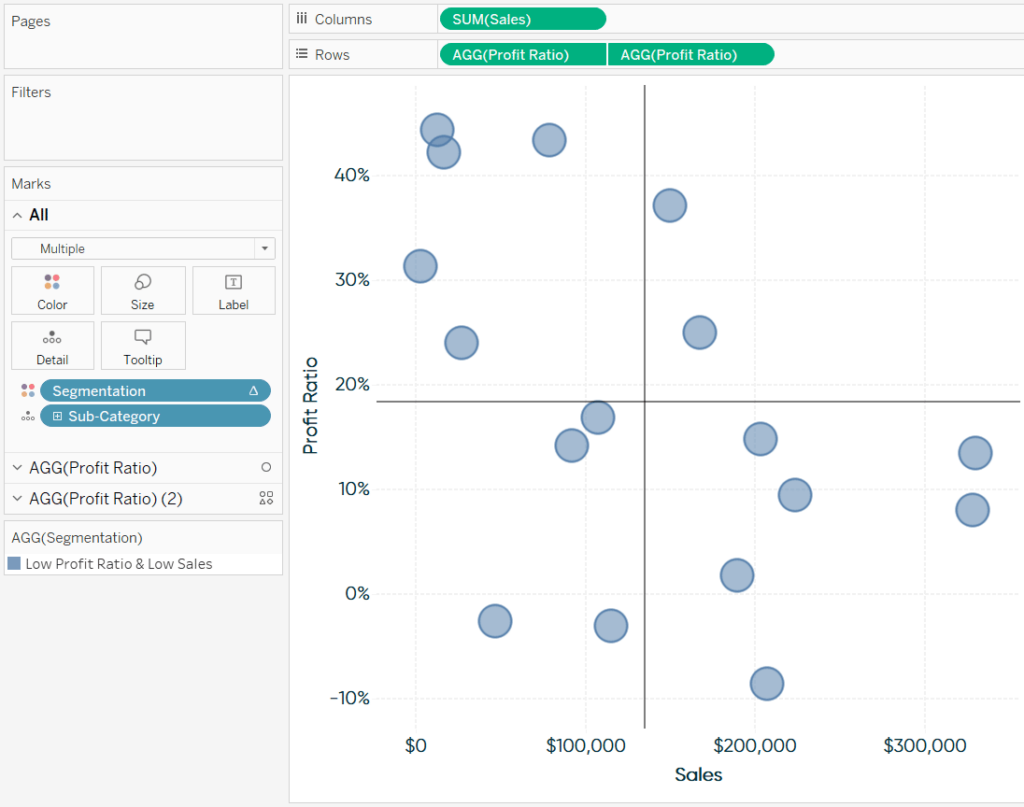
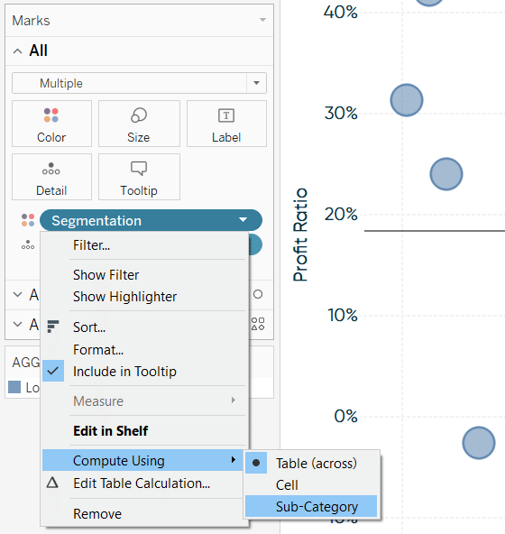
As you can see, so far all the marks have the same color. This is because, by default, table calculations (including WINDOW_AVG) are computed from left to right. We need to change the addressing of the table calculation from the default Table (across) to the level of detail we are segmenting: Sub-Category. This can be achieved by clicking on the measure with the delta symbol (Δ), hovering over “Compute Using”, and choosing “Sub-Category”.
An Introduction to Tableau Table Calculations
Here’s how the Tableau scatter plot looks after changing the addressing and choosing colors for each of the four segments.
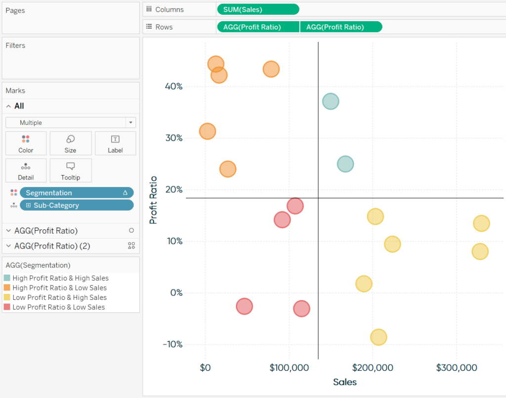
In a real-world business context, we may want to handle these product segments differently. Remember this segmentation can be used with any dimension relevant to your business, so you may be segmenting different regions, marketing channels, or customers. From here, it is very easy to isolate a segment using just two additional steps.
Let’s say we see an opportunity to improve our bottom line by focusing on the High Profit Ratio & Low Sales segment. These sub-categories are not selling much, but they’re very profitable when we do sell them. Perhaps we can do a promotional campaign to drive sales to the highly profitable products, or maybe we just want to further evaluate what’s making them profitable versus the other low-selling segment.
First, filter the view by right-clicking on the segment of interest on the color legend and choosing “Keep Only”.
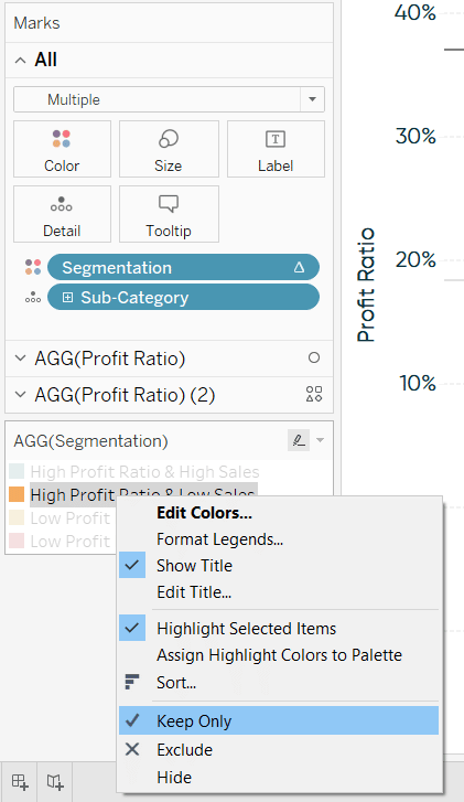
This will leave only the segment of interest on the view. Next, drag a box around the marks, right-click any one of them, and choose “Create Set…”.
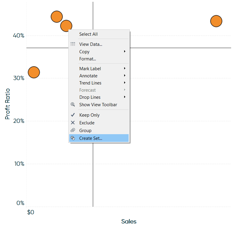
After giving the set a name and clicking “OK”, you will have an isolated set of the dimension members in your segment over in the Sets area of the Data pane. For some ideas on using this, see An Introduction to Sets in Tableau.
Thanks for reading,
– Ryan
Related Content
Ryan Sleeper
‘Connect the dots’ to help your audience read scatter plots This video will show you how to make connected scatter…
Dashboard Element 2: The Parameterized Scatter Plot
In the last post, I showed you how to build a current performance versus comparison performance index callout; one of…
Ryan Sleeper
Drill In and Out of Segments with a Single Click We’ve shown you before how scatter plots create a natural…

