A Quick Start Guide to Tableau Prep

In this tutorial, we’ll be covering the Tableau Prep tool and how we can use it to build out data workflows. If you are a data engineer, data enthusiast, or just all-around curious, then this is the place for you. We’ll cover everything from launching Tableau Prep, to aggregations and grouping, filtering, cleaning, and applying calculations to your data. Finally, we’ll explore the output options so you can take your newly refined dataset and use it for anything you want.
Getting started in Tableau Prep
Like with any new software, navigating your way around for the first time can be a daunting task. To help make this experience less stressful, I am going to highlight key areas throughout Tableau Prep that should be your main areas of focus as a beginner.
Continue reading with a free account, or login.
Unlock this tutorial and hundreds of other free visual analytics resources from our expert team.
Already have an account? Sign In
By continuing, you agree to our Terms of Use and Privacy Policy.
The above image is the first landing page that you will be greeted with every time Tableau Prep is launched. Let’s work our way from left to right; starting in the top-left corner, you should see an arrowhead pointing to the right. If you click on that you will see a button called “Connections +”.
Tip: An important note here is that whether you click on “Connections +” or “Connect to Data”, both will lead you to the exact same window, so go with whichever feels more organic to you.
Once you’ve clicked on that, you should see a menu that looks like the image below:
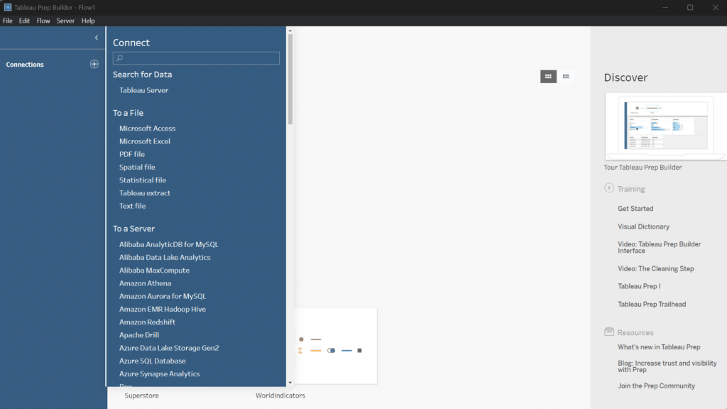
This menu is packed with many different data connectors, which allows you to connect to basically any form of data storage you may be working with, from standard Excel documents all the way to data warehouses. For this exercise, we’ll be working with the Sample Superstore dataset provided by Tableau.
Note: If you don’t have a copy of the Sample Superstore dataset, you can use any data source you want; most of the tips covered from here on out can apply to any dataset you’re working with.
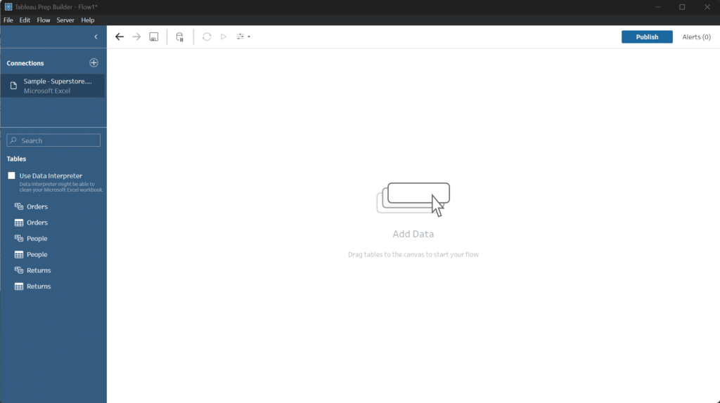
Once you’ve connected to the dataset, you should see this empty canvas where we can start loading in our data for processing.
Tactics for using Tableau Prep for the first time
Now that we’ve covered how to connect to data in Tableau Prep, we are ready to dive right into some of the different tools you can use to build out a workflow.
The first thing I like to do is create a plan of what the overall goal I want to accomplish is and break that down into bite-size chunks. For example, if I want to know which category in my dataset is the most profitable in each region, I would need to start by splitting the data by each region. From there, I’d want to take a sum of sales in each respective region, and with that, I could deduce which category has the highest sales in each region. Now, let’s carry an exercise like this out to see what it looks like in Tableau Prep. We’ll start by dragging our “Orders” table onto the canvas and then adding an aggregation step by clicking the plus button on the data input:
Aggregations
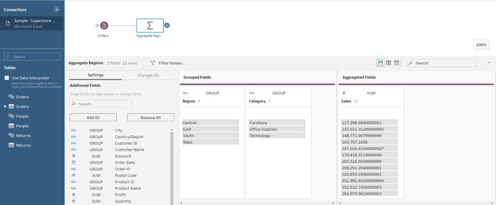
When we add an aggregation step, you’ll see a Grouped Fields and an Aggregated Fields window. The Grouped Fields pane is as the name suggests, i.e. it’s where you drag and drop the fields that you want grouped together. The aggregation window is where you’ll drag and drop the fields that you want to aggregate in some way, shape, or form. This can be taking a count of the items in that column, the sum, or even a minimum or maximum. To access these different grouping options, click where it says ‘Sum’.
Tip: Different data types will produce different options when grouping, so if you don’t see the option you are looking for, make sure to double-check what data type your column is set as). In this specific instance, I want to group by region and category to calculate the sum of the sales.
Once we’ve aggregated our regions down, we can now work on isolating the top-selling category.
Filtering, cleaning, and applying calculations
To do this, we’ll take advantage of the calculated fields option as well as filtering (Tip: Calculated Fields are similar to Calculated Fields used in Tableau Desktop as well). Start by adding a clean step to the flow by clicking the ‘+’ button. From there, in the bottom pane, select Filter Values along the top bar, which should bring up a text box for us to type a condition into:

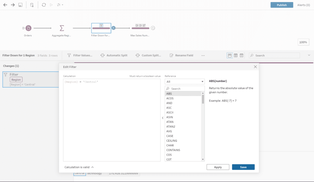
For this exercise I picked the “Central” region to isolate first, but I encourage you to go back and try out other ones as part of the learning process. Once we have our region isolated we can see our three categories and the sum of sales from our previous aggregation steps. We now just need to organize these in descending order to figure out which one has the highest sales, which we can use calculated fields for. Before diving into the specifics of how to get there, our goal from this point is to sort our data from highest sales to lowest.
To accomplish our sorting, we need to add another clean step. Select the ‘Create Calculated Field’ option along the top of the Results pane at the bottom of the screen. Similar to our filter, we should now get a popup box allowing us to create a formula using the built-in functions outlined by Tableau. I’ll be using the Orderby function this time around, which resembles the image below:

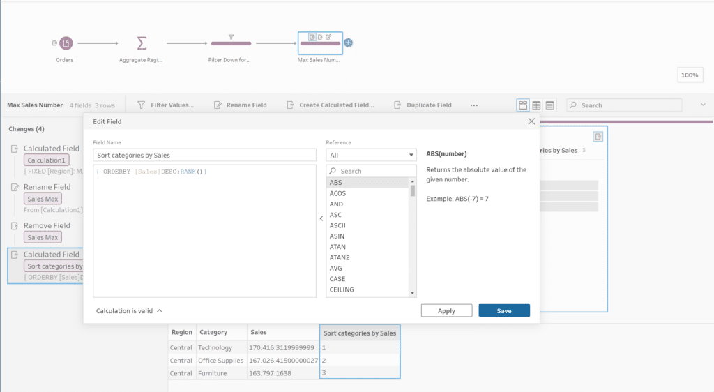
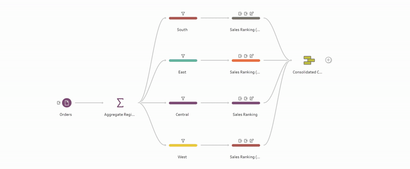
Under the box containing our newly crafted formula, you can see that our data has been sorted with ‘Technology’ ranked 1 at the top. Now if we wanted to repeat this for the other subsequent regions and merge those together to create a final dataset, we could update our flow to look something like this:
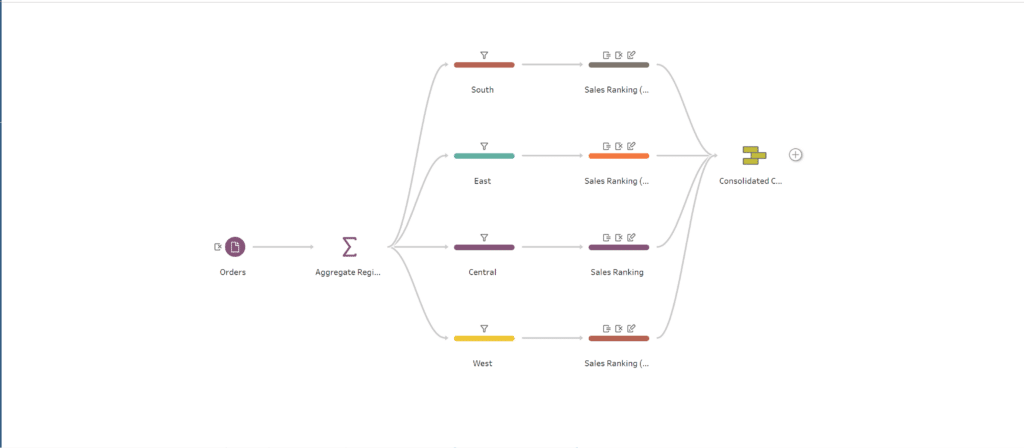
Using the filtering and aggregation steps performed before, we can create separate streams off of our original flow then combine them back together using either a join or union (in this case a union).
Outputting our data
Now that we have explored some of the different tools that Tableau Prep provides to process our data and build out a workflow let’s discuss how to actually output our final product.
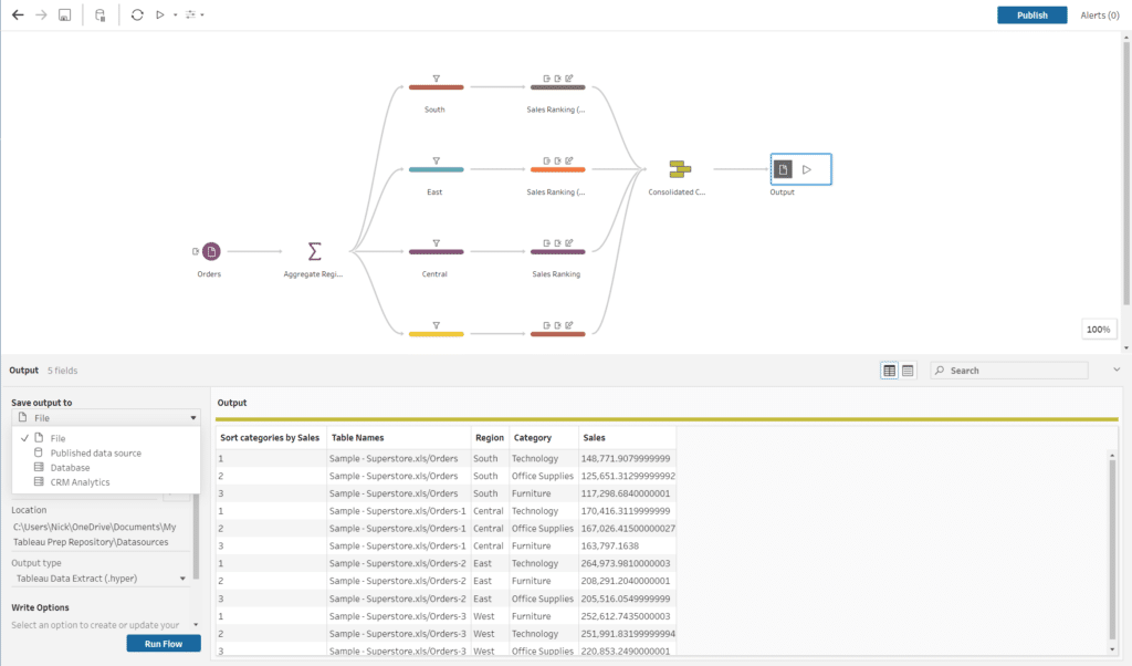
From the above image, you can see that we have four main options when choosing our output type. Let’s briefly explore what these options are:
-
- File – This option allows us to output our dataset as either a Hyper file, Excel Workbook, or CSV file.
- Published Data Source – Allows us to publish our dataset to a Tableau Server if we want to create a Live connection that we could then access through Tableau Desktop (Note: You will need to sign in to a server in order to use this option).
- Database – Allows us to connect and push our dataset to a database such as Snowflake or BigQuery.
- CRM Analytics – This is a relatively new offering from Tableau and Salesforce that allows you to integrate with the Customer Relationship Management system. If you want to learn more, you can do so by visiting the Tableau CRM FAQ here.
In this tutorial, we will be writing our output as a Hyper file to then be used within Tableau Desktop. We’ll start by configuring our output settings as shown below:
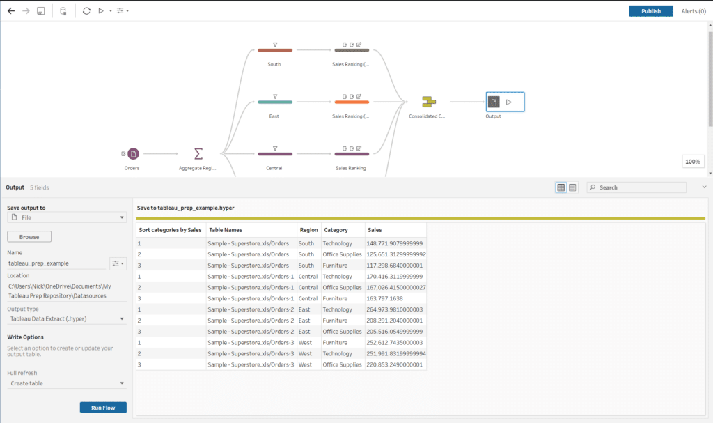
Now that we have configured our output settings, all that is left to do is hit the ‘Run Flow’ button at the bottom of the Configuration pane and let Tableau Prep handle the rest.
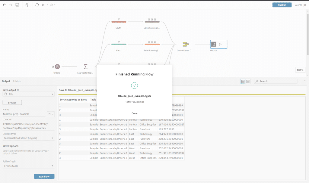
If everything has run successfully, you should see a popup similar to the image shown above.
Conclusion
Through this exercise, you learned how to connect to a data source using the Connections pane, set up a basic workflow with a couple of tools, and explore some of the cleaning and manipulation options available in Tableau Prep. While the concepts we covered in this tutorial covered a specific use case, there are plenty of high-level functions you can perform; I encourage you to take some time to learn about them and experiment in your next data project. Thank you for reading, and I hope that you are motivated to explore further as you continue on your data adventure. Don’t forget to keep your eyes open for new data engineering-centered Playfair content!
Thank you for reading, and best of luck!
Nick

Written By
Nick Cassara

Peer Review
Dan Bunker
Manager, Decision Engineering

Peer Review
Ethan Lang
Sr. Director, Enterprise Intelligence
Related Content
How to Pivot, Unpivot, and Double Pivot Data in Tableau Prep
One of the first topics I cover during my live training events is what I view as the single biggest…

Ryan Sleeper
Tableau’s Creator, Explorer, and Viewer License Options Which Tableau product is best for you? It’s important to remember that Tableau…
Ryan Sleeper
Start on the right foot by properly preparing data for Tableau The single biggest barrier to Tableau adoption is properly…