How to Flag Rows of Interest in Tableau

A “row of interest” can vary from project to project. A simple example would just be to mark rows where a specific data point was above or below a predetermined threshold. In this tutorial, I am going to show you how to flag “rows of interest”. However; instead of flagging which values are simply above and below a predetermined threshold, I will show you how to flag rows that are anomalies compared to the rest.
One of the main reasons behind investing time and resources into data visualization is to be able to quickly identify key pieces of information hidden in the data. Sometimes a simple line chart is useful to call out the peaks and dips in your data over time. Other times a bar chart is the best option to compare a specific measure between different categories. However, there are times when you want to have a variety of different data points on hand and the most efficient option is a text table.
Plain text tables lose the visual aspect that most chart types naturally have. You have all the data but you no longer have the visual indicators that draw the eye to important information. Even so, text tables are often used to gather all the information into one view. That gives us an opportunity to get creative in how we call out the most important information.
How to do Automatic Anomaly Detection in Tableau
Creating the logic to flag rows of interest
The underlying strategy is to use the average and standard deviation of profit by customer to determine what will be flagged as an anomaly. I won’t go into too much detail on standard deviation but simply stated, the standard deviation is measuring the general variability in our data. It is telling us how far the data varies in either direction from the mean. Those that fall in the range of the standard deviation would be considered a normal level of profit.
![]()
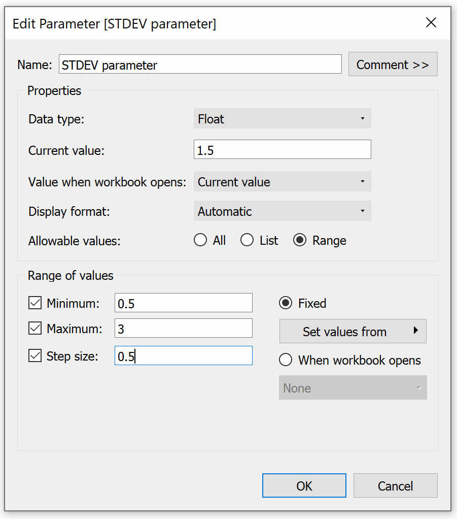
First, I will connect to the Sample – Superstore dataset then I am going to create a parameter to determine how many standard deviations from the average we would consider acceptable. I am choosing Float as the data type and setting a range of values with a minimum of 0.5 and a maximum of 3. As you increase the number, you are widening the range of acceptable profit levels so you will see fewer customers getting flagged as an anomaly. This step isn’t necessary but it adds to the user experience and offers a bit more flexibility if project requirements change.
Now I want to create a calculation that will flag customers whose profit is considered an anomaly. For the calculation, if the sum of profit falls less than the average, subtracted by the standard deviation multiplied by our standard deviation parameter, it will be marked as “Flag”. All else will be Null.
Continue reading with a free account, or login.
Unlock this tutorial and hundreds of other free visual analytics resources from our expert team.
Already have an account? Sign In
By continuing, you agree to our Terms of Use and Privacy Policy.
if sum([Profit])<= WINDOW_AVG(SUM([Profit]))-([STDEV parameter]*WINDOW_STDEV(SUM([Profit]))) then ‘Flag’
END
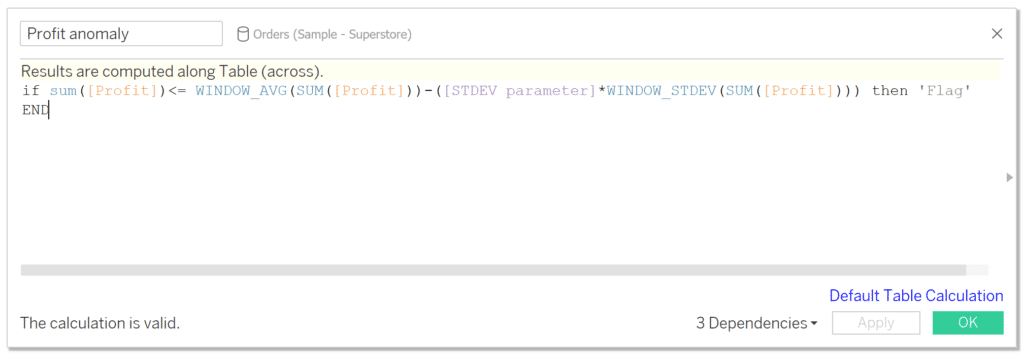
We are using WINDOW_AVG and WINDOW_STDEV instead of AVG and STDEV to calculate the average and standard deviation at the most granular level in our view as opposed to the average and standard deviation at the row level in the underlying data. For this instance, we are calculating it at the customer level since that is the level of detail currently in the view. The great thing about using the WINDOW functions is they will adapt even if your level of detail changes. For instance, if we were looking at products instead of customers you could simply change the dimension and this logic would adapt.
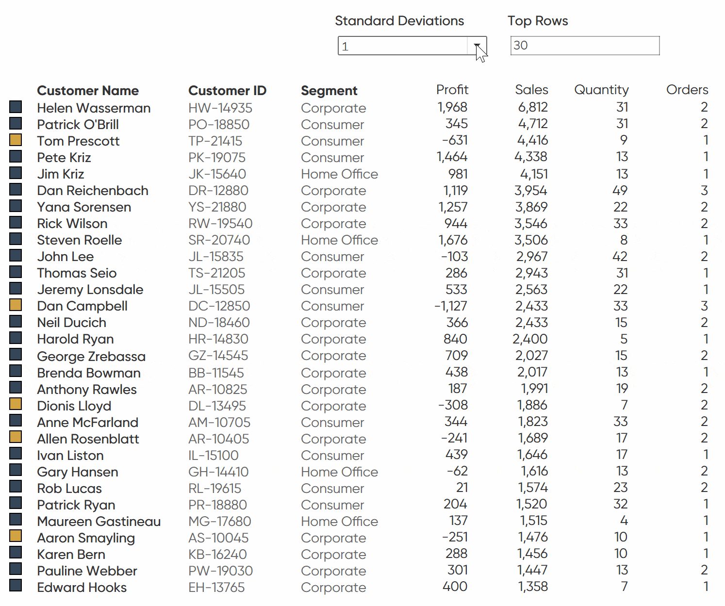
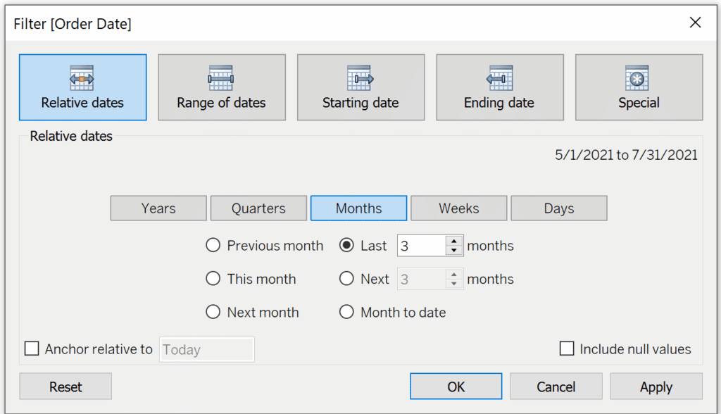
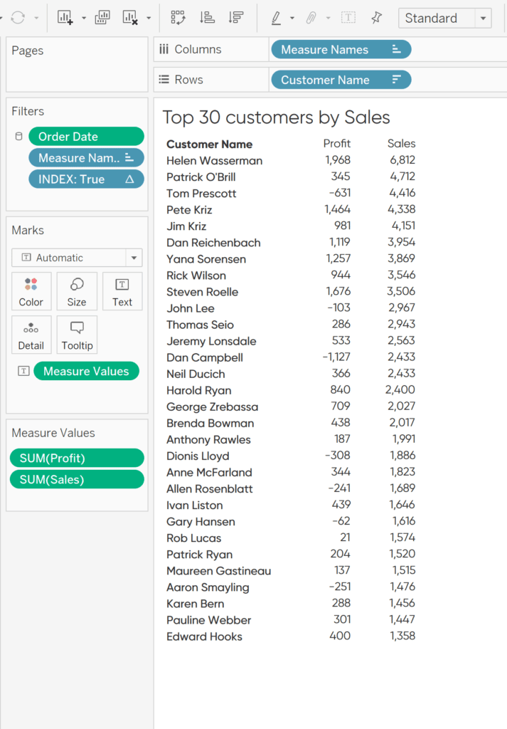
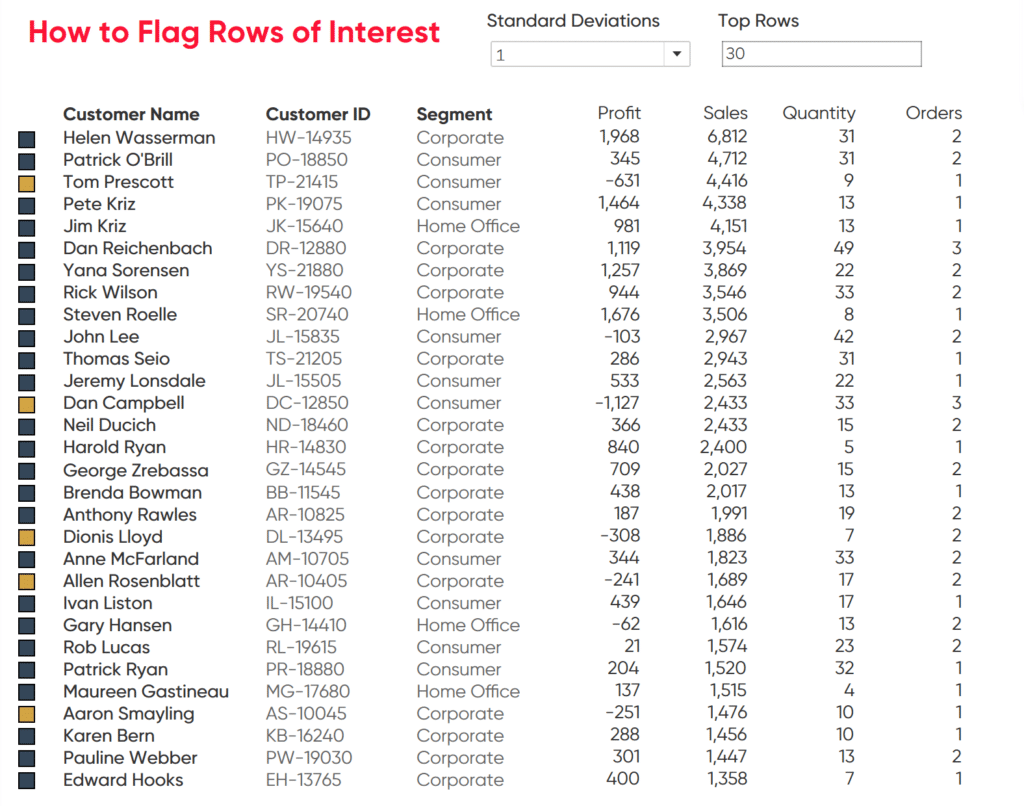
Now we want to assemble the visualization. Drag customers to the Rows shelf, Measure Names to the Columns shelf, and Measure Values to the Text property of the Marks card. Remove all of the measure values but the SUM of Profit and Sales. Also, I am choosing to only look at the last three months of data. To do so, drag Order Date to the Filters shelf. Then select Relative dates and last three months. Sort the table by Sales descending. This is my preference but know that you could look at any date range for your own analysis.
In addition to the month filter, I want to dynamically limit the number of customers on the view. First, create a parameter called Index Parameter. Change the data type to Integer. I am choosing to make the allowable values a range between 5 and 30 to better fit on the final dashboard.
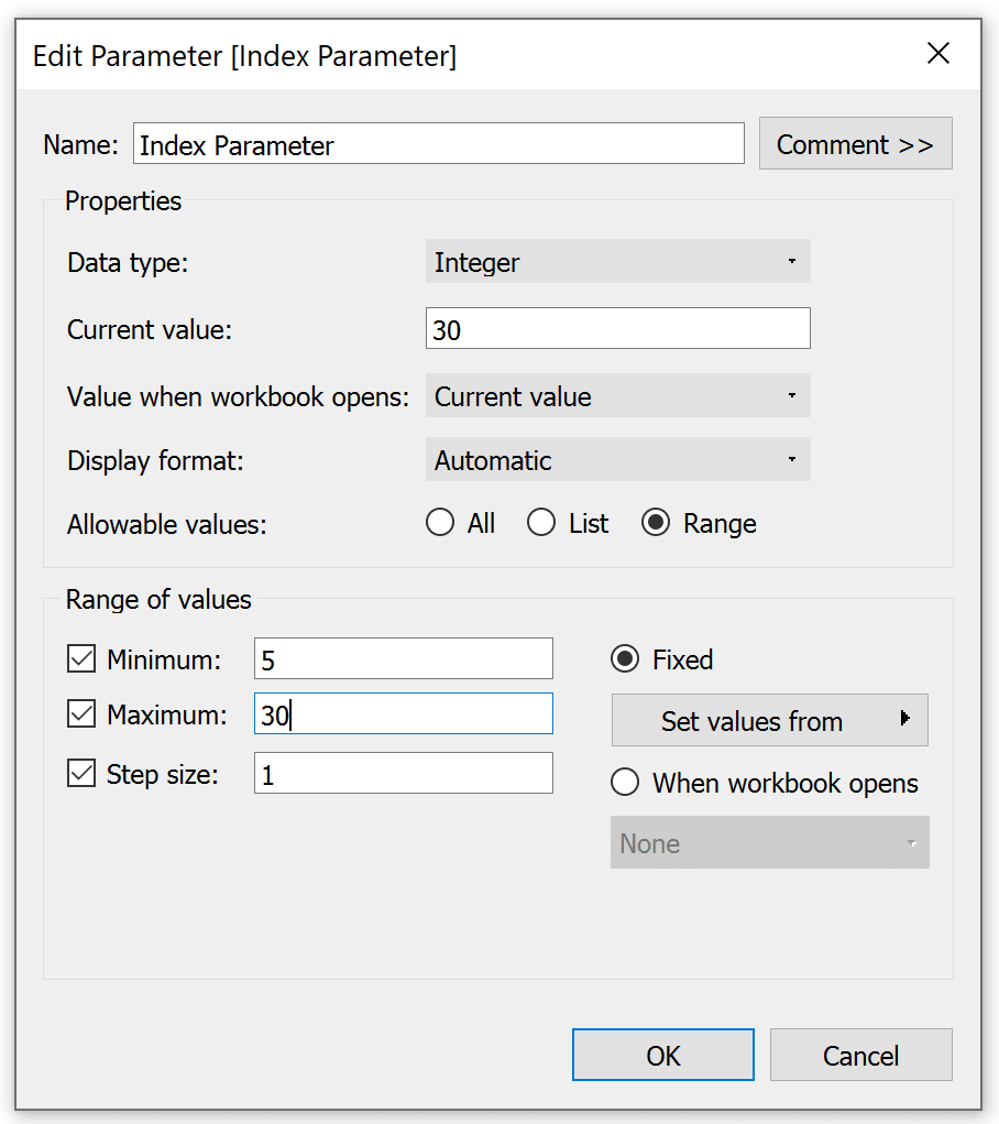
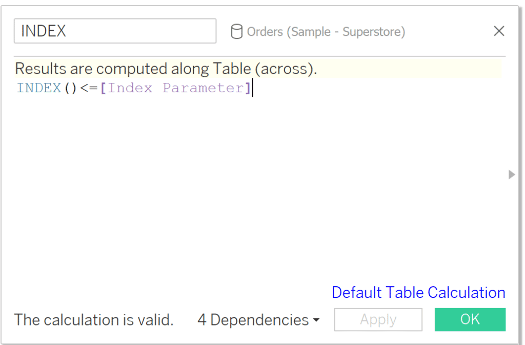
Then create an Index calculated field. This field will check if the row index is less than or equal to the Index Parameter we set and filter the view to that number of rows.
INDEX()<=[Index Parameter]
Using Tableau’s INDEX() Function for Easier Top N Filtering
Drag that calculated field to the Filters shelf and check True. This will dynamically filter your rows to only show the top N rows you choose in your parameter.
Now your sheet should look like this:
Creating an indicator that flags rows of interest
From here you could simply color the text to identify rows of interest. However; too much color on the text itself can make it difficult to read. Here is how to cleanly flag the rows without attacking your audience with too much color. First, duplicate the sheet. It is important moving forward that you don’t change the sorting of the customers on this new sheet or the original one.
![]()
Remove all of the fields from the view besides Customer Name. Keep the Index and Order Date on the Filter shelf but remove Measure Names. Change the mark type from Text to Square. Drag Profit Anomaly to the Color property of the Marks card; then set your colors to your own branding. In this instance, I am going to change the “Flag” color to gold and Null as a dark blue.
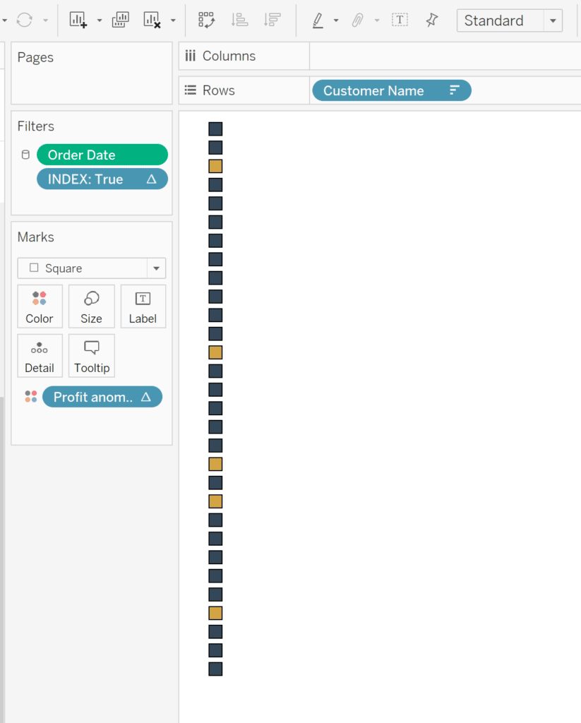
Next, we want to assemble the dashboard. Add both sheets to the dashboard and line them up so that the squares are matched to the appropriate customer. You can use the tooltip to help make sure they are correctly lined up.
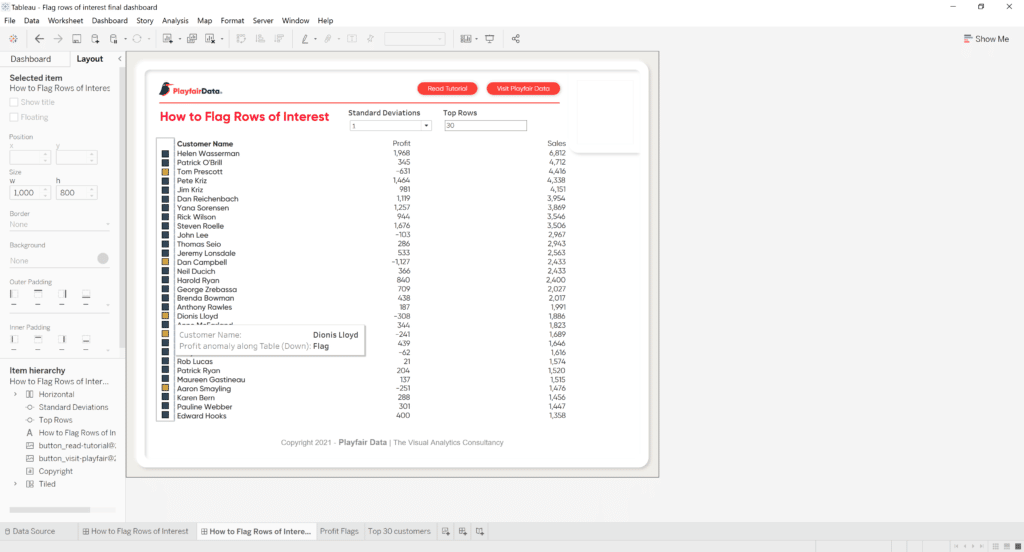
When you have the dashboard constructed, you can add or remove other dimensions or measures to fit your use case. I am going to add in the Customer ID, Quantity Ordered, and Number of Orders. Regardless of how much information you add to the text table, the flags will ensure that the important rows can be easily identified.
There you have it, all the information at your fingertips with the most important information flagged. You can adjust the colors as you see fit or maybe instead use shapes to call out rows of interest. There is plenty of flexibility to customize this technique to fit your needs.
Stay after it,
Maddie


Written By
Maddie Dierkes
Related Content
3 Creative Ways to Visualize Outliers in Tableau

There are many ways to detect outliers in your data, but flagging them for your end users may present some…

Ryan Sleeper
Encode Entire Tables Including Headers by Color and Size This video shows you how to highlight entire text table rows…
Ten Tableau Text Tips in Ten Minutes
This is the fifth and final post in a series about getting the most out of text in Tableau. For…