How to Make a Heat Map in Tableau

A Tableau heat map is a chart type that allows users to quickly identify patterns in marks by using the preattentive attributes of color and size. As the marks in the heat map increase or decrease in density, the associated preattentive attributes reflect the density by increasing or decreasing size and color intensity.
While this chart type does not provide precise detail about each of the marks, it is extremely effective at providing a starting point for an analysis that stakeholders can build on to glean insights, ask additional questions, and draw deeper conclusions. By the end this tutorial, you will be able to make a heat map in Tableau and understand the differences between a highlight table, heat map, and density plot.
The basic Tableau heat map
To create a basic heat map, start by dragging the Order Date field from the Sample – Superstore data source to the Columns shelf and choose Discrete Year. To finalize the foundation, drag Sub-Category to the Rows shelf.
Continue reading with a free account, or login.
Unlock this tutorial and hundreds of other free visual analytics resources from our expert team.
Already have an account? Sign In
By continuing, you agree to our Terms of Use and Privacy Policy.
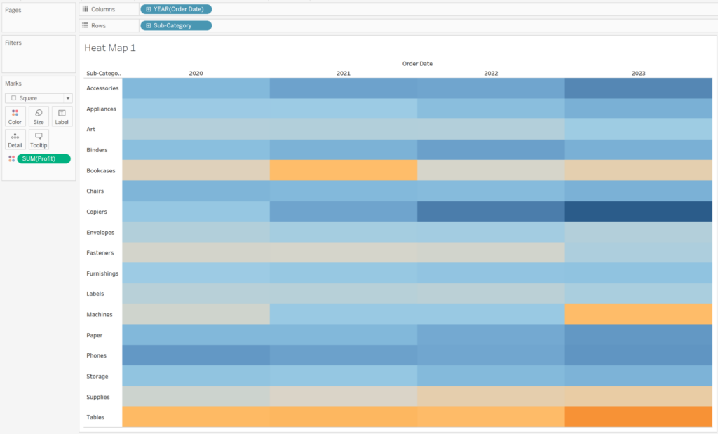
Next, change the mark type to Square and drag SUM(Profit) to the Color property of the Marks card. At this point you have what is technically called a highlight table, but is often known as a heat map. You can easily scan this table to determine the most profitable (dark blue) or least profitable (dark orange) Sub-Category by Year of Order Date.
![]()
A highlight table can be an effective way to transition an audience from a basic crosstab or Excel spreadsheet into visual analytics. Even without having numbers visible, I can quickly identify the highest and lowest profit areas with the highest being the dark blue and lowest colored the dark orange, respectively.
3 Ways to Make Handsome Highlight Tables in Tableau
A next step we can take in transitioning our audience to visual analytics is to turn this highlight table into a heat map. Start by changing the mark type to Circle and add another measure to the Size property.
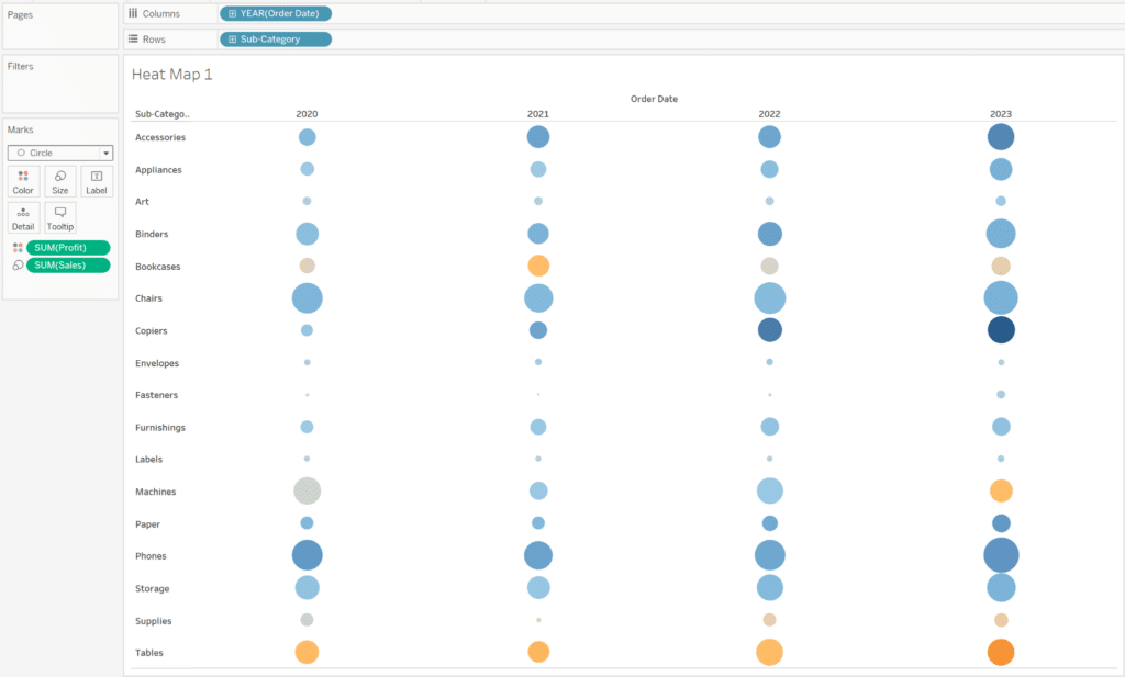
The major change is that I can quickly analyze not only the areas of highest or lowest sales, but also the areas of highest or lowest profitability. This chart can offer a great starting point for an analysis because the user can easily weigh two measures at once. For example, I can see that the Sub-Category of Tables in 2023 had average sales (according to the the size of the circle) but extremely low profitability (according to the color of the circle).
3 Ways to Smooth the Excel Transition
Another example is that I can see that over time, Copiers have both increased dramatically in sales and profitability because the size of the circle has increased and the color has darkened year after year. These two insights were quickly and easily found, leading us to ask more questions and causing action for further analysis.
The density plot in Tableau
A different form of heat map is called a density heat map and is a great way to visualize any spatial data which is most commonly used for sales, demographic, or weather data. This chart effectively draws the user’s eye to the darkest area of the map, quickly revealing areas of high or low density.
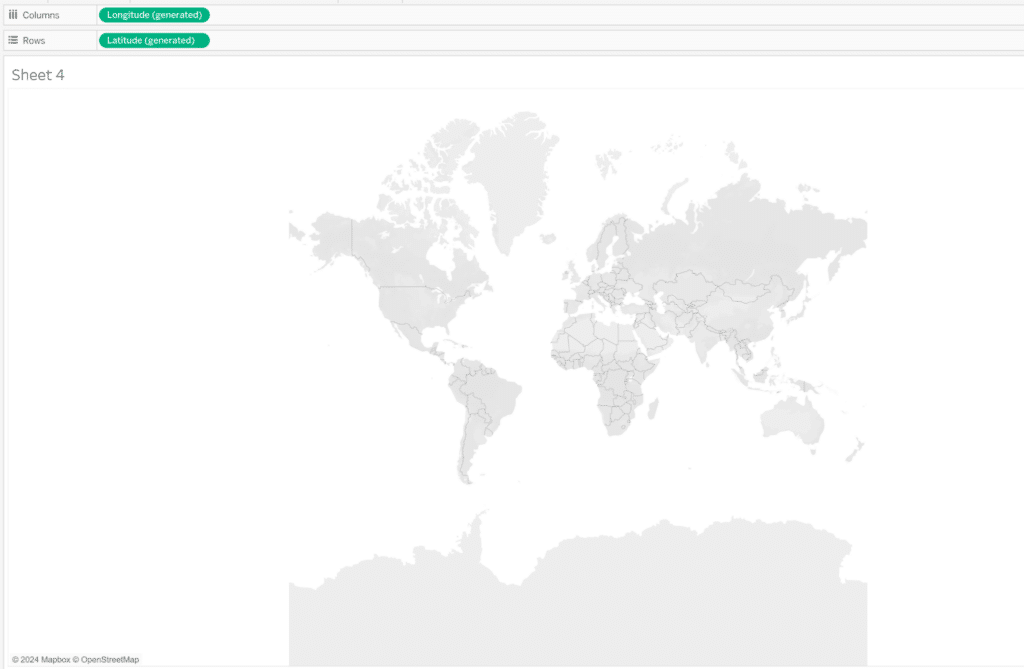
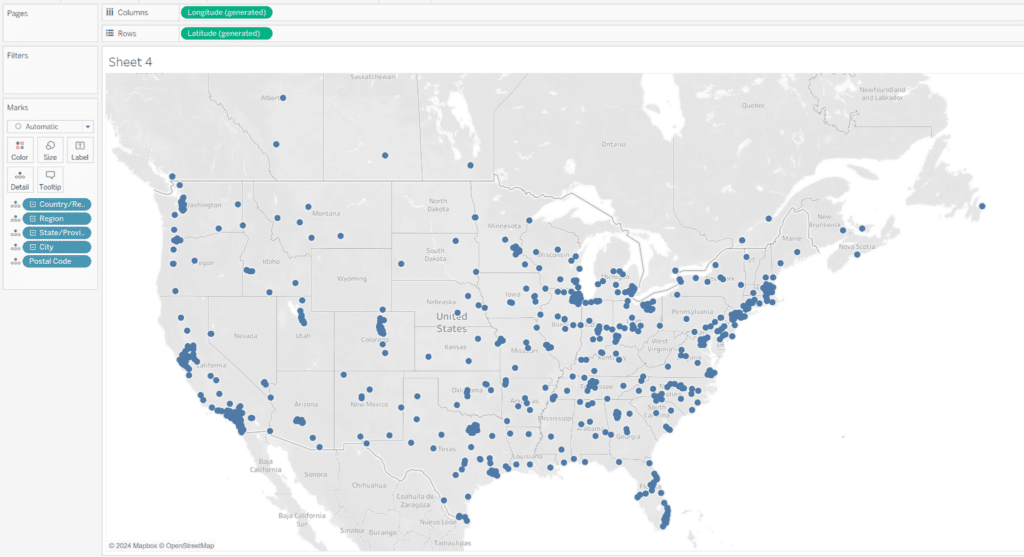
To build this heat map in Tableau, start by placing Longitude on the Columns shelf and Latitude to the Rows shelf. The result will be a blank map.
We want to visualize at the lowest level of geographic data available so we’ll place Country, Region, State, City, and Postal Code on the Detail property of the Marks card.
Next, change the Mark type to Density and place SUM(Sales) on the Color property of the Marks card. Lastly, format the color and transparency of the marks to your liking. You will notice that the immediate effect of adding Sales to the view is that some density marks will become larger and darker, whereas other density marks will get smaller and more transparent. The darkest density marks represent the geographic locations with the most sales and the smaller, more transparent density marks represent the locations with the least amount of sales.
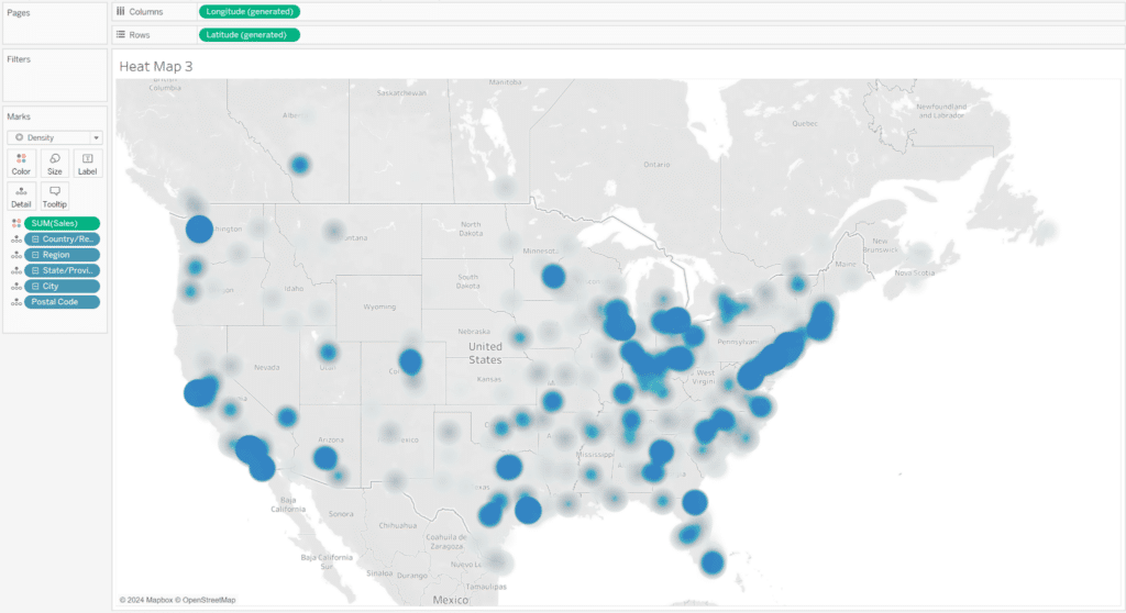
This can be a really effective way to quickly communicate a lot of geographic information at once, creating a starting point for analysis. Traditionally, the density heat map is encoded with the temperature color palette that adds a ‘hot and cold’ effect with red (hot) representing dense areas while blue (cold) represents low density areas . While this palette isn’t the most accessible, it is what a lot of people recognize for this analysis and will help them understand how to read the visual faster.
![]()
Tips for Creating Custom Color Palettes for Visual Analytics
An alternative to the Density mark would be to use a Circle mark which gives us the ability to not only encode the marks by sales, but also profit. Similar to the first heat map that we created, this chart will communicate a slightly different story, allowing us to weigh both sales and profitability at the same time.
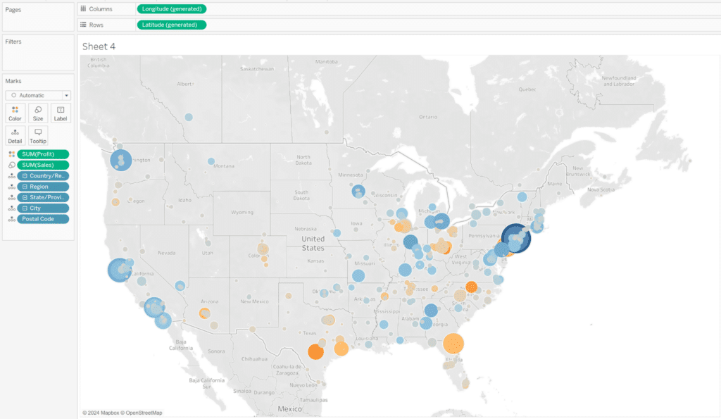
While heat maps in Tableau have the ability to communicate a lot of data at once, it can be confusing for some audiences to interpret double encoded marks. Therefore it is important to first think about who the audience is, whether or not this would be an effective chart for them, and always utilize legends and instructions to guide the user along the analysis.
Thanks for reading,
Dan Bunker

Written By
Dan Bunker

Peer Review
Ethan Lang
Director, Analytics Engineering
Related Content
3 Ways Psychological Schemas Can Improve Your Data Visualization
Whether you are aware of it or not, you are constantly recognizing and processing patterns in your everyday life. Think…

Ryan Sleeper
Improve on the ‘gateway’ chart to data visualization Highlight tables help smooth the Excel transition by introducing the preattentive attribute…
Tips for Creating Custom Color Palettes for Visual Analytics

When thinking about how we can tell a story through data, we often view the element of color as a…