Tips for Creating Custom Color Palettes for Visual Analytics

When thinking about how we can tell a story through data, we often view the element of color as a way to control the style and enhance visual data insights. In this blog post, I will provide tips that will go deeper into the importance and value of creating a custom color palette to enhance the storytelling of your data visualization.
So, what exactly is a color palette? More importantly, why do we need one in our data visualization?
Before we dive into it, I’d like to mention that I view color in data visualization from a UX perspective. I love thinking about color from not only an aesthetic point of view but also its psychological influence on our perception. If you are new to color theory, I would highly suggest doing some additional reading on its effect and how it can help us make better design decisions.
How to Create Custom Color Palettes in Tableau
Color theory terminology
Here is a quick crash course on some terminology:
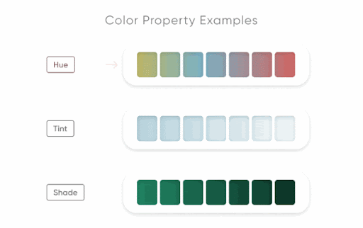
Hue – the main property of color (red, yellow, blue, violet, orange– think colors of the rainbow)
Saturation – the intensity of the color/hue.
Tone – a result of a hue mixed with gray
Tint results from the hue mixed with white, creating a more subtle color. Considered part of the color’s value.
Shade – when black is added to the hue, darkening it. Considered part of the color’s value.
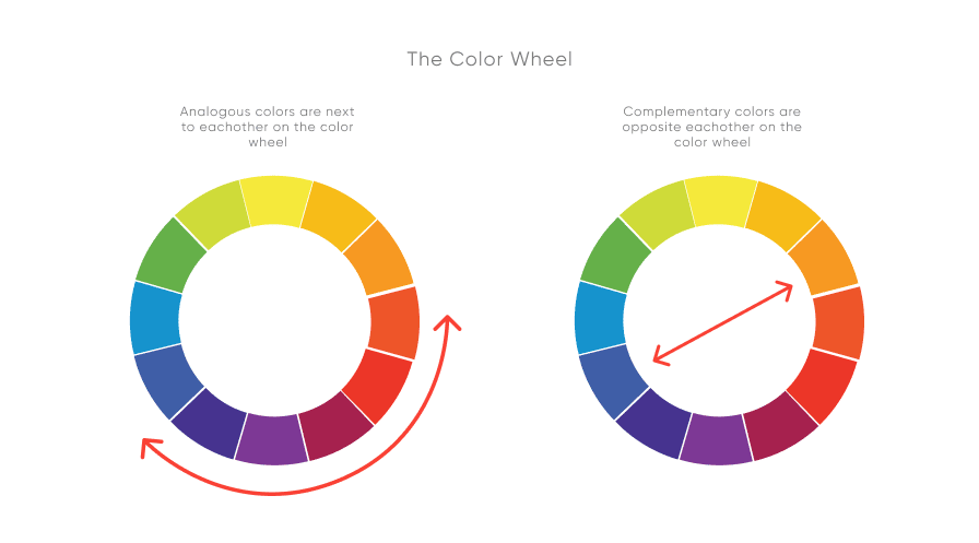
You’ll probably recognize the color wheel if you remember your elementary art class. As a quick refresher, complementary colors can be seen opposite each other while analogous colors are next to each other.
Steering back to color palettes, at their most basic level, they are simply a curated collection of colors that you will use in your design or visual.
![]()
Here are three basic types of color palettes:
Monochromatic – a variation of tints and shades of one hue

Analogous – consisting of colors located next to each other on the color wheel.

Complementary– consisting of colors located opposite each other on the color wheel.

What’s the value of a color palette in data visualization?
Continue reading with a free account, or login.
Unlock this tutorial and hundreds of other free visual analytics resources from our expert team.
Already have an account? Sign In
By continuing, you agree to our Terms of Use and Privacy Policy.
The usage of color in data allows us to quickly identify and understand information such as the differences and similarities in our data. When done correctly, it can enhance visibility, highlighting key aspects that may otherwise go unnoticed. A good color palette can further convey and emphasize the story within a data set.
Types of color palettes
Now that we have a basic understanding of color palettes and their role in the user experience when designing reports, we’ll look at three types of color palettes used in data visualization and some best practices to follow with them.
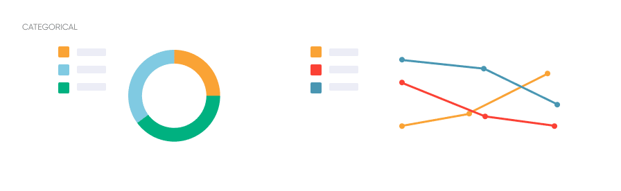
Categorical
In a visualization, categorical colors help users map meanings that are non-numerical. These colors serve to distinguish categories from each other without correlation visually.
The sequence in this color palette should have significant contrast to differentiate easily.
Do’s and Don’t:
- DO use categorical colors with data that is not ordered or numerical. As the name suggests, use them in a categorical way when scaling a data group.
- DO stay consistent with how you use each color in the chart.
- DO limit how many different colors you use to about 5.
- DO use colors that contrast each other and that have equal saturation.
- DO consider using complementary colors.
- DON’T use categorical colors with data that is sequenced or ordinal.
- DON’T use monochromatic colors or don’t have enough contrast, as this can confuse the viewer into thinking there is a sequence in the data.
Sequential
A sequential color palette uses data sequenced or numerical. It is conveyed through the ordering of a gradient or color’s value. Lighter colors in the gradient represent lower values, while darker colors represent higher values. When considering dark mode, it’s usually the reverse.
Monochromatic palettes are generally a good decision when showing sequential relationships and trends.
- DO use this palette with data that is numerical or ordered.
- DO use darker colors to show higher numerical values and light colors for lower density or numerical values.
- DO use monochromatic or analogous colors.
- DON’T use this with categorical data, leading to confusion and misinterpretation of the visual.

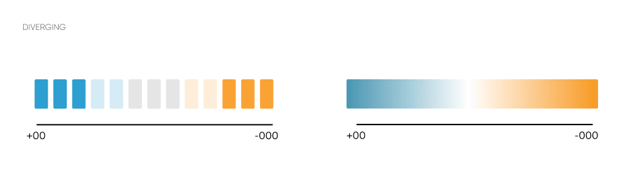
Diverging
Diverging colors also use numerical data, similar to sequential. This color palette combines two different sequential color gradients that meet at the center. Each end of this color palette is the darkest value and the highest contrast of each hue.
This color palette is good when dealing with data with opposite extremes or deviating from the median range.
- DO use darker colors to show extremes and contrast.
- DO balance colors from the midpoint. You can cut out any excess darker colors that don’t fit your data. The center should be the lightest, where you want to start.
- DO use gradients of complementary colors.
- DON’T use diverging colors with sequential data as this can cause misinterpretation of the data.
Accessibility considerations
We’ve talked about types of color palettes and their best practices in data visualization. From a UX standpoint, we must consider the accessibility of our visuals.
Designing with accessibility in mind enables people with a range of abilities and disabilities to perceive, understand, navigate, interact with, and contribute to the web.
Visual constraints can come from visual impairments, device (resolution and quality), and usage (will the report be printed in black and white?)
Specific tools like simulators can check how your visuals will be seen and perceived by people with color blindness.
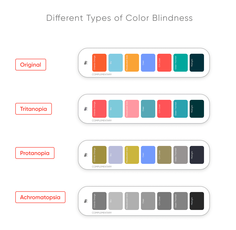
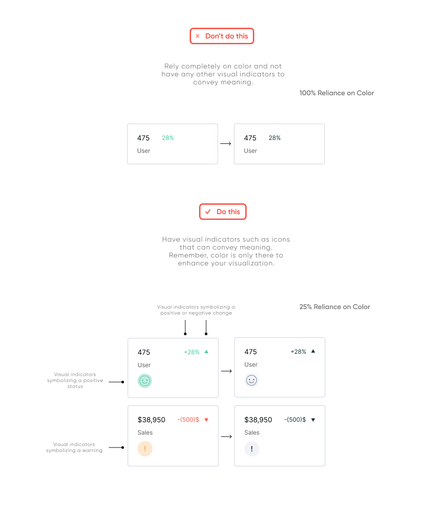
In general, color reliance should be avoided when considering accessibility. It’s essential to have other visual indicators (such as text) and clues that are not dependent on only color.
Action items like buttons, toggles, callouts, and even charts should have meaningful labels and titles so that people can understand what they are doing.
Another situation is when we tend to use green despite proving against best practices for color accessibility. That doesn’t mean that we reject the color “green.” Still, we consider its nature and use icons and signifiers to assure our users perceive the correct information – regardless of color.
Here are some common tips to keep in mind when making your color palette in your data visualization more accessible.
- DO use varying values of a hue.
- DO have other visual indicators in your data visualization other than color.
- DON’T use red, green, blue, or yellow together without variety in their color value (lightness/darkness)
Branding
When creating a custom color palette, it’s important to consider how it relates to the company’s brand and identity. Can users recognize the company by the color palette? How does this affect our perception of the tool?
It’s a good idea to keep the company’s brand guidelines and logo in mind when creating a palette.
Color adds value to the overall product – not just the charts – and helps with the tool’s navigation (UX). Some things to be mindful of include:
- Not abusing one color (avoid over-selling the brand and drowning the user),
- Differentiating visualization colors from navigational colors,
- Considering state association with brand color (If the brand predominantly is red, don’t use red to signify “bad” in charts).
Additionally, it’s a good idea to think about users and their culture. Specific colors have different associations depending on the culture. For example, the color red, in western cultures, can represent danger. While in eastern cultures, it can express joy and celebration. It’s important to ask ourselves how color plays a role in identity? Will using one color affect the user’s perception of the tool? Will it affect user adoption?
![]()
In a recent blog, Jason Penrod, our Director of Information Design, said, “We have found that integrating branding into the final product design generates a positive response, increasing user adoption. In other words, branding can influence the effectiveness of a product’s ability to fulfill user needs and deliver an enjoyable experience where users can better adapt to the new tool.”
Here are some tools and resources that I recommend using as you navigate your way through creating your custom color palette for your data visualization.
- Color Brewer – a tool to easily create color schemes for map data visualizations.
- Colbis – a color-blindness simulator tool to check the accessibility of your color palette.
- Data Color Picker is a palette chooser to create a series of visually equidistant colors for your data visualization.

Summary
Today we discussed some of our tips to keep in mind when creating custom color palettes for your data visualization. Overall, your data set should determine whether to use a categorical, sequential, or diverging color palette. To make your plot more accessible, ensure that color is meaningful and consistent, and consider colorblindness when you create your color palette.
This quick checklist should keep you on track:
- Know your product. Brand consideration can add value to your storytelling and overall navigation (user experience).
- Know your data. Understanding the type of data in the dashboard will help you choose the color palette that will best suit your story.
- Know your users. Keep in mind who’s making decisions with your report and if they’ll effectively draw insights from them. Test for color accessibility and make sure your color selection matches the data-literacy level of your audience and the user experience.
Thanks,
Zoya


Written By
Zoya Zafar

Peer Review
Rafael Simancas
Sr. Manager, Brand Strategy

Graphic Design
Jason Penrod
Director, Information Design
Related Content
3 Storytelling with Color Tips to Improve Your Data Visualization
Color is one of the easiest ways to control the style of your data visualization. A good use of color…

Ryan Sleeper
Dynamically Change Background and Marks with a Single Click Color is an essential asset to branding, engagement, and storytelling. In…
Ryan Sleeper
Leverage color to improve your designs and help communicate insights Color tips include reducing the saturation of marks, keeping color…