3 Storytelling with Color Tips to Improve Your Data Visualization
Color is one of the easiest ways to control the style of your data visualization. A good use of color makes visuals more engaging, makes insights pop off the view, and adds some professional polish that helps build credibility. This post provides tips to improve your data visualization by reducing the saturation of colors, reducing the cognitive load on your end users, and how to leverage schemas to improve your audience’s understanding.
There are some fascinating parallels between storytelling and the practice of data visualization. Every story contains at least three elements: (1) characters, (2) plot, and (3) narrative. The way that I equate those three aspects of storytelling to data visualization is: (1) the characters are the fields in the data we are analyzing, (2) the plot is the insight that emerges during the analysis, and (3) the narrative is the style in which we communicate the insight to our audience.
It’s the latter aspect, narrative, which we as dashboard authors have the most control over. If we are able to communicate our insights in a way that is engaging to draw the user in, understandable so our point gets across, and trustworthy to build credibility, we vastly improve the chances of somebody taking an action based on our insight.
Reduce the saturation of colors
Saturation is one of three values that creates every color. Hue is the shade of a color, brightness (or lightness) determines how dark or light the color looks, and saturation is the intensity of a hue. My first tip is subjective and should be considered on a case by case basis, but I believe that it makes sense in a lot of cases to reduce the saturation, or intensity, of colors on a view. In my opinion, some of the default colors, particularly on a PC’s color picker tool, are too intense.
![]()
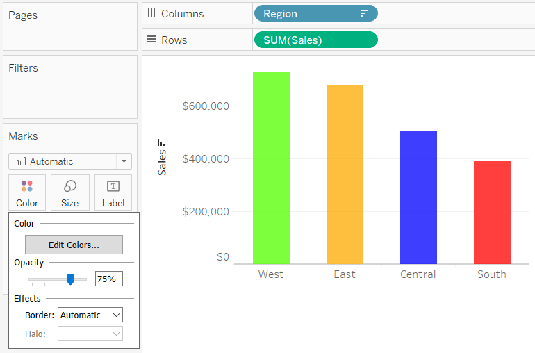
I like to dull these hues down by reducing their saturation. This is easy to do in Tableau by reducing the opaqueness (or adding transparency if that’s how you think about it) of marks. To change the opacity of a color, simply click the Color Marks Card and drag the Opacity slider to the left. I find that somewhere between 75% and 90% (depending on the brightness of the colors) reduces the saturation just enough so that the colors are easier to look at, but don’t detract from the selected hue or show underlying lines.
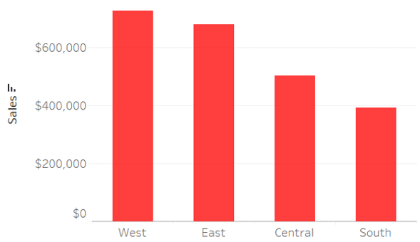
To illustrate, here is a quick bar chart built with the Sample – Superstore dataset using default colors from a PC. These would not be my top choices for colors, but we’ll improve on these throughout the post.
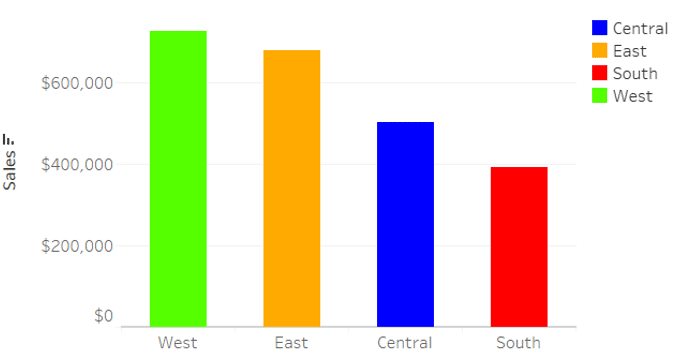
Here’s how the same colors look after clicking on the Color Marks Card and dragging the Opacity slider to 75%.
Here are the two side by side. On the left are the original colors at full saturation; on the right are the colors with reduced saturation.
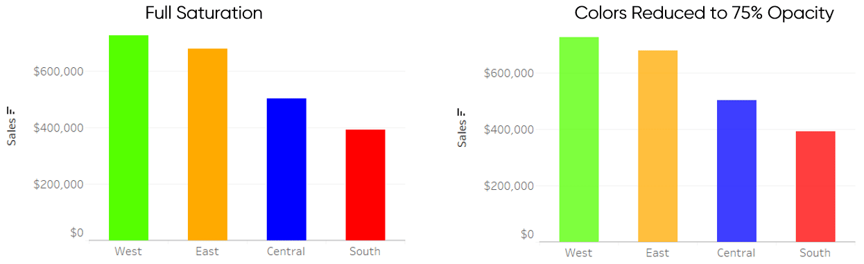
The colors on the left are harsh on the eye and difficult to look at, almost creating a dizzying effect. The colors on the right have been dulled down which make them easier on the eye and add some professional polish. The amount you change the Opacity slider should depend on the brightness of the colors you’re using and how much transparency you need to blend in to dull the color down.
I also realize that sometimes you want the colors at full saturation. For example, if you are creating a reverse contrast dashboard (light on dark) and want to maximize the contrast between the marks in the forefront and the background, opaque marks may be the best choice. I have just found that in most cases reducing the saturation of colors by reducing their opacity is an easy way to improve the colors in my designs.
Continue reading with a free account, or login.
Unlock this tutorial and hundreds of other free visual analytics resources from our expert team.
Already have an account? Sign In
By continuing, you agree to our Terms of Use and Privacy Policy.
Reduce the cognitive load on your audience
Cognitive load is the amount of work that you and your end users must do to process a visualization. You should always be trying to reduce the burden on your audience and make it as easy as possible to find insights.
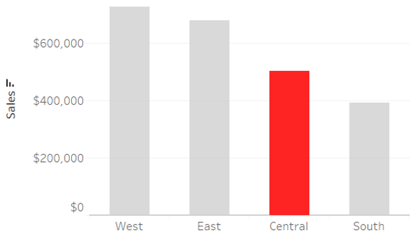
One common pitfall with the use of color is double-encoding. Double-encoding happens whenever the same breakdown is used to encode the marks in two different ways. When a chart with double-encoding is used in a vacuum (i.e. by itself with no other charts), it increases the cognitive load on your end users.
Let’s have another look at the “After” chart from the first tip.
Before coloring the bars by the Region dimension, the sales values in this bar chart were already separated into one column per region. By encoding the marks by the same Region dimension, we actually made it more difficult for our end users to process the view. They already knew each column was a region, but now they have to look back at forth at the color legend to ensure the color-encoding represents the same thing.
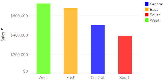
To reduce the burden on your end users, do not use the same breakdown for multiple encodings. Here’s how the chart looks after removing the Region dimension from the Color Marks Card and choosing one consistent color for all four columns.
The huge caveat to this tip is that I’m only recommending it when the chart will be viewed on its own. For example, if I were to paste this image into a PowerPoint presentation or an email. If the chart will be used in a dashboard with other charts that are encoded by the same breakdowns, the double-encoding can actually help draw associations between the charts, and thus, reduce the cognitive load. For example, if I have a line graph and a bar chart that are both colored by the Region dimension, it will be easier to compare the Central region across the two charts.
Bonus Tip: Reduce the cognitive load by remapping colors.
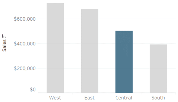
Another way to reduce the time to insight for your end users is to remap colors to call attention to your primary insight. In Tableau, you can do this by placing the dimensional breakdown on the Color Marks Card, double-clicking on the discrete color legend, and mapping colors there. I usually give the dimension member I want to bring attention to a bright color, and the remaining colors a neutral gray or brown color.
Here’s an example calling attention to the Central region.
Beware of existing associations with colors
In my post, 3 Ways Psychological Schemas Can Improve Your Data Visualization, I share how to tap into your audience’s expectations to reduce the time to insight and increase the accuracy of insights. Color is one of the easiest ways to leverage these expectations because there are some common associations between colors and their meanings and they are relatively easy to understand.
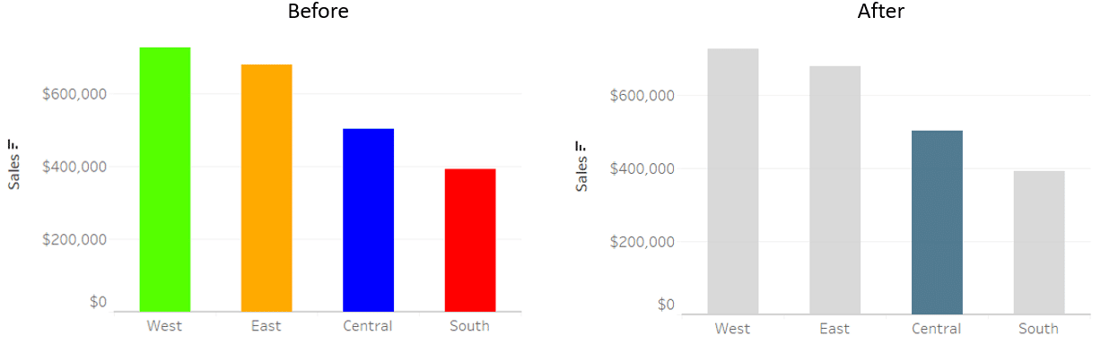
For example, for better or worse, we all know what green and red represent. It is almost hard-wired into us to think that green means good and red means bad. At a minimum, you should keep in mind that your users will have expectations about what different colors represent. When used well, you can use these existing associations to avoid confusion and make it easier for your audience to process your visualizations.
I often use red to highlight insights like you saw in the previous tip because it is a prominent color in the Playfair Data brand. I chose red because of the symbolism of that color being the first color that humans see; not to mention it is one of the most visible colors. However, audiences who are seeing my work for the first time may misinterpret the red color as representing a negative performance. That’s why in a corporate setting, I may avoid red and green and opt for something more neutral when highlighting dimension members.
This approach adds some differentiation to the dimension member I want the audience to focus on, but allows them to decide for themselves if something is positive or negative and should be acted on. Of course, if you want to convey a positive or negative performance, you may want to use colors that your audience will likely perceive as representing positive and negative. There are some scientific reasons that you may want to avoid red and green, but blue and red or blue and orange are alternatives that I often implement.
![]()
To bring attention to your most positive and negative dimension members, see How to Automatically Highlight Highs and Lows in Tableau.
Take a look at how far our bar chart has come after implementing these storytelling with color tips:
Thanks for reading,
– Ryan


Written By
Ryan Sleeper
Related Content
3 Innovative Ways to Highlight Selections in Tableau

In this tutorial I will demonstrate three ways to use different mark types with transparent sheets to highlight a selection…

Ryan Sleeper
Create Reusable Discrete, Ordered Sequential, and Ordered Diverging Color Palettes Learn how to look up color hex values and update…
Ryan Sleeper
Dynamically Change Background and Marks with a Single Click Color is an essential asset to branding, engagement, and storytelling. In…