How to Make a Tableau Timeline when Events Overlap

I’ve shared in the past how to make a timeline in Tableau. This is one of my favorite techniques for creating a calendar and/or providing context to my end users. Timelines can be used to show your audience when notable events occurred in the business that may be impacting performance. But what happens when there is more than one event on the same day? By default, the marks will overlap, preventing my audience from seeing the entire picture.
This post will show you how to make what I call a “jittered timeline” in Tableau. When events overlap on the same day, the calculated field shared in this tutorial will automatically provide perfect spacing between the marks. This is also helpful if you ever want to control the alignment of marks on a jitter plot. The controlled spacing serves not only a practical purpose, but it also looks great!
Watch the related video with Playfair+
How to make a jittered timeline in Tableau
By the end of this post, you will be able to create a timeline in Tableau that automatically spaces marks when more than one event happened on the same day. You will be able to control the intensity of the jitter and get the marks to align perfectly on a zero baseline.

This is a technique I originally picked up from Lindsey Poulter’s visualization, 13 Straight.
For the following illustration, let’s say we represent a company that will be doing a big marketing push the week of Tableau Conference 2019 and Black Friday / Cyber Monday later in November. I’ve got this schedule planned, but want to visualize it as a timeline alongside other charts in Tableau:
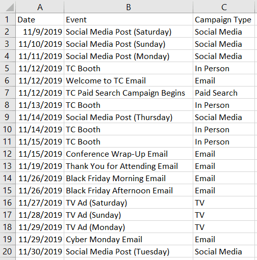
To start the timeline in Tableau, I will place the Date field on the Columns Shelf as a continuous field at the day date part. To ensure all the events in the dataset are represented on the view, I’ve also placed the Event dimension on the Detail Marks Card. Lastly, I’ve changed the mark type to Circle just so the events are easier to see.
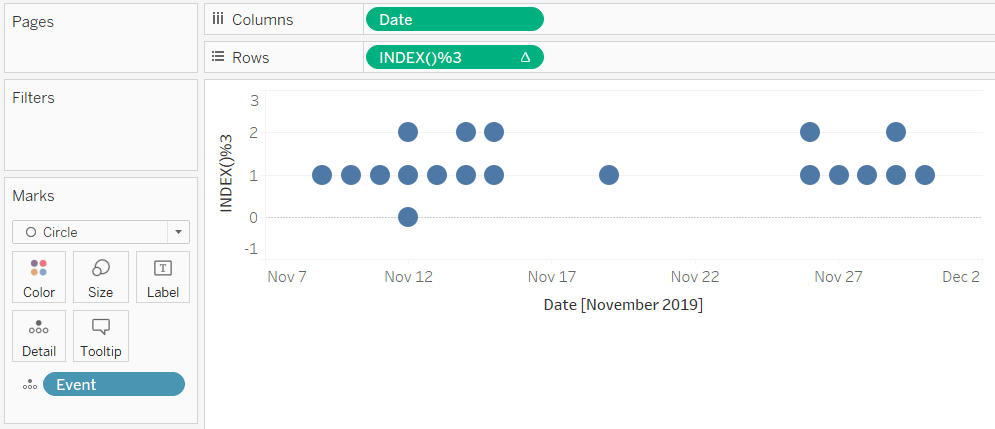
Here’s the issue. Several of these dates have multiple events and even though the viz level of detail is currently Event, I am not able to see that level of granularity. For example, November 12th has three events, but the three circles overlap. This gives the appearance to my audience that there was only one event that day.
![]()
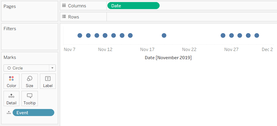
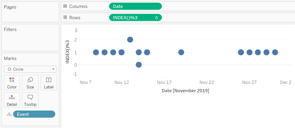
To visually separate marks on a timeline when more than one event occurred on the same day, we will use a similar tactic that is used to create Tableau jitter plots. We will need to take the following concept a step further with the calculated field further down this post, but to illustrate why it’s needed, I’ll start with a traditional jitter plot. Since there is a maximum of three events on any one day in my dataset, I will place a jitter with an intensity of three rows onto the Rows Shelf. The formula is INDEX()%3.
Continue reading with a free account, or login.
Unlock this tutorial and hundreds of other free visual analytics resources from our expert team.
Already have an account? Sign In
By continuing, you agree to our Terms of Use and Privacy Policy.
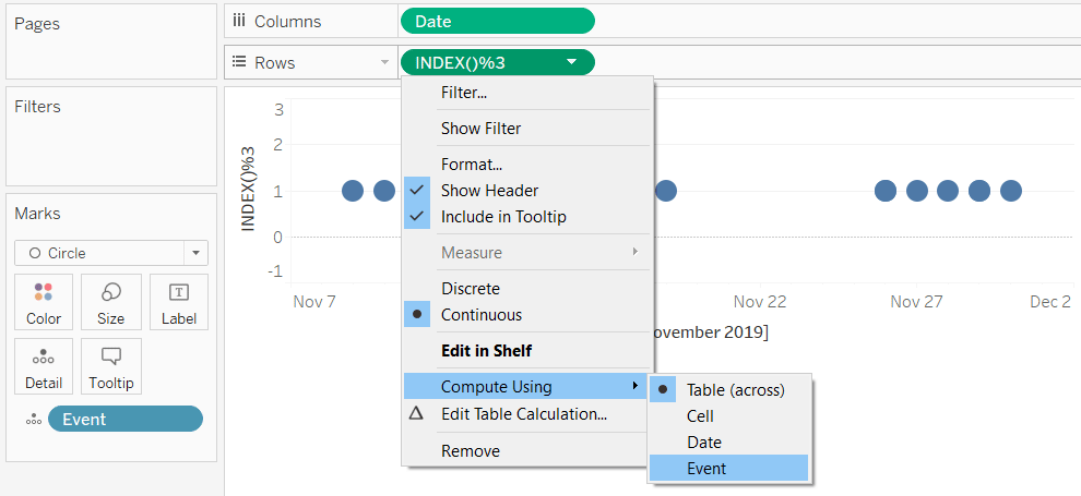
I also need to change the addressing of the INDEX() table calculation to be computed on Event instead of the default, Table (Across). This can be accomplished by clicking into a measure that has a delta symbol on it, hovering over “Compute Using”, and changing the addressing.
This assigns a number from 0 to 2 to each event and gives them unique locations on the y-axis. At this point, I’ve accomplished my objective of separating marks when there is more than one event on the same day. However, notice that whenever there are two events on one day, the events start at the value of 1 on the y-axis, and the two circles are not aligned perfectly with the days containing one or three events.
The controlled jitter calculated field
To make the circles line up perfectly, we will ‘control the jitter’ with the following calculated field:
INDEX()
%
MIN({FIXED [Date]: COUNTD([Event])})
+
(IF MIN({FIXED [Date]: COUNTD([Event])})=2 then -.5
ELSEIF MIN({FIXED [Date]: COUNTD([Event])})=3 then -1
ELSE 0
END)
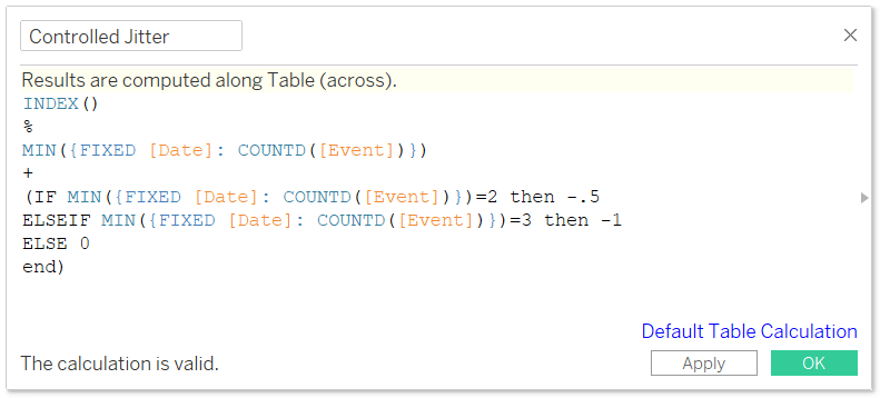
This uses the same foundation of a jitter plot where the INDEX() function is followed by a percentage sign and the intensity of the jitter. However, this time we are controlling the exact index value, or row number, for each scenario in our data.
The INDEX() function always starts at 0 and increases in multiples of 1, so our formula is saying when there are two events per date, then start the values at 0 + -.5. This results in our first event being placed at -.5 on the y-axis and our second event being placed at .5 on the y-axis.
When there are three events on one date, the index values start at -1. This results in the first date being shown at -1 on the y-axis, the second value being shown at 0, and the third being shown at 1.
In my case, the ELSE statement was used to capture everything else, which in my dataset would be one event per date. When that is the case, the single events line up at 0.
Create the timeline visualization
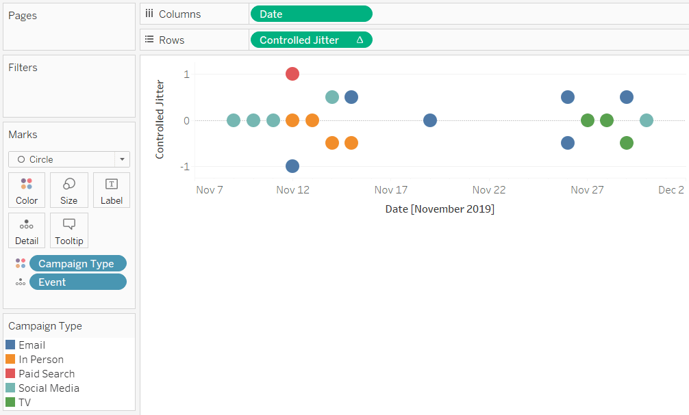
Here’s how the timeline looks after replacing the original jitter with the newly created Controlled Jitter calculated field and, once again, changing the addressing to Event.
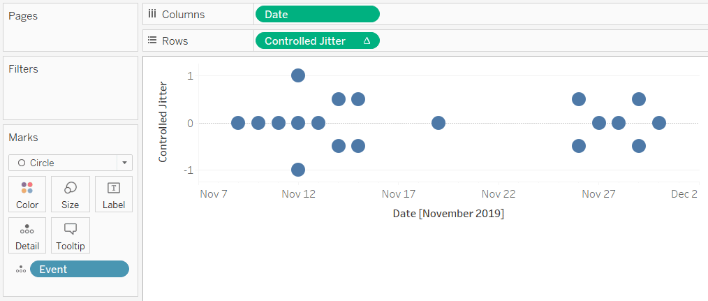
Note how the dates are not only separated but are aligned perfectly on a baseline of 0.
A few more notes / ways this can be used:
This works if your dataset has more than three events per day. You would just add scenarios to the calculated field. Just know that whatever number you type after each THEN statement will be the value that the events start on the y-axis.
This also works even if you’re not making a timeline view. You can make a “controlled jitter plot” when wanting to separate overlapping marks for any dimension. Just replace the Date field in my calculation above with whatever dimension has overlapping data.
If you add additional levels of detail to the view, you will have to update the addressing accordingly to get things to line up. For example, here’s how my view looks after coloring the circles by the Campaign Type dimension.
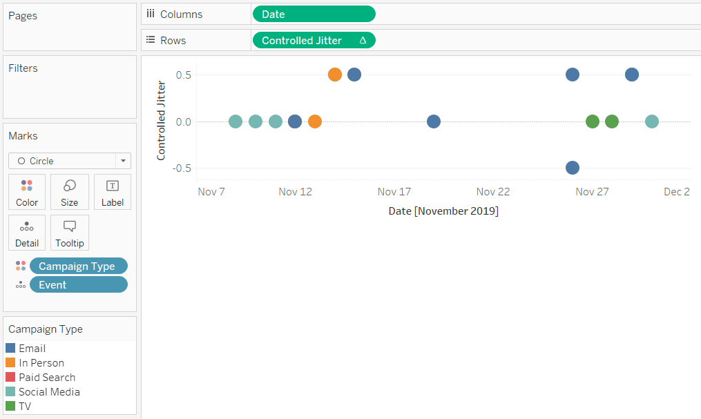
I’ve lost the nice alignment on the zero baseline. This one is not quite as easy as changing the addressing using the Compute Using option because I now have to use two different dimensions: Event and Campaign Type. To update the addressing so both dimensions are included, I must right-click on the Controlled Jitter calculated field and choose “Edit Table Calculation”:
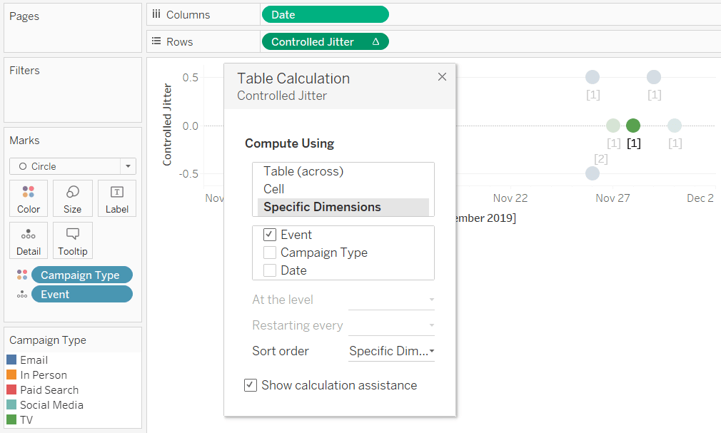
After including both Event and Campaign Type in the specific dimensions being addressed, things are looking good again:
Pixel perfect bonus: How to make an axis range for a Tableau timeline
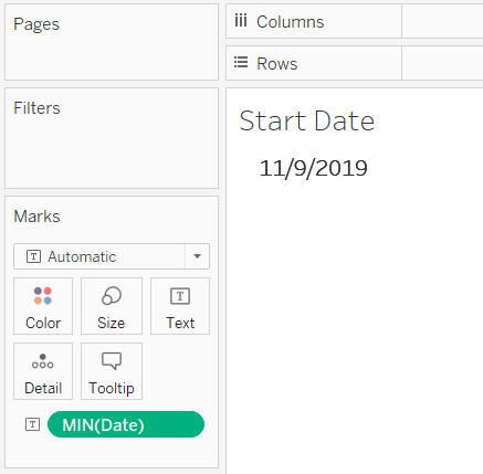
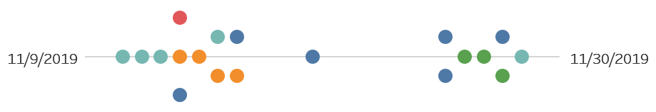
One fun design idea is to show only the start and end of a timeline range. This is easily accomplished by creating a sheet for the minimum date in your dataset, a sheet for the maximum date in your dataset, and then placing these two sheets along with your timeline on a dashboard.
![]()
To create the sheet for the minimum date, simply place the date field used to create your timeline on the Text Marks Card with an aggregation of Minimum:
Then do the same thing for the end date by starting a new sheet and placing the date field on the Text Marks Card with an aggregation of Maximum.

Here is how my final view looks after hiding the original headers on my timeline view, updating the formatting to remove grid lines and axis rulers, and putting all three sheets next to each other on a dashboard:
For a live example of a controlled jitter plot / timeline built to show events when they are overlapping, see my visualization, BLOCKBUSTER.
Thanks for reading,
– Ryan


Written By
Ryan Sleeper
Related Content
How to Make a Timeline in Tableau
Timelines are not an out-of-the-box chart type in Tableau, but they can serve several practical purposes for your analyses and…
The Beginner’s Guide to Tableau Table Calculations

Tableau table calculations, while very powerful, can be both tricky and confusing to work with. There are some great benefits…
Practical Tableau: Why and How to Make Customizable Jitter Plots
‘Jittering’ is a technique for separating overlapping marks on a view. By giving marks some extra room by separating them…