Practical Tableau: An Introduction to Table Calculations
Tableau comes with several preset calculations that you can compute with the numbers on a view including running total, difference, percent difference, percent of total, moving average, and more. These predefined calculations are called table calculations because they compute the result based on a virtual table that includes only the numbers on the view. Table calculations in Tableau provide several benefits including:
– A fast way to create advanced calculations even without knowing the underlying syntax
– Table calculations can be saved for future use as calculated fields, and because calculated fields can be edited, this is a great way to learn the syntax and the different functions available in Tableau
– Efficient processing; table calculations are computed on a very small subset of the data source, making them an efficient solution for calculating results
Watch the related video with Playfair+
An introduction to Tableau table calculations
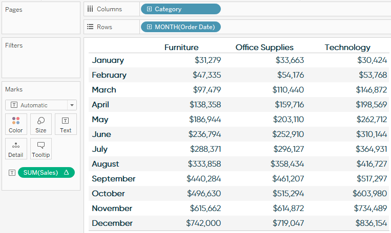
To help introduce table calculations and how to use them, we will be using this simple crosstab created with the Sample – Superstore dataset:
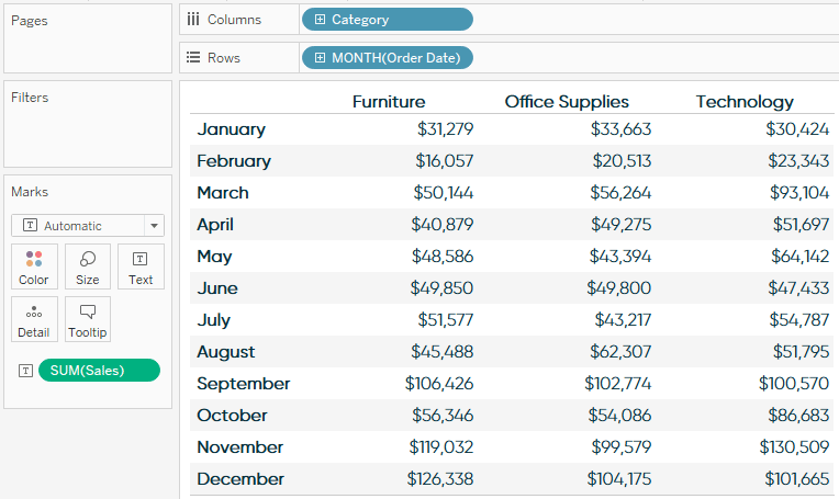
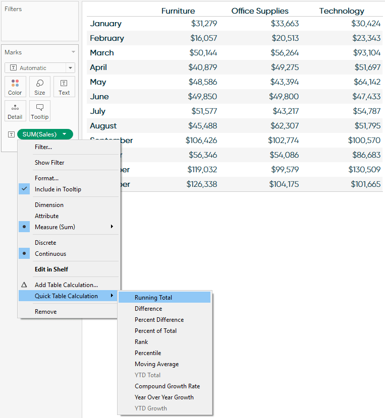
Table calculations are added to measures, so in order to add a table calculation, click a measure that’s on the view. The fastest way to add a table calculation is to hover over “Quick table calculation” and choose an option:
Continue reading with a free account, or login.
Unlock this tutorial and hundreds of other free visual analytics resources from our expert team.
Already have an account? Sign In
By continuing, you agree to our Terms of Use and Privacy Policy.
Here’s how the view looks after choosing the “Running total” table calculation:
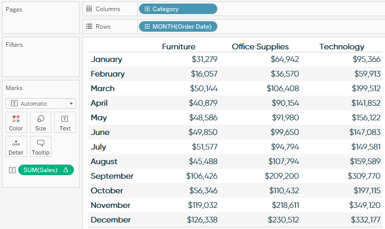
Table calculations are defined by how they are (1.) partitioned – or grouped, and (2.) addressed – or how they are computed. Notice in the example above the running total is being computed from left to right, which is the default addressing. This would mean that, by default, the table calculation is being addressed by the Product Category dimension. This leaves the Month dimension as the partitioning field. For a running total calculation, this doesn’t make a lot of sense.
![]()
It is easy to change the addressing by changing how the table calculation is being computed. To do this, click on the measure with the table calculation again, now identified with a delta symbol, hover over compute using, and change how the calculation should be computed (or addressed):
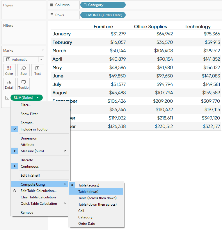
Here’s how the crosstab looks after changing the addressing / compute using to Table (Down):
Now that the addressing field has been changed to Month and the partitioning field has been changed to Product Category, my result makes a lot more sense for my analysis. I can look at each Product Category column, and look down across months to see how the sales built up throughout the year.
There are many different options available within table calculations that can be accessed by clicking a measure with a table calculation and choosing “Edit table calculation…”. For just a few possibilities, see one of Tableau’s most popular posts, Top 10 Tableau Table Calculations.
I mentioned in the introduction to this chapter that one of the benefits of table calculations is that they provide a way to learn the syntax. To do so, simply double-click on a measure with a table calculation to see the underlying formula. This code can be copied into a calculated field so you can take a closer look.
Lastly, even though they are called table calculations, table calculations do not literally have to be used on a table, or crosstab, view. Here is one example I regularly use to add value to a basic monthly line graph:
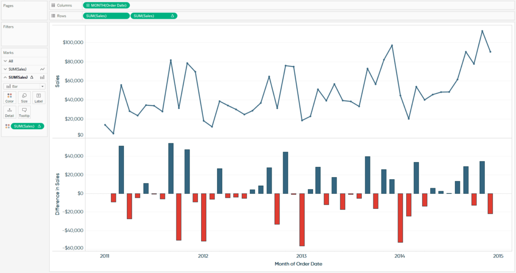
Notice that the first row is a basic monthly trend, while the second Sales pill has a delta symbol, indicating there is a table calculation being applied. This time, I am using the second row to show the month-over-month difference in sales – another of the quick table calculation options available in Tableau.
To create this visualization, I started by simply making a line graph showing the sum of sales by continuous month of order date. I then placed a second occurrence of the Sales measure on the Rows Shelf, which created a second row with the exact same trend. Now that there were two independent pills for the Sales measure, I was able to add a table calculation for month-over-month difference (the second option under “Quick table calculation…”) to the second pill only.
![]()
Each measure also gets its own set of Marks Cards, which means they can be edited independently. After changing the second row so the mark type is bar and the marks are colored by the month-over-month change, the result is the visualization above. Now in addition to a typical monthly sales trend, I’ve provided the month-over-month difference values and visualization, which allows the end user to quickly compare the spikes and drops across months; a value-add made possible through Tableau table calculations.
Thanks for reading,
– Ryan
This content is excerpted from my book Practical Tableau: 100 Tips, Tutorials, and Strategies from a Tableau Zen Master published by O’Reilly Media Inc., 2018, ISBN: 978-1491977316. Get the book at Amazon.


Written By
Ryan Sleeper
Related Content
The Beginner’s Guide to Tableau Table Calculations

Tableau table calculations, while very powerful, can be both tricky and confusing to work with. There are some great benefits…
An Introduction to Calculated Fields in Tableau
Possibly the most powerful feature of Tableau is its ability to allow authors to create new data from existing data…

Ryan Sleeper
Encode Entire Trend Charts with a Single Comparison Have you seen stock ticker gauges that show a full trend line…