Tableau 201: How to Make Dynamic Dual-Axis Bump Charts
Tableau bump charts are an effective way to show how dimension members are ranking across different measures over time. For example, you may want to see how specific product categories have ranked in sales for your company from year to year. Or maybe you want to use discrete months as your element of time to see if the rankings for product categories change based on seasonality. Or maybe you want to do something outside of work and see how your fantasy football players are ranking across different statistics from week to week!
Whatever the case may be, I’ve found bump charts to be an engaging and easy-to-interpret means for visualizing ranks over time. Fellow Tableau Zen Master, Matt Chambers, created one of the most popular Tableau Public visualizations of the year with a bump chart and provided his technique at his site, Sir Viz-a-Lot.
In addition to being an engaging and easy-to-understand visualization, this chart type is very easy to make in Tableau.
This tutorial will show you how to make bump charts in Tableau, but also (1) how to leverage a dual-axis to provide additional context on the view and (2) how to allow the end user to choose the measure being ranked and the dimension members being compared.
Watch the related video with Playfair+
How to make bump charts in Tableau
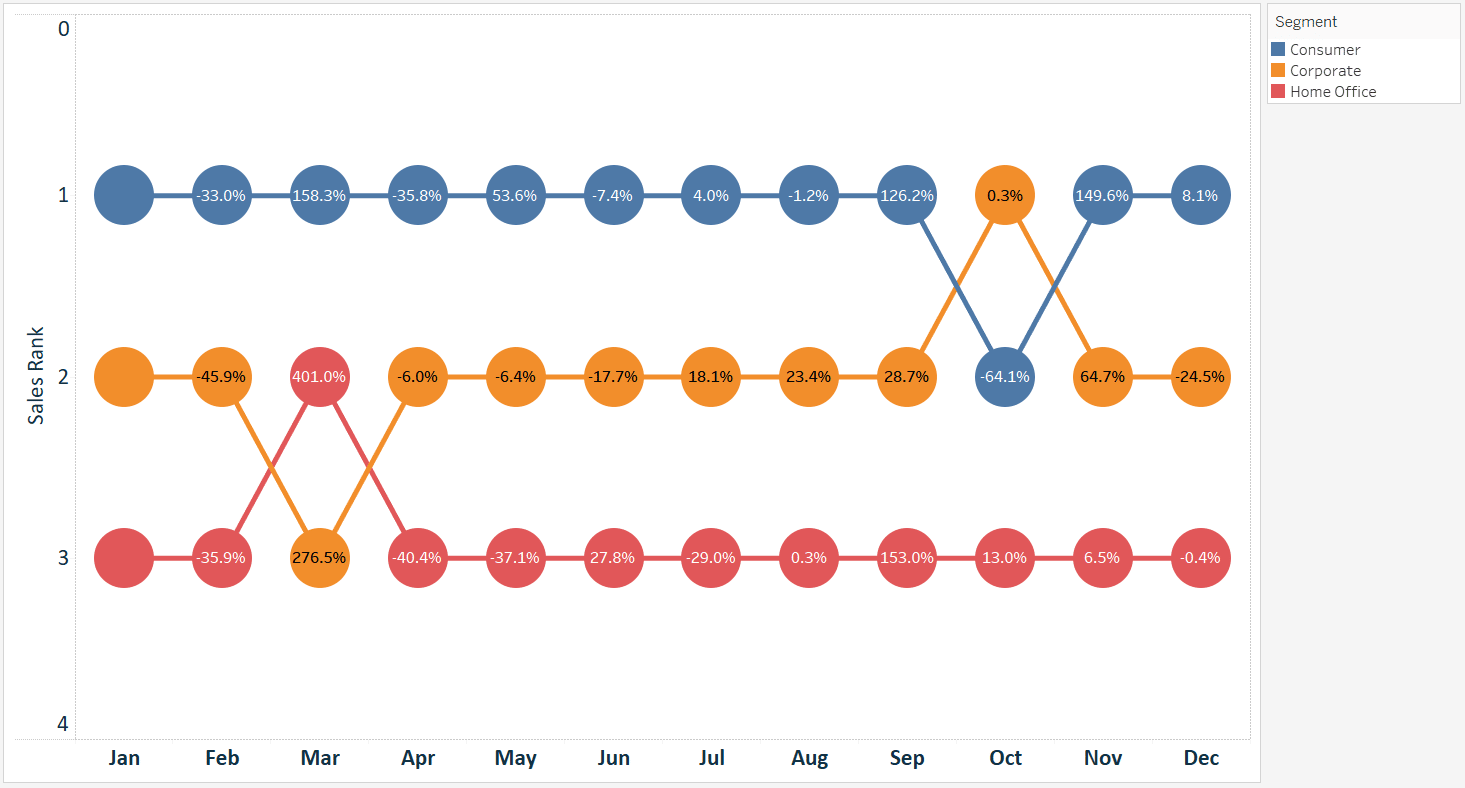
For the first part of the tutorial, we will re-create this bump chart that shows us how the segments from the Sample – Superstore dataset rank between January and December for the SUM(Sales) measure.
To create a bump chart, start by placing the element of time that you want to evaluate onto the Columns Shelf. To re-create the bump chart pictured, I placed discrete MONTH(Order Date) onto the Columns Shelf.
![]()
Continue reading with a free account, or login.
Unlock this tutorial and hundreds of other free visual analytics resources from our expert team.
Already have an account? Sign In
By continuing, you agree to our Terms of Use and Privacy Policy.
On the Measures Shelf, I will place a calculated field for the measure that we want to rank; in this case Sales. The formula for my calculated field is RANK(SUM(Sales)). At this point, the view looks like this:
The RANK function acts as a table calculation in Tableau, so when it was added to the view, it was computed across the table from left to right. To rank the sales amounts by the Segment dimension, let’s make the level of detail in the view more granular by dragging the Segment dimension to the Color Marks Card.
That got us closer, but we still need to change the RANK table calculation to compute for each segment. The Delta symbol on the Sales Rank measure tells us that a table calculation is happening. To edit how the table calculation is being computed, right-click on the Sales Rank measure, hover over “Compute Using”, and choose “Segment”.
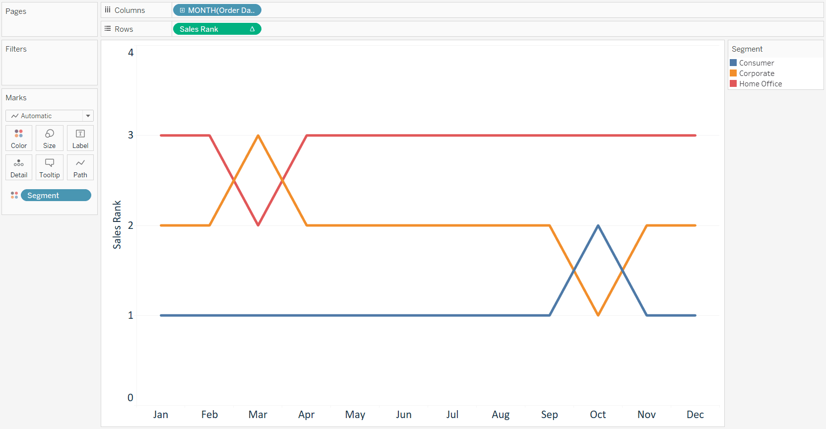
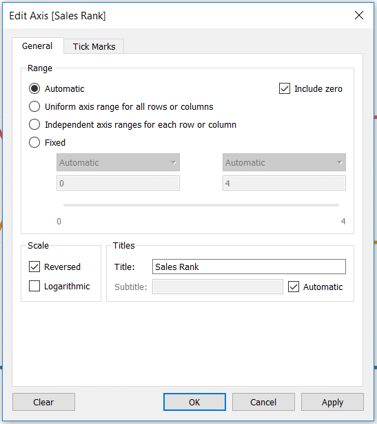
At this point, we’ve technically got a bump chart in Tableau. It may be more intuitive for the best rank (i.e. 1) to be on top, so I will reverse the axis by right clicking on the Sales Rank axis, clicking “Edit Axis…”, and checking the box to reverse the scale.
We have a bump chart, but wouldn’t it be great to provide some additional value to the analysis? It’s good to know that the consumer segment led the way for the first nine months of the year, but we don’t know if the sales for that segment were going up or down throughout the year. To provide that context I will create a dual-axis combination chart. The first axis will be the bump chart that we just set up, and the second axis will be a dot plot that displays the percent change in month-over-month sales.
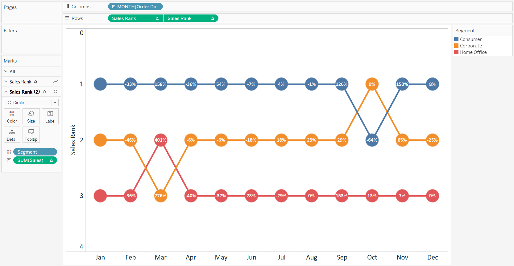
To make this bump chart dual-axis, duplicate the Sales Rank measure and place it on the opposite axis and right-click on the right axis to click “Synchronize Axis”. If working with a second axis sounds new to you, be sure to read How to Make a Dual-Axis Combination Chart in Tableau before moving forward.
At this point, we have the same line graph twice, with one laying on top of the other. Now that we duplicated the Sales Rank measure, we have two separate sets of marks cards, and they can be edited independently. I will change the mark type on the second marks shelf to circle to make my bump chart look a little bit nicer.

I now have some real estate to add some additional context to the marks. One possibility is to display the rank (1 through 3) for the mark on each circle. That may be a good use if you’re dealing with many separate rows of marks, but with only three, that seems like a waste of valuable real estate. Instead, I will add the Sales measure to the Label Marks Card (for the circles only), then add a table calculation that computes the month-over-month percent change in sales for each segment. I also hid the right axis to finalize my bump chart.
The Beginner’s Guide to Tableau Table Calculations
Our Tableau bump chart is now showing the month-over-month rank per segment, but also the month-over-month percent change in sales for each segment. This is turning out to be a solid static analysis, but why don’t we add even more value in Tableau by allowing our end user to choose what dimension is used in the sales ranking.
To accomplish this, I will use this trick to allow end users to choose measures and dimensions in Tableau. For this example, I will allow my end users to choose from the Segment, Ship Mode, or Category dimensions. The first step is to create a string parameter with the choices of Segment, Ship Mode, and Category.

Then I will create a calculated field to give Tableau instructions on what to display for each parameter choice.
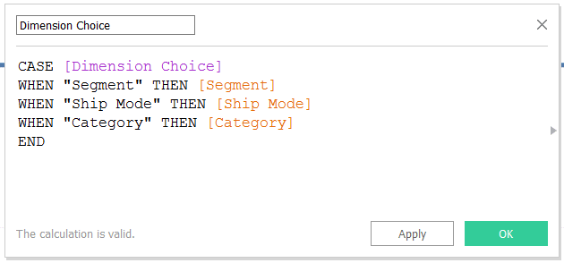
Now if I replace the segment dimension on the color marks cards of my bump chart with my newly created Dimension Choice field, the lines and circles will be colored based on what my end user selects in the parameter.
In addition to placing the Dimension Choice dimension on the color marks card for both axes, there are two more small steps to get this working: 1. Ensure the table calculations on the Rows Shelf are now computing on Dimension Choice (they were previously computing on Segment) and 2. Show the parameter control for Dimension Choice so the end user can change the selection (to do this, right-click on the parameter and choose “Show Parameter Control”).
![]()
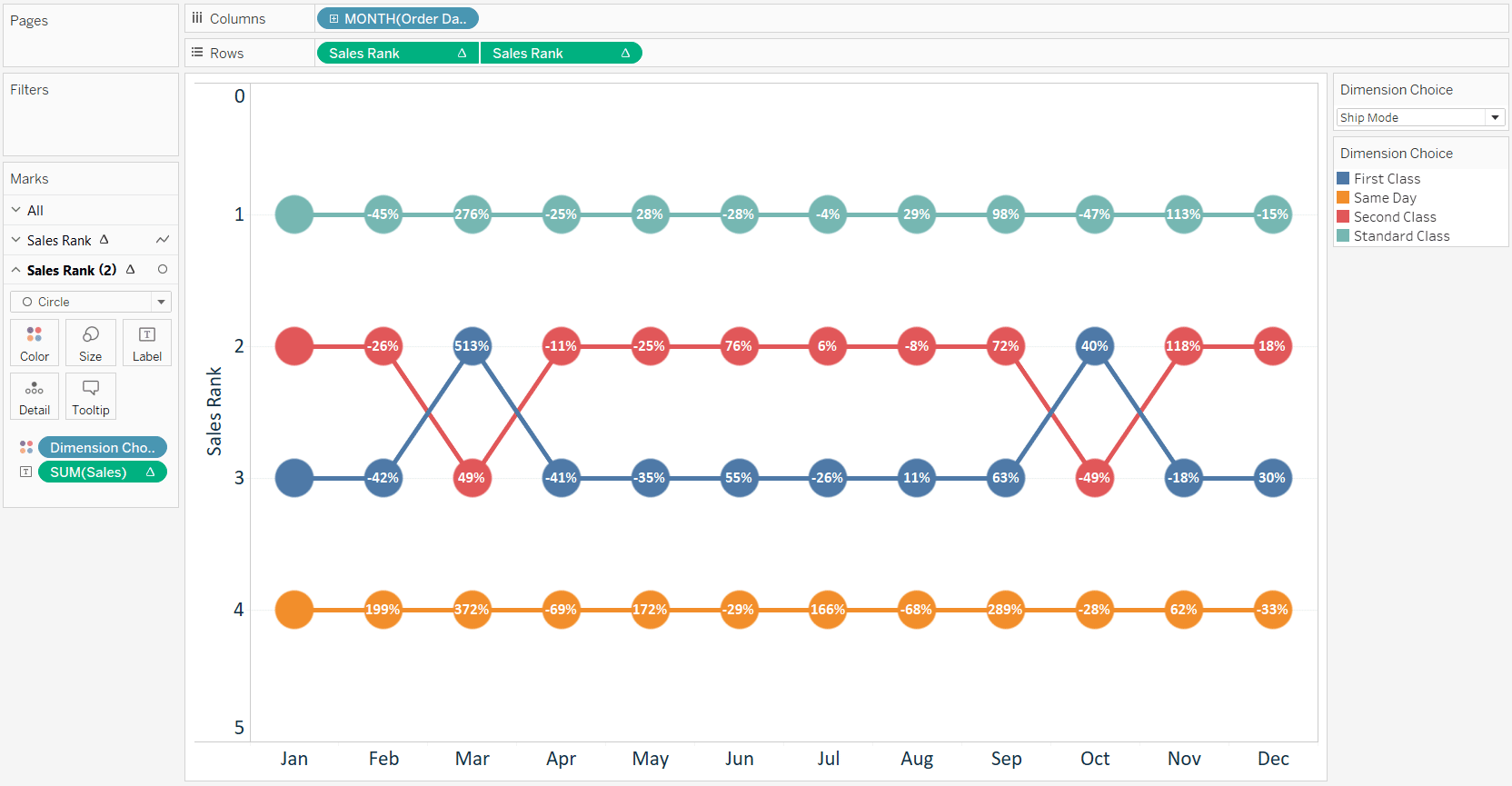
Now if I select Ship Mode in the parameter control, my bump chart rankings are based on Ship Mode.
If I choose Category, my bump chart rankings are based on Category.
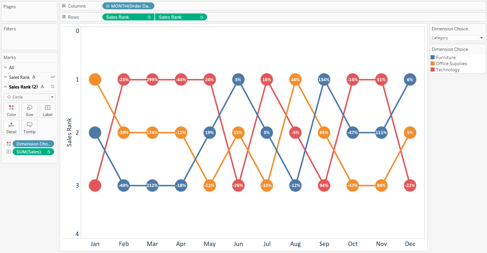
A dynamic, dual-axis bump chart that is providing multiple layers of insight for our end users, and allows them to control the visualization. Your wheels may already be turning at the possibilities for your own analyses, and yes, you can also use the parameter selection approach to change the measure for the ranking!
Thanks for reading,
– Ryan
This content is excerpted from my book Practical Tableau: 100 Tips, Tutorials, and Strategies from a Tableau Zen Master published by O’Reilly Media Inc., 2018, ISBN: 978-1491977316. Get the book at Amazon.


Written By
Ryan Sleeper
Related Content

Ryan Sleeper
Several ways to use a favorite user feature This video will show you how to make dual-axis combination charts –…
Ryan Sleeper
Improve your users’ experience by integrating measure names in calculations The introduction of parameter actions in Tableau 2019.2 has allowed…
The Beginner’s Guide to Tableau Table Calculations

Tableau table calculations, while very powerful, can be both tricky and confusing to work with. There are some great benefits…