Tableau Hack: How to Dynamically Highlight Selections in Connected Scatter Plots

Tableau connected scatter plots can be an extremely powerful chart type when trying to compare relationships between two measures and how their performance moves over time. Traditional scatter plots allow the users to gain a great overview of their data at a glance, but connected scatter plots can seem rather crowded and can make a deeper analysis challenging. What if we could find a way that keeps the benefits of a scatter plot, whilst being able to focus on a single dimension member to highlight changes over the years?
This post will show you how to create a dual-axis scatter plot that compares a single selected dimension member to a previous time period. I will also give you some helpful design tips that will take this tactic and others to the next level!
Watch the related video with Playfair+
How to create a dynamically connected scatter plot in Tableau
In this example, we will create a dynamic scatter plot from the Sample – Superstore dataset that can compare Profit and Quantity over the years from 2018 and 2019 for a specific dimension member that is highlighted.
After connecting the Sample – Superstore Excel spreadsheet to Tableau, we are going to create a basic scatter plot. Begin by dragging Quantity onto the Columns Shelf, Profit onto the Row Shelf and Sub-Category onto the Detail property of the Marks Card.
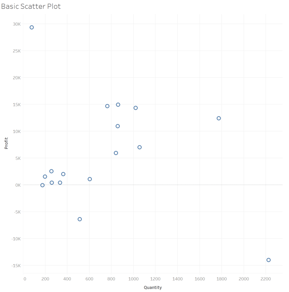
When dragging and dropping the respective fields in place, Tableau automatically recognizes the ideal chart type and will show us the scatter plot, which is the correct visualization.
3 Ways to Make Stunning Scatter Plots in Tableau
Continue reading with a free account, or login.
Unlock this tutorial and hundreds of other free visual analytics resources from our expert team.
Already have an account? Sign In
By continuing, you agree to our Terms of Use and Privacy Policy.
Create a parameter to highlight your sub-category selection
To make the selection of the highlighted Sub-Category, I am going to use a parameter to control the selection. This will allow the user to choose which dimension member they want to focus on.
![]()
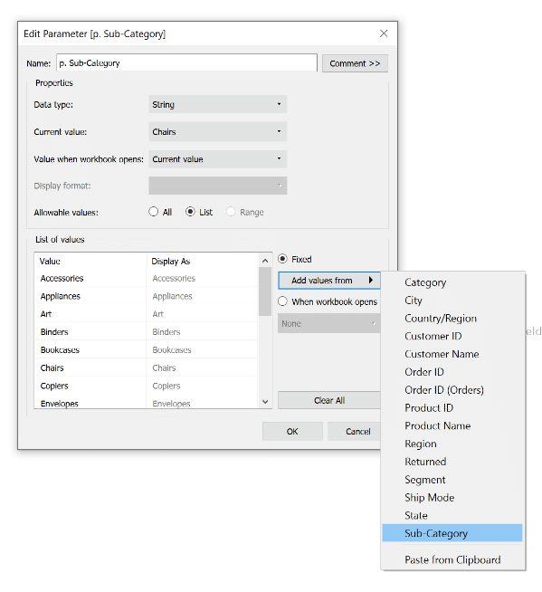
To create the parameter, right-click in any blank space in the Data pane, choose Create, then Create Parameter. I will title it “p. Sub-Category”, change the data type to String, and click the List radio button. Then choose “Add values from” on the right side of the window, click the Sub-Category dimension and click OK. By adding the values from the source itself you can avoid spelling errors and it populates the entire list for you rather then doing it yourself.
In later steps, the parameter will be used to determine which Sub-Category item will be compared over the years 2018 and 2019 and will also determine highlighting on the visualization.
Create calculated fields to dynamically highlight a scatter plot with connecting lines
Now we’ve come to the calculations part of the connected scatter plot. The first calculation allows you to see two dots on your connected scatter plot, namely the values for the Sub-Category in 2018 and 2019. These two dots will later be connected, illustrating the change from 2018 to 2019.
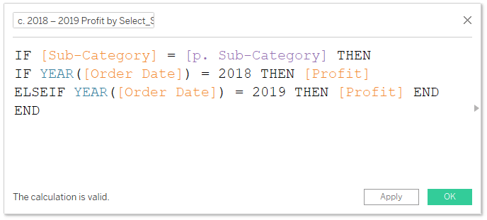
To create the calculated field, right-click on any blank spot in the Data pane, select Create, then Calculated Field, and call it “c. 2018 – 2019 Profit by Select_Sub-Category”.
Then you will need to type the following formula to slice out the exact points that you need:
IF [Sub-Category] = [p. Sub-Category] THEN
IF YEAR([Order Date]) = 2018 THEN [Profit]
ELSEIF YEAR([Order Date]) = 2019 THEN [Profit] END
END
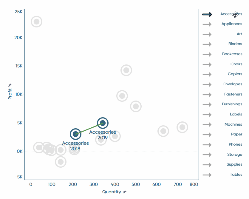
Once that calculation is valid and working, you can exchange the Profit measure on the Rows shelf with your new calculated field. Once you do that, there will only be one dot visible. To make both values visible you will need to change the mark type to Line, drag Order Date onto the Path property of the Marks card, and drag Order Date onto the Label property of the Marks card. Make sure that Order Date is defaulted to Year for both instances. There will also be a “null values” indicator from Tableau which you can hide for better visibility. After following the steps above you should end up with a view that looks like this:
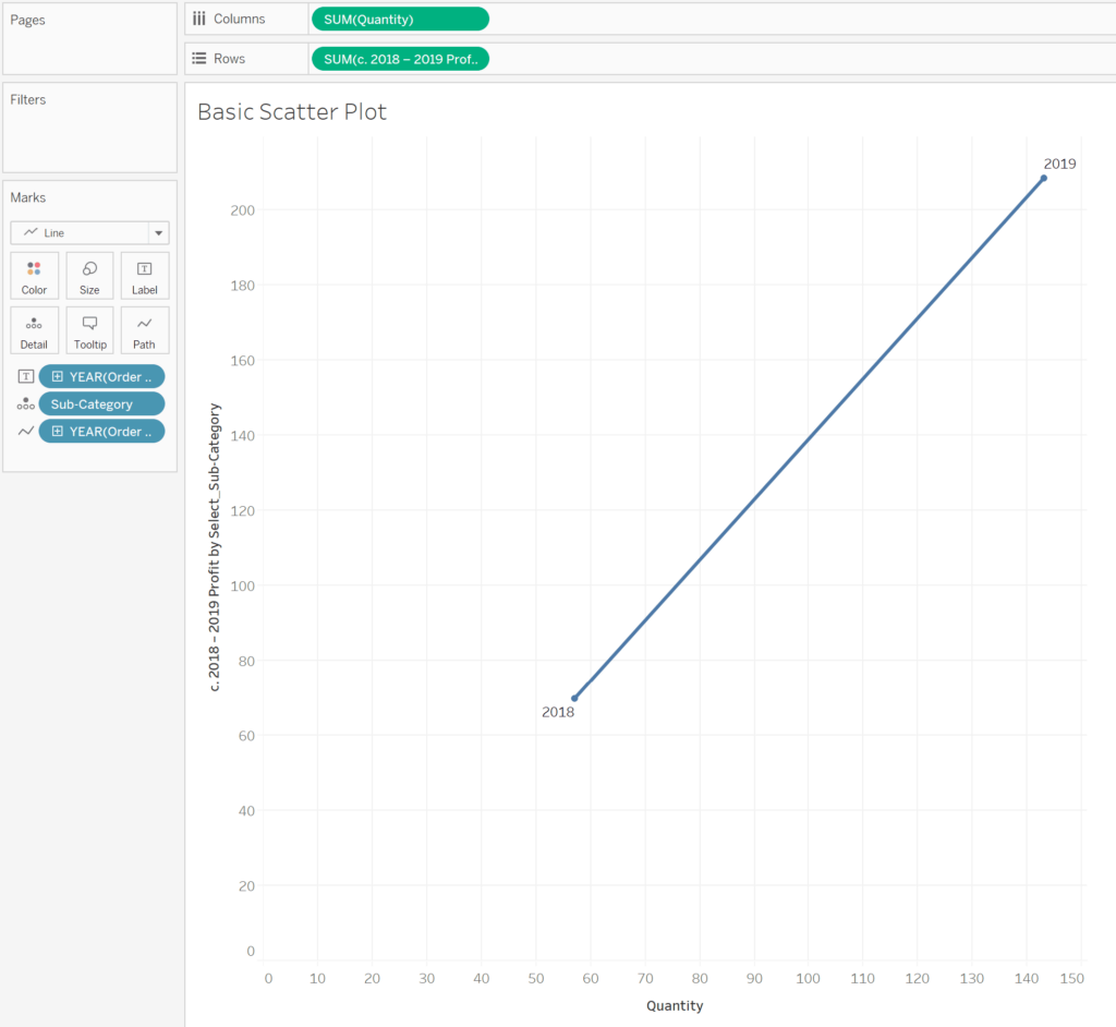
By the way, when you drag the Order Date dimension onto the Marks card, we have it defaulted to a discrete value of YEAR(Order Date). This is what we need in this example, but you can change this to months and even days as long as you match your calculated field and define the two comparison ranges.
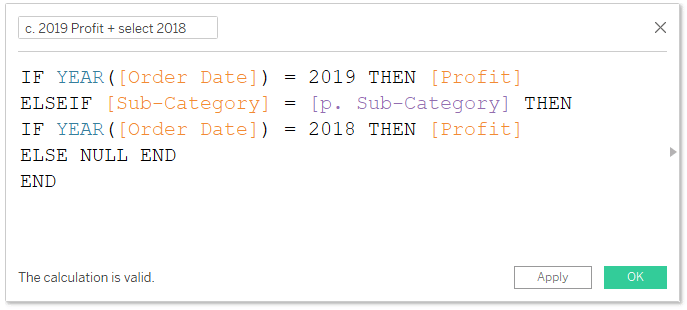
The second calculated field’s objective is to show us all sub-categories in 2019 plus the selected/highlighted sub-category in 2018. We will be doing this by filtering out all of 2019 via the DATETRUNC formula and putting an additional filter through our parameter selection which only shows the sub-category selected for 2018. Go ahead and create a new calculated field with the formula below.
IF YEAR([Order Date]) = 2019 THEN [Profit]
ELSEIF [Sub-Category] = [p. Sub-Category] THEN
IF YEAR([Order Date]) = 2018 THEN [Profit]
ELSE NULL END
END
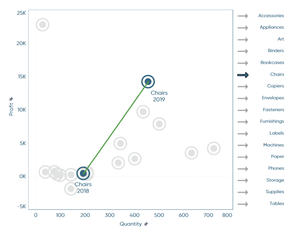
Create a dual axis combination chart
Once you’ve created this calculation, drag it after the previous field we created, “c. 2018 – 2019 Profit by Select_Sub-Category”, on the Rows shelf. We are going to create a dual-axis combination chart with the two measures on the shelf by right-clicking on one of the measures and selecting Dual Axis.
When you create a dual axis view, make sure you synchronize the two y-axes by right-clicking into one of them and selecting “Synchronize Axis”. Otherwise, your view may be out-of-sync and won’t match what you are trying to convey.
One of the benefits of using dual-axis combination charts is that you can independently modify the look and feel of the two views by clicking in the respective Marks card for each of them.
For this example, I decided to create a calculated field that highlights my sub-category selection and will color the rest grey. The calculation for that is simply:
[Sub-Category] = [p. Sub-Category]
And the outcome of it would either be True or False.
By dragging that field onto the Color property of the Marks card for the second calculated field, c. 2019 Profit + select 2018), I get the option to define two colors for the values on the view. I would recommend that you choose one color to highlight your selection, and a greyish color to blend your non-selected dimension members in the background.
![]()
In the end, I did some additional formatting by adding nice sub-category selectors to the right of the dashboard and hooking those up with a Change Parameter dashboard action. I also made sure all the fonts align and are spaced correctly. If you need some help to create those dimension selectors, I would recommend taking a look at our posts on Tableau toggles.
Now it’s your turn to create your dynamically connected scatter plot in Tableau!
Stay hungry,
Maggy


Written By
Maggy Muellner
Related Content
3 Innovative Ways to Highlight Selections in Tableau

In this tutorial I will demonstrate three ways to use different mark types with transparent sheets to highlight a selection…

Ryan Sleeper
Create Perfect Marks and Borders by Leveraging a Dual Axis Mark effects like borders and halos (for maps) have limitations…
Ryan Sleeper
Drill In and Out of Segments with a Single Click We’ve shown you before how scatter plots create a natural…