The Parallels Between Storytelling and Data Visualization
Think of the lyrics from your favorite song – or any song for that matter. I guarantee it contains the words “I”, “you”, or somebody’s name.
Ever watched a movie that didn’t contain a sequence of events that made up the overall story? That sounds awful.
Notice how everyone at the office holiday party has their own unique style, emotions, and delivery of the same story – even when recounting events that everyone is familiar with?
This is because every story, regardless of the format it is delivered in, contains at least three elements: 1. characters 2. plot and 3. narrative. In this post, I’ll share the parallels between storytelling and data visualization, how you can use these attributes to better connect with your audience, and how to improve the chances of your data visualization being adopted.

Continue reading with a free account, or login.
Unlock this tutorial and hundreds of other free visual analytics resources from our expert team.
Already have an account? Sign In
By continuing, you agree to our Terms of Use and Privacy Policy.
Characters / Plot Narrative = Fields / Insights / Style
Let’s start with the core elements that make up every story and their respective data visualization counterparts. I think of the characters in a story as the fields in the data being analyzed. As in most stories where characters play a larger role, the same is true of data visualizations with their key performance indicators. Some dimensions or measures may also be underdeveloped and discovered to be unusable in the analysis at hand and maybe even removed from the data altogether. And of course, the data contains its villains, which may include hidden errors, a headache-inducing join, or a poor performance we have to share with the boss. In the end, all these types of fields that play a different role will work together to make up a plot.
![]()
The plot are the insights that emerge when evaluating the fields in the data. When I’m teaching data visualization, literally the first rule I share is that “Measures are the numbers; dimensions are what you slice and dice the numbers by to glean insight.” When you use a combination of quantitative and qualitative fields that leads to something you can act upon, you have discovered insight. Much like a plot in a story, the sequence of these discoveries, the analyst weighing which of these can be acted upon, and ultimately prioritizing which to share with other stakeholders, makes up the overall analytics that they’re doing.
Two Types of Data Stories and Tactics for Handling Each
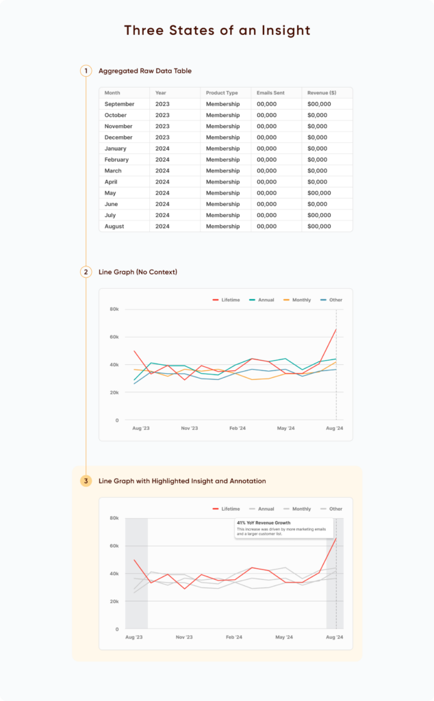
Lastly, the element that I believe we as analysts have the most control over, is the narrative, which I think of as the style in which we communicate the insights that we have found. Let’s say we are analysts for the Playfair+ platform and we have discovered an insight that our latest anniversary sale led to an astounding 41% year over year increase in revenue which was driven by an increase in the number of times our marketing team sent emails and because our list of potential customers had grown substantially from the same time last year as well.
One way we could communicate this insight is to send stakeholders an unwieldy spreadsheet containing every sale and assume they will filter it to their liking and arrive at the same conclusion. Being the practical analysts we are, you may at least consider aggregating the data by month and/or product type to reduce the number of rows stakeholders must wade through before taking action. Unfortunately, in my experience, this is where most companies stop with their analytics and reporting. Slightly better than providing the data in its rawest form, but short of visual analytics and all the benefits it has to offer.
A Spreadsheet is Not a Data Visualization
When we know the insight, it is our responsibility to communicate that insight in a way that the viewer understands and can potentially take action. A better way to communicate the insight we found would be to convert it to a line graph, leveraging the preattentive attributes of height and 2-D position to improve the chances that your stakeholder arrives at the same insight.
The best option would be to highlight the product type we want the viewer to focus on and/or even annotate our exact findings and recommendations directly on the data visualization. See the power of going from a raw spreadsheet of aggregated data to data visualization, to a story with your own narrative.
Who’s the best basketball player of all time? Michael Jordan, LeBron James, or… Wilt Chamberlain?
I bet you answered Michael Jordan. If you’re not an NBA fan, you may not have even heard of Wilt Chamberlain. Did you know that Michael Jordan (32,292) barely cracks the top five for total career points and trails LeBron James (40,474) by over 8,000 points? Not to mention the latter is still playing and adding to this giant, 25%+ gap. Part of this comes down to how you personally define success, but I’m convinced that Michael Jordan is widely considered the best player of all time because of the style he brought to the game at the right time, permanently setting this narrative in place.
Vital Strategy Question 2: What is the Measurement of Success?
It was the chains. The shoes. The leap from the free throw line that created the iconic ‘Jump Man’ logo. The weird Oakley sunglasses at the 1992 Olympics that were popular at the time for some reason. Not to mention his passion, energy, and yes, talent, on the court. Adding your own narrative or style to analytics is so powerful that I’ve actually struggled with this dynamic for a long time. I like to pride myself on being objective, honest, and generally take data at its face value, but the reality is this is not enough. Particularly if you’re wanting to make a positive impact and cause actions at your organization.
![]()
Believe it or not, I remember the exact moment I became aware of this concept. I was a huge basketball fan in the 90’s, driven largely by my fandom of the upstart Orlando Magic, who were competing for championships just a few short years since their inception. So, at 13 years old, I couldn’t wait to get my hands on the new NBA at 50 book, which highlighted the history of the league and ranked the top 50 players of all time. The single most surprising and interesting part of the book was a head-to-head comparison of Michael Jordan vs. Wilt Chamberlain.
I swear the NBA thought better of this or something because pretty much the only conspiracy theory I buy into is that all images and knowledge of this graphic have been wiped from the Internet and our collective memory. But I never forgot this image. Even as a 13-year old, I remember being shocked by this and wondering how the player unanimously regarded as the greatest of all time wasn’t even close to Wilt Chamberlain when it came to the cold, hard data. While my original copy of the book is long gone, I fortuitously stumbled upon the book again at an antique consignment store of all places and had to re-add it to my collection. See for yourself:
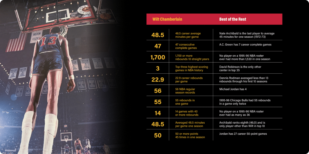
So how did the narrative of Jordan’s greatness become so pervasive? I’ve heard it’s because people think Jordan was more athletic than Chamberlain. Wilt won the high jump as a college athlete… while he was wearing a hat… as a 7’1” human. I’ve heard it’s because Jordan played against better competition and Chamberlain was a “man amongst boys”. Wilt outperformed 11-time champion, Bill Russell, in every notable statistic except for free throw percentage during the same era… including scoring 100 points in a single game against a 6’11 defender.
Even though Bill Russell himself has been documented several times calling Chamberlain the greatest of all time, I know I won’t sell everybody on this. But that means your assessment isn’t purely based on data – and that’s okay. That’s my point. You’re acknowledging that the data alone is not enough. You must consider the style in which you are communicating insights, the existing bias of your stakeholders that will inevitably creep in, and the emotion of how decision makers feel about the insights and prospective actions.
Tactics for making storytelling parallels work for your data visualization
According to authors Chip and Dan Heath in Made to Stick, 63% of an audience remembers stories following a presentation, but only 5% of those same people remember the statistics. So here are five ideas that I hope bring these storytelling and data visualization parallels to life and add value to your organization. If you get stuck, the Playfair Data team is here to help if you need analytics consulting to take your visual analytics to the next level.
Help your stakeholders see for themselves. You would likely think of Wilt Chamberlain as the greatest basketball player of all time if there was footage of him scoring 100 points, winning the high jump with a hat on, or effortlessly dunking from the free throw line – but there isn’t. Data is the same way in that I can share all of the facts, repeat the insights over and over, but at the end of the day, the chances of my stakeholders taking action with the information will only occur if they see it themselves. And I’m not talking about million row spreadsheets of raw data that look like the millions of others they’ve seen throughout their career; I’m talking about engaging and effective data visualizations to draw them in, help them understand, and drive decision making.
Build rapport with stakeholders. Whether you like to think of it like this or not, analytics is a sales process. Visual analytics, in particular, require creative aspects that can be subjective. You have to build rapport with your audience so they ‘buy in’ to what you’re telling them and improve the chances that they take action. It matters who is telling the story. Part of this will just come over time as you consistently deliver value and build a track record of wins. In the short term, you can build rapport by being honest about data limitations, doing your best to communicate the methodologies of how your data visualizations were created, and ask stakeholders questions to ensure their diverse requirements are being met.
Vital Strategy Question 1: Who is the Audience?
Add authority and credibility to the visuals. Another way to build rapport / trust with your visual analytics is to make them well designed. We as practitioners have to stop saying, “oh, we just build pretty charts and graphs.” Well-designed data visualizations have a giant head start towards causing action when compared to raw spreadsheets or data visualizations built with all of the software defaults. For better or worse, the secret to ‘pretty charts and graphs’ is that they add instant authority to any analysis. I say for better or worse because this works so well that all of the underlying data can be wrong, and stakeholders will be more likely to believe it if it looks professionally developed. Playfair Data looks at design as an equal aspect of visual analytics, along with strategy, data prep, and engineering, and have an entire learning path dedicated to graphic, interface, and user experience design.
Build your visual analytics brand. Another way to take advantage of design thinking is to build your own brand within your visual analytics practice. I’ll never forget the time a subscriber sent me a message saying they knew an email was from me, not by the data visualization, but by the subject line of the email – this is branding at its finest. By using consistent colors, storytelling style, department wide logos, chart types, interface designs, and user experiences, you establish your own brand. Over time, this provides the benefit of continuously building rapport with your audience, even when you’re not there to walk them through the dashboard and will add authority to the analysis.
Use comparisons. Using comparisons, whether they be period over period, performance versus goal, or competitive benchmarking, are one of the best tactics for helping stakeholders make decisions and take action using visual analytics. It’s not enough to say, “we made $100,000 last month.” You’re exponentially better off saying, “we made $100,000 last month, which was down 20% from where were last year”, or “we made $100,000 last month, which exceeded our monthly goal by $15,000 driven by our conference sponsorship.” – and, of course, your best chance at success is to show them this story using visual analytics.
Thanks for reading,
– Ryan

Written By
Ryan Sleeper
Related Content
Vital Question 1: Who is the Audience?
I’ve always believed that it is not enough to master the tactics of Tableau and data visualization if you neglect…

Ryan Sleeper
Undeniable links between graphs and old-school storytelling This video discusses the three elements found within every story and how those…
A Spreadsheet is Not a Data Visualization
Like the movie Groundhog Day, but without its Certified Fresh 96% score on Rotten Tomatoes, there is one conversation I…