Winning the Oracle Analytics Cloud Data Visualization Challenge


What better way to start the year than for the Playfair Data team to have won yet another award! Our team competed in the 2025 Oracle Analytics Cloud Data Visualization Challenge, and out of hundreds of submissions, our data visualization was recognized as one of the top five winners. With Ethan assisting with strategy, Rafael as the design architect, Felicia as the quality assurance engineer, and myself, Dan, as the analytics engineer, this was truly a team effort.
This was my first time using Oracle Analytics Cloud to compete in a data visualization competition, but despite that hurdle, our team produced a world-class product to come out as winners. Upon reflection, we won because we stuck to the fundamental principles of visual analytics.
💡 Visual analytics applies universally across all data visualization software. It doesn’t matter if you use Power BI, Tableau, Oracle Analytics, or even Excel. The visual analytics principles of strategy, design, engineering, and data prep are tool agnostic. By properly applying those principles to this competition, our team’s efforts ultimately resulted in victory.
In this post, I am excited to share my engineering experience with Oracle Analytics, Rafael’s design lessons from the competition, specific product highlights that I found very valuable in Oracle Analytics Cloud (OAC), and product updates I hope to see in the future.
The Oracle Analytics Cloud Data Visualization Challenge
The OAC Data Visualization Challenge, available to all Oracle Analytics Community members, was a competition to see who could create the best data visualization in Oracle Analytics Cloud within a one-month timeframe.
Using the Auto Insurance dataset Oracle provided, our team set to work strategizing how to visualize the data. The judgment criteria for the competition were broken down into six categories: awareness of the audience, quality of design execution, appropriateness of visualizations, range of methods used for investigation, the quality of the story, and the depth of the investigation.
With this information, our team knew that the analysis needed to immediately engage the audience and provide an easy-to-comprehend story. For that reason, the decision was made to veer away from a traditional exploratory business dashboard and lean into an engaging infographic dashboard that would lead the audience through a story.
Building the analysis using the “5 Whys” framework
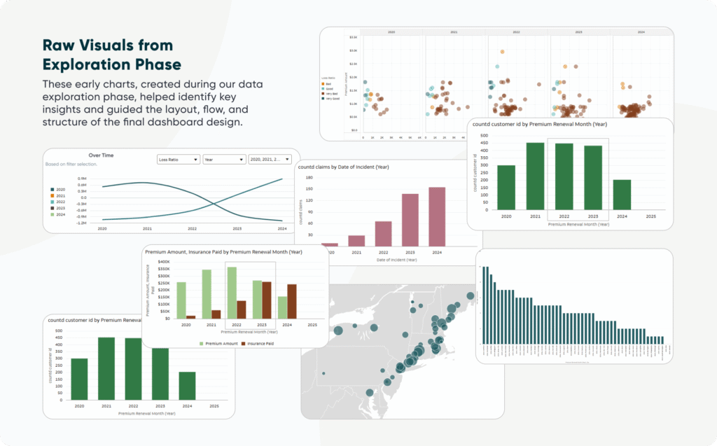
Connecting to the auto insurance dataset with Oracle Analytics Cloud, I began the data exploration to identify any interesting insights. Using a range of methods, which included building tables to get familiar with the data fields, histograms to understand the distribution of the data, scatter plots to identify correlations, line charts to look at trends, etc. I finally came across an interesting insight that jumped off the page.
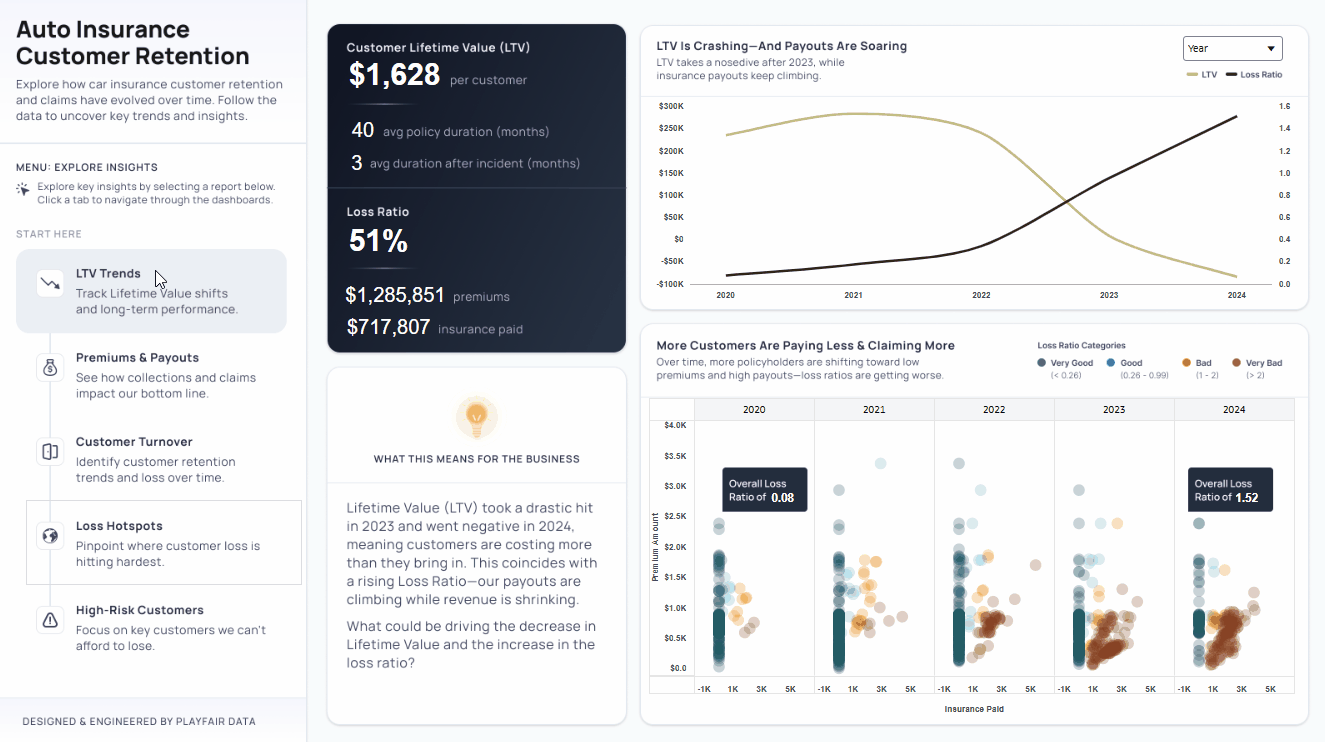
Through one of the oldest, simplest, and yet most effective data visualizations, the line chart, I identified that the lifetime value (LTV) of the auto insurance company’s customers was dramatically dropping, while the loss ratio was steadily increasing during the same time period. This appeared to be a great starting point for a deeper analysis.
To dig deeper, I used the “Five Whys” framework, which ultimately was reflected in the five canvases, or dashboards, used in the final project. The “Five Whys” framework is a simple yet effective way to understand the root cause, good or bad, of any given outcome. You work backwards by starting with the outcome and ask, “Why did this occur?” Which leads you to an answer, then you ask again, “Why did this occur?”, and continue to do this three more times.
Why is lifetime value decreasing and loss ratio increasing? The main insight found was that the company’s lifetime value began going negative in 2023 – 2024 with the loss ratio increasing. Moving backwards from that insight I found that the company’s collected premiums were dropping while the insurance payments were increasing. This is a particularly alarming insight because an insurance company’s profit is the spread between premiums collected and insurance paid out.
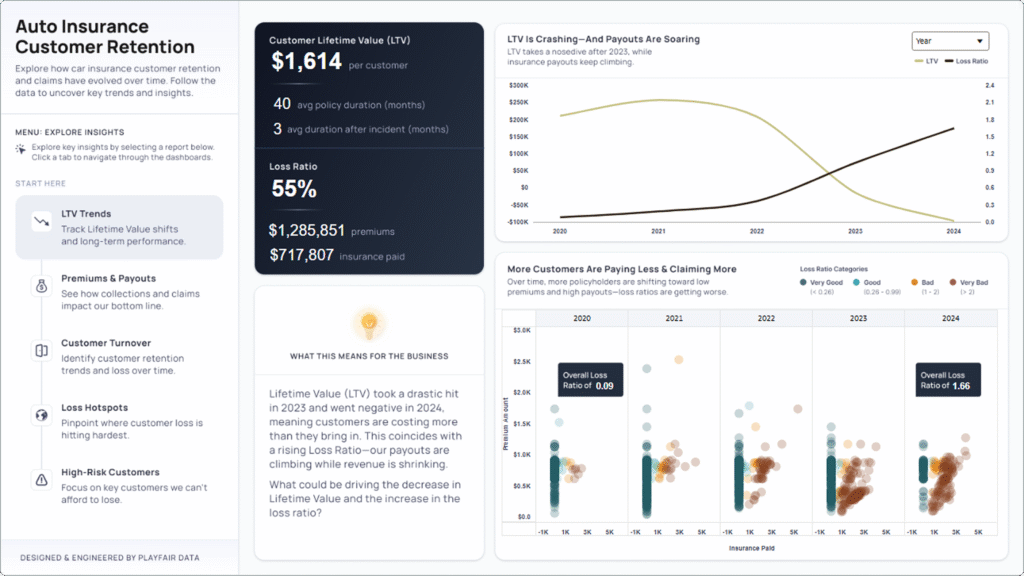
Why are premiums dropping and insurance payments increasing? Around half of the customer base filed a claim, collected their payout, then canceled their insurance. This is an obvious problem for an insurance company whose business model depends on customer retention. While it explains why there was a significant increase in paid out insurance with fewer premiums collected, we still don’t understand why the customers cancelled their subscription.
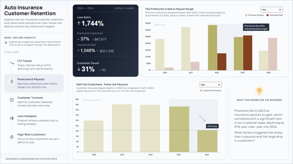
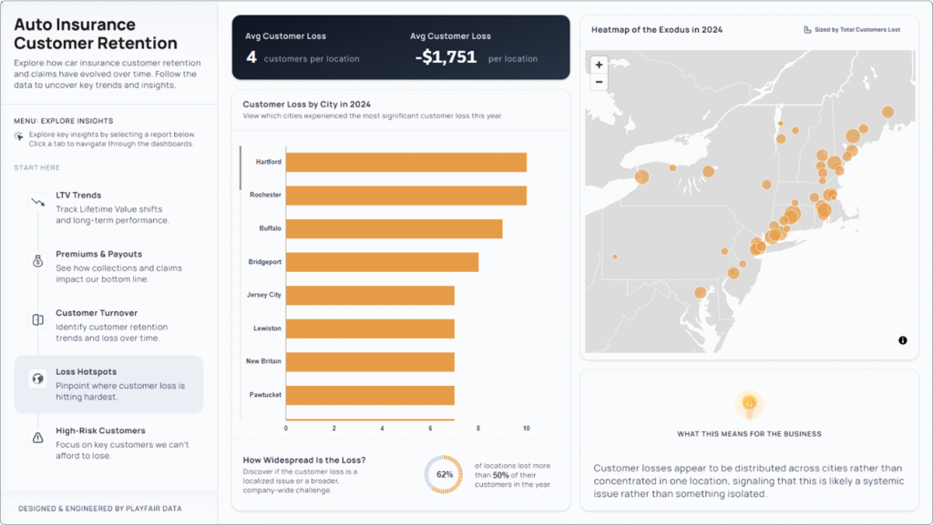
Why did half of the customer base leave? The number of claims was fairly steady over time, but in 2023 the claims doubled. With this being a sample data set, we made a logical hypothesis that the surge in claims may have overwhelmed the customer service team, resulting in poor customer service and further explaining the customer fallout. These filed claims were widespread geographically, but what about the customer loss?
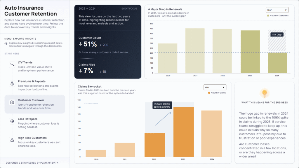
Was customer loss isolated to a single location, or is it widespread? If we can isolate the customer service problem to a single location or locations, then we know where to focus our time and resources. If it isn’t isolated, we know that a deeper, more systemic issue may be at play within the business and processes. Uncovered in the below visualization, the customer loss was widespread, meaning there is a systemic issue that should be addressed as soon as possible. But with this alarming trend unfolding within the business, it is imperative that we identify a way to quickly curb any additional customer fallout.
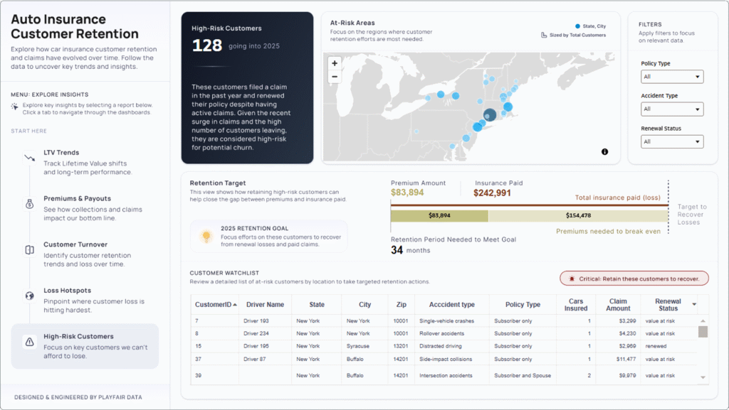
Are there any current customers who have recently filed a claim going into 2025? The company cannot afford to lose any more customers, therefore the answer to this question will allow for immediate action for the management team across the region to focus retention efforts around those high-risk customers until the more systemic issue within the business can be addressed. The analysis culminates with the dashboard, featured below, that identifies high-risk customer profiles, their locations, and how long they need to be retained for the company to at least break even on their claims.
Turning an analysis into a story
Hi, I’m Rafa — the designer on this project. My role was to take the insights from our analysis and shape them into a clear, intuitive dashboard. Here’s how I approached it.
Step 1: Understand the data. Before I designed anything, I had to get familiar with the data. That meant asking questions, researching the insurance industry, exploring similar tools, and talking with our engineers to understand what we were working with. I wanted to know: What’s the story here? What might users expect to see? And what’s going to surprise them?
Good design starts with empathy, so a good mindset to be in is to ask oneself: Would I understand this at a glance? Would I know what to do next?
Step 2: Plan the flow. Once I had a handle on the data and the visualizations we wanted to use, it was time to map out the journey.
We used the “Five Whys” framework — each “Why?” became its own dashboard view. Like chapters in a story, each one ends with a new question and leads naturally into the next. This structure helped control the pace, focus attention, and avoid overwhelming the user. We didn’t want to just show insights — we wanted to lead users to them.
The Parallels Between Storytelling and Data Visualization
Step 3: Build the framework. With the story in place, I wireframed the layout in Figma: navigation, KPIs, charts, and annotations. I thought about flow and hierarchy: What should users see first? What looks clickable? Where will their eyes land? Most people read top to bottom, left to right — so the layout followed that rhythm. Big-picture trends went at the top; detailed views followed after at the bottom, and key metrics got bold treatment to pull attention right where we wanted it.
Step 4: Design for action. Lastly, the final check: Can users take action? A dashboard can be beautiful, but if it doesn’t help someone make a decision, it’s not doing its job. I always end by asking: Do we clearly show what to do next? If not, we refine until we do.
Key takeaways from engineering in Oracle Analytics Cloud
Highlight of Dan’s favorite OAC features
Parameters. Oracle Analytics’ parameters are by far the biggest highlight for me. Parameters in any data visualization tool can unlock a lot of engineering flexibility, so I was very happy to see that Oracle Analytics made its parameters relatively robust.
- Visibility Parameters, similar to Tableau’s dynamic zone visibility, allow you to dynamically show or hide objects in the view based on the value of a parameter. While the functionality is limited to making objects 100% transparent as opposed to fully hidden, this feature is powerful and has a lot of potential engineering use cases.
- Binding Parameters allow the engineer to connect or ‘bind’ a parameter to a filter. This allows the user to easily filter specific charts across canvases, and I foresee these binding parameters unlocking a lot of engineering user experience (UX) flexibility in the future.
- Enforce Validation is a parameter feature that ensures that any incoming values are validated against a list of available values. If a value received doesn’t match an available option, it’s ignored. This is a powerful feature because it allows you to build parameters to show ‘only relevant values’ based on logic in a calculation.
Canvases. There are many things to like about OAC canvases, also known as dashboards. You can add background images, create a freeform canvas (floating visualizations), and the feature that I appreciate the most is that rather than building individual sheets and then adding those sheets to the Canvas, all the visualizations are built within the Canvas. This is great for large projects because rather than accumulating and managing hundreds of separate sheets, everything simply lives within the canvas itself.
Chart engineering. Oracle Analytics Cloud has taken the ‘drag and drop’ approach to chart building, where you select the type of chart you want to build, then add the appropriate dimensions and measures. While I have become accustomed to Tableau’s Marks card approach to building charts, Oracle’s UX was so clean and easy to understand that I was able to quickly figure out how to build a plethora of visualizations in very little time.
As a bonus, Oracle Analytics charts have some features that I appreciated, such as curved lines, combination charts, and the ability to build or download plugins.
OAC product updates I am excited to see in the future
More robust Visibility Parameters. Visibility Parameters have a lot of potential to unlock flexibility within Oracle Analytics, but a key component will be developing them to truly make the objects in the view disappear, rather than just making them 100% transparent. Making them completely disappear would allow the engineer to do “Sheet Swapping”, as we call it in Tableau, where you can stack visualizations on top of each other and swap their visibility based on the parameter value.
The second update I’d like to see on Visibility Parameters is for them to work within the editing interface, not just in Presentation mode. This will keep layered visualizations from overlapping on top of each other in the editing interface, making complex engineering much easier and more scalable.
Sorting and organizing calculations. The ability to organize calculations is a small detail that makes a big impact on complex engineering projects. There is currently no way to organize calculations in Oracle Analytics, which became a bit of a problem as the number of calculations began stacking up during this competition. I’d expect that to change in the future as their talented product team continues rolling out updates.
Data Actions. This powerful OAC feature allows the user to drill into details, link to external content, and pass filters between canvases directly from the data points in a visualization. I’d like to see Data Actions develop to support changing parameter values through selections within the canvas. This additional feature would unlock many engineering capabilities, such as creating custom buttons, dynamically changing Visibility Parameters, and more.
Conclusion
With so many positive takeaways from the data visualization competition, Oracle Analytics Cloud, and the entire Oracle organization, it excites me that Playfair Data is now an official Oracle Partner. I am also excited to announce that I have been selected to be a 2025 Oracle Analytics Ambassador and will be doing a lot more work in Oracle Analytics, so stay tuned for more OAC tutorials and other related updates coming your way soon! To see more OAC content, check out Oracle Analytics Public or the Oracle Analytics Community Data Visualization Gallery.
Thanks for reading,
Dan & Rafael

Written By
Dan Bunker

Written By
Rafael Simancas

Peer Review
Alyssa Huff
Assoc. Director, Information Design

Peer Review
Felicia Styer
Assoc. Director, Analytics Solutions
Related Content
3 Ways to Make Lovely Line Graphs in Oracle Analytics Cloud
As far as I’m concerned, boring chart types are always in style. The problem-solving principle of Occam’s Razor states that,…
3 Ways to Make Beautiful Bar Charts in Oracle Analytics Cloud
When it comes to comparing discrete categorical values, rarely is there a better choice than the bar chart. Invented by…
How to Setup Oracle Cloud Infrastructure for Oracle Analytics Cloud
Trying to navigate Oracle Cloud Infrastructure (OCI) for the first time can be an overwhelming experience with all the applications,…