How to Normalize Current and Prior Dates on the Same Axis in Tableau
Dates can be tricky to work with in Tableau. It’s no wonder there are six different chapters in Practical Tableau explaining different approaches to get the most out of this special data type. One of my favorite techniques that doesn’t happen ‘out-of-the-box’ for us in Tableau is to compare the performance of a selected date range to the performance of the date range immediately preceding it through normalizing dates. For example, if I choose this week as the current date range, I want to see this week’s data in addition to last week’s data so I can do an easy period-over-period analysis.
You can always set your date range filter to capture both time periods, but if you’re using a continuous axis, the dates will not be lined up on top of each other – making it difficult to compare dates. This post and video will show you how to compare any selected date range to the same number of days immediately preceding the selection – all on one axis so they’re lined up! While I’ve written about this topic before, I’ve found an even better approach to reduce the number of calculations required.
How to Normalize Current Dates and Prior Dates on One Axis in Tableau
Why normalizing dates is needed
Before I share the technique for normalizing dates so they line up period over period, let’s take a look at why this is needed. We’ll say we are wanting to look at the sales performance for the month of October. No problem; here’s the Sales measure by continuous Order Date from the Sample Superstore dataset, filtered to the month of October.

Now let’s say we want to do a month over month comparison. I’ll bring in the September dates by changing my date filter to start at September 1st.

While both the current selection and comparison period are represented on the view, it is very challenging to analyze the month-over-month performance because they aren’t directly lined up on the graph. For example, the spike you see is the date of October 22; if you wanted to see how we did on September 22, you would have to scroll over the marks and read the tooltips to find the same date last month. Even then, it would be challenging to compare the scales because the data points aren’t lined up.
![]()
You could change the Order Date dimension to discrete day, then put MONTH([Order Date]) on the Color Marks Card to equalize the dates, but I’m going to show you an approach that has several advantages:
– The comparison date range will be automatically computed for you
– You can use a continuous axis, which is my preference with line graphs
– You will see a line with all the ‘dots’ connected (discrete headers would show NULL by default when the date doesn’t have data)
– The approach can be used regardless of which date part you’re using to truncate the order date
– It creates a true ‘apples to apples’ date range comparison. For example, if you select 31 days in October, the comparison will be the 31 days immediately preceding October; so the 30 days in September plus one additional day to make the ranges the same number of days.
Create the date range parameters
To start, create two parameters with a data type of Date; one parameter will be used to control the beginning of the date range and the other will be used to control the end of the date range.
For my Start Date parameter, I will set the current value to the first of October and leave the allowable values as all.

For the End Date parameter, the current value will be set at October 31st and again I’ll leave the allowable values set to all.

Compute the days in the comparison range
Next, we need a calculated field that computes the number of days in the range selected between the Start Date and End Date. This will be used later to equalize the dates from the comparison period so they line up with the dates of the current period. The formula is:
DATEDIFF(‘day’,[Start Date],[End Date])+1

The next calculation we need will determine whether each date is in our current date range or our comparison date range. The formula is:
IF [Order Date] >= [Start Date] AND [Order Date] <= [End Date] THEN “Current”
ELSEIF [Order Date] >= [Start Date] – [Days in Range] AND [Order Date] <= [End Date] – [Days in Range] THEN “Comparison”
ELSE “Not in Range”
END

When the dates are within the Start Date and End Date parameter values, this calculation classifies those dates as the current range. To compute which dates are in the comparison period, the calculation takes the values set in the two parameters minus the days in the range; creating a date range with the same number of days immediately preceding the selected range! The ELSE statement at the end acts as a catch all that will classify dates that did not meet either of the first two statements; we will filter these out later anyway.
The last calculated field we need will add the number of days in the range to the comparison date range so that they line up on the same axis with the selected range. I call this the Date Equalizer and the formula is:
IF [Current / Comparison] = “Comparison” THEN [Order Date] + [Days in Range]
ELSE [Order Date]
END

Create the visualization with normalized dates
We’re now ready to make the chart.
To illustrate what our calculations are doing, I’ll start this new version of the line graph by placing the Current / Comparison calculated field on the Color Marks Card and show the parameter controls for both the Start Date and End Date parameters. As you can see, the dates within the current selection are colored one thing, and the dates in the range immediately preceding the selection are colored a second hue.

And here’s exactly what I was talking about regarding why this hard to compare period over period dates. It’s nice to see the different colors for each date range, but they are not lined up on X-axis.
One of the interesting aspects of this approach is that we no longer need a date filter. The Current / Comparison calculated field is now determining which dates are left on the view, so I’ll remove the original Order Date filter from the Filters Shelf.

We will temporarily see all of the dates in the dataset, with only our current and comparison date ranges colored. We can filter out the dates that are not in range by placing the Current / Comparison calculated field on the Filters Shelf and excluding “Not in Range”.

Lastly, to move the comparison dates forward on the X-axis so they line up with the dates in the selected range, we need to use the newly created Date Equalizer calculated field instead of the original Order Date field. Here’s how the chart looks after replacing Order Date on the Columns Shelf with the Date Equalizer field.

Now the comparison date range has not only been computed, but the number of days in the selected range has been added to the comparison range. This moves the comparison points forward so they line up perfectly on the same axis with the selected range. Plus, the comparison date range is the same number of days as the selected date range. Most companies would look at October compared to September, but they’re comparing 31 days to 30 days. In this view, we’re seeing all of October compared to September plus the last day in August to make the date ranges equal.

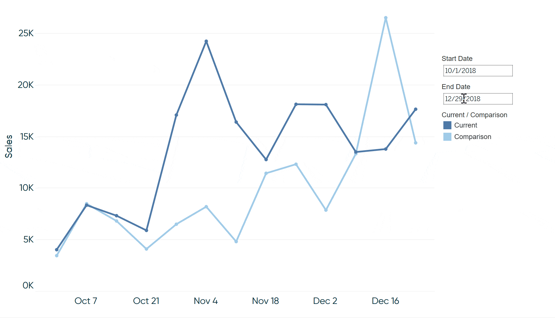
This approach even works with different date parts and regardless of what date range is selected. Here’s the same view after changing the date part to continuous week and changing the selected range to Q4 2018 (through 12/29 to filter out partial weeks).

We’ve just created a quarter-over-quarter comparison, and these calculated fields have equalized the dates so we can easily compare the same weeks quarter over quarter on one axis!
Thanks for reading,
– Ryan


Written By
Ryan Sleeper
Related Content
How to do Dynamic Date Selections in Tableau

In a lot of business cases, you are doing analysis based on common units of time such as: weeks, months,…
How to Automatically Compare Date Periods in Tableau

In this post you will learn how to parameterize the ‘date part’ in calculated fields and dynamically compare date periods…

Ryan Sleeper
Automatically Compare Full Days, Weeks, Months, Quarters, or Years Learn a calculated field that (1) looks at today’s date, (2)…