Practical Tableau: Serving Up 3 Better Options Than Pie Charts
Despite being one of the least effective means of communicating data, I often see Tableau pie charts in corporate dashboards and Tableau Public visualizations. New users likely see pie charts as an easy way to spruce up their dashboards, but they are doing themselves a disservice because pie charts increase time to insight and reduce accuracy of insights – the opposite of what we are trying to achieve with data visualization. I’ve talked before about the science behind why you shouldn’t use pie charts, so this chapter will be different.
When I share the shortcomings of pie charts, I am usually asked, “…but if I can’t use pie charts, then how do I show a parts of a whole relationship?” Despite the limitations of pie charts – especially the fact that we can process bars more efficiently than the areas of a pie – this is still one of the most common questions I receive during my Tableau trainings. This inspired me to document some better alternatives to using pie charts in Tableau.
Why does Tableau allow pie charts in the first place?
You may be wondering, if pie charts are so bad, why does Tableau even allow you to build them with Show Me or by changing the mark type to ‘Pie’?
![]()
When pie charts were first introduced to Tableau, they were meant to be used for the specific purpose of being a secondary mark type on a filled map. You may have seen this example from Tableau where they show the sales by category by US state using a pie chart on each state.
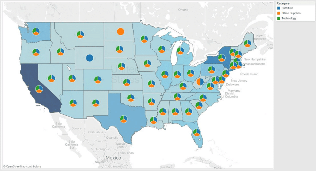
In this example, the colors on the filled map represent the total sales per state, and the pie is used to show the make-up of total sales in each state. In this scenario, using pie as the secondary mark type is the only way to accomplish this view.
Though their intentions were good, Tableau let the genie out of the bottle by introducing this mark type. I have actually never seen this intended use in a real dashboard, but users have instead adopted pie charts in several ways that are outside of best practices. Even in this example, you basically see 48 or so little peace signs because it is almost impossible to differentiate between the three categories. In this chapter, I will share a couple of alternatives to pie charts while building up to my recommended approach to visualizing a parts of a whole relationship.
Create a free account, or login.
Unlock this tutorial and hundreds of other free visual analytics resources from our expert team.
Already have an account? Sign In
Tableau pie chart alternative one: Bar chart
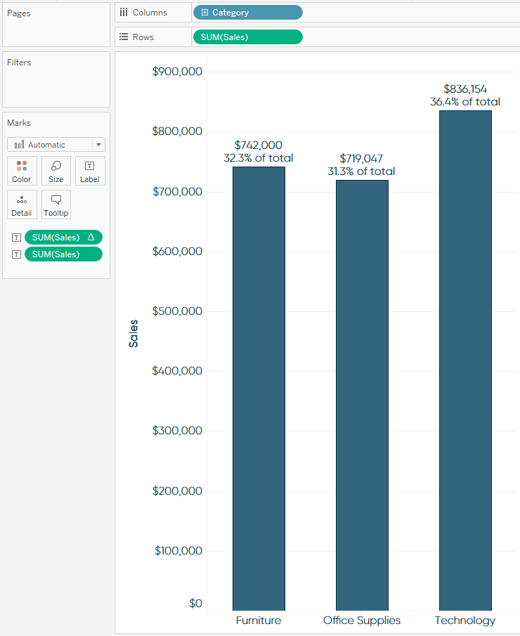
I have two rules if you absolutely have to use pie charts in your Tableau workbooks. The first is to use five slices or fewer including “Other”. The “Other” slice acts as a catch-all for the remaining slices outside of the top four. More importantly, pie charts should never be used in a time-series analysis. So my first pie chart alternative is to simply use a bar chart, which is a great choice for comparing categorical values at one point in time.
One thing you lose in this approach compared to the map above is the quick comparisons between states. However, you can use Tableau dashboard actions to achieve something similar by having the bar chart update when a state is clicked on or hovered over. Another reason I like this approach is you gain real estate to include the actual sales numbers and/or the percent of the whole that each category is contributing.
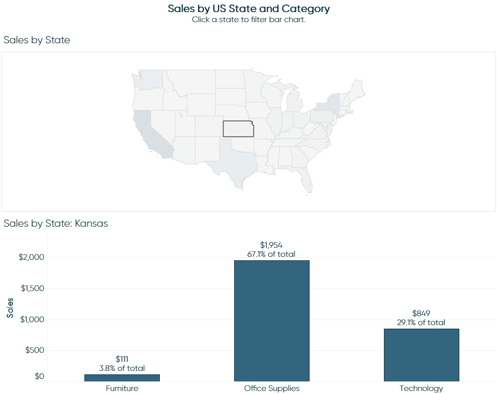
Tableau pie chart alternative two: Stacked bars or areas
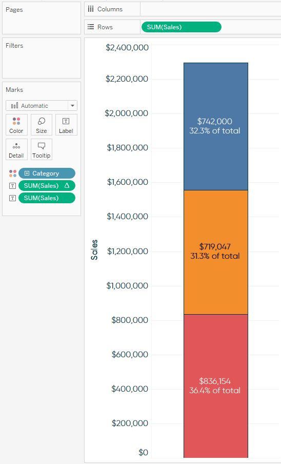
Another Tableau pie chart substitute would be to use a stacked bar chart. While this option is slightly better than a pie chart, I do not like this alternative as much because it is challenging to compare trends across the view unless the stacked bar is on the bottom. On the positive side, a stacked bar adds some value because it is easier to process the category on the bottom, easier to process the value of the whole, and you have additional real estate to add context when compared to a pie.
It is easy to convert a bar chart to a stacked bar in Tableau by simply removing the dimension that is creating each bar from the Rows or Columns Shelf. With a stacked bar, the top of the highest bar represents the total, and each color below represents a contribution to that total.
Bar Chart: Before
Bar Chart: After (Stacked Bar)
Whether you use a bar chart or a stacked bar chart, the values are for one point in time. For me, these chart types do not provide much value because they get stale very quickly in a corporate dashboard. In other words, the bars likely will not fluctuate a significant amount from week to week or month to month. Even if they do, because you are always looking at one point in time, you lose the comparison to prior time frames.
If you are going to use stacked bars, I suggest you use them to show how the distribution is changing over time (i.e. have one stacked bar for each time period). To take this a step further, you can add a quick table calculation to your measure called “Percent of Total” and change “Compute using” to “Table (Down)” to see what percent of the whole each category represented during each time frame.
To accomplish this, start by adding a table calculation for ‘Percent of Total’ to the measure by right-clicking the measure on the view (or clicking the down arrow on the measure’s pill), hovering over “Quick Table Calculation”, and choosing “Percent of Total”. Then change the direction of the table calculation to Table (down) instead of the default Table (across) by clicking into the measure’s pill again, hovering over “Compute Using”, and choosing “Table (down)”.
This table calculation will make every bar’s height 100%, then each color represents a share of that 100%. For a more cohesive view, change the mark type from bar to area to get a result like the following:
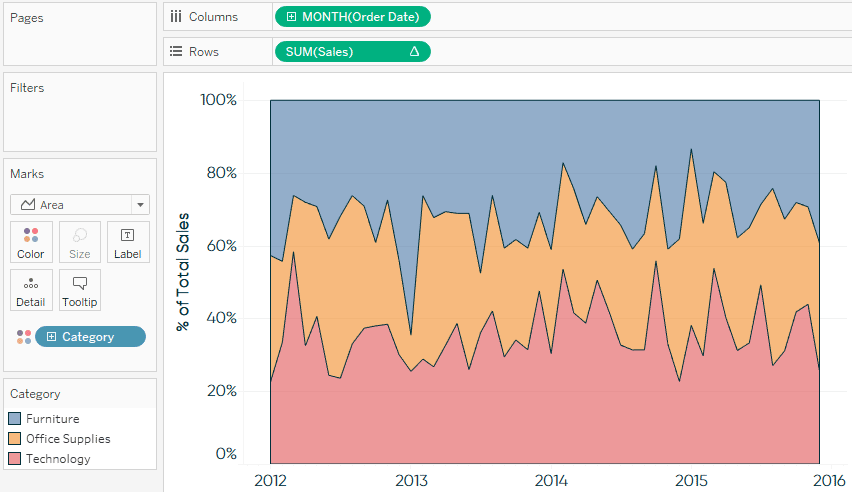
Tableau pie chart alternative: My recommended approach
I mentioned that we would be building up to my recommended approach, and while the alternatives provided to this point are all more effective than pie charts, they have their own limitations. Stacked areas like the one shown in the previous example can be challenging to decipher because unless the slice is on the bottom, it is difficult to precisely read the trend of each individual slice.
The first thing I recommend for the optimal parts of a whole visualization, is to change the mark type from area to line:
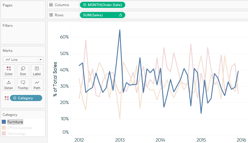
It is now easier to see the trend of each individual category. In this example from the Sample – Superstore set of data, the lines follow a similar trend so there is quite a bit of overlap. Clicking on the color legend highlights each category to help illustrate each individual trend.
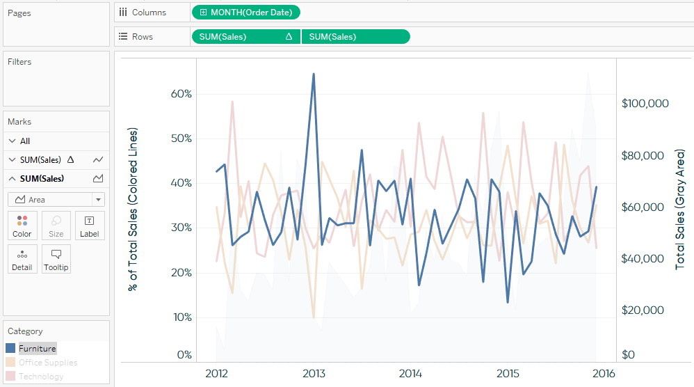
We can now see the sales contribution in percentages of each category to the total sales over time. One piece of context we lose with this approach is whether the total sales amount is trending up or down. The last thing I recommend is placing the Sales measure on the opposite axis, which creates a dual axis line graph. By default, Tableau colors the total sales by category. In this case, we only care about how the total sales amount is trending over time, so remove Category from the Color Marks Card on the SUM(Sales) Marks Shelf.
![]()
You are left with four lines instead of three, which is causing even more overlap. Total sales is a secondary insight, so I suggest changing its mark type to area and washing it out. To do this, navigate to the Marks Shelf for SUM(Sales) (without the Category dimension on the Colors Marks Card), change the mark type to ‘Area’, and change the opacity by clicking on the Color Marks Card. Finally, you can add total sales to the Tooltip Marks Card on the Percent of Total Sales Marks Shelf so that both the percent of total and total sales show up when you hover over each data point. Your finished product will look like this:
In review, in this chapter, we have evolved our visualization of a parts-to-whole relationship from a static pie chart during one point in time, to a dual-axis combination chart showing how the distribution changes over time. We did this all without losing the context of how our total is trending.
This alternative to pie charts in Tableau will help reduce your time to insight, while also making your analysis more accurate, precise, and actionable.
Thanks for reading,
– Ryan
This content is excerpted from my book Practical Tableau: 100 Tips, Tutorials, and Strategies from a Tableau Zen Master published by O’Reilly Media Inc., 2018, ISBN: 978-1491977316. Get the book at Amazon.

Written By
Ryan Sleeper
Related Content
How to Reorder Stacked Bars on the Fly in Tableau
I often mention during my training workshops that Tableau stacked bar charts are among my least favorite chart types because…

Ryan Sleeper
Essential Chart Types, Preattentive Attributes, & Much More Meet the instructor, Ryan Sleeper, and learn the fundamentals of Tableau Desktop…
Ryan Sleeper
Adding love for bar charts by showing you how to make them more engaging in Tableau This video shows how…