How to Reorder Stacked Bars on the Fly in Tableau
I often mention during my training workshops that Tableau stacked bar charts are among my least favorite chart types because unless a dimension member is on the bottom of each stack, it is very challenging to analyze how its performance is trending over time or by the category being analyzed. I typically recommend converting stacked bar charts to dot plots, which will provide a truer representation of each dimension member’s location on the x or y-axis.
However, I realize there can be value in analyzing not only individual dimension members, but how they add up to a total – the purpose of a stacked bar chart. This post shares a solution for getting the best of both worlds. This tutorial will show you how to move one or more dimension members to the bottom of every stack just by clicking on them, making it easier to uncover insights.
How to Improve the UX of Stacked Bar Charts in Tableau
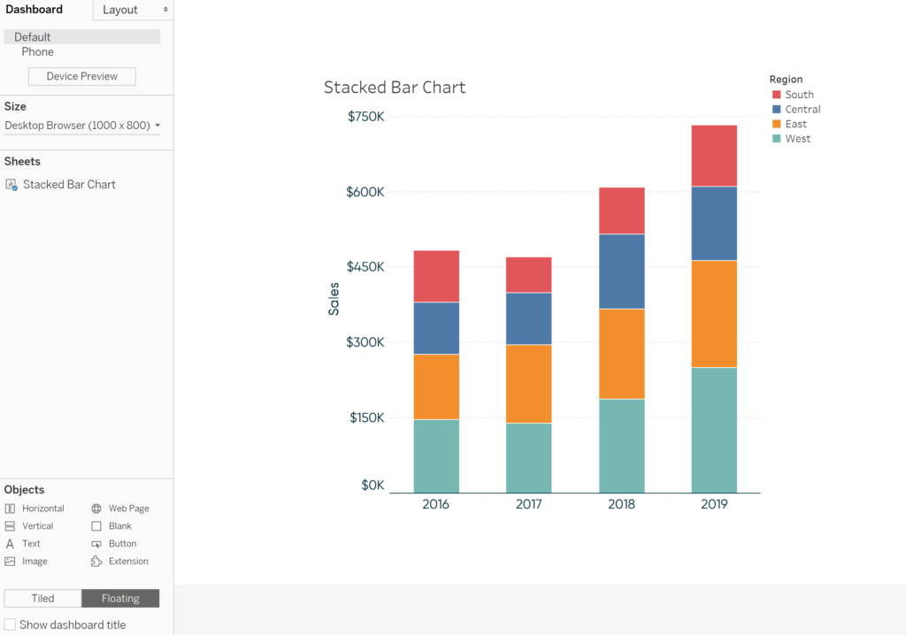
Create a stacked bar chart in Tableau
By the end of this post, you will be able to re-sort dimension members within a stacked bar chart in Tableau just by clicking on them.
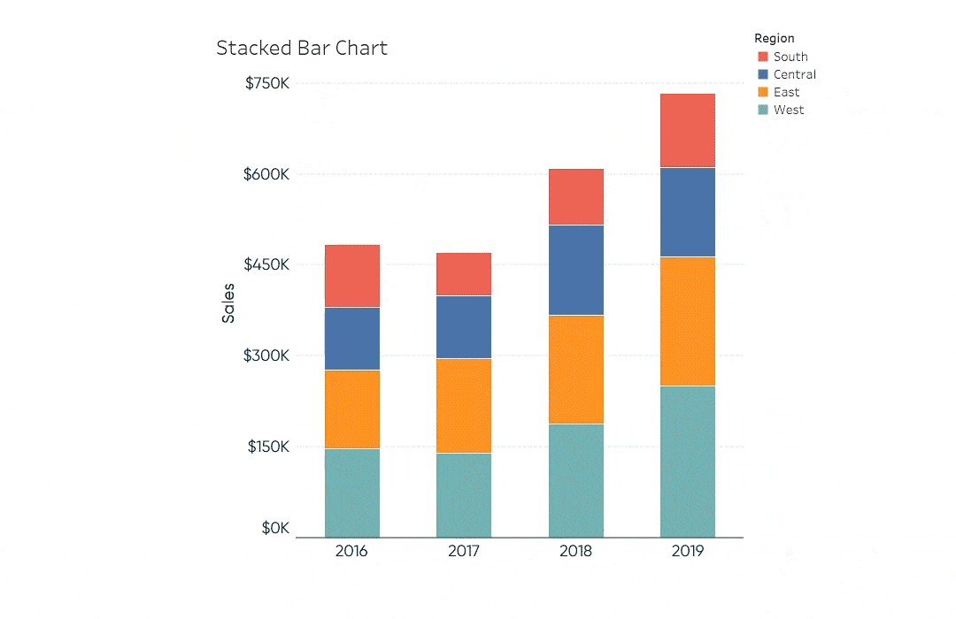
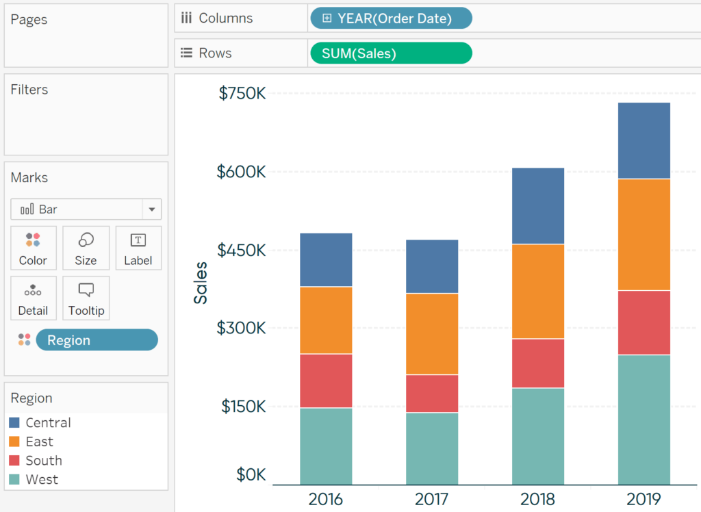
First, make a stacked bar chart by placing the measure of interest on the Rows Shelf, a dimension on the Columns Shelf, and a second dimensional breakdown on the Color Marks Card. If using a date field, ensure you have changed the mark type from Automatic (Line) to Bar.
Here’s a stacked bar chart looking at Sales by Year of Order Date and Region from the Sample – Superstore dataset:
Next, create an empty set out of the dimension being used on the Color Marks Card. The easiest to way to do this is to right-click on the dimension in the Dimensions area of the Data Pane, hover over “Create”, and click “Set…”. Give the set a name and click the OK button. Remember, do not select any of the dimension members because we will overwrite them in a future step.
![]()
Continue reading with a free account, or login.
Unlock this tutorial and hundreds of other free visual analytics resources from our expert team.
Already have an account? Sign In
By continuing, you agree to our Terms of Use and Privacy Policy.
Here’s how my empty Region set looks:
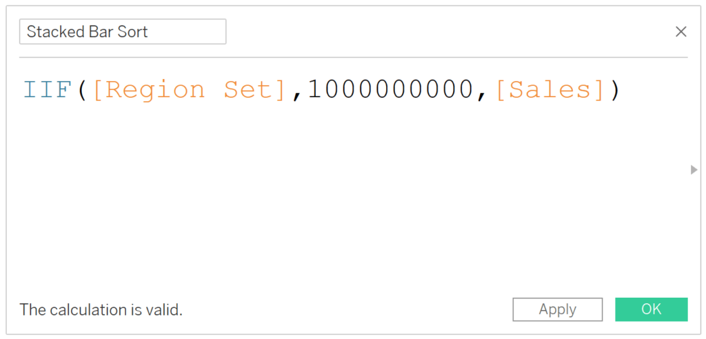
The key calculated field
Next is the calculation that makes this technique go. Create a calculated field that returns a value higher than any value in your dataset when the dimension member is in the set and returns the true measure value when the dimension member is out of the set. When this is the case and the stacks are sorted in ascending order, the selected dimension member(s) will always show up on the bottom of the stack.
This formula can be written several ways, but one elegant way to write it for my example is:
IIF([Region Set],1000000000,[Sales])
Note I hard-coded 1 billion as the value when the dimension member is in the set; any number greater than the highest value in the dataset will result in the selected dimension member being placed on the bottom of each stack after we apply the sort in the next step.
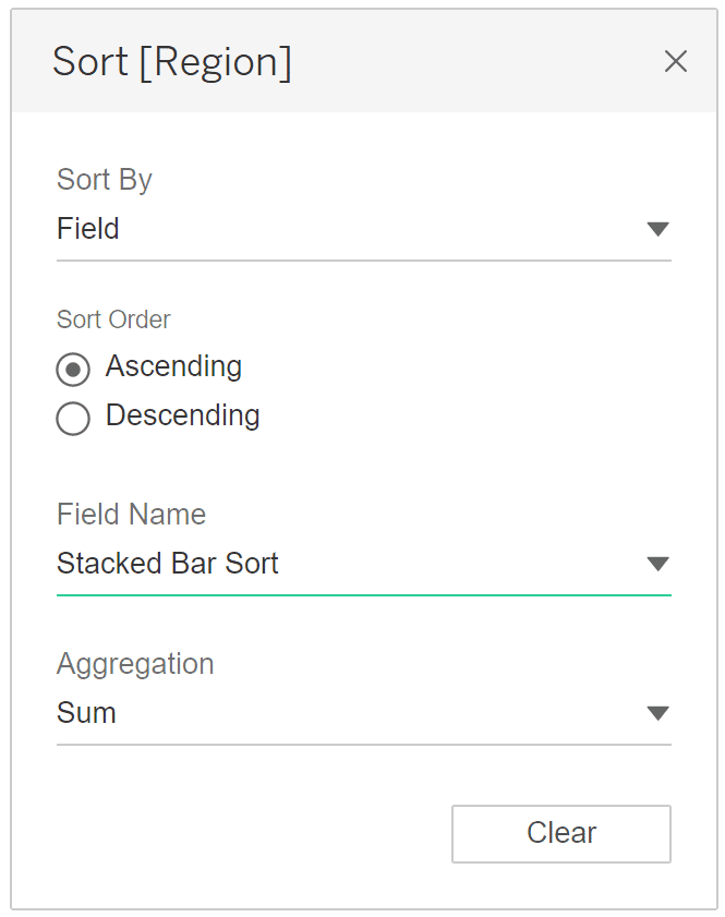
Setting up the sort for the stacked bar chart in Tableau
To sort the stacks by the newly created calculated field, right-click the dimension on the Color Marks Card and choose “Sort…”. In the dialog that appears, change the “Sort by” dropdown to “Field” and choose the newly created field.
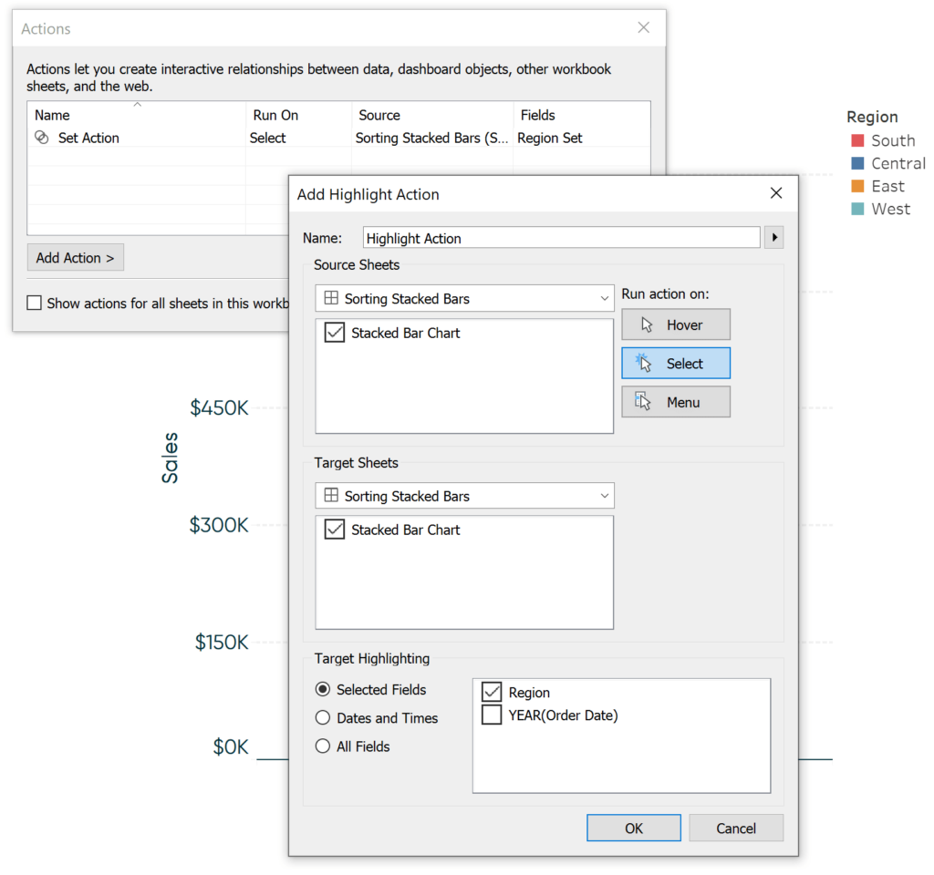
Adding the dashboard actions
Lastly, we need to add two actions: a set action and a highlight action. I typically add actions to sheets on dashboards, so I will place the stacked bar chart created to this point on a new dashboard.
I’ll add the set action first by navigating to “Dashboard > Actions…” in the top menu options. After clicking the Add Action button and choosing “Change Set Values…”, I can set up my action. I will say that if you click on the Stacked Bar Chart, overwrite the Region Set with the selection. If the selection is cleared, I’ll remove all values from the set so it goes back as if nothing happened.
An Introduction to Tableau Dashboard Actions
At this point, clicking a region within any of the stacked bars will already move that region to the bottom of every stack. However, to improve the user experience, I’m going to add a highlight action so the dimension member selected is highlighted across every stacked bar.
Now, clicking any region in any of the four stacked bars will move that region to the bottom and highlight it throughout the chart! Let’s say I’m interested in seeing how the South region is trending but it’s challenging because there are three other regions stacked below the red bar for each year. Now if I click any of the red bars, the South region is moved to the bottom and highlighted throughout the rest of the view.
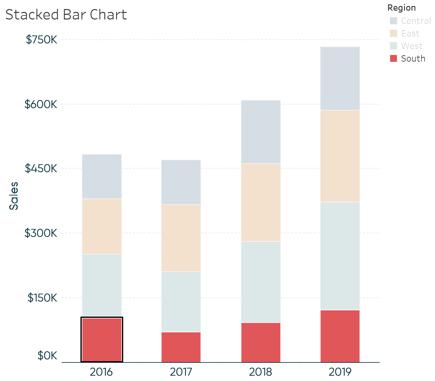
Ah-ha; the South region started the year strong, fell to its worst performance in the second year, but has been trending up the previous two years.
![]()
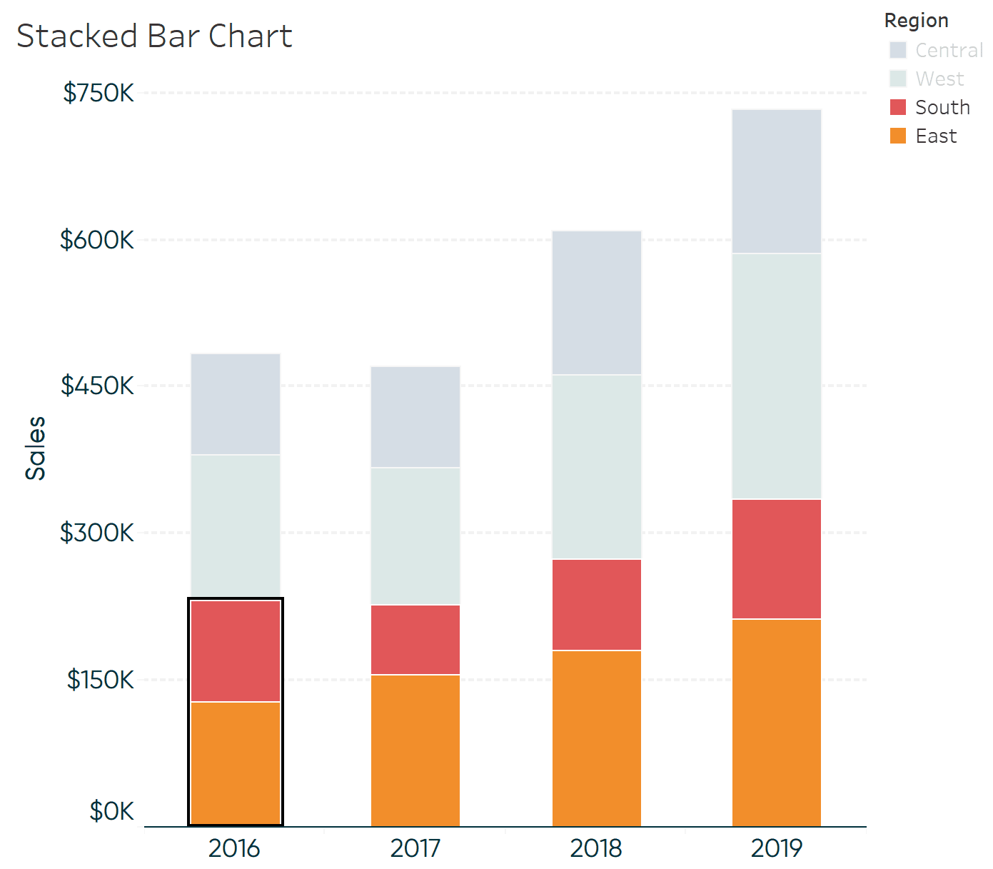
This technique can also be accomplished with parameter actions, but in this case, set actions have at least two distinct advantages. First, we can clear the selection by clicking the Escape key and the chart will return to its original state. Second, sets allow you to select multiple values. Here’s how the chart looks after clicking a bar for the South region, then holding the Control key while clicking a bar for the East region.
As you can see in the animated .GIF in this post’s introduction, the technique outlined in this tutorial works even better with animated transitions – currently in beta of Tableau version 2020.1.
Thanks for reading,
– Ryan


Written By
Ryan Sleeper
Related Content
3 Ways to Make Wonderful Waterfall Charts in Tableau
Waterfall charts visualize the individual categorical or time period contributions to a running total and are one of my favorite…

Ryan Sleeper
Add detail to bar charts by stacking equally sized units Unit charts are stacked bar charts made up of individual,…
Ryan Sleeper
How to sort in ascending, descending, alphabetical, manual order, and more Sorting is a best practice for charts built with…