3 Ways to Make Wonderful Waterfall Charts in Tableau

Waterfall charts visualize the individual categorical or time period contributions to a running total and are one of my favorite choices for analyzing a part-to-whole relationship. I’ve shown you how to make a waterfall chart in Practical Tableau and how to take them a step further with dual-axis waterfall charts in Innovative Tableau, but an update to how Tableau handles sorting has made these slightly trickier to create.
This post will show you the latest way to make a waterfall chart in Tableau and several formatting tricks for making your waterfall charts as well-designed and effective as possible.
FAQs answered in this post:
How do I create a basic waterfall chart in Tableau?
Place your measure on Rows and dimension on Columns, then add a Running Total table calculation by right-clicking the measure and selecting Quick Table Calculation. Change the mark type to Gantt Bar, place the original measure on Size, then add a negative sign before the measure on Size to reverse the direction. Finally, correct the sort order by right-clicking your dimension, selecting Sort, and choosing the original measure field to restore descending order.
Why do I need to multiply my measure by negative one in waterfall charts?
Gantt bars naturally extend upward from their starting position, but waterfall charts require blocks to cascade downward from the running total. Multiplying by negative one reverses the direction so each block picks up where the previous one ended, creating the waterfall effect. Without this step, blocks would stack upward rather than showing the cumulative progression from one category to the next.
How do I highlight dimension members dynamically in waterfall charts?
Create a parameter from your dimension, then create a calculated field with “[Dimension] = [Dimension Parameter]” and place it on Color. Edit the table calculation to compute on both your dimension and the highlighter field by selecting Specific Dimensions. Use IIF statements with the same parameter comparison to display dynamic labels only on selected dimension members, showing values or percentages exclusively for highlighted blocks.
How do I create custom totals bars for Tableau waterfall charts?
Build a separate stacked bar chart with your measure on Rows, dimension on Detail, and highlighter on Color. Drag the dimension above the highlighter in the Marks Shelf to control sort order, then sort in ascending order by your measure. Add custom labels like percent of total using formulas with TOTAL functions, create a custom column header by typing between tick marks on Columns, then align with your main waterfall on a dashboard.
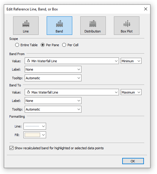
How do I add reference bands to highlight selections across waterfall charts?
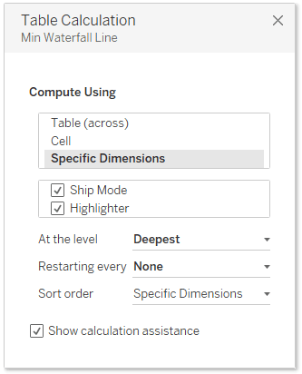
Create two calculated fields: one for the minimum (RUNNING_SUM(SUM([Measure])) – SUM([Measure])) and one for the maximum (RUNNING_SUM(SUM([Measure]))), both wrapped in IF statements checking your parameter selection. Place both on Detail, edit their table calculations to compute on all dimensions in the view, then add a reference band using these fields as the range. This creates a highlight that spans from the bottom to top of selected blocks.
How can Playfair Data help implement advanced waterfall chart techniques?
Playfair Data specializes in Tableau engineering including table calculations, Gantt bar techniques, parameter actions, and reference bands that create interactive, engaging visualizations. Our experts teach part-to-whole analysis techniques and dynamic highlighting methods for waterfall charts. Schedule a strategy call to learn how our Flagship Tableau training can help your team master waterfall charts, running totals, and advanced interactive features that improve stakeholder engagement.
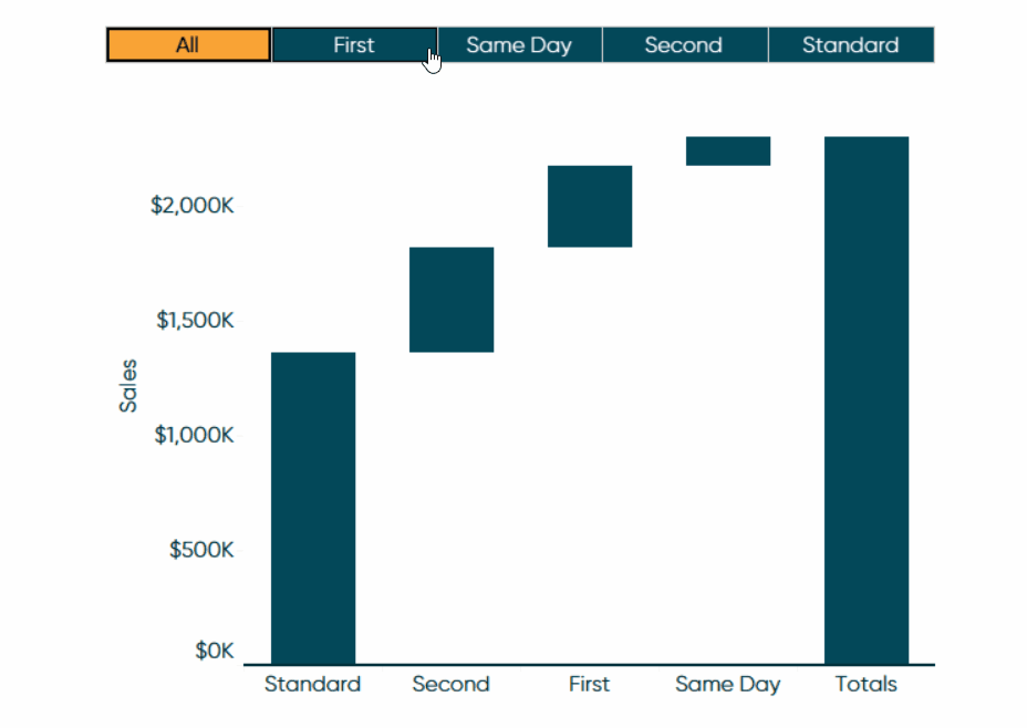
How to make a waterfall chart in Tableau
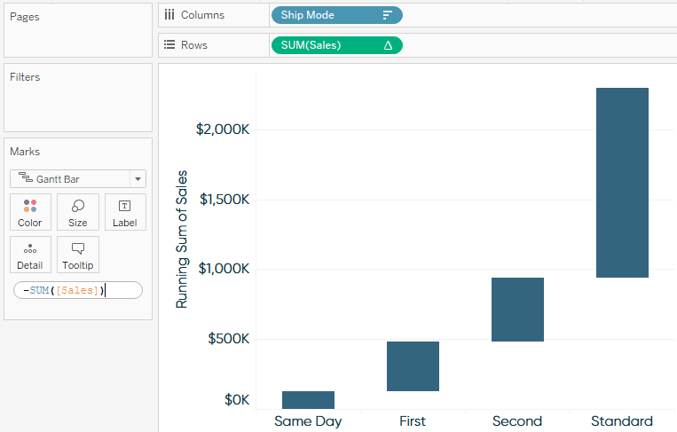
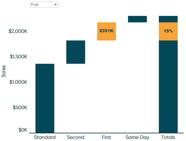
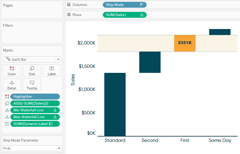
By the end of this post, you will be able to recreate this sales by ship mode waterfall chart from Tableau’s Sample – Superstore dataset. The user will have the ability to select a dimension member, highlight the selection, and show the percentage contribution on a custom stacked bar chart.
To get started, place your measure of interest onto the Rows Shelf and your dimension of interest onto the Columns Shelf. By default, this will create a bar chart. At this step, I recommend sorting your bars in descending order which will allow you to compare not only the size of each mark, but their rank order from left to right.
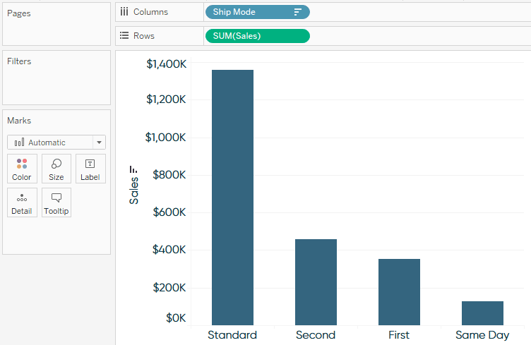
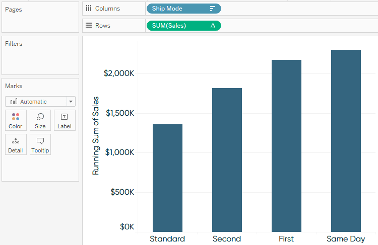
Next, add a Running Total table calculation to the Sales measure by right-clicking the measure on the Rows Shelf, hovering over “Quick Table Calculation”, and selecting “Running Total”.
An Introduction to Tableau Table Calculations
Next, change the mark type from Automatic (Bar) to Gantt Bar and place the measure of interest (Sales, in my case) onto the Size Marks Card.
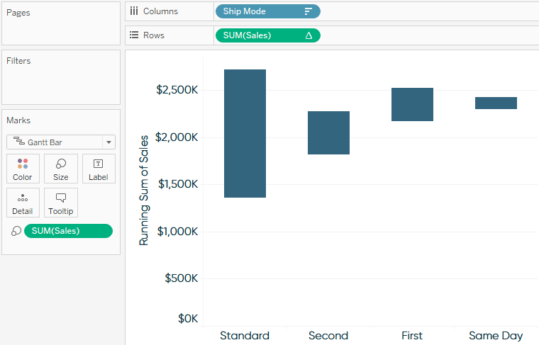
The blocks are the correct size, but they begin at the location of each Gantt mark and go up in direction because the sales values are positive. To have each block pick up where the last one left off, we must reverse the values to negatives. The easiest way to do this is to double-click the Sales pill that’s on the Size Marks Card, type a negative sign (-) before SUM([Sales]), and hit the Enter key.
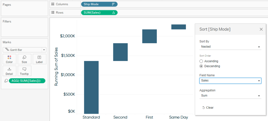
This used to be all you had to do to create a waterfall chart in Tableau but note how our sort order has changed. Our Tableau waterfall chart is upside down because the marks are now being sorted in descending order by their negative sales values, putting the worst performer first. To correct this, right-click the dimension on the Columns Shelf, select “Sort”, and change the Field Name dropdown back to the original measure of interest.
Voila – a fundamental waterfall chart in Tableau!
How to highlight user selections
My first tip for taking your Tableau waterfall charts a step further is to highlight a dimension member based on a parameter selection. What’s best about this approach is a single parameter control or dashboard action can be used to (1) color dimension members on a waterfall chart, (2) show performance labels for the selected dimension member, and (3) highlight the same dimension member across multiple sheets on a dashboard.
How to Highlight a Dimension Member in Tableau
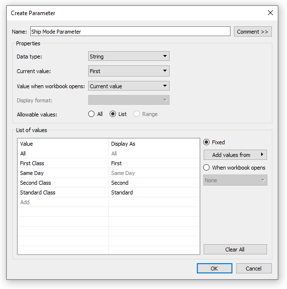
To get started, right-click on the dimension you want to create the highlight from, hover over “Create”, and choose “Parameter”. This automatically creates a parameter with the correct data type and a prepopulated list of the dimension’s members. I also recommend you add an allowable value for “All” which will provide the option to not highlight a specific dimension member.
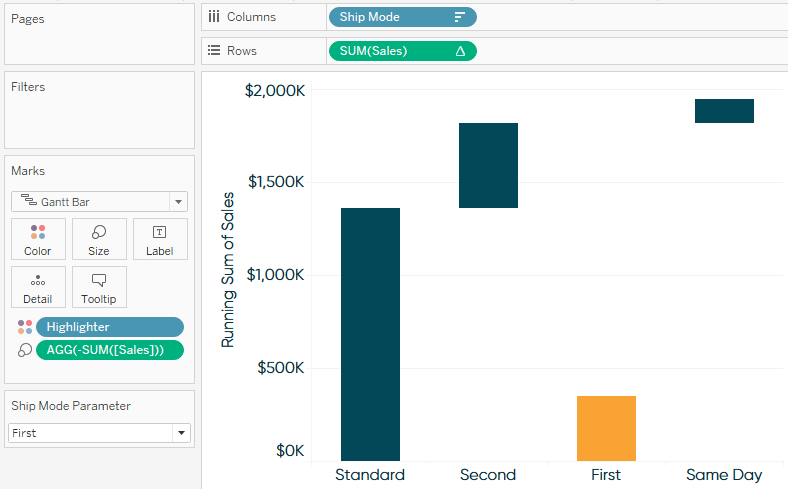
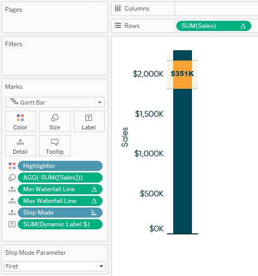
To use this as a highlighter, create a calculated field with the formula [Ship Mode] = [Ship Mode Parameter] and place it onto the Color Marks Card. You would replace “Ship Mode” with whatever dimension you are using in your own data source. I have also showed the parameter control to show this is working by right-clicking on the Ship Mode Parameter and choosing “Show Parameter”.
As you can see, this has temporarily broken the cascading waterfall effect because, by default, the table calculation being used to generate the waterfall chart is being computed from left to right. Now that we have multiple dimensions on the view, we need to edit the table calculation to include both the Ship Mode and Highlighter dimensions. You can edit a table calculation by right-clicking on the pill with a delta symbol and choosing “Edit Table Calculation”.
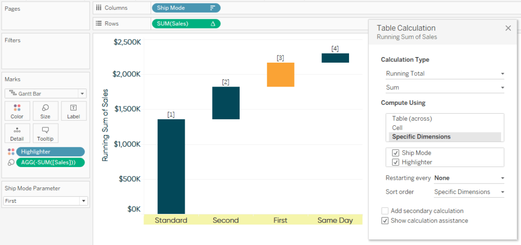
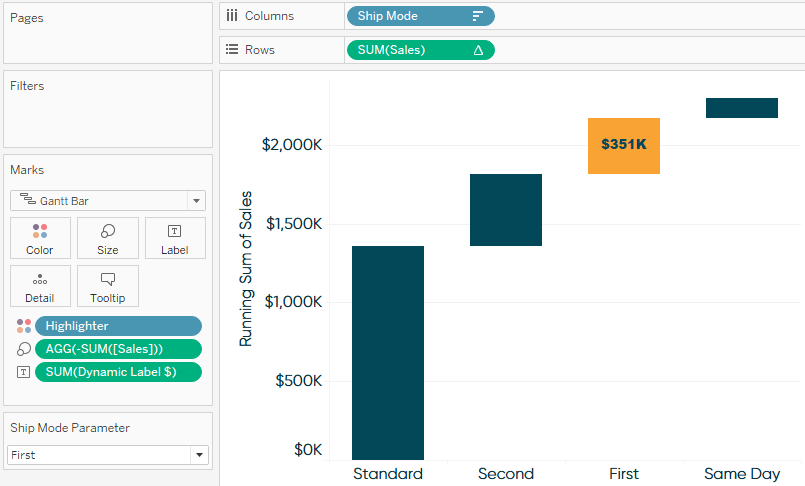
You can also use the parameter selection to dynamically display a label only on selected marks. To display the sales that the selection contributed, I’ll make a calculated field with the formula: IIF([Ship Mode] = [Ship Mode Parameter],[Sales],NULL). After placing this field onto the Label Marks Card, the label will show up only on the highlighted block!
How to make custom totals for Tableau waterfall charts
One optional feature for waterfall charts is to add a total bar at the end of the waterfall to visualize where the running total ended up following the ups and downs across dimension members. The easiest way to do this is to navigate to the Analytics pane, drag the Totals features onto the view, and drop it onto “Row Grand Totals”. The drawback to this convenient approach is the highlighted selection always moves to the top, preventing the highlighted blocks from lining up from left to right. Further, the built-in total is not a separate chart so we don’t have any flexibility in encoding the marks (i.e. the Label Marks Card).
![]()
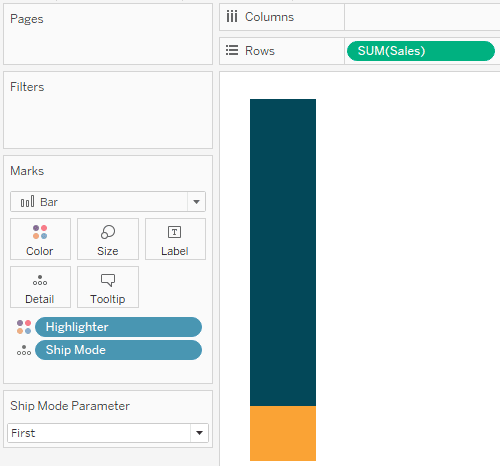
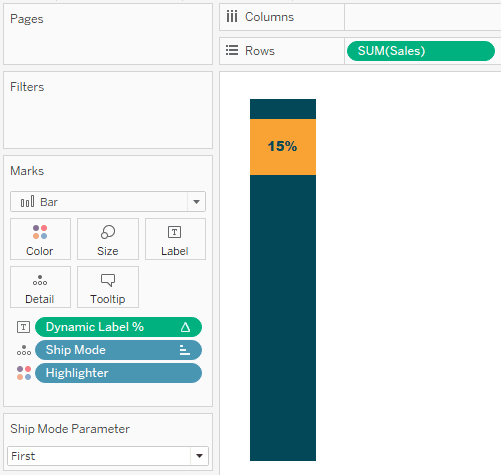
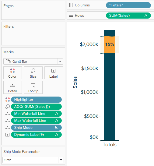
Instead, I will create a stacked bar chart to represent the waterfall totals. To do so, start a new sheet, place the measure being used for the waterfall chart on the Rows Shelf, place the dimension being used onto the Detail Marks Card, and the Highlighter field onto the Color Marks Card. We no longer need the repetitive y-axis, so I will remove that by right-clicking on the axis and deselecting “Show Header”.
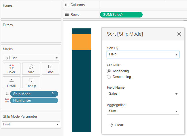
We have the foundation, but things aren’t lining up as expected. To ensure the stacked bars in the totals line up with their respective blocks in the waterfall chart, from within the Marks Shelf, drag the dimension on the Detail Marks Card above the dimension on the Color Marks Card. Then sort the dimension on the Detail Marks Card in ascending order by the measure you are using by right-clicking on the dimension and choosing “Sort”.
Another advantage of keeping your totals on a separate sheet is you can customize the labels with something other than what’s being used on the main chart. Let’s say we want to display the percent of total sales that the selection contributed instead of the dollar amount. For this use case, the formula is IIF(ATTR([Ship Mode]) = [Ship Mode Parameter],SUM([Sales]) / TOTAL(SUM([Sales])),NULL).
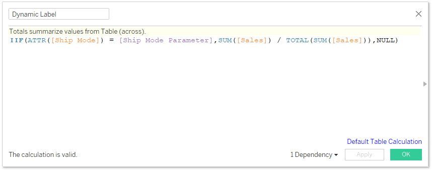
After dropping this calculated field onto the Label Marks Card, my totals visualization will display the percent of sales, while my main waterfall chart still displays the original sales values.
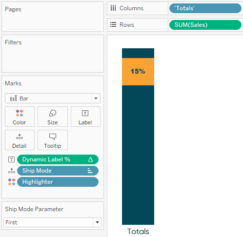
One last note – because the totals visualization doesn’t have a column header, it won’t line up with the main waterfall chart when they are both added to a dashboard. To alleviate this, double-click on the Columns Shelf, type your preferred name for the totals column between tick marks, and hit the Enter key.
When you’re ready to see these together, simply add them both to a dashboard with the same height and line them up.
How to create custom range highlighters using reference bands
We’ll conclude with a little Tableau magic that highlights a selection across both worksheets. First, make a calculated field that will eventually draw the bottom of the highlight; the formula is:
IF ATTR([Ship Mode]) = [Ship Mode Parameter]
THEN RUNNING_SUM(SUM([Sales])) – SUM([Sales])
END
Of course, you would replace Ship Mode from my use case with whatever dimension you are analyzing.
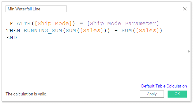
This formula takes the running sum of sales across the entire waterfall chart minus the sum of sales for the highlighted dimension member, ensuring it always lines up at the bottom of the highlighted block.
We will also need a calculated field that will eventually draw the top of the highlight; the formula is:
IF ATTR([Ship Mode]) = [Ship Mode Parameter]
THEN RUNNING_SUM(SUM([Sales]))
END
This formula computes the running sum of sales across the entire Tableau waterfall chart, ensuring it always lines up at the top of the highlighted block. To use both of these within a reference band, place them onto the Detail Marks Card of the main waterfall chart.
Continue reading with a free account, or login.
Unlock this tutorial and hundreds of other free visual analytics resources from our expert team.
Already have an account? Sign In
By continuing, you agree to our Terms of Use and Privacy Policy.
My Min Waterfall Line and Max Waterfall Line calculated fields are table calculations so, as with the table calculation on the Rows Shelf of this sheet, we need to change the table calculation to be computed on both of the dimensions being used in the view (Ship Mode and Highlighter, in my case). You can achieve this by right-clicking any pill that has a delta symbol on it, clicking “Edit Table Calculation”, then choosing the specific dimensions.
From there, you can add them as a reference band by right-clicking on the y-axis and choosing “Add Reference Line” or dragging “Reference Band” from the Analytics pane onto the view. Here are the settings for my reference band:
Here is how the final main waterfall sheet looks:
It is slightly trickier to add this same reference band to the totals sheet because the main waterfall was built with a table calculation and a mark type of Gantt Bar while the stacked bar chart was built without a table calculation and a mark type of Bar. If you choose to add this last feature, I suggest you simply duplicate the worksheet containing the main waterfall, drag the dimension that is on the Columns Shelf to the Detail Marks Card, and re-add the sort by negative sales in ascending order.
![]()
This keeps all the table calculations you have already figured out intact on the second sheet!
From here, you can re-add the percent of total label and the “Totals” column header.
Here’s how my final Tableau waterfall chart looks after hiding the header of the new totals worksheet and lining it up with the main waterfall on a dashboard.
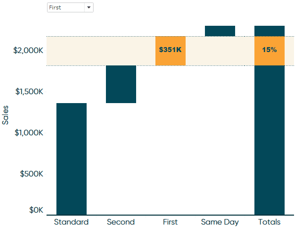
Changing the selection in the parameter control will change the color of the selected block, draw a highlight across multiple worksheets, and show dynamic labels!
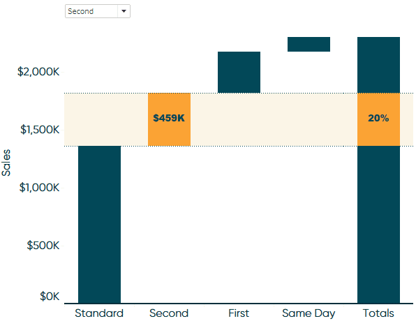
This Tableau waterfall chart can be combined with other views on a dashboard and the single parameter control can highlight a dimension member throughout. Try taking this a step further by using a secondary data source to create a navigation in Tableau as pictured in this tutorial’s introduction.
Thanks for reading,
– Ryan


Written By
Ryan Sleeper
Related Content
3 Ways to Avoid Data Visualization Desire Paths
Desire paths are unplanned trails that form when users circumvent the carefully constructed paths before them in favor of routes…

Ethan Lang
Learn the foundation of logical statements that can be transferred over multiple tools In this tutorial you will learn how…
Introducing Balance Scale Charts in Tableau

The “Balance Scale chart” came to life during a team brainstorming session while building the Financial Analysis Swift as we…