Introducing Balance Scale Charts in Tableau

The “Balance Scale chart” came to life during a team brainstorming session while building the Financial Analysis Swift as we discussed different chart types that could best represent the balance sheet data and how users would want to view it. The original intent was to show the relationship between the two sides of a balance sheet with assets on one side and liabilities/equity on the other. While this turned out to be a great chart for visualizing financial data, I came to realize there could be many other uses. I found that the Balance Scale chart is a fantastic alternative to a bar chart when comparing any two values or groups of values.
Building a Balance Scale chart to compare two values
The Balance Scale is built with only one sheet using a Dual-Axis Combination chart between two Gantt marks. One Gantt creates the visual platform on each side of the scale, which then rests on top of the second Gantt which extends to the bottom of the visualization and is colored white to cover the gradient in the background. The background gradient is used to assist in visualizing the upward and downward movement of the scale, emphasizing weight.
Continue reading with a free account, or login.
Unlock this tutorial and hundreds of other free visual analytics resources from our expert team.
Already have an account? Sign In
By continuing, you agree to our Terms of Use and Privacy Policy.
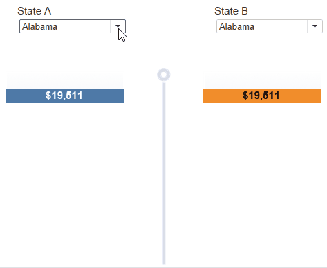
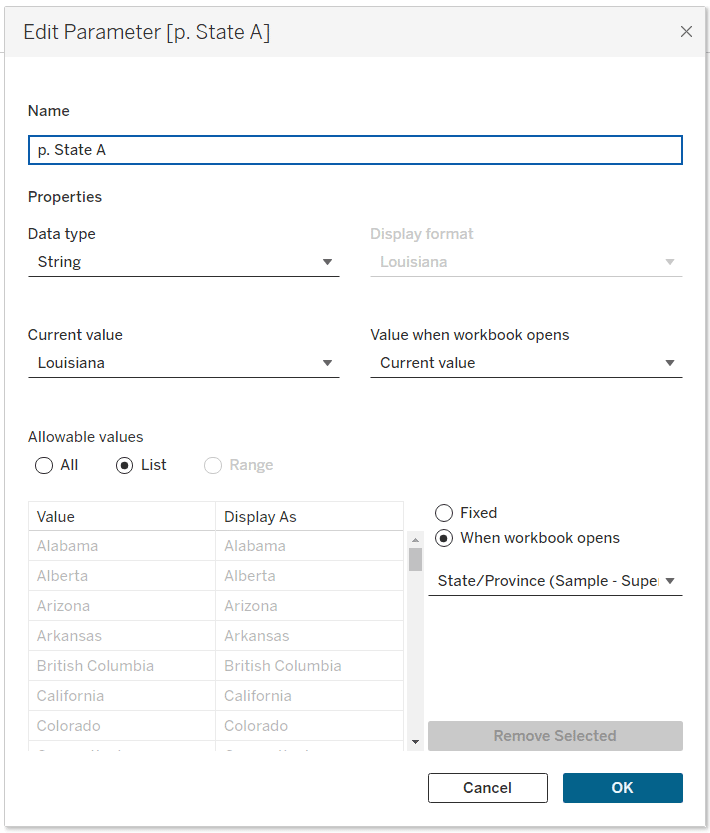
If you want to follow along, start by connecting to the Sample – Superstore dataset that comes preloaded with Tableau Desktop. Open a new sheet and name it ‘Balance Scale’. Create the first of two string parameters by right-clicking the ‘State/Province’ dimension, choose ‘Create’, and select ‘Parameter’. Name the parameter ‘p. State A’.
Create the second parameter by duplicating ‘p. State A’, rename it ‘p. State B’, and change the value of the parameter to a different state. At this point you have two string parameters to represent the two sides of the balance scale.
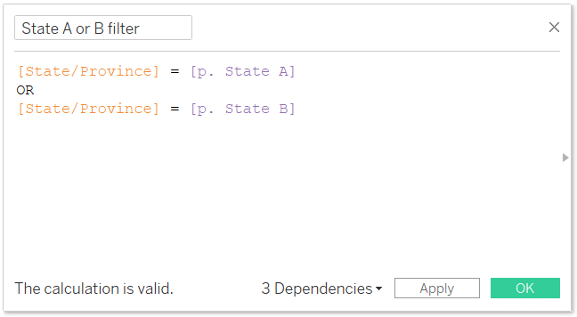
There are only four total calculations needed to build a simple Balance Scale chart that compares two values. The first calculation filters the sheet to only the two states that are equal to ‘p. State A’ or ‘p. State B’. Name this calculation ‘State A or B filter’ and the syntax is as follows:
[State/Province] = [p. State A]
OR
[State/Province] = [p. State B]
The next calculation assigns the state selected from the parameter ‘p. State A’ to a string value that we’ll call ‘State A’ and assigns the state selected from the parameter ‘p. State B’ to a string value that we’ll call ‘State B’. By renaming the parameter values to either ‘State A’ or ‘State B’, we will only have to map two different colors for the Gantt marks rather than having to map a color to each different state that can be selected from the parameter.
![]()
Name the calculation ‘State Groups’ and the syntax is as follows:
IF [p. State A] = [State/Province] THEN ‘State A’
ELSEIF [p. State B] = [State/Province] THEN ‘State B’
ELSE NULL
END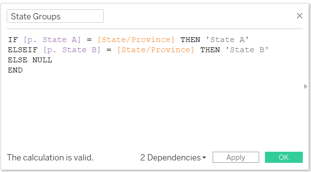
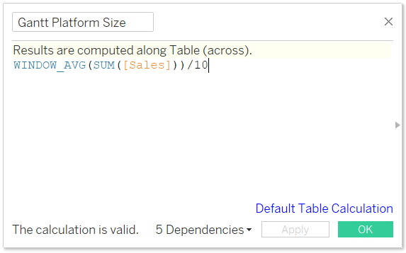
This next calculation is our first of two Gantt sizing calculations and will be used to dynamically size the platform Gantt based on the total sales in the view. Create a new calculation called ‘Gantt Platform Size’ to increase the width of the Gantt mark based on 10% of the amount of sales in the view. Sizing it based on a percentage of sales in the view will allow the Gantt to dynamically re-size no matter how large or small the total sales are. Whereas if it were sized based on a static number, then the Gantt mark would increase and decrease in width based on the fluctuation of total sales on the y-Axis depending on which states are chosen from the two parameters.
3 Ways to Make Gorgeous Gantt Charts in Tableau
The syntax is as follows:
WINDOW_AVG(SUM([Sales]))/10
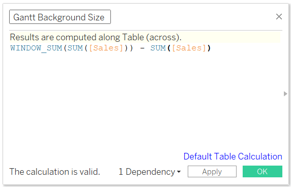
The last calculation sizes the second Gantt chart, which will be used to cover the gradient in the background. Name the calculation ‘Gantt Background Size’ and the syntax is as follows:
WINDOW_SUM(SUM([Sales]))-SUM(Sales)
With these four calculations built, we will begin engineering the Balance Scale. Place the ‘State A or B Filter’ on the Filters shelf, choosing True. Place ‘State Groups’ on the Columns shelf and the SUM(Sales) on the Rows shelf. Change the Mark type to Gantt. Adjust the Size property slider half way between the middle tick mark and all the way to the right and change the Fit at the top to ‘Entire View’.
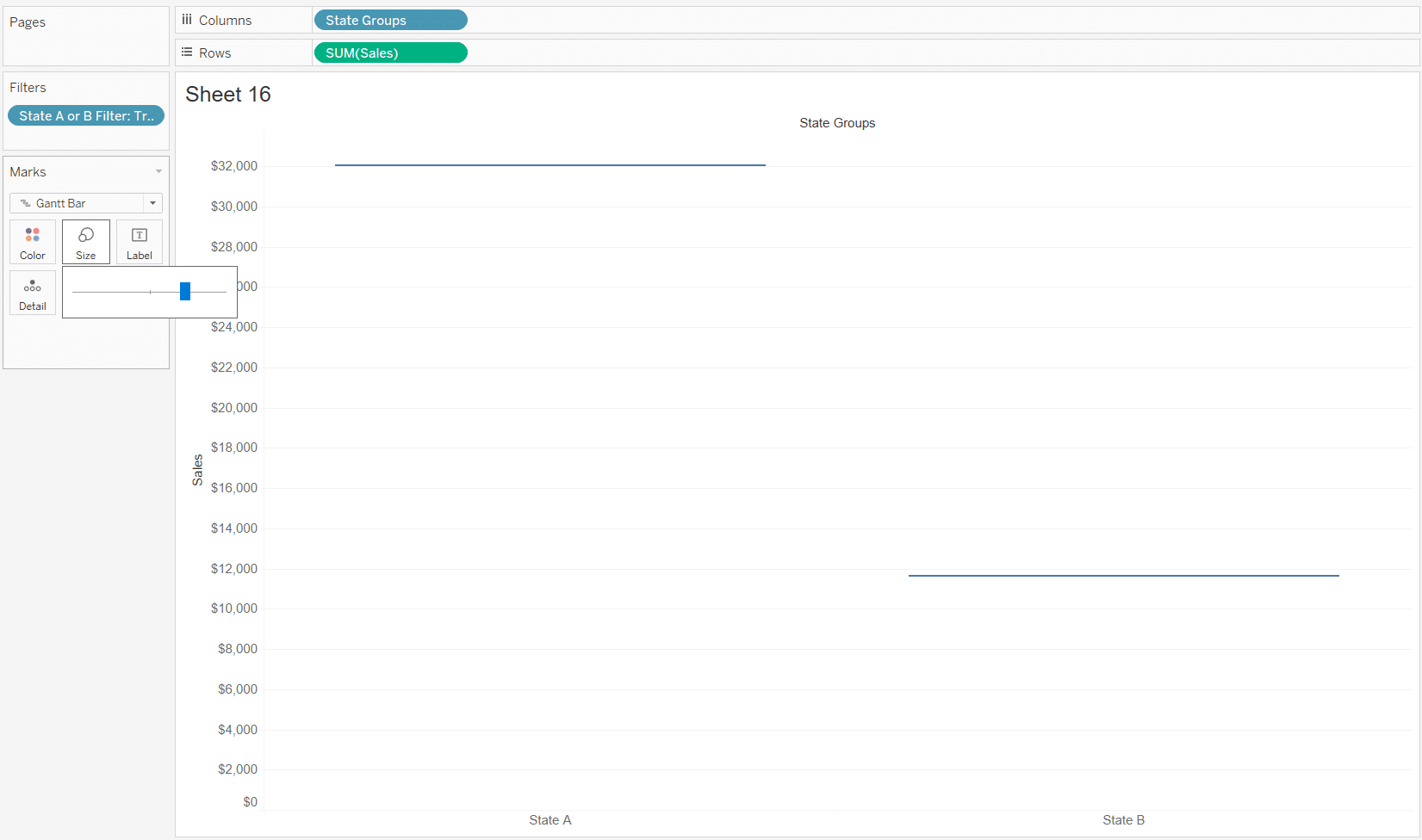
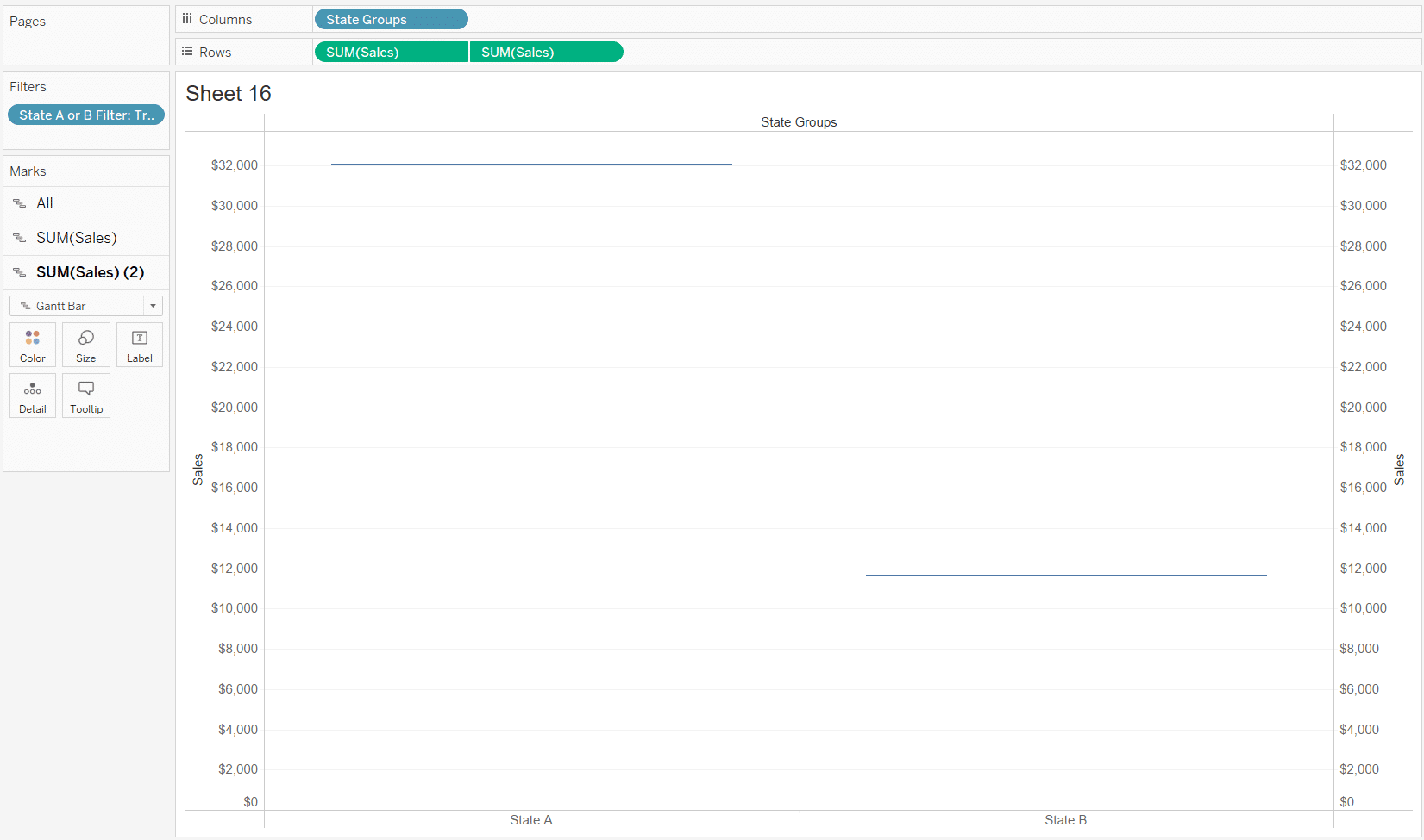
Duplicate the SUM(Sales) on the Rows shelf by Ctrl+Clicking and dragging the pill to the right. Right-click the second SUM(Sales) pill that was just duplicated, choose ‘Dual Axis’ from the drop down menu, then right-click the second Y axis and choose ‘Synchronize axis’ from the drop down menu.
In the first Gantt Marks card, place the ‘Gantt Background Size’ calculation onto the Size property, then change the Color property to white.
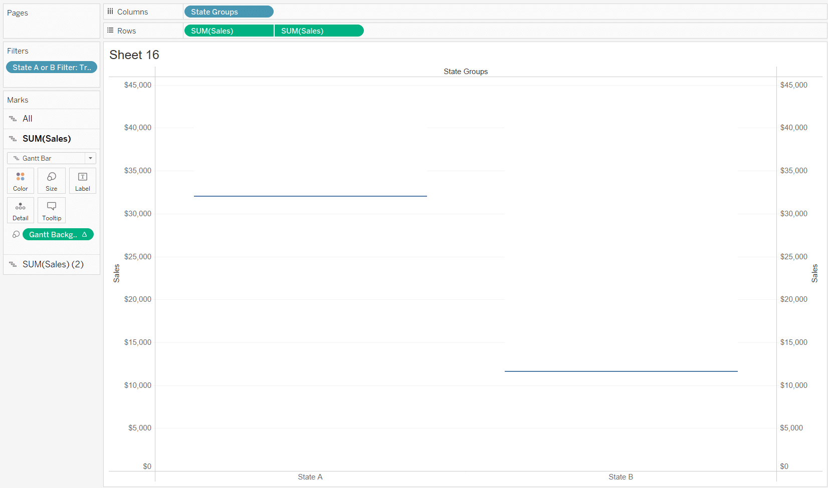
In the second Gantt Marks card, place the ‘Gantt Platform Size’ calculation on the Size property, ‘State Groups’ on the Color property, and SUM(Sales) on the Label property.
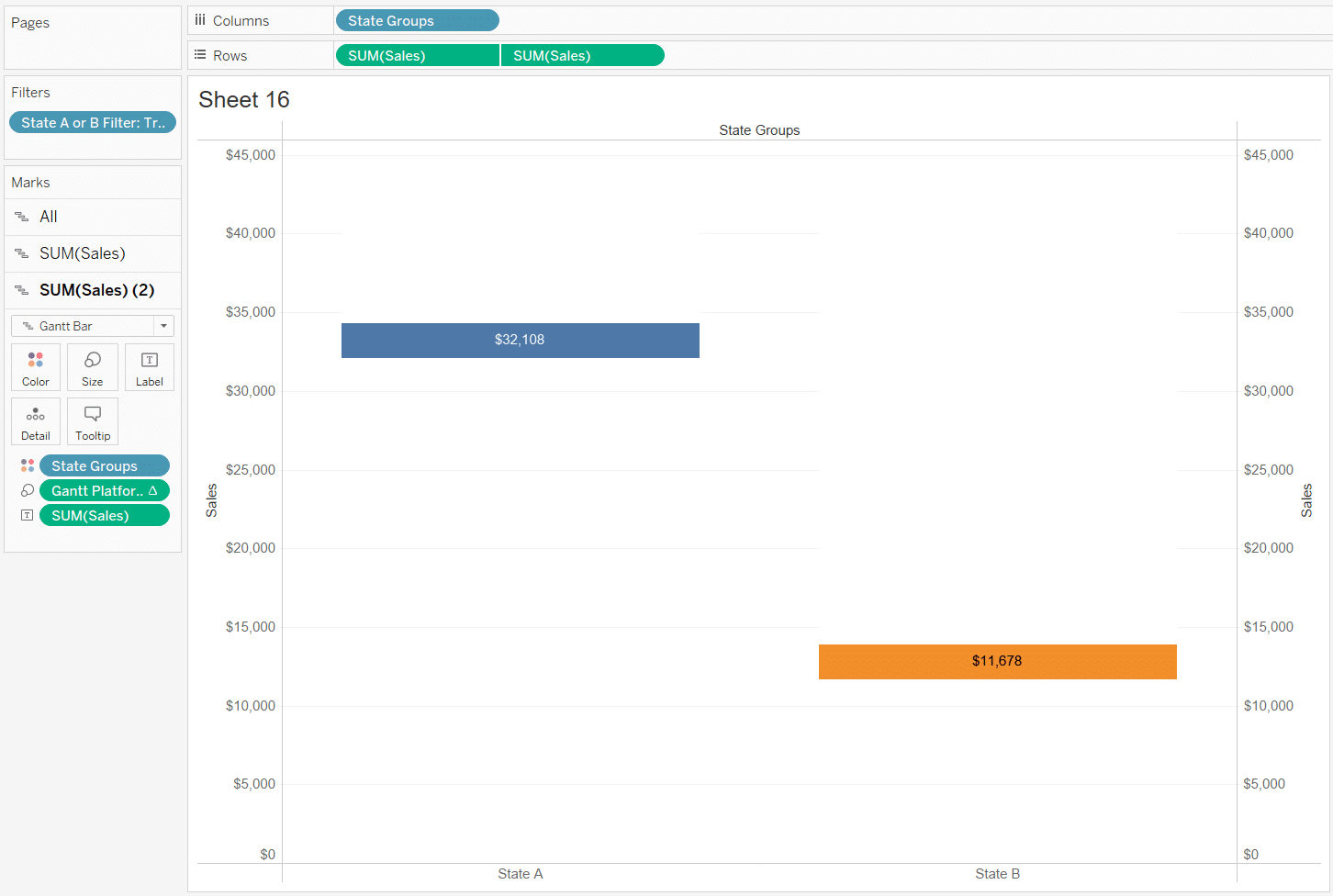
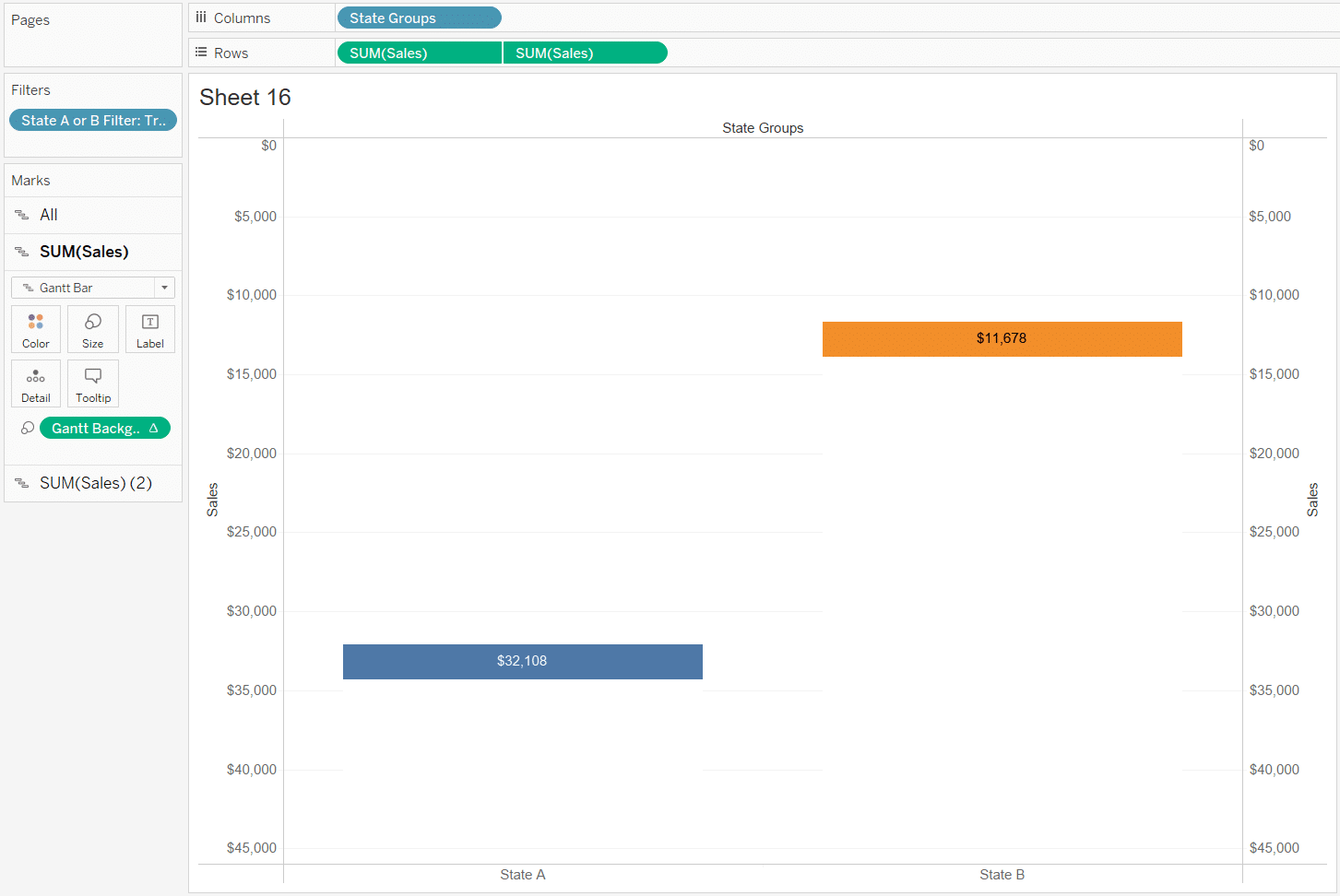
The Balance Scale is taking shape, but remember it’s supposed to behave similarly to a two-sided weight scale where the heavier item gets weighed down lower than the lighter item. Right-click the y-Axis and choose ‘Edit Axis’ from the drop-down menu. Under the section of the menu called ‘Scale’, checkmark ‘Reversed’. Click the ‘X’ in the top right corner of the menu.
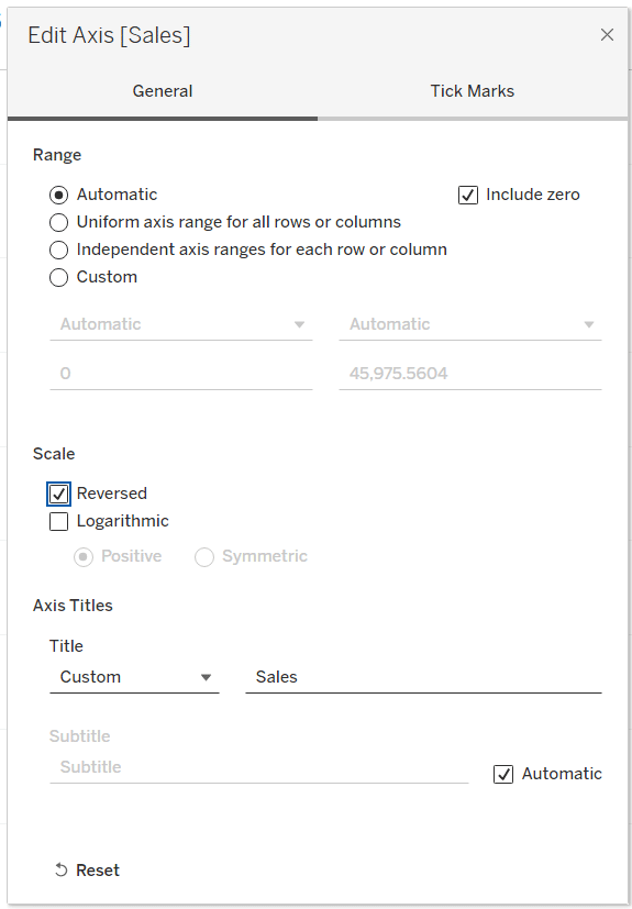
Reversing the y-Axis makes the Balance Scale Chart behave exactly like a two-sided weight scale with the state with more sales getting weighed lower than the state with less sales. Format the sheet by hiding all axes, headers, grid lines, adjusting the Gantt colors as necessary, etc.
To utilize the same gradient background that I am using in this tutorial, right-click the image below and save it to your desktop.

Open a new dashboard, float an image object into the view, choose the gradient background image, and size it to your liking. Float the ‘Balance Scale’ sheet over the top of the gradient background and adjust the sheet so the width and height align with the background image. Show both State A and State B parameters and place them above each side of the scale. Adjust the parameters and watch the scale come to life!
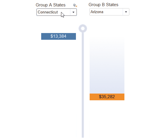
Building a Balance Scale chart to compare two groups of values
The simple Balance Scale chart is great if you only have two parameter values to compare, but many times we want to compare two groups which contain many values. For example, instead of comparing two states, you may want to compare two groups that contain many states.
Changing the Balance Scale chart from comparing only two values to comparing two groups of values is as simple as adjusting three portions of the original Balance Scale chart we previously created. There will be two Sets that replace the original ‘State A’ and ‘State B’ parameters, and we’ll adjust the calculation called ‘State Groups’.
![]()
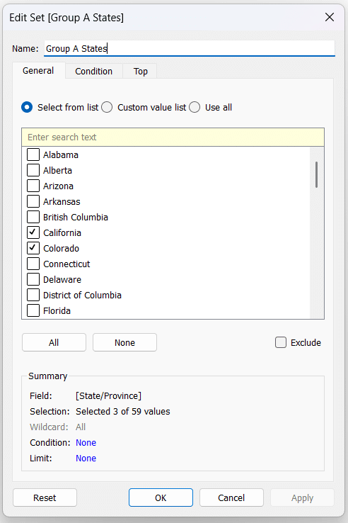
Start by duplicating the ‘Balance Scale’ sheet we previously created to jump start this portion of the tutorial. In the Data pane of your duplicated sheet, right-click the State dimension, choose ‘Create’ from the drop-down menu, and select ‘Set…’. Name the Set ‘Group A States’ and checkmark several states.
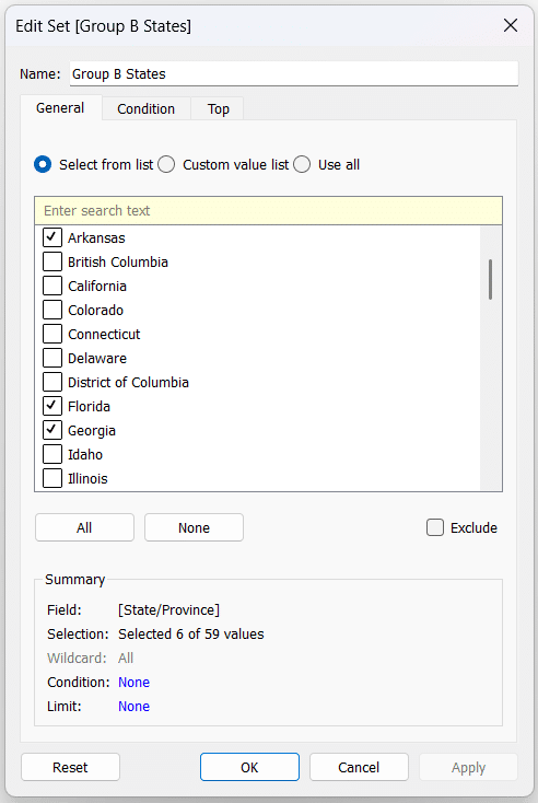
Duplicate the ‘Group A States’ Set, change the name to ‘Group B States’, and checkmark several different states.
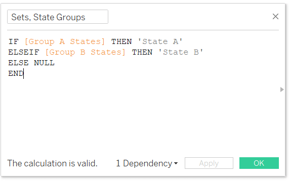
Create a new calculation named ‘Sets, State Groups’, which will replace the old calculation called ‘State Groups’. The syntax for this calculation is as follows:
IF [Group A States] THEN ‘State A’
ELSEIF [Group B States] THEN ‘State B’
ELSE NULL
END
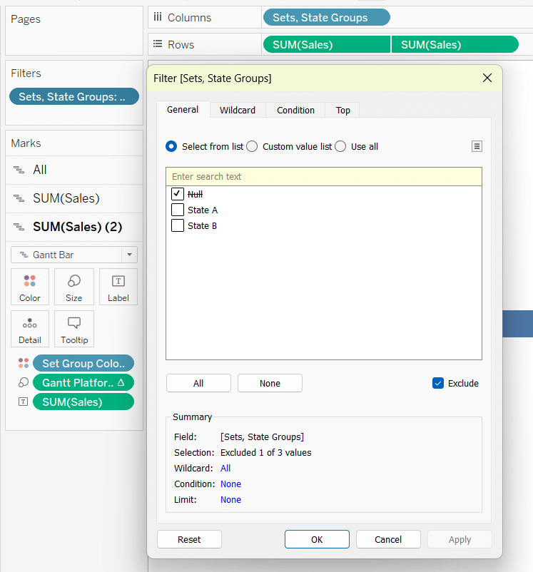
Drag this new calculation to both the Columns shelf and the Color property of the Gantt Marks card to replace the old calculation called ‘State Groups’. Lastly, remove the old filter called ‘Group A or B Filter’, place ‘Sets, State Groups’ on the Filters shelf, and exclude Null.
Create a new dashboard called ‘Balance Scale, Sets’, float the new sheet into the dashboard, show both Sets, and place them just above each appropriate side of the Balance Scale.
You now have two separate ways to build a Balance Scale Chart to enhance the user experience and engagement with your analysis.
Thanks for reading,
Dan

Written By
Dan Bunker

Peer Review
Felicia Styer
Assoc. Director, Analytics Solutions
Related Content
How to Make Sensational Spider Charts in Tableau
Spider charts, also known as radar charts, are an engaging and perhaps underutilized chart for visual analytics. While this advanced…

Ryan Sleeper
Make Project Plans More Engaging with One Simple Trick Ryan shows you how to: (1) make a traditional Gantt chart…
The Definitive Guide to Tableau Sets

In this post you will learn how to: (1) create static Tableau sets, (2) create dynamic sets, (3) use sets…