3 Ways to Make Gorgeous Gantt Charts in Tableau

Traditional Tableau Gantt charts display a mark at a start date and size the mark by duration, showing a visual connection between a starting point and an end point. The fact that Tableau has a mark type of “Gantt Bar” that can be sized by any value, whether it’s a duration or another type of value completely, unlocks some additional flexibility. The Gantt Bar mark in Tableau can be used to create waterfall charts, leapfrog charts, ranged dot plots, bar-in-bar charts – or for their traditional use – project planning.
At Playfair Data, we like to use Gantt charts to show team member roles, consulting project tasks, and deadlines, but we have found some limitations in the default Gantt chart’s look and functionality. This post will show you how to make a Gantt chart in Tableau and three ways to make them more engaging and effective. You’ll learn how to: (1) easily round Gantt marks, (2) dynamically add the current date as a reference line, and (3) automatically segment tasks into “Complete”, “In Progress”, or “To Do”.
Watch the related video with Playfair+
How to make a Gantt chart in Tableau
By the end of this post, you’ll be able to make rounded Gantt charts, show today’s date as a dynamic reference line, and color the Gantt marks by their status.
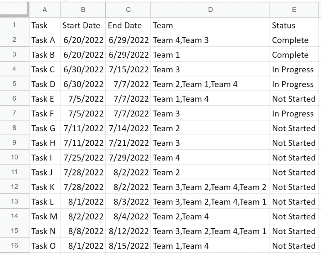
But first, I’ll show you how to make a traditional Gantt chart in Tableau. Gantt charts are one of the few chart types that the Sample – Superstore dataset does not have a good use case for. Instead, you can follow along using (1) this sample project plan that we’ve shared as a Google Sheet or (2) any dataset that has a column for task, start date, and end date.
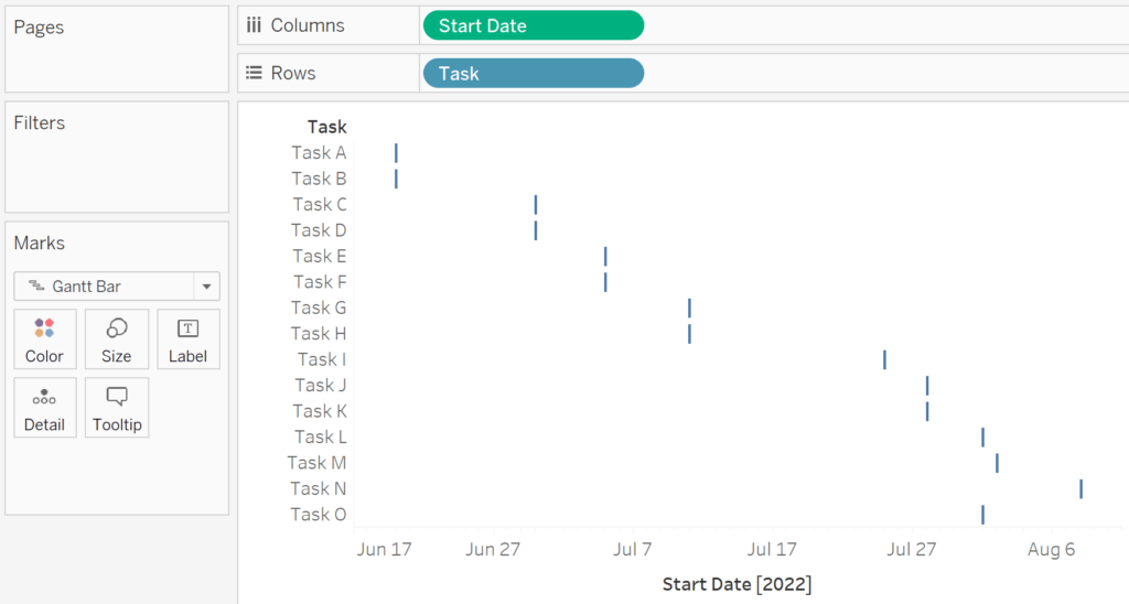
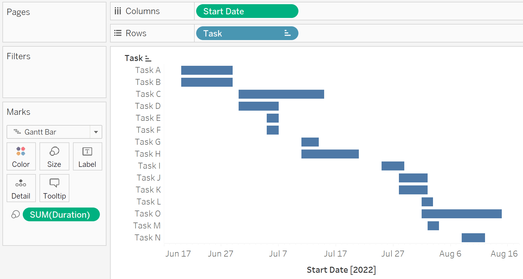
To begin a traditional Tableau Gantt chart, use the dropdown on the Marks card to change the mark type to Gantt Bar, place the dimension containing your tasks on the Rows shelf, and your Start Date field on the Columns shelf.
![]()
For best results, use the date as continuous with a date part of day. You can make this selection by right-clicking while you drag the Start Date field to the Columns shelf and choose the very first option: Start Date (Continuous).
Continue reading with a free account, or login.
Unlock this tutorial and hundreds of other free visual analytics resources from our expert team.
Already have an account? Sign In
By continuing, you agree to our Terms of Use and Privacy Policy.
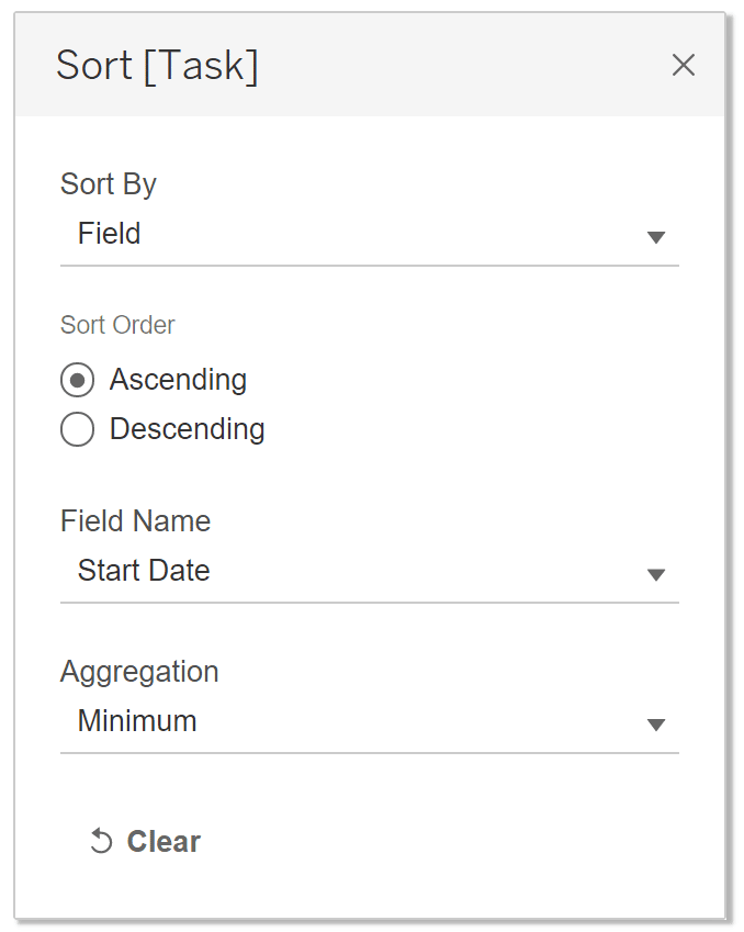
By default, the tasks will be sorted by Data Source Order, or the order they appear in the underlying dataset. In my case, Task O kicks off before Tasks M and N, but appears later in the sort because of its Data Source Order. If you prefer to sort by Start Date, right-click on the Task dimension on the Rows shelf and choose Sort. Then choose Field in the first dropdown, the Ascending radio button, Start Date as the field, and Minimum as the aggregation.
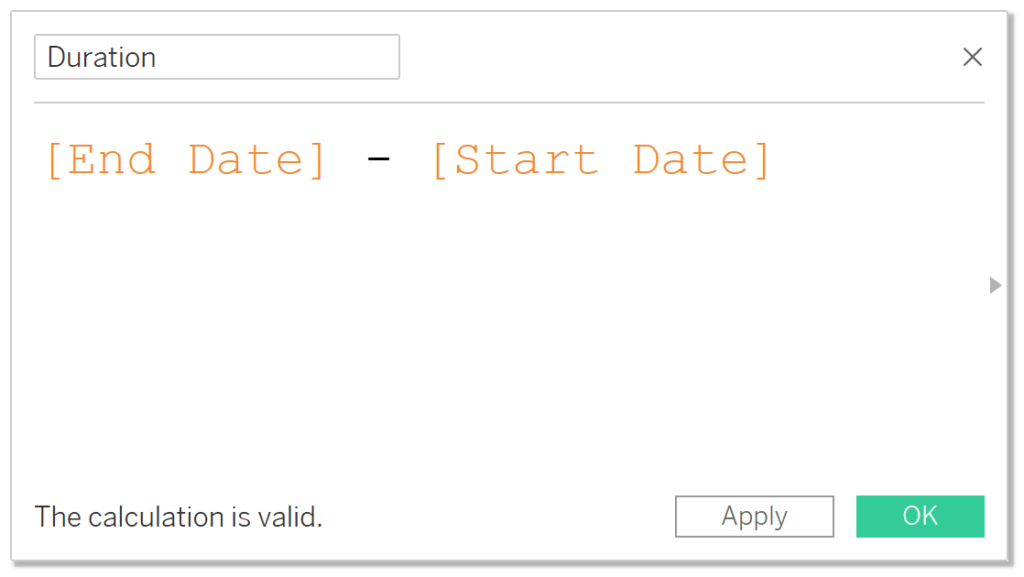
To complete the Gantt chart, we will need to size the Gantt marks by the duration of the task. It’s possible that you have this value in your dataset, and if so, simply place it on the Size property of the Marks card. In my case, there is no column for “Duration”, but I can compute it in Tableau with this simple calculated field:
[End Date] – [Start Date]
Here’s how the final Tableau Gantt chart looks after adding this newly-created calculated field to the Size property of the Marks card.
The easy way to make rounded Tableau Gantt charts
The default Gantt chart is not terrible, but I prefer a more modern, rounded aesthetic. Fortunately, I’ve found a very easy way to round the straight edges of the Gantt marks without adding any calculated fields! First, we will need to change the data type of the Start Date and End Date fields from Date to Number (whole). You can do this by either (1) right-clicking on each field on the Data pane, hovering over “Change Date Type”, and choosing “Number (whole)”, or (2) clicking the Data Source tab in the bottom-left corner of the Authoring interface, clicking the data type icon at the top of each column and choosing “Number (whole)” there.
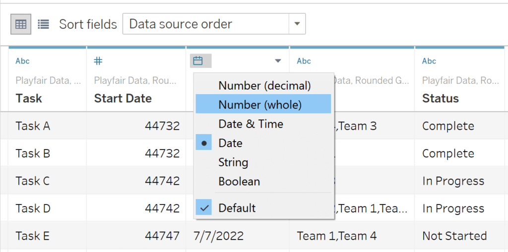
Changing the data type of a date to Number (whole) converts it to a serial number counting up from January 1st, 1900. We also need to convert each date field from a dimension to a measure; the easiest way to do this is to right-click on each date field on the Data pane and choose “Convert to Measure”.
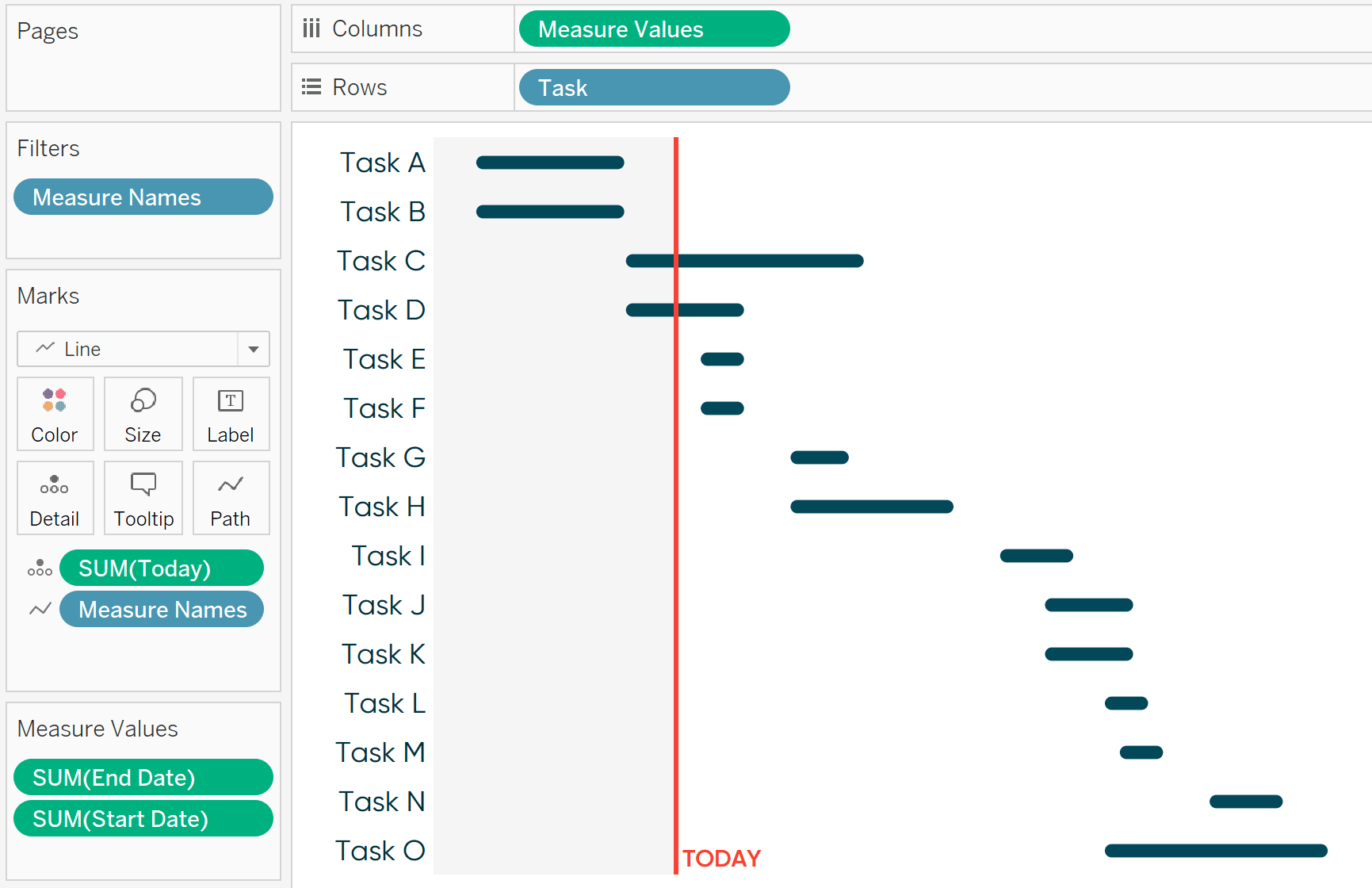
We are now ready to begin our rounded Tableau Gantt chart. On a new sheet, this time we will change the mark type to Line, place the Task field on the Rows shelf, and place the Measure Values field on the Columns shelf.
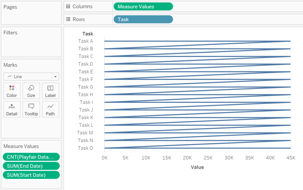
By default, the generated Measure Values field will include every measure in the dataset, as seen on the Measure Values shelf. We only need the Start Date and End Date values, so I will remove the record count field, CNT(Playfair Data, Rounded Gantt Charts), by left-clicking on it from within the Measure Values shelf and dragging it away. Doing this also places the Measure Names field onto the Detail property of the Marks card. To get Tableau to connect our dots as intended, you need to drag the Measure Names field to the Path property of the Marks card.
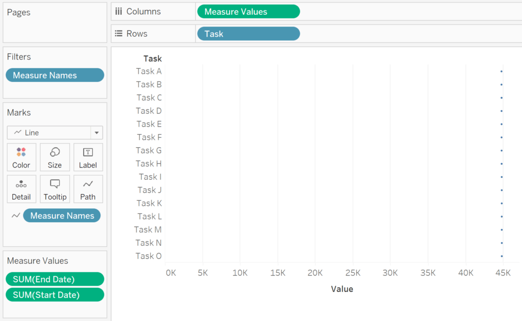
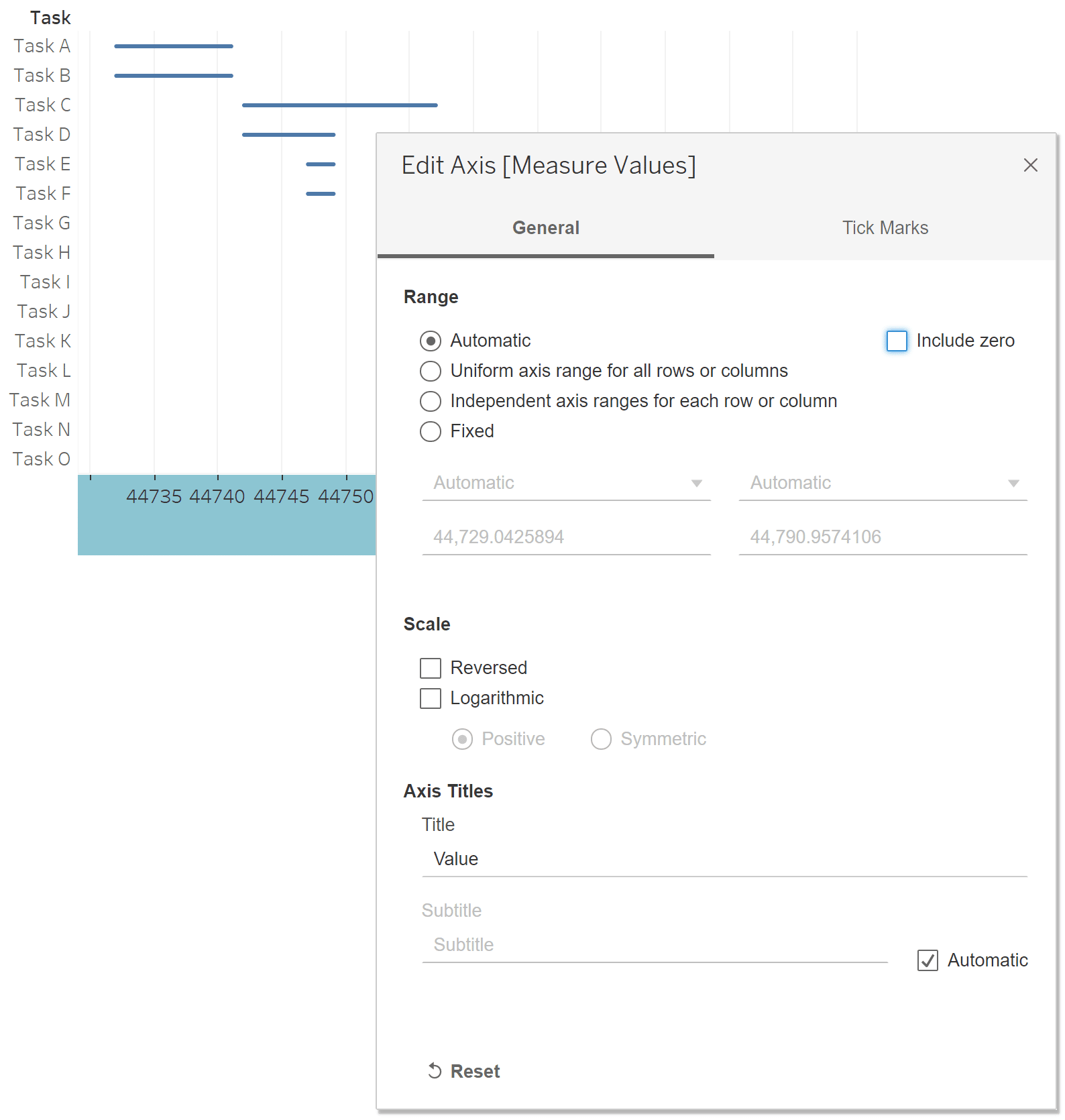
Believe it or not, this is already working. However, because our axis is now continuous and includes zero, our first mark does not appear until 44,732 days in since 1/1/1900. To see our rounded Gantt marks come into view, we must edit the axis so that it does not include zero. You can do this by right-clicking on the axis, choosing “Edit Axis”, and deselecting the box that says “Include zero”.
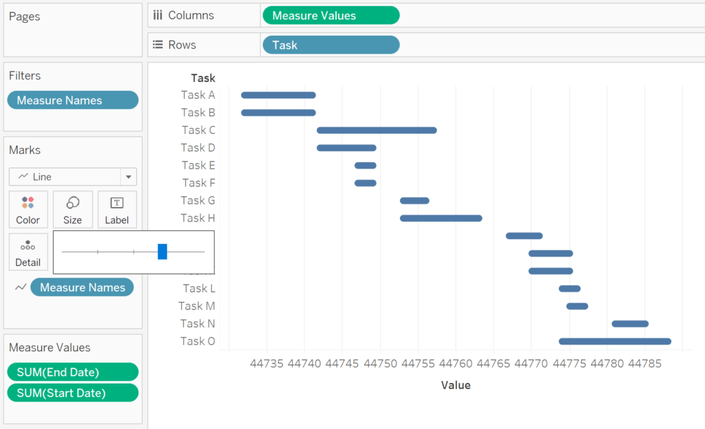
From here, you can modify the size of the Gantt marks to your liking by clicking the Size property of the Marks card and moving the slider from left to right.
There you have it – rounded Gantt charts in Tableau with no new calculated fields – not even for duration!
How to add a reference line for today’s date
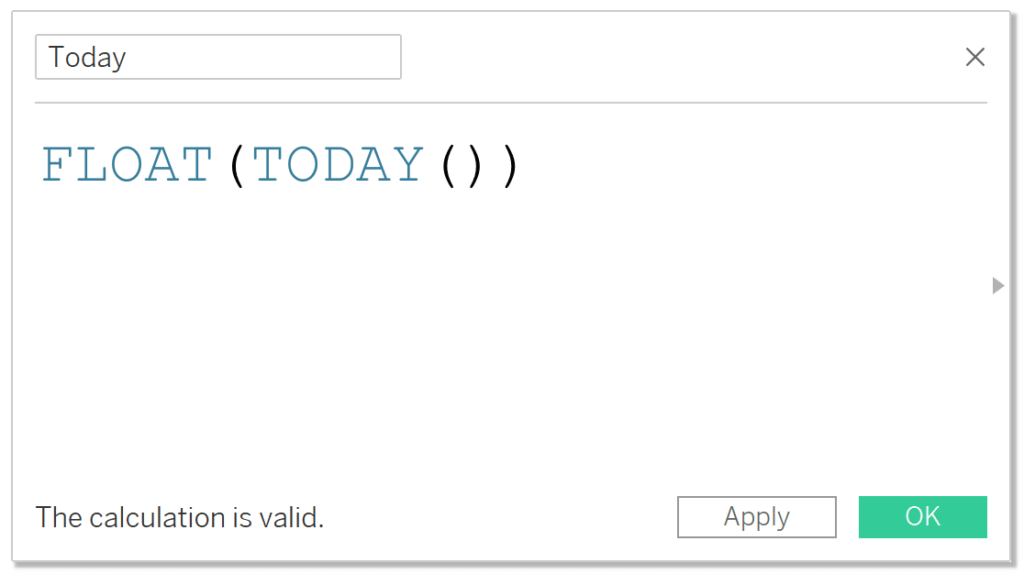
To provide context on how much time has passed and how much time we have left to complete a project, I like to display the current date on Gantt charts. If you are making a traditional Tableau Gantt chart, you will create a calculated field with the formula: TODAY(). If you are making a rounded Gantt chart, you will need to wrap the TODAY() function in FLOAT to convert it to a serial number: FLOAT(TODAY()).
The TODAY() function is dynamic and will move as time progresses; this is what you would want to use in a real-world scenario. Since I am using a sample dataset with fixed dates, I will alter my date field slightly to hardcode a date of July 5th, 2022. If you are following along using the sample Google Sheet, you can modify your “Today” calculated field to FLOAT(DATE(“2022-07-05”)).
Whether you are making a default or rounded Gantt chart, place this newly-created Today calculated field onto the Detail property of the Marks card; making it available to use as a reference line on the view. If you are making a traditional Gantt chart, you will need to right-click on the Today field on the Detail property of the Marks card and choose “Exact Date”.
To add the date as a reference line, right-click on the axis and choose “Add Reference Line”. If you have added the date to the Detail property of the Marks card, it will be available as a choice in the Value dropdown. You can get creative in this dialog and do some formatting, such as updating the reference line label, changing the line’s color and weight, and/or adding some shading for dates that have passed.
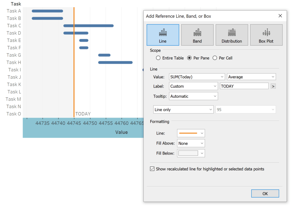
The serial numbers on the axis are not providing much value, so I will also hide the axis by right-clicking on it and deselecting “Show Header”. Here’s how my rounded Gantt chart looks in Tableau, with a reference line for the current date and some extra formatting.
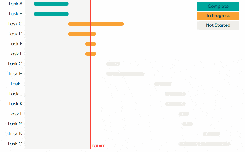
How to automatically segment tasks
You may have noticed that the sample project plan contains a column called “Status” with three dimension members: Complete, In Progress, and Not Started. If I were to drag this field to the Color property of the Marks card, the user could instantly see the status of each task based on their color encoding. This is a great feature but would require the project manager to maintain the most up-to-date status in the Google sheet.
If we assume our project will stay on track and our team will meet each deadline, we can do a similar status segmentation that will color each Tableau Gantt mark automatically by comparing the dates of each task to the current date. To do so, copy the following formula and create a calculated field:
IF [Start Date] < [Today] AND [End Date] < [Today] THEN “Complete”
ELSEIF [Start Date] <= [Today] THEN “In Progress”
ELSE “Not Started”
END
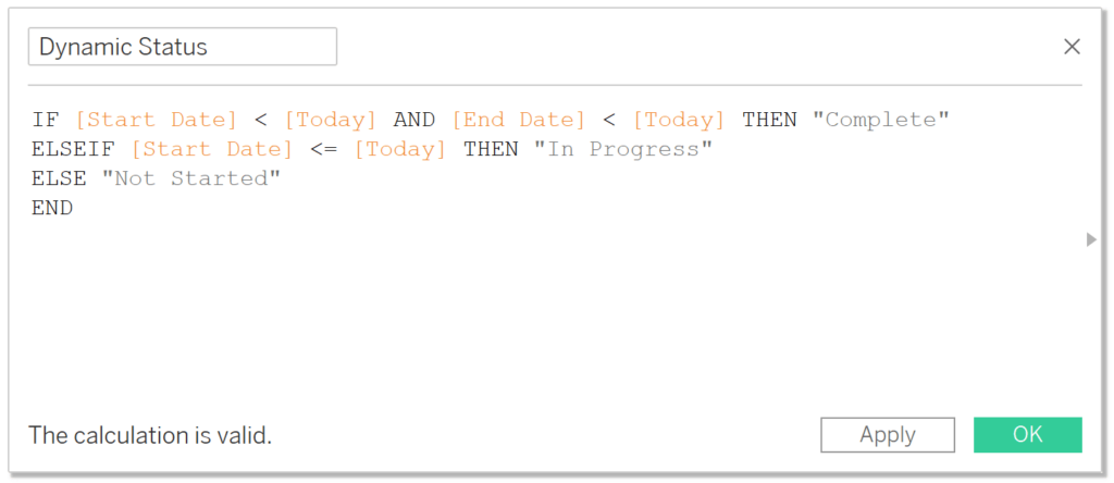
Note: [Today] in this calculated field is the calculated field we created in the last section. It equals TODAY() when building a traditional Tableau Gantt chart and FLOAT(TODAY()) when building a rounded Tableau Gantt chart.
![]()
Now I will place the newly-created Dynamic Status calculated field on the Color property of the Marks card to display the current status of each task. Here is how my final Gantt chart looks after implementing all three tips in this post.
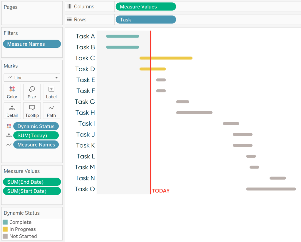
Look at that Gantt chart – it’s gorgeous!
Thanks for reading,
– Ryan


Written By
Ryan Sleeper
Related Content
Introducing Sankey Bump Charts in Tableau

For a while now, I have been thinking of ways to show how a single dimension member ranks over several…
How to Account for Leap Year in Tableau

Brace yourselves – 2024 is a leap year! Here are a few strategies to keep your Tableau workbooks accurate this…
How to Make Sensational Spider Charts in Tableau

Spider charts, also known as radar charts, are an engaging and perhaps underutilized chart for visual analytics. While this advanced…