How to Do Better What-If Scenario Planning with Tableau Set Controls
A long time ago, in a Tableau galaxy far away (aka 2014), I shared how to make a what-if analysis in Tableau using parameters. This is a popular business tactic for illustrating differences between actual or expected results and a custom scenario (i.e. what would happen if we were able to increase sales by 10%).
What-if analyses just became much easier with the introduction of set controls in Tableau 2020.2. Now, a scenario can be applied to one or more dimension members and you can have multiple scenarios within a single view. This post shows you how to use Tableau set controls to create a more dynamic and user-friendly scenario planning experience.
How to Use a Tableau Set Control for Scenario Planning
How to “show sets” for easier scenario planning in Tableau
By the end of this post, you will be able to create a what-if analysis for both a positive and negative scenario on the same chart.
For this analysis, you can apply positive what-if scenarios to one group of dimension members and negative what-if scenarios to a second group of dimension members.
![]()
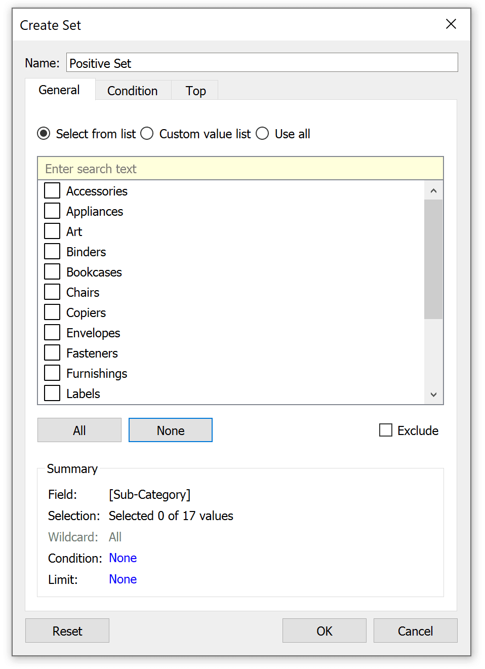
First, create an empty set for each scenario (positive changes and negative changes, in this case). I’m using the Sub-Category dimension from the Sample – Superstore dataset, so the easiest way to create an empty set is to right-click on the field in the Data pane, hover over “Create”, and choose “Set”.
An Introduction to Tableau Sets
This will open a dialog where you can give the set a name and click OK to close the window. Don’t worry about adding anything to the set at this point because we will control what is included later via the new set control feature.
Continue reading with a free account, or login.
Unlock this tutorial and hundreds of other free visual analytics resources from our expert team.
Already have an account? Sign In
By continuing, you agree to our Terms of Use and Privacy Policy.
Repeat this step for the second set of dimension members.

Controlling the intensity of the scenario with a parameter control
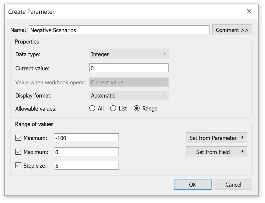
You will also need a parameter to control the scenario values applied to each of these two sets. For the first set, I will create a parameter with a data type of Integer and provide a range of values from 0 – 100 in increments of 5. These will eventually correspond to percent increases in the Sales measure from 0 to 100 percent.

The parameter for my negative set will include a range of values between 0 and minus 100 percent, eventually corresponding with negative changes all the way down to losing 100% of our sales.
An Introduction to Tableau Parameters
You also have the option to display parameter values as percentages, but this can be trickier to manage because everything will be multiplied by 100. This means that an increment of five corresponds with 500%.
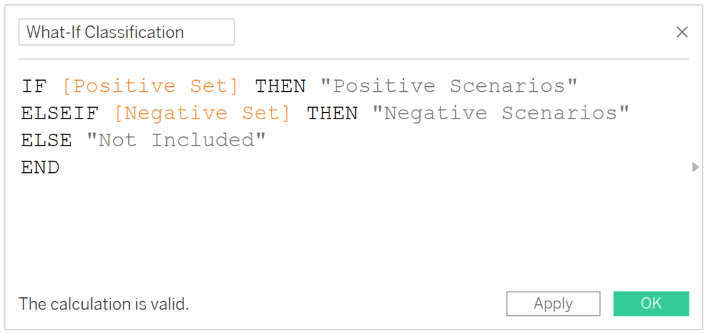
The final step to begin using these multiple what-if scenarios at the same time is to create this key calculated field which classifies every dimension member into one of three ways and instructs Tableau whether a custom scenario should be applied, and if so, which one. For the two sets I’ve created so far, the formula is:
IF [Positive Set] THEN [Sales]*(1+([Positive Scenarios]/100))
ELSEIF [Negative Set] THEN [Sales]*(1+([Negative Scenarios]/100))
ELSE [Sales]
END
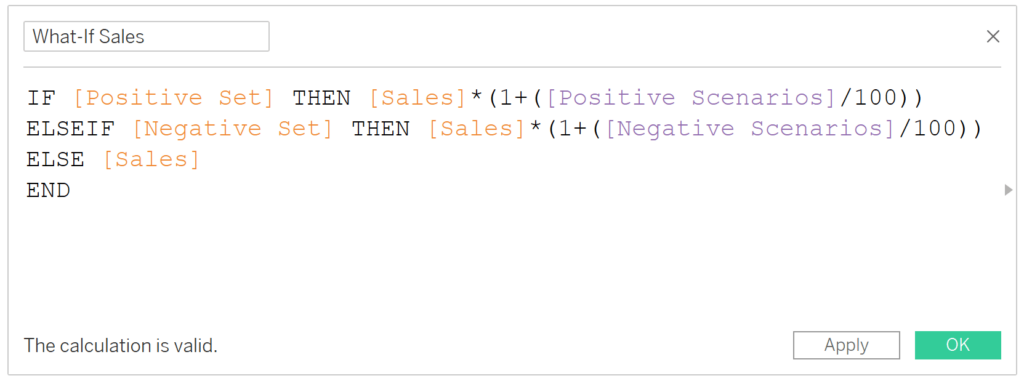
Note that if you choose to display parameter values as percentages, you would remove the “/100” from the first two lines.
While this formula will allow us to have multiple scenarios visualized on the same chart, note that each dimension member can only be classified once. For example, we can’t both raise and lower the sales for one sub-category at the same time. The IF / THEN logic in this calculated field goes in order from top to bottom, so if a sub-category were in both the Positive Set and Negative Set, it would be classified as a positive scenario before it made it to the second line.
Quality checking the what-if scenarios
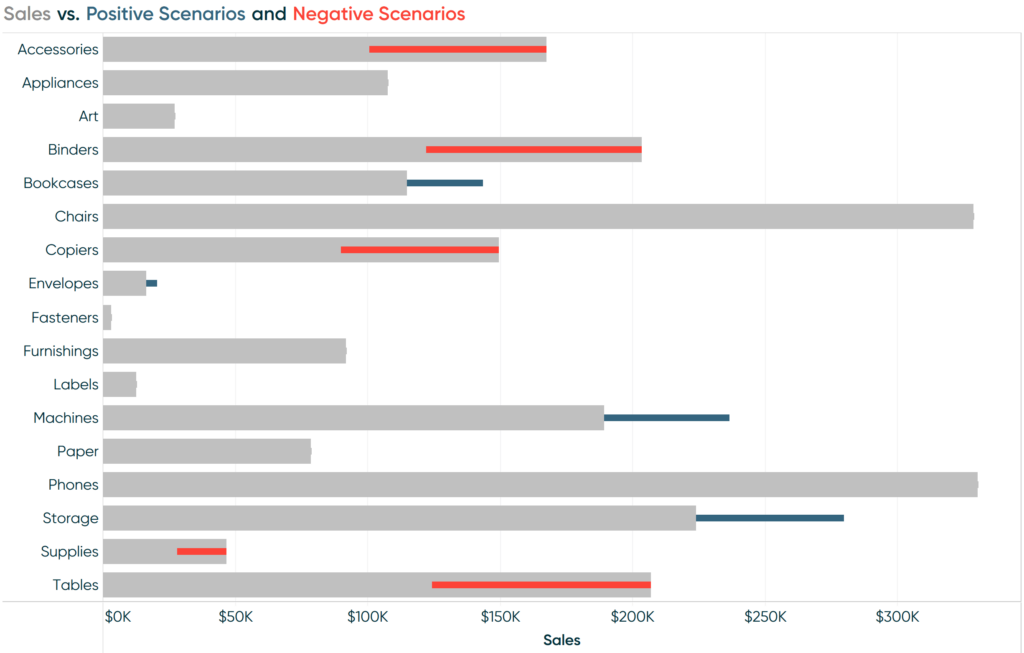
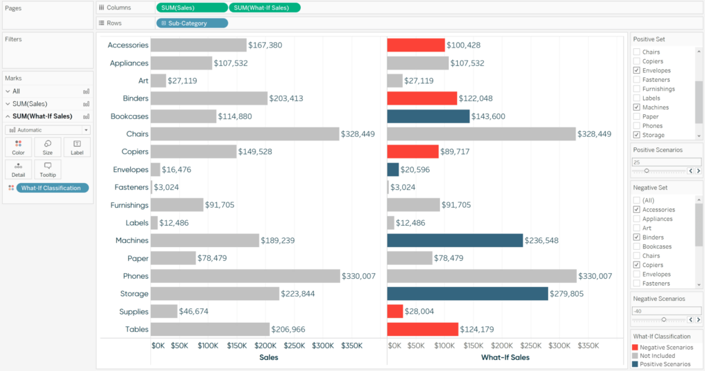
To ensure this is working as expected, I will create a two-column bar chart with the original sales on the left and newly created what-if sales on the right.
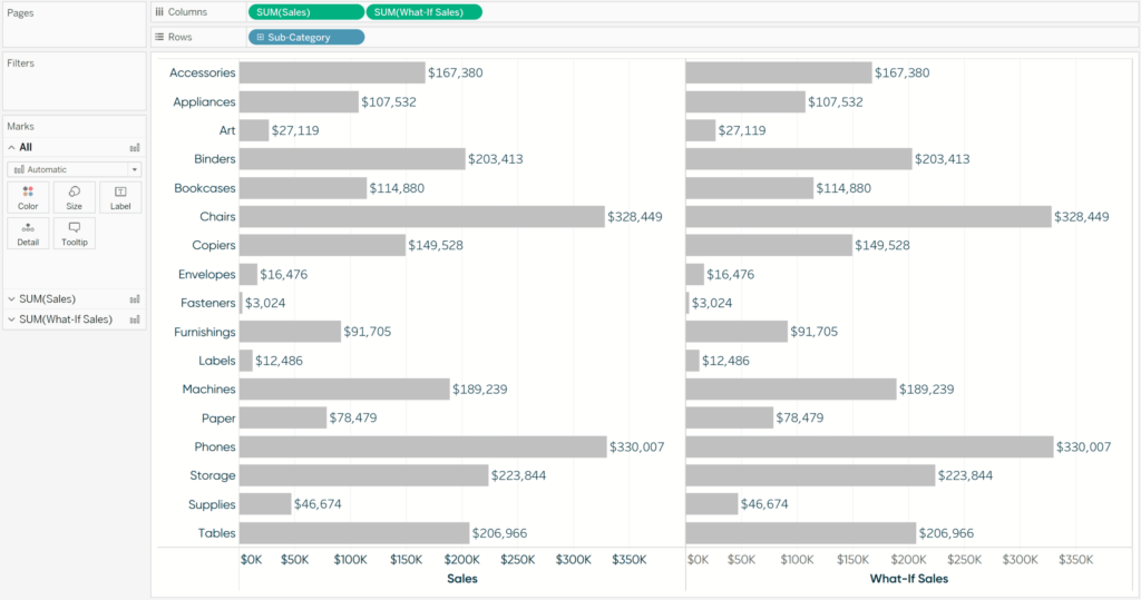
So far the values on both sides match because there are no values in our empty sets. Even if there were values in our sets, both the Negative Scenarios and Positive Scenarios parameters are currently set to 0, which would result in no change on the right side. To unlock the flexibility of this multi-scenario tool, we must show both parameter controls and the newly introduced “set controls”.
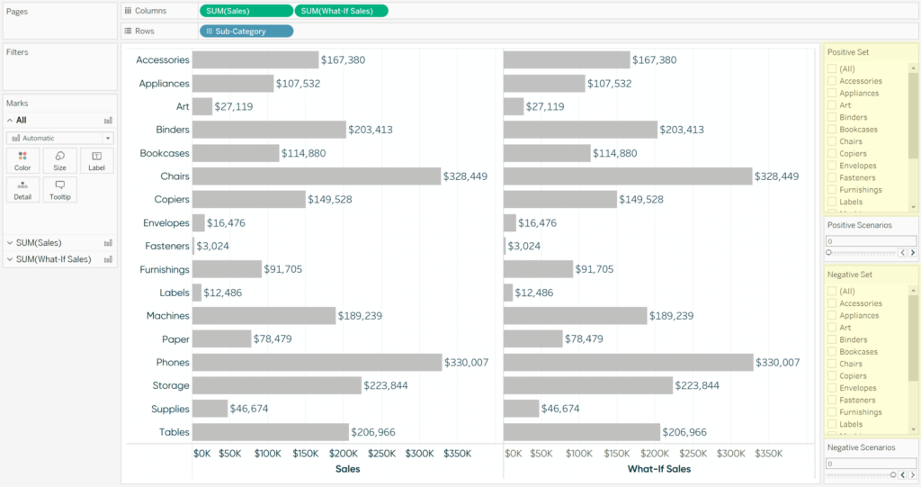
To show a parameter control, right-click on it from the Data pane and click “Show Parameter” (previously called “Show Parameter Control” prior to Tableau 2020.2). To show a set control, right-click on a set from the Data pane and click “Show Set”.
Note that to show a set, the set must exist somewhere on the view or as part of a calculated field on the view. Since I’ve used both the Positive Set and Negative Set fields in the What-If Sales calculated field, I’m able to show these set controls. If the set is not on the view, the option to “Show Set” will be grayed out and reads “Show Set (add set to view)”. Prior to Tableau 2020.2, the only option with sets was to show a binary set filter and you could only choose to show dimension members that were either “IN” or “OUT” of the set.
Check it out, now you can allow yourself and your users to decide what is added to the set, much like you would a regular discrete filter!
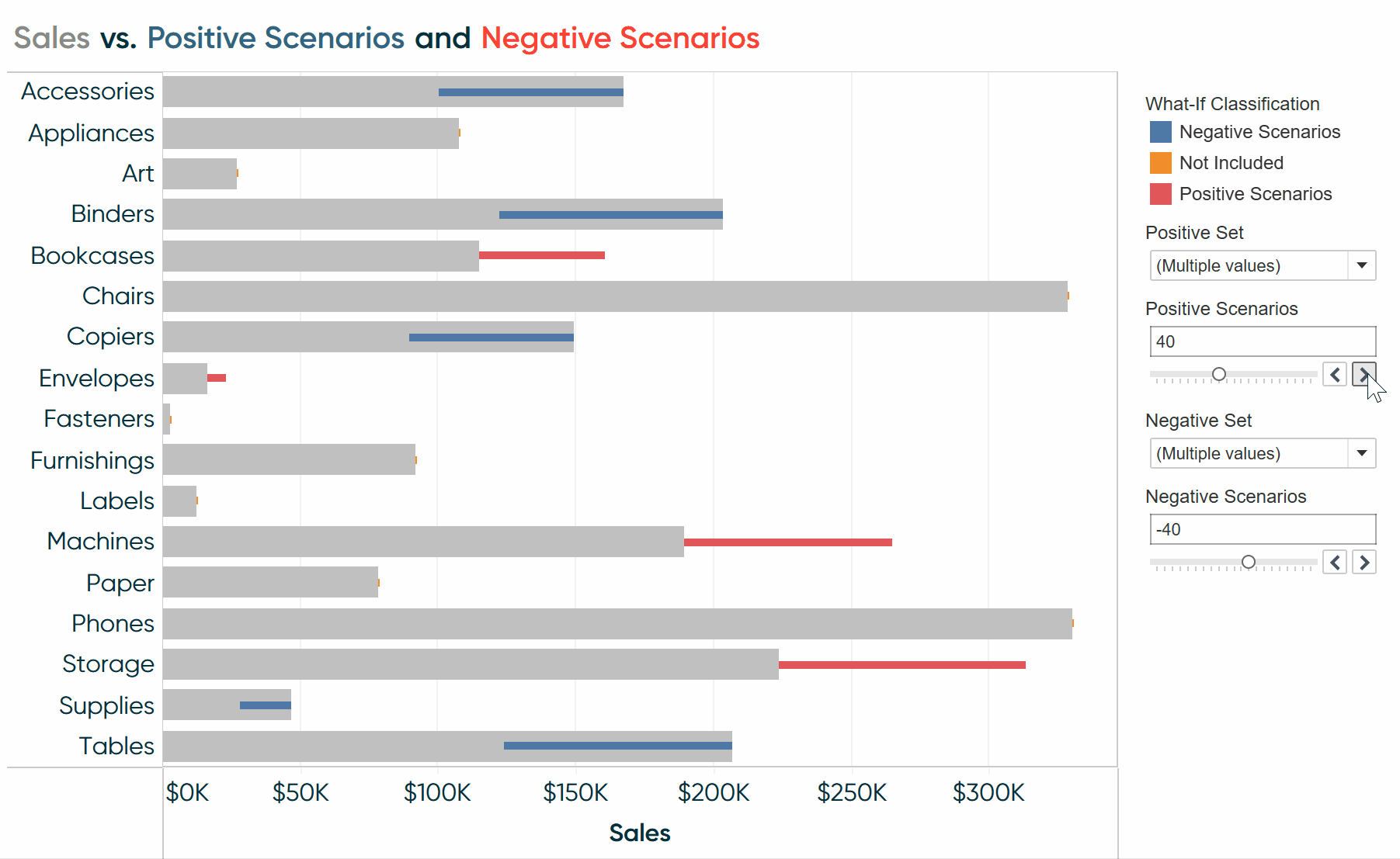
For our scenarios, let’s say that the current climate is expected to increase our Bookcases, Envelopes, Machines, and Storage sub-categories by 25% while reducing our Accessories, Binders, Copiers, Supplies, and Tables sub-categories by 40%. You have been able to do something similar before using set actions, but it was clunky to explain how to do a multi-select (hold the Control key while you click multiple dimension members); plus you couldn’t do more than one scenario on the same view.
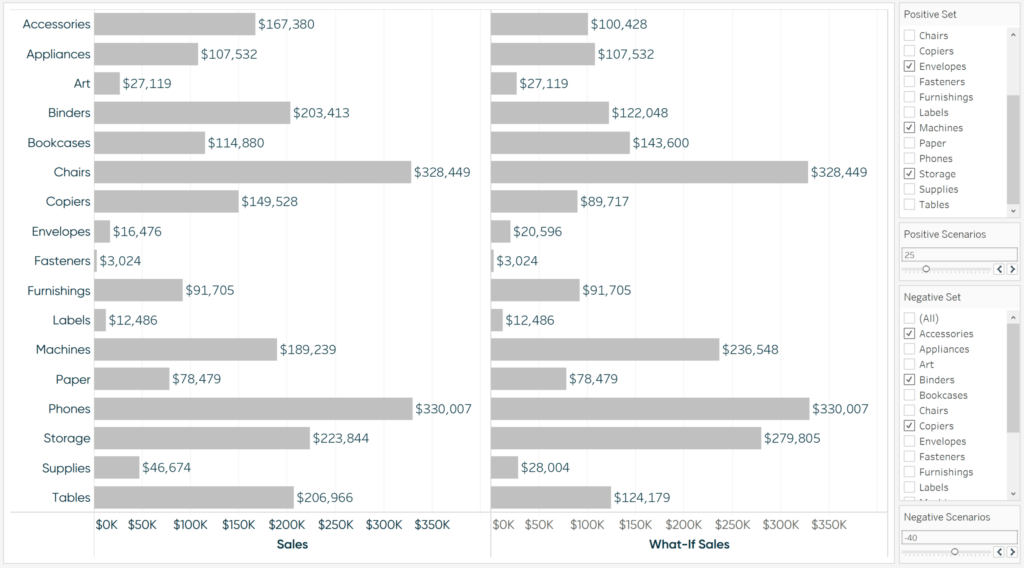
As you can see, the math is checking out between the changes on the right side and the original values on the left side. Now that I know this is working, there are some fun options on bringing this chart to life.
![]()
First, I’ll make a calculated field that colors the dimension members by whether they are included in a what-if scenario.
IF [Positive Set] THEN “Positive Scenarios”
ELSEIF [Negative Set] THEN “Negative Scenarios”
ELSE “Not Included”
END
Here’s how the chart looks after adding this calculated field to the Color Marks Card for the right side.
Now we know which dimension members are being included in the what-if scenarios. To better integrate the what-if values with the actual values, I’ll make the following updates:
– Convert this into a dual-axis combination chart by clicking the second pill on the Rows Shelf and choosing “Dual Axis”
– Change the mark type for Sales back to bar and What-If Sales to Gantt Bar
– Click the Size Marks Card for What-If Sales to reduce the size of the Gantt marks
– Synchronize the axes by right-clicking on either axis and choosing “Synchronize Axis”
– Size the Gantt Marks by a new calculated field that computes “SUM([Sales]) – SUM([What-If Sales])”
– Hide the top axis by right-clicking on the axis and deselecting “Show Header”
Here’s how my final chart looks:
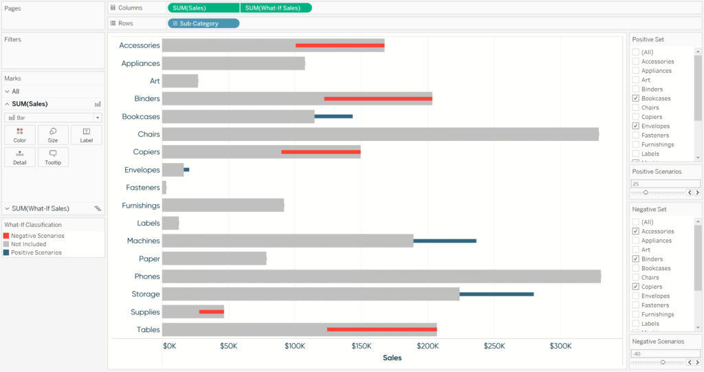
We have just created a single visualization containing multiple what-if scenarios that our users can easily update on the fly using Tableau’s new set controls. I used a bar chart for ease of illustration and quality checking, but these scenarios can be applied throughout an entire workbook on any chart type.
Thanks for reading,
– Ryan


Written By
Ryan Sleeper
Related Content
3 Ways to Make Gorgeous Gantt Charts in Tableau
Traditional Tableau Gantt charts display a mark at a start date and size the mark by duration, showing a visual…
3 Simple Ways to Improve the UX of Your Dashboards

At Playfair Data, we pride ourselves in improving the UX of dashboards to transform raw data into powerful insights. To…

Ryan Sleeper
Several ways to use a favorite user feature This video will show you how to make dual-axis combination charts –…