How to Create Persistent Comparison Sets Across Tableau Dashboards
Comparisons help us find and communicate insights in Tableau and segmentation (a type of comparison) is one of the best ways to make those insights actionable. So why not combine these tactics by allowing dashboard users to create custom comparison sets in Tableau that are relevant to them? This is a user experience that was improved dramatically with the introduction of set actions which allow you to create sets by simply interacting with dimension members on a dashboard. These custom sets persist across dashboard views, providing an opportunity to leverage the same sets across multiple analyses.
This post will show you how to design set actions to create persistent comparison sets, but also how to use those comparison sets to (1) provide a visual cue to your audience that reminds them what they have selected, and (2) the calculations required to compare a focus dimension member to the comparison set.
Watch the related video with Playfair+
Make the foundational scatter plot
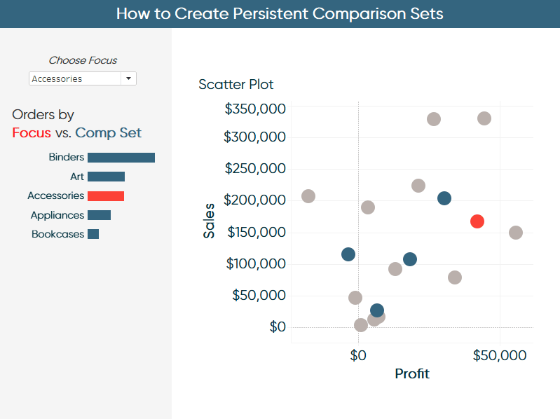
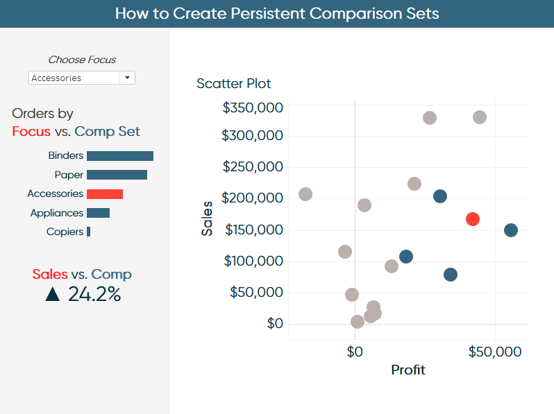
By the end of this post, you will be able to create the comparison on the left side of this dashboard on the fly by selecting dimension members from the scatter plot.
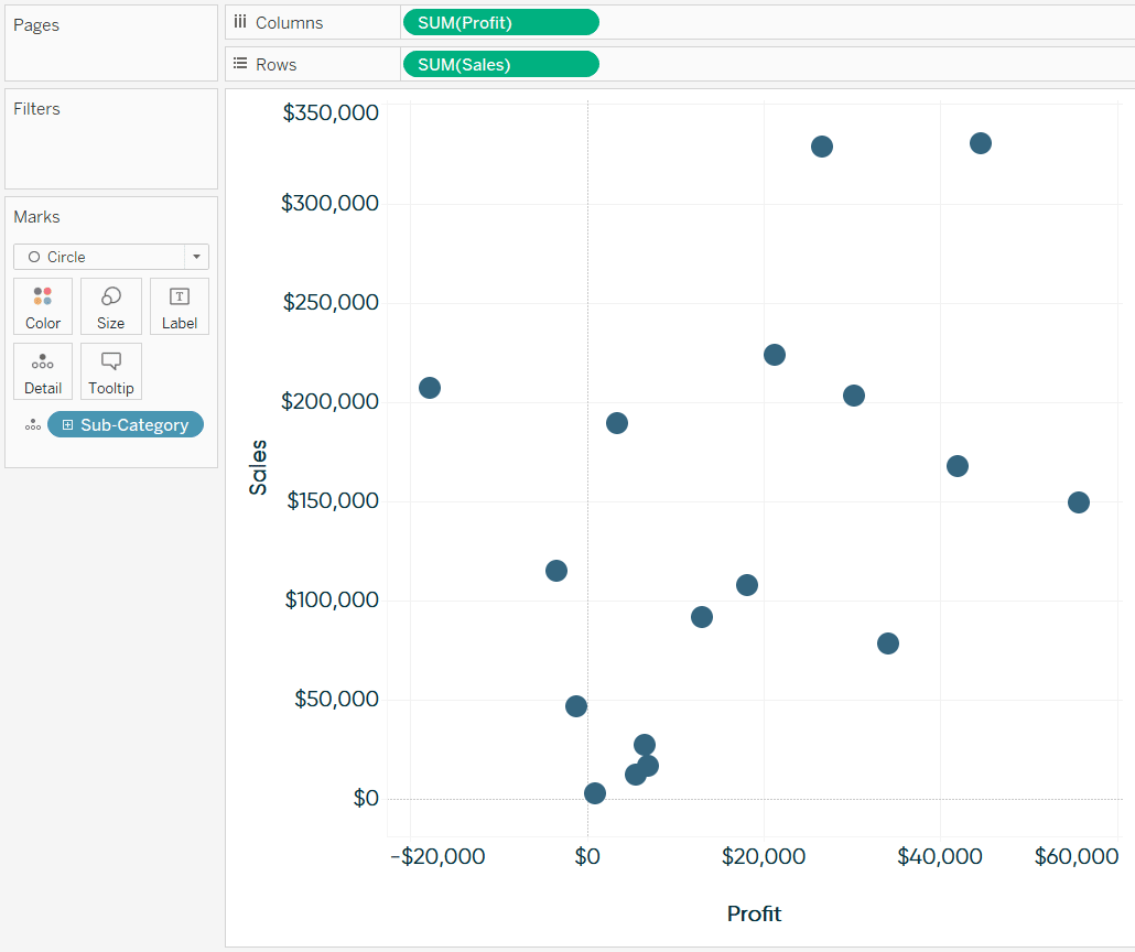
To get started, I’ll make the scatter plot view which serves as the foundation of the first dashboard. Scatter plots are one of my favorite “prescriptive” dashboard elements, and you can learn more about making them more engaging and effective in the post 3 Ways to Make Stunning Scatter Plots.
![]()
Continue reading with a free account, or login.
Unlock this tutorial and hundreds of other free visual analytics resources from our expert team.
Already have an account? Sign In
By continuing, you agree to our Terms of Use and Privacy Policy.
This version is created with the Profit measure on the Columns Shelf, Sales measure on the Rows Shelf, and Sub-Category dimension on the Detail Marks Card.
Create a focus dimension member for sets in Tableau
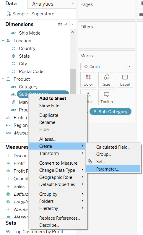
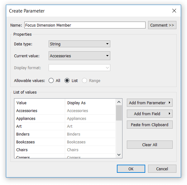
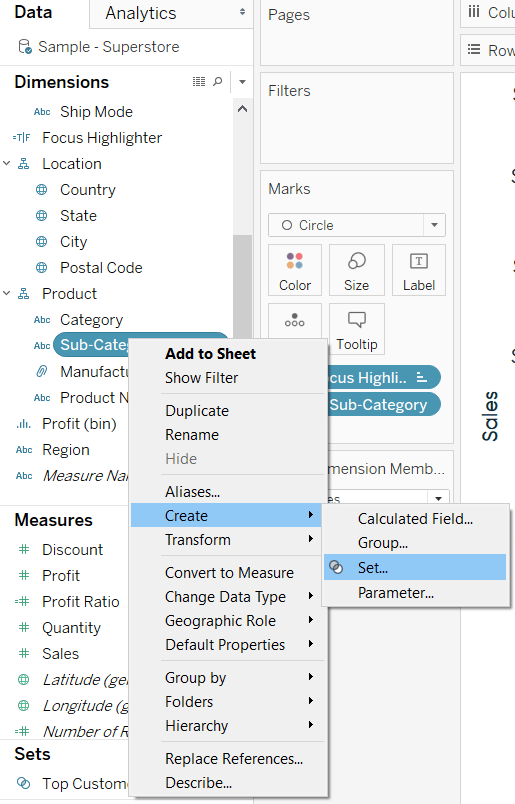
Next, we will create a focus dimension member for the workbook. The performance of the focus dimension member will eventually be compared to the comparison Tableau set created later in the post. My go-to technique is to use parameters to highlight a dimension member on visualizations. Since my focus dimension member will come from the dimension members within the Sub-Category dimension, we can use a shortcut to populate the list of allowable focus values. To do so, right-click on the dimension of interest (Sub-Category in this case), hover over Create, and choose ‘Parameter…’.
This automatically creates a parameter with a list of allowable values matching the dimension members of the dimension.
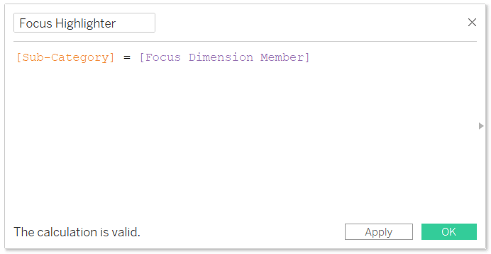
To use this parameter to highlight the focus dimension member (i.e. whichever allowable value is selected in the parameter), create a Boolean calculated field as follows. For our example, the entire formula is:
[Sub-Category] = [Focus Dimension Member]
If you want to see how this highlight effect works on its own, place this calculated field on the Color Marks Card of every chart in which you want to highlight the selected dimension member. The dimension member matching the current value of the parameter will get one color; every other dimension member will get a second color.
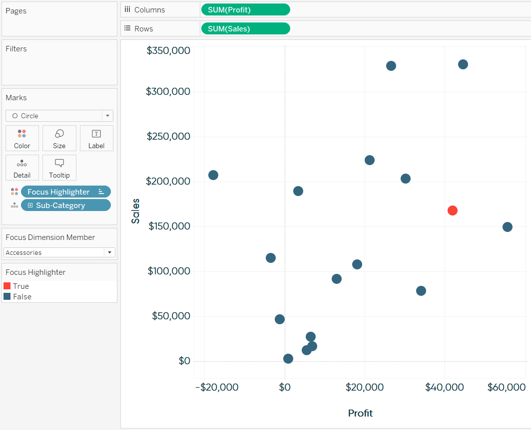
For this illustration, I have chosen to show the parameter control which provides a dropdown with the list of allowable parameter values. You can show the parameter control by right-clicking on the parameter and choosing “Show Parameter Control”. You also have the option to use parameter actions to control the selection of the focus dimension member, but that is a topic for another post.
Create dynamic comparison sets in Tableau
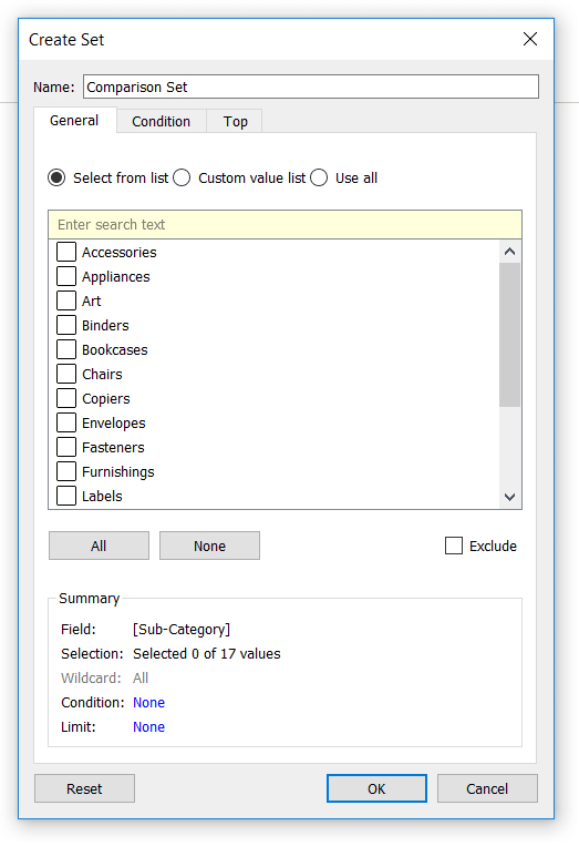
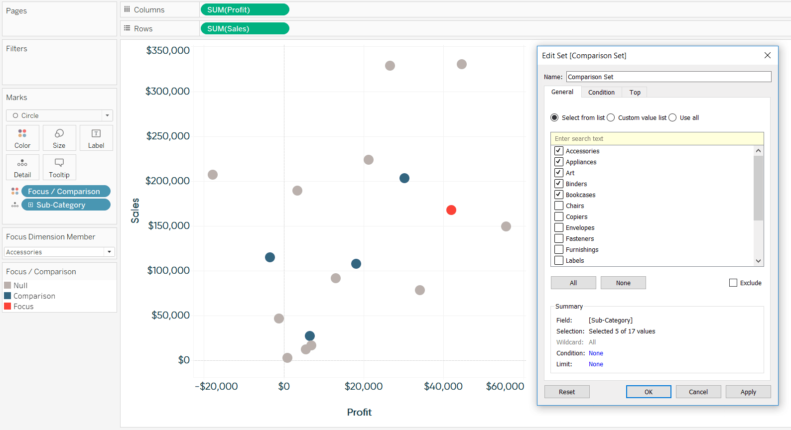
Now we’re ready for the comparison set portion of this technique. First, we need to create a set in Tableau from the dimension being used on the visualization(s). Similar to our parameter above, the easiest way to do this is to right-click on the dimension, hover over Create, and choose “Set…”.
Leave the set empty for now because we will overwrite the values being included in the set with set actions in a future step.
Next comes the key calculated field that drives all our comparisons and future calculations. The formula is:
IF [Sub-Category] = [Focus Dimension Member] THEN “Focus”
ELSEIF [Comparison Set] THEN “Comparison”
END
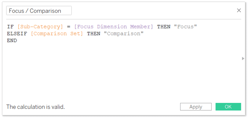
This calculated field classifies the dimension member matching the current value of the parameter as the “Focus” and the dimension members in the Comparison Set as “Comparison”. Note the first line of this code is the parameter highlighter we used to color the scatter plot so far; we’re just adding in the logic to classify the dimension members in our Tableau set as the comparisons.
We’re going to replace the Focus Highlighter field on the Color Marks Card with the newly created Focus / Comparison calculated field so the dimension members get classified as one of three things: (1) Focus, (2) Comparison, or (3) NULL – or not a Focus or Comparison dimension member (i.e. everything else).
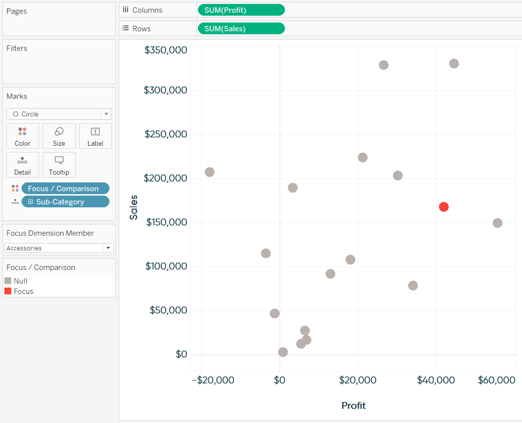
Note we don’t see any dimension members classified as comparisons yet because our set is empty. If I were to add the first five dimension members to the Comparison Set, we would see the Focus dimension member of Accessories (selected via the parameter control) colored red, the four selected dimension members other than Accessories from the Comparison Set colored blue, and everything else colored gray. Again, we will overwrite these selections later using set actions.
In this example, Accessories was classified as Focus and not Comparison because IF / THEN logic is processed in order and each dimension member can only be classified as one thing at a time. In our Focus / Comparison calculated field, the Accessories dimension member got classified as Focus before even moving on to the next line of logic.
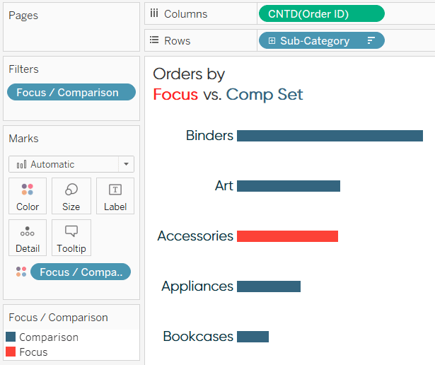
This next step is optional, but I like to create a visualization that illustrates which dimension member is being used as the focus and which are included in the comparison set. This element is also meant to illustrate the scope of the selections (i.e. has the dimension member selected had a larger or smaller impact on the business).
This can be any visualization, but let’s go simple for now with a bar chart that looks at Unique Orders per Sub-Category. I’ve also filtered the marks with the Focus / Comparison calculated field from earlier so that we’re keeping only dimension members that have been classified as either the Focus or a Comparison.
If you plan to create large sets that result in too many bars, you can use the INDEX() function to limit the number of marks included along with your Focus dimension member. If this is of interest, in addition to the Focus / Comparison field on the Filters Shelf, you would have to add a calculated field that looks something like this:
[Focus Dimension Member] = ATTR([Sub-Category]) OR INDEX()<=5
This would keep the Focus dimension member, plus the first five rows of the bar chart.
Add the segmentation to relevant views
Now we’ll put this into action by adding both the scatter plot and bar chart to a dashboard.
To allow our audience to update the Comparison Set on the fly by simply selecting dimension members on the scatter plot, we will use set actions. To create a set action, click on Dashboard in the top navigation of the Dashboarding interface, then “Actions…”. From within the dialog box that appears, click on the Add Action button and choose “Change Set Values”.
While designing a set dashboard action in Tableau, you can choose where the action originates, when you want the action to execute, the set that will be overwritten with the selections, and what you want to happen when the selection is cleared out. In this example, I’d like to click on the scatter plot and have the selections overwrite the Comparison Set. When the selection is cleared, I would like the selections to stick until another selection is made. This means the selection will persist, even when navigating to other dashboards.
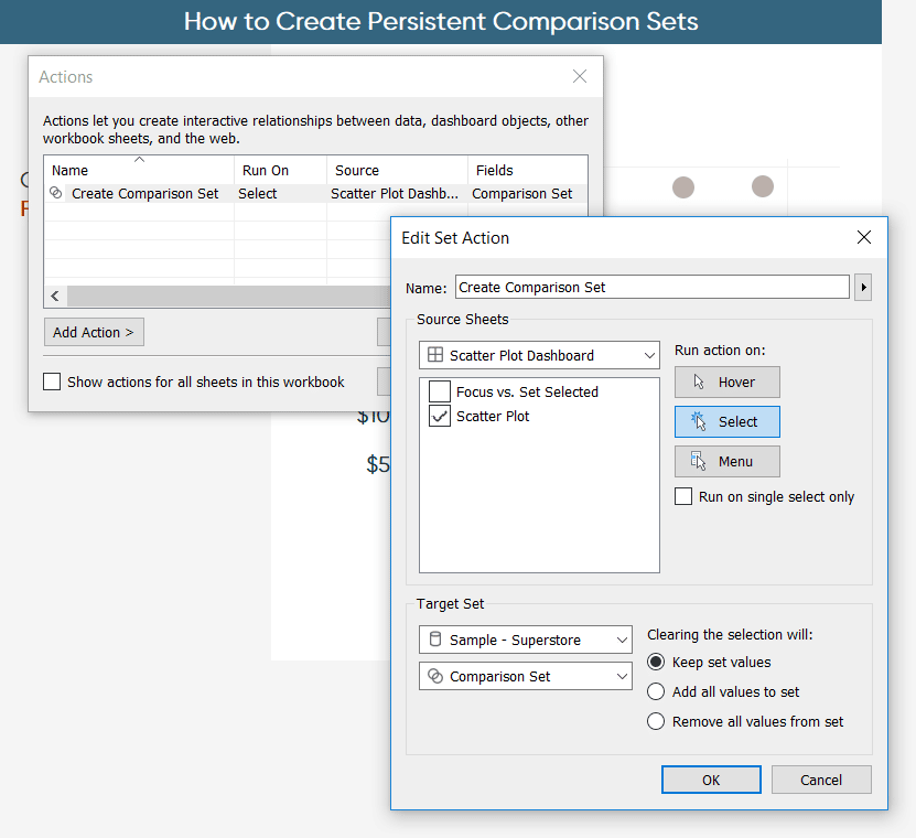
After clicking the OK buttons to save the new dashboard action, simply clicking on the scatter plot will update the sub-categories included in the Tableau set, which in turn updates the bar chart. Perhaps instead of adding the first five sub-categories to the set, I would like to create a better peer group by selecting the four dimension members closest to Accessories on the scatter plot.
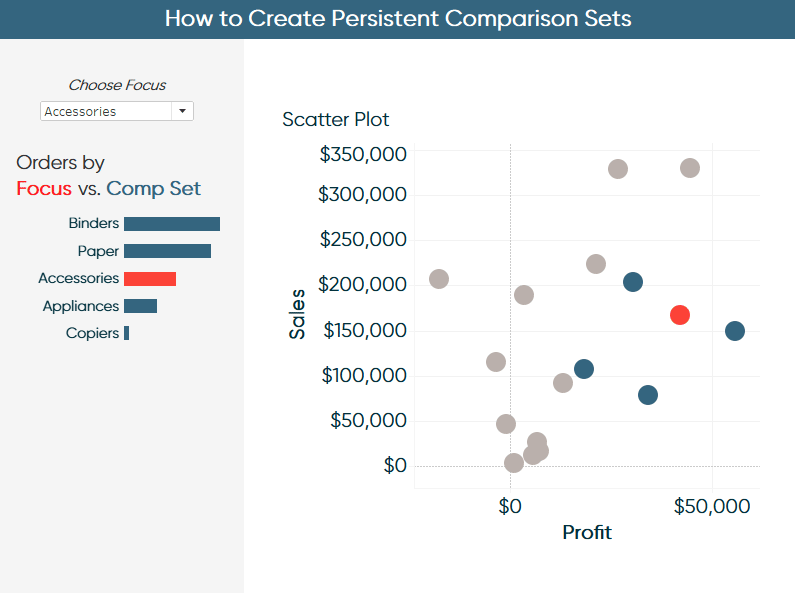
Just think of the possibilities with this. Your audience can now choose a focus of the dashboard that is relevant to them, then create a comparison set based on a peer group, a single benchmark, or a series of benchmarks – all on the fly!
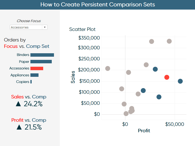
One way I like to use this is to compare the focus to the comparison set with callout numbers. To illustrate, I’ll create a calculated field that computes the percent difference between the Focus dimension member and the Comparison Set for the Sales and Profit measures. The first calculation would be:
(SUM(IF [Focus / Comparison] = “Focus” THEN [Sales] END)
/
(SUM(IF [Focus / Comparison] = “Comparison” THEN [Sales] END)
/
COUNTD(IF [Focus / Comparison] = “Comparison” THEN [Sub-Category] END)))
-1
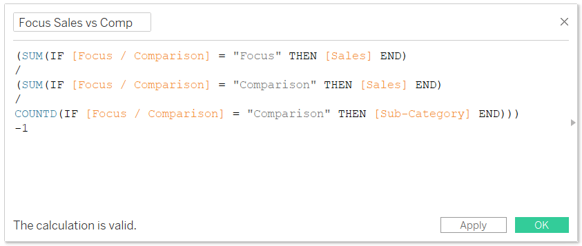
The numerator for this calculation isolates the SUM of Sales for the Focus dimension member. The denominator does the same thing for the dimension members classified as “Comparison”, but then divides that amount by the number of dimension members in the Comparison Set, creating a weighted average. The weighted average would not be required if we were using ratios (i.e. Profit Ratio instead of Profit). The minus one computes the percent difference when the format of this measure is converted to percentages.
Now you can make a callout number in the format of your choosing. I like to use conditional up and down triangles as outlined in tip 5 of these 10 Tableau text tips.
I’ll do the same steps for the Profit measure.
Here’s where the magic happens. Now the user can select a peer group, a single benchmark, or a benchmark group. Those selections overwrite the Comparison Set. That Comparison Set feeds the bar chart illustrating the scope of the selection and the callout numbers computing the performance of the Focus versus the comparison(s).
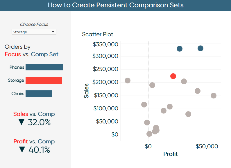
Here’s how the dashboard looks after selecting Storage as the focus and choosing the two best performing sub-categories as the benchmark to see what it would take to make Storage rise in the rankings.
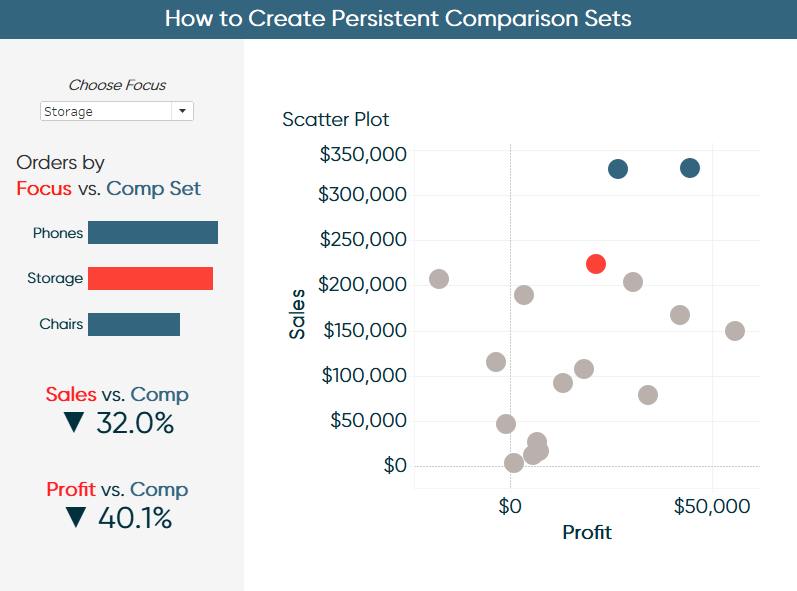
This is becoming a very rich analysis. We can now see visually where Storage is compared to the selected benchmarks on the scatter plot. We also see that, of the three selected dimension members, Storage ranks second in orders indicating this is an important sub-category to the business. Unfortunately, Storage is lagging in Sales and Profit compared to the benchmark set by 32% and 40.1%, respectively.
![]()
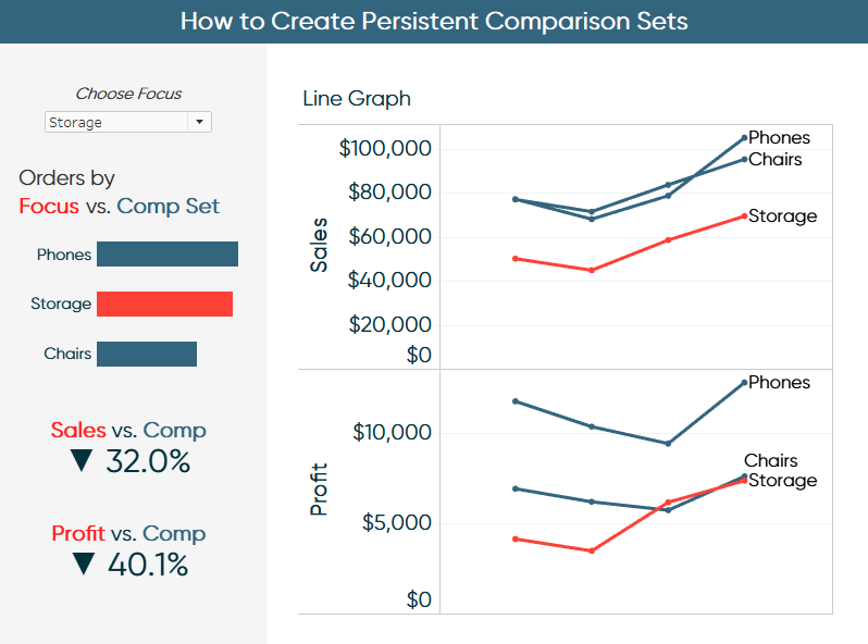
Lastly, this functionality persists across dashboard views. So, you can just duplicate the first dashboard, leave the left side as is so your audience is oriented with the segmentation being included, then add alternative visualizations.
Thanks for reading,
– Ryan


Written By
Ryan Sleeper
Related Content
The Definitive Guide to Tableau Sets

In this post you will learn how to: (1) create static Tableau sets, (2) create dynamic sets, (3) use sets…

Ryan Sleeper
Create permanent highlights that work across worksheets using parameters Ryan shows you his favorite approach for highlighting specific marks using…
3 Innovative Ways to Highlight Selections in Tableau
In this tutorial I will demonstrate three ways to use different mark types with transparent sheets to highlight a selection…