Dashboard Element 1: The Current Versus Comparison Index Callout
One of the primary elements you’ll find on almost every high-level corporate dashboard that I ever create is a callout that conveys the current performance of the KPI by some comparison point (i.e. goal, prior period). I’ve shown you before how to make “performance indicator titles” in Tableau, but I usually take these a step further by displaying the KPI’s performance and color it based on a 100-point index or percent change. I like this element for several reasons: (1) it provides the exact numbers for my stakeholders that are accustomed to viewing reports as raw data, (2) it forces them to benefit from the pre-attentive attribute of color, and (3) it is descriptive and helps the user decide if they should invest further time for investigation. This post will show you two design options for creating a current vs comparison index callout in a dashboard in Tableau.
This is the first in a five-part series about my go-to elements of Tableau dashboards. For future updates, subscribe to our mailing list.
Tableau Dashboard Element: The Current Versus Comparison Callout
How to create a current versus comparison index callout in Tableau
I’ve been using the first approach to creating a current versus comparison index for years, so we’ll start there. The element consists of three rows, each of which will require their own calculated field: (1) the current period performance with a mark type of Text, (2) the goal or prior period performance with a mark type of Text, and (3) the current versus comparison index with a mark type of Square.
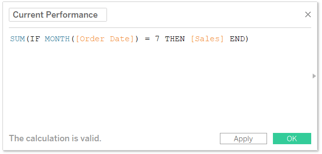
For this scenario, let’s imagine the current performance is sales (from the Sample – Superstore dataset) during the month of July and the comparison is sales during the month of June. There are several ways to isolate the current performance and the comparison performance. My favorite approach to comparing period over period performance in Tableau is outlined here, but for the purposes of this illustration, I will simplify the two calculated fields as follows:
Current Performance
SUM(IF MONTH([Order Date]) = 7 THEN [Sales] END)
Comparison Performance
SUM(IF MONTH([Order Date]) = 6 THEN [Sales] END)
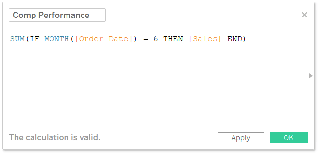
So far, the first formula shows sales when the month of Order Date equals 7 (i.e. July), and the second formula shows sales when the month of Order Date equals 6 (i.e. June). The final formula needed is to compute a 100-point index. I love to use a 100-point index score because it normalizes data on a 100-point scale, even with different data formats (i.e. currency, integers, percentages).
Continue reading with a free account, or login.
Unlock this tutorial and hundreds of other free visual analytics resources from our expert team.
Already have an account? Sign In
By continuing, you agree to our Terms of Use and Privacy Policy.
It also makes the math very easy. A score of 100 means the current performance outperformed the comparison; a score less than 100 means the current performance underperformed the comparison. Since everything is based on a 100-point scale, you simply subtract 100 to compute the change. For example, an index of 120 means a 120 – 100 = 20 point improvement.
The formula for a 100-point index is:
(Current Performance / Comparison Performance) * 100
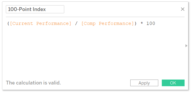
I prefer a 100-point index to a percentage change formula because I don’t like to compute a percentage of a percentage. However, if you or your stakeholders are used to seeing the data in this format, you can easily convert the index formula to be a percent change formula by changing “* 100” in the preceding calculation to “- 1”.
Now that we’ve isolated the current performance, the prior performance, and the comparison index, we’re ready to make the dashboard element. The only way to combine different fields and different mark types, is to use this trick to conditionally format individual rows or columns in Tableau like you can in Excel. The technique involves setting up a placeholder calculated field with the formula MIN(0); then placing the calculated field on the Rows Shelf three times.
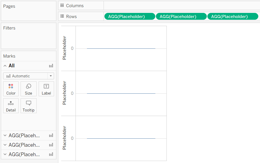
Now that there are three measures on the Rows Shelf, there are three different Marks Shelves that can be edited independently of each other. That means I can put current performance with a mark type of Text on the first row, comparison performance with a mark type of Text on the second row, and the comparison index with a mark type of Square on the third row.
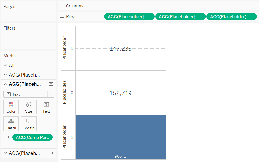
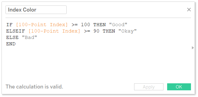
Lastly, I like to color the square based on the 100-point index score. I typically do one color for greater than 100 (outperformed), a second color for a score of 90 – 100 (slightly underperformed), and a third color for a score of less than 90 (underperformed). This can be accomplished with a calculated field such as:
IF [100-Point Index] >= 100 THEN “Good”
ELSEIF [100-Point Index] >= 90 THEN “Okay”
ELSE “Bad”
END
This approach works okay when you’re only making this index callout for a few metrics, but can be a bit manual with all of the calculation creation. There is a way to automate this coloring that is beyond the scope of this post, so I’ll throw in a shameless plug and let you know that it’s outlined in chapter 61 of Practical Tableau. The coloring is much easier if you only want to communicate a positive or negative change; you would simply place the index score on the Color Marks Card and modify the colors so they’re on a diverging color palette, with a step size of two, and a center of 0.
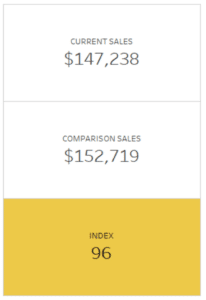
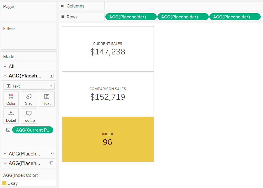
Lastly, the only thing you lose with this placeholder hack is the title of each row. However, you can add that by modifying the text on the Text Marks Card. Here’s how my final dashboard element looks after tweaking the format, adding sheet titles via the Text Marks Card, and coloring the index score by my newly created Index Color calculated field.
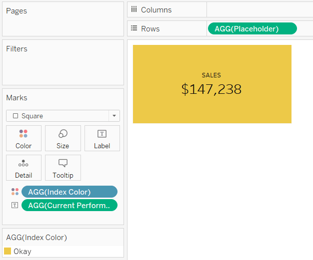
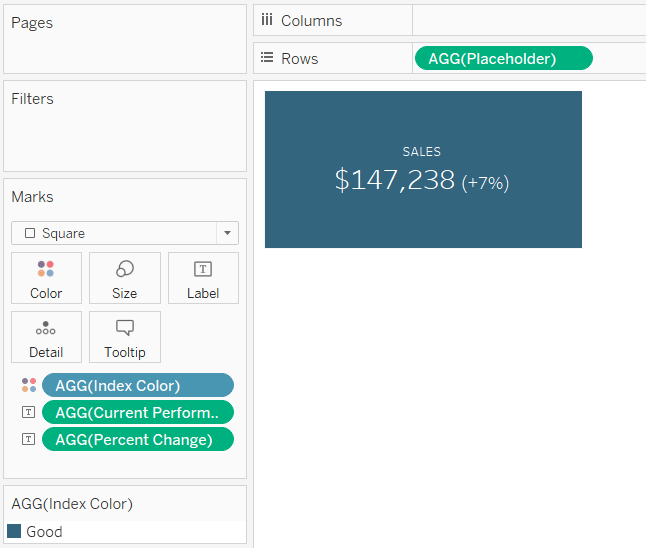
An alternative current vs comparison index callout in a Tableau dashboard
I like what we have so far because it displays the exact numbers for the current and comparison performance and it also introduces the pre-attentive attribute of color so my stakeholders can see at a glance how they are doing across key performance indicators. But in the spirit of minimalism, lately I’ve been gravitating towards a slightly different look that collapses the three rows into one.
![]()
If you were following along, you already have the calculations and foundation required to create this second look. For this second approach, we will be showing just the current performance and coloring the entire element based on the period versus comparison index. One approach to creating the second view is to remove the first two rows from our first index callout, replace the index score on the label with current performance, and update the element title.
With this style, I like to add either the index point change or percent change following the current performance. As most are new to the 100-point index, this time I’ll show a percent change. The calculation is:
([Current Performance] / [Comp Performance]) – 1
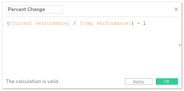
I’ll then place this calculated field on the label by dragging it to the Label Marks Card. I’ll also customize the label so that both numbers are on the same line by clicking on the Label Marks Card and modifying the text.
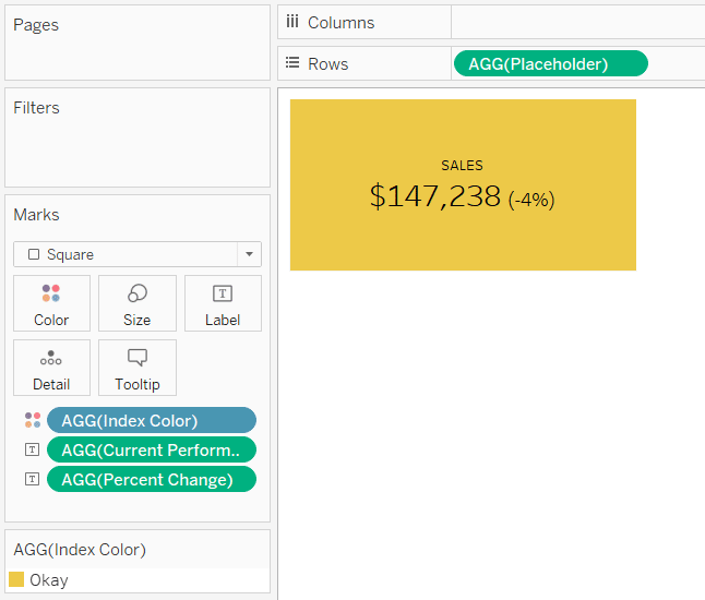
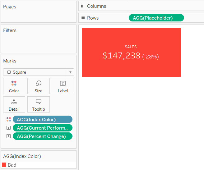
In this case, the current versus comparison performance was down, but within 10%, so the element turned yellow. If I were to change the comparison to March, where the underperformance was greater than 10% (an index of 90 or less), the element changes to a second color to communicate “Bad”.
If I change the comparison to a month that July outperformed, such as April, the element turns a third color to communicate “Good”.
Whether you prefer the first or second style, I recommend placing a series of these elements across the top or down the left side of your summary dashboard to provide a starting point for your descriptive analysis. Once you’ve got it down, take the percent change formatting a step further by incorporating alt-code triangles into your dashboard elements.
Thanks for reading,
– Ryan


Written By
Ryan Sleeper
Related Content
3 Ways to Conditionally Format Numbers in Tableau
There are many needs to conditionally format numbers in Tableau. I’ve previously covered how to dynamically change the prefix and…
3 Ways to Make Handsome Highlight Tables in Tableau
To draw a highlight table in Tableau, you need one or more dimensions and exactly one measure. This is the…

Ryan Sleeper
Comparing Dates with Tableau’s DATETRUNC, DATEADD, and LOD Functions Get more from dates in Tableau by learning how to: (1)…