3 Ways to Make Handsome Highlight Tables in Tableau
To draw a highlight table in Tableau, you need one or more dimensions and exactly one measure. This is the same criteria to draw a raw text table in Tableau, except with highlight tables, you’re limited to one measure instead of one or more measures. This one measure is what encodes the cells in the table by the preattentive attribute of color. It’s essentially a spreadsheet with colored cells.
As I shared in my post, Why do you visualize data?, the highlight table is my favorite chart type for introducing the value of data visualization. I think it works well because most companies are still using spreadsheets for most of their reporting, and by converting a text table to a highlight table, the audience is forced to take advantage of the preattentive attribute of color. This kind of becomes a gateway to more complex visualizations.
This content is excerpted from my book, Innovative Tableau: 100 More Tips, Tutorials, and Strategies, published by O’Reilly Media Inc., 2020, ISBN: 978-1492075653. Get the book at Amazon.
![]()
Highlight tables are already more engaging and effective than a text table / crosstab view, but this post aims to provide three more ways to make your highlight tables even better in Tableau.
How to make a highlight table in Tableau
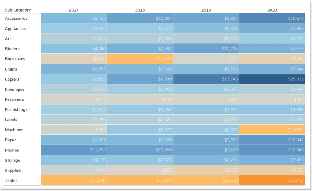
To lay the foundation for the next couple of tips, I’m going to make a quick highlight table in Tableau with the Sample – Superstore dataset. There are several ways to make this, but I’m going to preselect the fields Order Date, Sub-Category, and Profit; then use Show Me in the top-right corner of the authoring interface to select the third option on the top row.
After selecting “highlight tables” with Show Me, the following view is generated. As you can see, the cells are colored on a diverging spectrum with the worst profit values being colored a dark orange, and the best profit values being colored a dark blue.
Continue reading with a free account, or login.
Unlock this tutorial and hundreds of other free visual analytics resources from our expert team.
Already have an account? Sign In
By continuing, you agree to our Terms of Use and Privacy Policy.
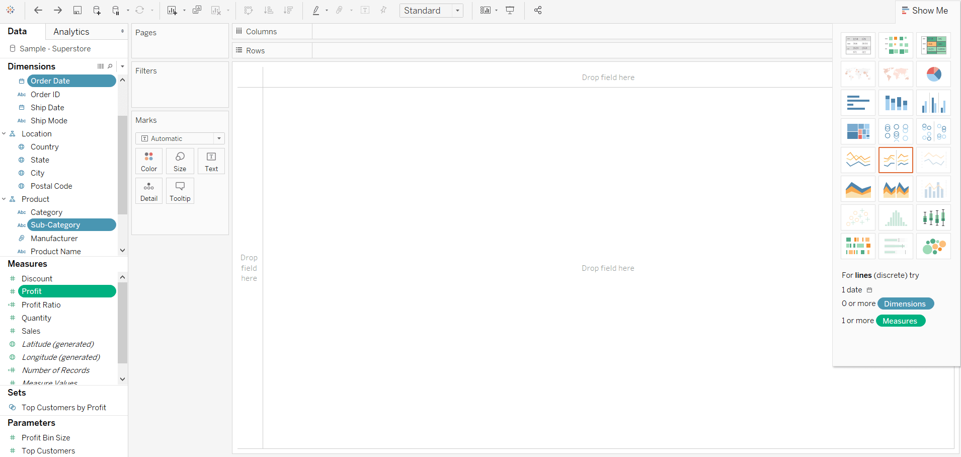
1. Format the marks
My first tip to creating more engaging highlight tables involves using the formatting options available to us in Tableau. Specifically, we will format the cells of the highlight table using the Color and Label Marks Cards. First, whenever I create a chart type and the marks are touching, I like to add a white border around the marks which provides a clean-looking separation. Examples of these chart types include stacked bar charts, stacked area graphs, filled maps, and highlight tables.
To add a white border around the marks, click the Color Marks Card and change the “Border” effect from “None” to white (or a color of your choosing).
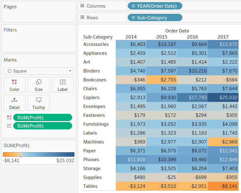
Regarding the labels, note that some of the values are colored black, while others are colored white. Tableau is trying to help you here by ensuring there is enough contrast between the label and the hue of the color below. I often opt for darker and bolder colors for highlight tables, which we’ll discuss in the next tip, so I typically like to change all the labels to white. To do so, click on the Label Marks Card, click on the options for “Font”, and change the color to white.
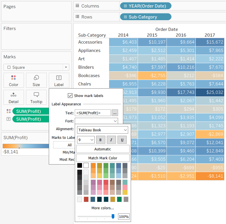
All black is also a good choice depending on the colors selected in the next tip.
2. Use colors in moderation
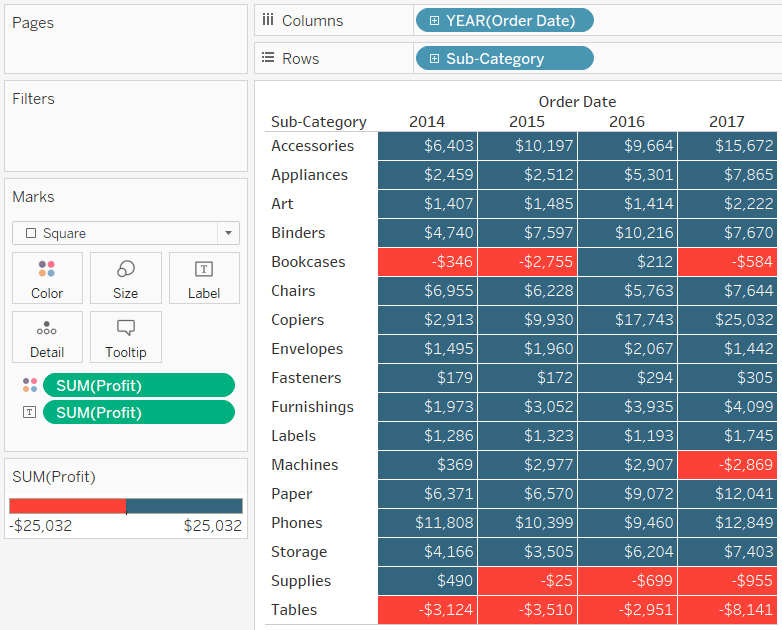
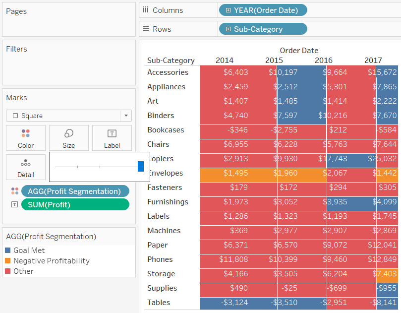
Depending on your objective or business question, it doesn’t always make sense to use a full diverging color palette in a highlight table. Notice in the highlight tables we’ve created to this point that the colors for the values of -$25 and $294 are very challenging to differentiate. These numbers mean very different things to the business – one cell represents profitability and the other represents a loss – yet they are both colored gray because they are in the middle of our diverging color spectrum.
You likely will only have a few cells that are easy to differentiate depending on the range of values in your highlight table. If your business question is to truly identify the highest and lowest values in the dataset, you will benefit from reading my post, How to Highlight the Highest and Lowest Points in Tableau. Instead, I often want to know which cells contain positive values and which cells contain negative values. This would be easier to differentiate if my highlight table were limited to two colors; one for positive values and one for negative values.
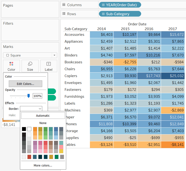
To make this change, you can either click the Colors Marks Card and choose “Edit Colors…” or double-click the color legend. Both paths will take you to a dialog box that looks like this:
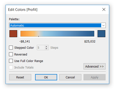
Changing the “Stepped Color” option down to two will show one color for positive values and another color for negative values. You can also customize the colors being used on each end of the spectrum by clicking the colored square on each end of the palette and choosing a different color. Here’s how my highlight table looks after reducing the steps to two and choosing two custom colors.
3. Color cells based on a discrete segmentation
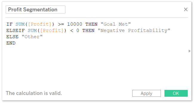
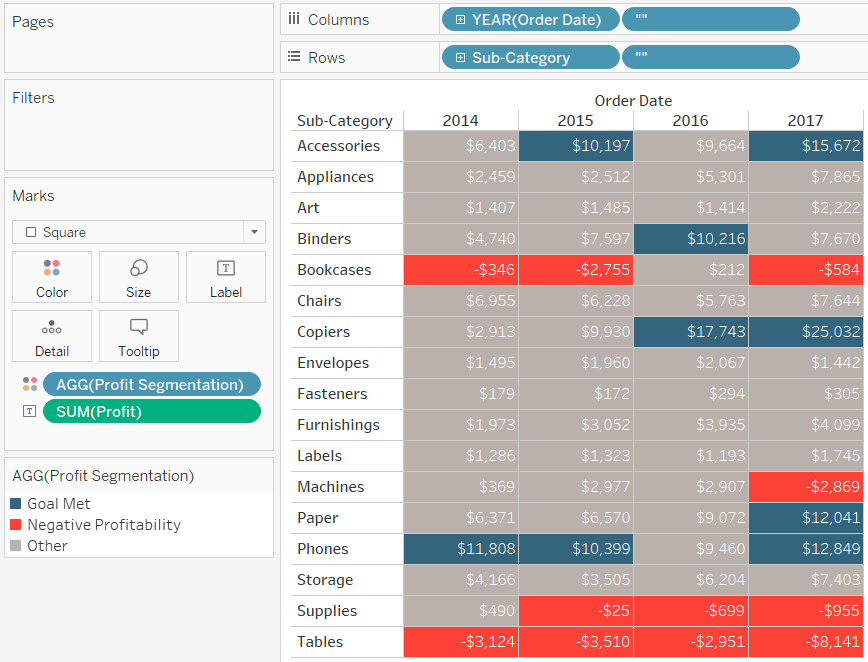
I realize two colors will not be enough for every objective. The two colors are providing more value than a plain text table can alone, but this approach would be most useful if you were able to color the cells based on a performance segmentation of your choosing. For example, perhaps you have a goal for each sub-category or want to compare each value to the performance during a different period. For illustration purposes, let’s assume that we want to color the cells red if profit is negative, blue if profit is above our goal of $10,000, and gray for every remaining value.
To get this effect on other chart types, you would start by setting up a calculated field like this:
IF SUM([Profit]) >= 10000 THEN “Goal Met”
ELSEIF SUM([Profit]) < 0 THEN “Negative Profitability”
ELSE “Other”
END
But let’s see what happens when we replace the Profit measure on Color Marks Card with our newly created Profit Segmentation calculated field.
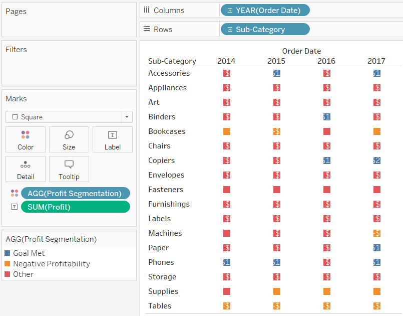
This is happening because we are now encoding the square mark type by a discrete calculated field rather than a continuous measure. Even when we increase the size of the squares using the Size Marks Card, the highlight table doesn’t look right because the squares bleed over into neighboring cells.
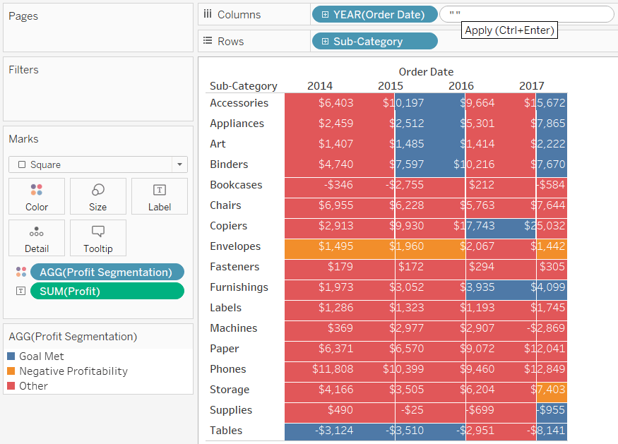
Fortunately, there’s a trick for perfectly coloring the cells ‘between the lines’. If you add a second discrete field to both the Columns Shelf and Rows Shelf, the grid will be corrected. The trick is instead of choosing another dimension from the dataset or replicating the fields already on the view, we will add a “blank” dimension. To do so, double-click in an open area of the Columns Shelf, type two quotation marks, and hit the Enter key.
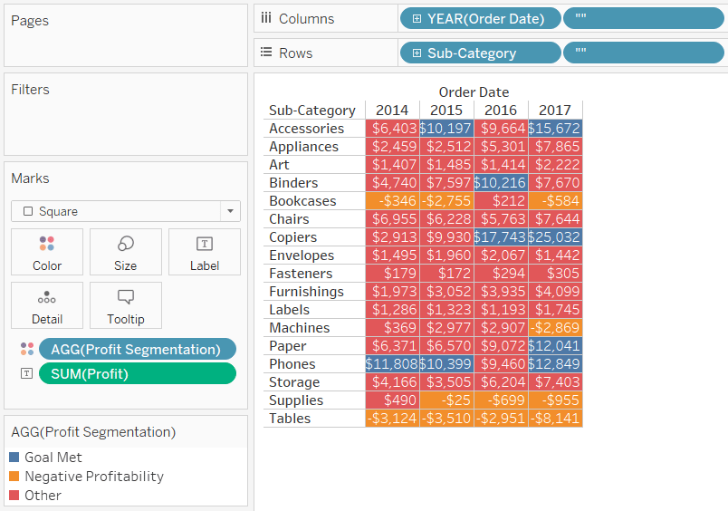
Replicate this step for the Rows Shelf. Here’s how my view looks after adding a blank dimension to both the Columns Shelf and Rows Shelf and hiding their headers. You can hide the headers by right-clicking on the newly created dimensions and deselecting “Show Header”.
Here’s how my view looks after resizing the table and mapping the colors to my original use case (red for negative values, blue for values above goal, and gray for everything else).
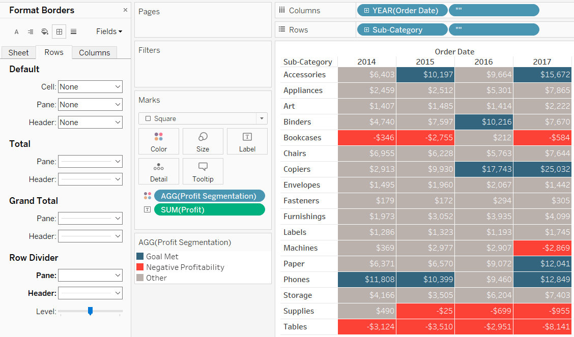
When you create a highlight table out of discrete fields, the border formatting is no longer on the Color Marks Card but controlled by the Row Divider and Column Divider options on the Format Pane. You can access the format options by right-clicking anywhere on the view, choosing “Format…”, and navigating to the Borders tab. This gives you even more flexibility for the formatting options of the borders. You can choose not only different colors, but different line styles and weights.
![]()
Here is how my final highlight table looks after incorporating all the tips in this post and formatting the borders.
Compare this to the default highlight table at the beginning of the post! We’ve not only enhanced a text table to introduce the value of the preattentive attribute of color, but we’ve made it easier to answer our business question while improving the design of the highlight table.
Thanks for reading,
– Ryan


Written By
Ryan Sleeper
Related Content
3 More Ways to Overcome the Excel Barrier to Tableau Adoption
Yikes – I’m getting old in Tableau years. This week I clicked on a Tableau Public post I thought sounded…

Ryan Sleeper
Two ideas for bringing attention to minimum and maximum values Make Tableau answer business questions for you automatically using a…
Ryan Sleeper
Help your audience evolve from spreadsheets to data visualizations How to convert a text table to a highlight table, leverage…