Why do you visualize data?
My favorite question to ask when I present on Tableau and data visualization is: Why do you visualize data? This question has produced so many insightful answers that I’ve made it a standard discussion whenever I visit new places. The conversation provides an opportunity to learn what’s important to different industries and how they’re leveraging visualization to meet their objectives. I’ve seen firsthand that the answer to this question is not as simple as: Visualization helps you understand data.
It’s been fascinating to witness the evolution – revolution, perhaps – of static, crosstab outputs to interactive, self-serve analytics that have been made possible through tools like Tableau. But we aren’t done growing yet. While the practice of data visualization is more than two centuries old, many have yet to buy in. This means we, as data visualization practitioners, have a huge opportunity (and I believe responsibility) to add value by proving the worth of visualization and driving adoption.
![]()
This post provides my answer to the question: Why do you visualize data? In addition, I share my personal exercise for getting stakeholders to buy in to the value of data visualization.
Why do you visualize data?
First, I want to be clear that there really is no wrong answer to this question. What is so interesting to me is that I’ve heard dozens of unique responses, and there is usually at least one response I had never heard each time I ask the question. I’ve heard everything from it’s fun, to it gets people more engaged, to it helps with adoption, to it helps find insights, etc., etc.
I’ve spent quite a bit of time trying to whittle my own answer down to one succinct sentence, which is currently:
To find and communicate actionable insights.
This answer aligns closely with my data visualization mission statement to (1) reduce the time to insight (2) increase the accuracy of insights and (3) improve engagement. The benefits may seem obvious, but I would estimate that 80 – 90% of corporate reports are still in a tabular format. A spreadsheet is not a data visualization, so how do we help our stakeholders evolve to something more effective? I find the most success proving the value of data visualization by explicitly demonstrating its effectiveness with the following exercise. It’s one thing to say that data visualization helps add value, but it’s another thing when the stakeholder can see it for themselves.
Continue reading with a free account, or login.
Unlock this tutorial and hundreds of other free visual analytics resources from our expert team.
Already have an account? Sign In
By continuing, you agree to our Terms of Use and Privacy Policy.
I start by asking them to look at a table of data and ask the most basic business question possible: What is the highest number?
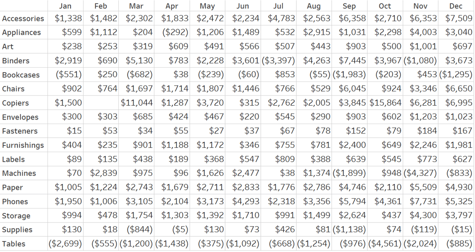
This usually takes several seconds with at least two or three incorrect responses before finding the correct answer. If I need to further validate the point, I also ask them to call out the lowest value. I then introduce the basic preattentive attribute of color, with the higher values being colored a darker blue, the lower values being colored a darker red, and ask them to try again.
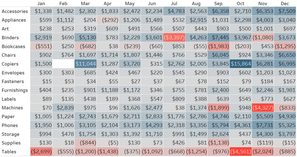
The punchline is obvious. Data visualization has reduced the time to insight and increased the accuracy of insights. I would also argue that the highlight table created in the second image is more engaging than the original raw table of data.
This exercise was inspired by Stephen Few’s famous “count the 9’s” which also illustrates the value of the preattentive attribute of color. But I prefer the crosstab to highlight table demonstration because the first view is what corporate reports look like. It really clicks when the audience can see for themselves how easy it is to improve the corporate reports they have been relying on.
Further, with tools like Tableau, you can add logic that instantly answers the business question for you. Here’s how the view looks when coloring the highest value blue, the lowest number red, and every remaining cell gray.
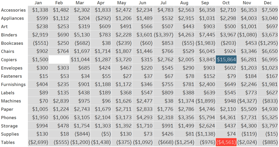
Compare this to the crosstab view above – a remarkable improvement for achieving our objective of answering the business question at hand!
![]()
Visualizing data has helped us find and communicate insights in the raw table. To make these insights actionable, the insights have to be seen by the most relevant – and sometimes largest – audience possible. For tips on achieving this last reason we visualize data, see the design section of the Triple Crown Framework for data visualization.
Thanks for reading,
– Ryan

Written By
Ryan Sleeper
Related Content

Ryan Sleeper
Help your audience evolve from spreadsheets to data visualizations How to convert a text table to a highlight table, leverage…
3 More Ways to Overcome the Excel Barrier to Tableau Adoption
Yikes – I’m getting old in Tableau years. This week I clicked on a Tableau Public post I thought sounded…
Ryan Sleeper
Improve on the ‘gateway’ chart to data visualization Highlight tables help smooth the Excel transition by introducing the preattentive attribute…