My Data Visualization Mission Statement

According to Google’s dictionary, a mission statement is “a formal summary of the aims and values of a company, organization, or individual.” Some of these stated missions are quite broad, leaving a lot of runway to innovate while keeping track of the business’ original purpose. Consider Microsoft’s, “Our mission is to empower every person and every organization on the planet to achieve more.” Others are laser-focused on a specific product, such as Honest Tea’s, “to create and promote great-tasting, healthy, organic beverages.”
For me, a great mission statement is short, incorporates primary values, and provides some direction. The most important aspect of mission statements is that they help in decision making because they remind stakeholders of the purpose at hand. The idea is that these short statements can scale to keep everybody pulling in the same direction.
You’ve likely at least heard of mission statements, if not a few famous examples, but have you considered them in the context of data visualization? This post shares my data visualization mission statement and how it helps me solidify some of my opinions including why I believe data visualization is superior to spreadsheets and why I don’t use pie charts.
My data visualization mission statement
When I started my company, I put a lot of thought into my mission statement and ended up on, “Be the best-possible partner resource for translating data into valuable information.” Whether that’s through a training, dashboard development, or discovery analytics, these twelve words help me decide what projects to partner on. If I don’t have the capacity or skill alignment to be the best choice, I don’t try to get the project. If the project isn’t related to turning raw data into value, I don’t try to get the project. I have no problem telling a potential partner this because I don’t want them to waste money, and for me to waste time.
This mission statement has helped guide me where to partner, but I also have a set of principles I follow once I start working on a data visualization project. While somewhat unorthodox from a traditional mission statement, I believe it fits the definition from above. My data visualization mission statement is:
Continue reading with a free account, or login.
Unlock this tutorial and hundreds of other free visual analytics resources from our expert team.
Already have an account? Sign In
By continuing, you agree to our Terms of Use and Privacy Policy.
- Reduce the time to insight
- Increase the accuracy of insights
- Improve engagement
If these three principles look familiar, it’s because I also call these the benefits of data visualization. If I ever have a decision to make while I’m creating a data visualization, I ask if the change will accomplish all three of these things. If it fails at any one of them, I simply don’t do it.
My favorite example, and the way I often get an audience to evolve from their spreadsheet mentality, is to show the difference between a raw table of data and a highlight table. When adding preattentive attributes to improve processing time, you always (1) reduce the time to insight and (2) increase the accuracy of insights. I also argue that a highlight table is much more (3) engaging than the raw table, so all three criteria are met.
I wouldn’t be doing what I’m doing if I didn’t believe data visualization was the key to understanding data, but just illustrating that these principles affirm my reasoning. Let’s look at another example: pie charts. When I argue against the use of pie charts, it’s almost become a humorous debate. I’m often confronted with people who are just positive they have the one perfect use case where they are forced to choose a pie.
I want to go on the record to say that when I recommend avoiding pie charts, it’s not because I’m a data visualization elitist living up on the hill in my castle. It’s because of my data visualization mission statement. While it can be argued that pie charts are more engaging than a bar chart, they fail relatively dramatically at reducing the time to insight and improving the accuracy of insights.
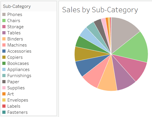
Let’s try to answer a basic business question using Tableau’s Sample – Superstore dataset: What are the three worst-performing product sub-categories in sum of sales?
Pie Chart
Sorted Bar Chart
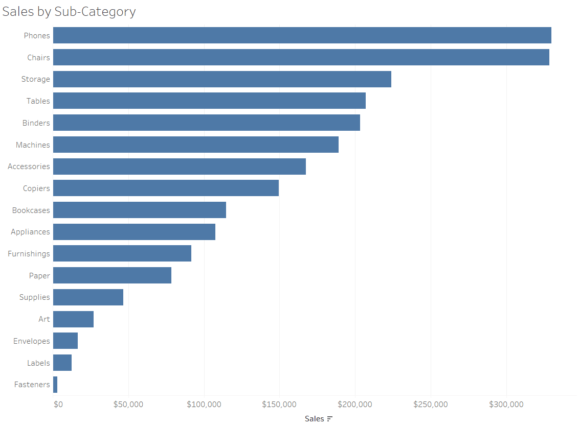
To keep it a somewhat fair fight, I sorted the dimension members in both charts. With the pie chart, the size of the slices prevents us from showing all of the labels. You can provide this information in a tooltip if using Tableau, but it doesn’t help non-interactive versions of the view. This means you are forced to provide the sub-category names through a color legend, increasing the cognitive load on your end user (i.e. they have to look back and forth at the chart and the color legend). This increases the time to insight.
![]()
Further, we are much better at comparing the lengths of bars compared to areas of a pie. If I wasn’t such a nice guy and sorted the charts, it would be much harder to determine the bottom three sub-categories when looking at the pie chart compared to the bar chart. Using a bar chart would provide more confidence that you are correctly picking the bottom three. In other words, it would increase the accuracy of your insight.
I know I’m not going to convince everyone, but sharing this because the reasoning behind my opinion on pie charts is objective. If you think you have the one case where a pie chart is easier to process and improves the accuracy of insights – go for it! I just have never come across one.
Pie charts are engaging, which is one of the reasons they’re still so pervasive in reporting. I’m a huge believer in engagement, but it has to be done tastefully with a balance between the first two principles of the mission statement. To help make some more effective chart types more engaging, I documented 3 Ways to Make Beautiful Bar Charts and 3 Ways to Make Lovely Line Graphs.
For some general ideas on making your data visualization more engaging, check out the Design section of the Triple Crown Framework.
Thanks for reading,
– Ryan

Written By
Ryan Sleeper
Related Content
A Spreadsheet is Not a Data Visualization
Like the movie Groundhog Day, but without its Certified Fresh 96% score on Rotten Tomatoes, there is one conversation I…
Practical Tableau: Serving Up 3 Better Options Than Pie Charts
Despite being one of the least effective means of communicating data, I often see Tableau pie charts in corporate dashboards…
Playfair Data Presents: Preattentive Attributes
In the post and video, Why do you visualize data?, I share my exercise for educating stakeholders on the value…