Triple Crown Framework for Data Visualization: Design

This is the fourth and final post about my newest strategic framework for data visualization. For previous posts, see An Introduction to the Triple Crown Framework, Triple Crown Framework: Psychology, and Triple Crown Framework: Data.
Why do you visualize data? My answer is to find and communicate actionable insights. The first two pillars of the Triple Crown Framework have helped us find and communicate insights, and sometimes to help make them actionable, they need to be seen by the right audience. Sometimes this means the most relevant audience possible (i.e. the decision-maker who can take action); other times this means the largest audience possible (i.e. raising awareness to the mainstream). In either case, my ‘Trojan Horse’ for getting my visualization to cause an impact is design.
Among other benefits, an effective design has the power to engage stakeholders, improve adoption, increase credibility, and cause virality. The trend that I’ve observed during my eight-year data visualization career is that an increasing number of practitioners are realizing that you must balance data with design to have the best chance at causing action.
This post shares some of my favorite design tips which are applicable for both a corporate environment or mainstream audience.
Keep it simple
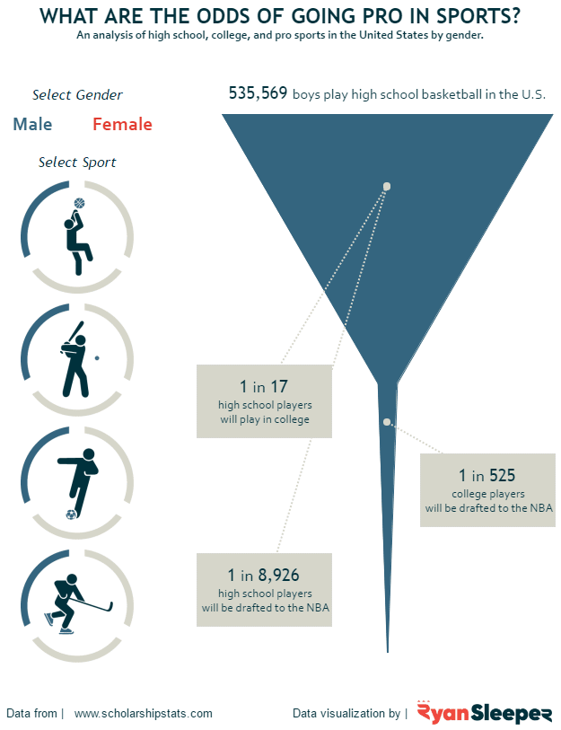
One of the most popular visualizations I’ve shared is Odds of Going Pro in Sports. I like to discuss this example because it was created in just a couple of hours on a Sunday afternoon. The visualization asks one question, there is one chart, and there are two filters (one with two options; the other with four). The visualization is almost impossible not to understand even if you know nothing about sports.
This concept is transferable to a corporate setting. I find that stakeholders often force too much into one view, and the visualizations become counter-productive. Some of the most effective corporate dashboards I’ve seen ask one business question, then all information in the visualization ladders up to answering the one business question. By asking one question, you provide an objective for why the audience is using your dashboard and that focus helps lead them to action. A little white space never hurt anybody!
Continue reading with a free account, or login.
Unlock this tutorial and hundreds of other free visual analytics resources from our expert team.
Already have an account? Sign In
By continuing, you agree to our Terms of Use and Privacy Policy.
Balance data and design
I mentioned in the introduction to this post that I’ve noticed more and more people embracing the design aspect of data visualization. I still primarily see crosstab views as the starting point for most corporate reports, but if I had to guess the share of quality analysts who put some thought into design, I’d say it’s fifty-fifty. So it’s headed in the right direction, but we still have a long way to go. To help illustrate the value of design, consider the following example, which was my most frequently shared visualization.
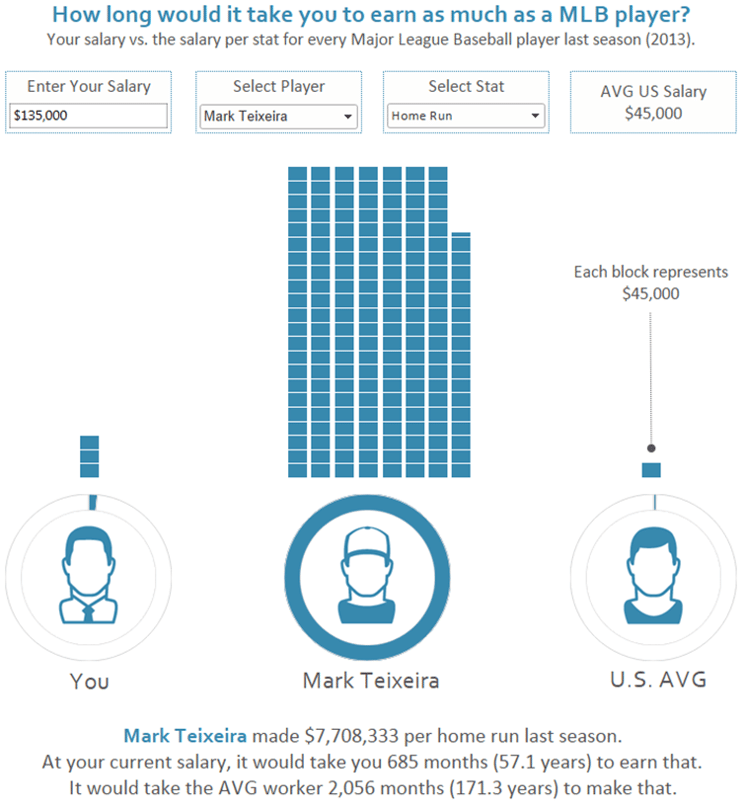
The viz asks an interesting question and the end user can type in their own salary to become part of the story. So it’s compelling with or without the polished design, but do you think it would have been shared as frequently if it looked like this?
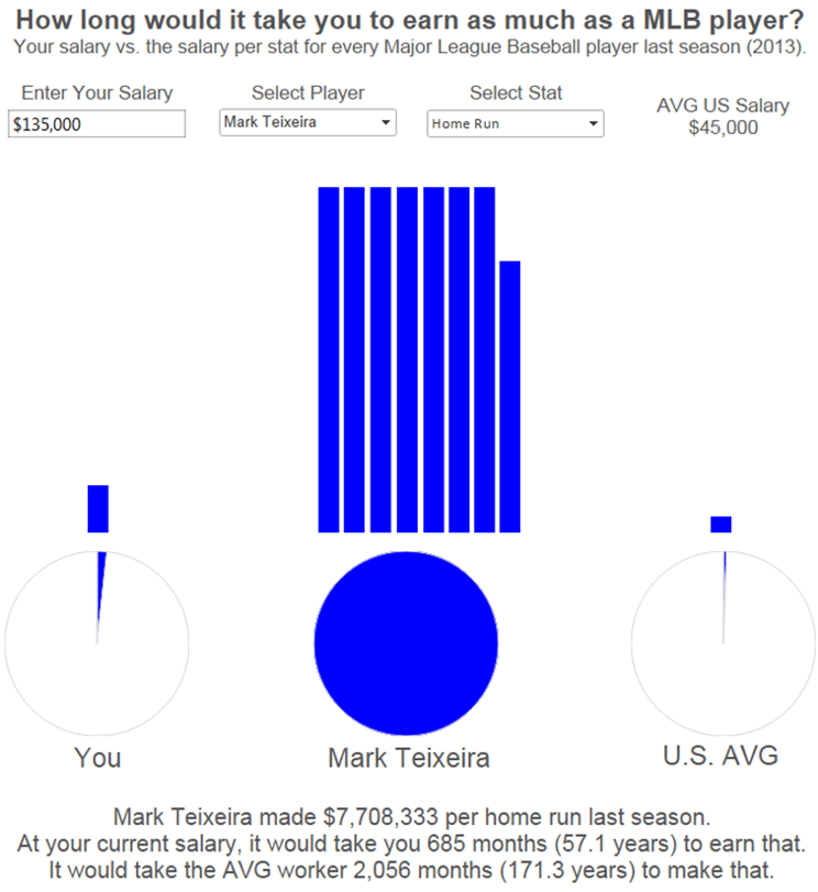
It’s the same exact story, but without improving the aesthetics, it doesn’t have the same credibility or remarkability.
Some data people I’ve heard from are not confident in their design skills, but there are several improvements you can make without any formal design training.
![]()
First, experiment with some different fonts. This is an easy way to put your own touch on a design and only takes a few minutes of exploration. Just ensure it’s legible and fits the tone of what you’re sharing (i.e. no Webdings for your finance report).
Color also is an easy way to provide a professional look and feel for your visualization. Try a complementary color scheme with no more than five colors; even better if you can keep it to just one or two. One of my favorite tools for generating schemes like this is paletton.com. Another easy way to improve colors is to reduce their saturation; this is easily achieved by clicking on the Color Marks Card and dragging the Opacity slider to around 85%.
Icons look good, but also have the ability to leverage schemas as discussed in the psychology post. Plus, they can even overcome language barriers to reach new audiences! The icons on the visualization above were the only element that required a graphic design program such as PhotoShop or Illustrator, but even these icons are royalty-free stock images that I purchased. My two favorite sites for purchasing icons like these are thenounproject.com and istockphoto.com.
Add your own narrative to an old story
Some of the parallels between storytelling and data visualization are uncanny. Every story has at least three components: (1) Characters (2) Plot / Storylines and (3) Narrative. In data visualization, I equate these three storytelling elements to (1) Measures / Dimensions (2) Insights and (3) Narrative – or the style in which you communicate the insights.
We, as data visualization authors, have a lot of control over the narrative. What’s best about this is we can even revisit old datasets and insights and communicate them in new ways to add value.
![]()
Here’s just one of infinite possibilities. As a sports fan, every time I go to see how my team is doing, I am presented with something that looks similar to this:
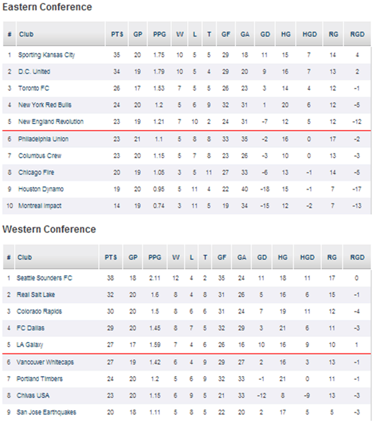
The wall of numbers! As a data visualization evangelist, this experience pains me every time. So I took a shot at visualizing the same data with a goal of using the same amount of space.
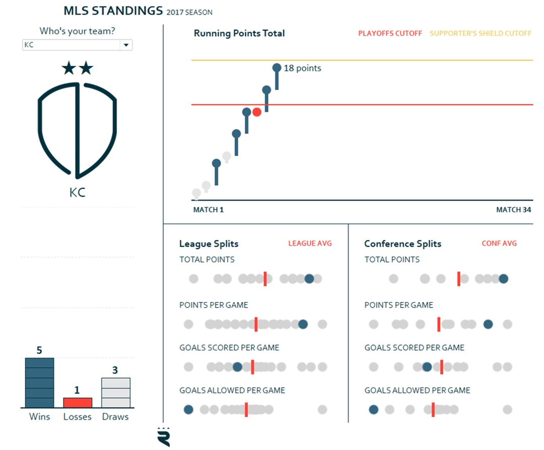
In the latter version with my own narrative, I’m now able to see how my favorite team is performing in context of the rest of the league and I’ve leveraged preattentive attributes to help my end users process this visualization faster than they ever could with a raw table of numbers.
I suspect you’ve got a few tables of data laying around the office disguised as valuable reports, no? It’s never too late to bring those reports back to life and provide value to your organization by adding your own narrative to an old story.
Thanks for reading,
– Ryan

Written By
Ryan Sleeper
Related Content
Introducing the Triple Crown Framework for Data Visualization
This is the first in a series of four posts about my newest strategic framework for data visualization. Subscribe here…
Triple Crown Framework for Data Visualization: Psychology
As mentioned in the introduction to the Triple Crown Framework, psychology was the third and final guiding pillar that I…
Triple Crown Framework for Data Visualization: Data
This is the third in a series of four posts about my newest strategic framework for data visualization. For previous…