Triple Crown Framework for Data Visualization: Psychology

As mentioned in the introduction to the Triple Crown Framework, psychology was the third and final guiding pillar that I believe leads to the creation of the best data visualizations. However, despite being thought of last, the psychological aspects of data visualization occur before anything else. Even the consideration of a strategic framework in the first place is a psychological exercise that takes place before getting into the data or design.
For this reason, I’m going to move psychology up to the primary pillar, and provide three examples of how psychology can improve your data visualization. This post will provide some context around the importance of knowing your audience, introduce the concept of psychological schemas, and share my personal approach to explicitly introducing the value of data visualization.
This is the second in a series of four posts about my newest strategic framework for data visualization. Subscribe here for future updates.
Triple Crown Framework for Data Visualization: Psychology
Know your audience
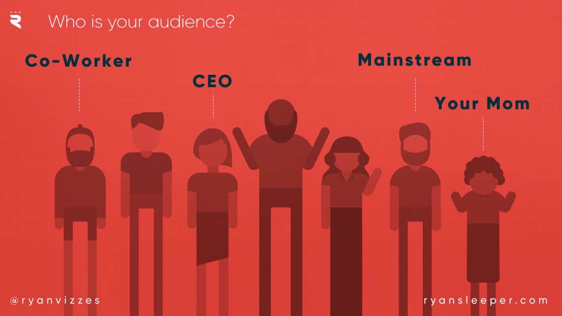
Every time I begin a new data visualization project, I start with what I call my ‘two vital questions’. One of the questions I ask is what is the measurement of success? After all, how do you know what to visualize if you don’t even know how you’re being measured? Even before that though, I ask what I consider to be the most important question to ask going into any project: Who is the audience?
The answer to this question is critical to your success because different audiences will consume / understand / perceive your work in different ways. Being aware of these differences and tailoring your output gives you the best chance at an action being taken based on the insights you are providing.
For example, a dashboard I create for a CEO is going to look very different than a dashboard I create for a fellow analyst. In the first example, I may boil the insights to the top and, if I’m feeling brave, even provide some recommendations on what action to take next. For the latter audience, I may build in additional flexibility, such as filters or dashboard actions, because I’m confident they will explore to discover their own insights in the data.
Continue reading with a free account, or login.
Unlock this tutorial and hundreds of other free visual analytics resources from our expert team.
Already have an account? Sign In
By continuing, you agree to our Terms of Use and Privacy Policy.
Being such a heavy user and advocate of Tableau Public, a third different audience I may design for is a mainstream audience. As most of my best Tableau Public dashboards are about sports, and my viewers aren’t necessarily data people, I need to communicate the insights in a way that is easy to understand, even for non-analysts. If you are ever in a similar situation, I suggest sharing your work with somebody who is not familiar with the topic you are visualizing. This exercise will provide valuable feedback regarding whether the insights are as intuitive as you think they are. My favorite audience for testing my sports-related visualizations: my mom. 🙂
Use psychological schemas
Psychological schemas are the countless patterns that we have built up over our lifetimes to make sense of the world. For example, a young child might learn what a horse is and assume a cow is a horse the first time they encounter one (so these schemas can evolve as we learn more over time). These schemas can be used to improve your data visualization in two big ways: (1) to help your end users process your visualizations more efficiently and (2) to cause a disruption to an expectation, providing a starting point for an analysis.
![]()
To help bring this idea to life, take a look at the following visualization. This bar chart shows the lowest ticket price per section during Super Bowl 50.
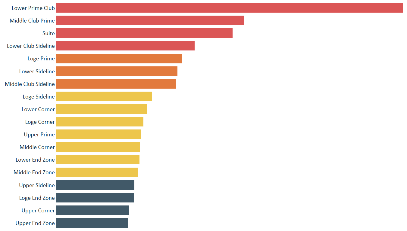
This chart is perfectly acceptable, and would be considered by many to be within ‘best practices’. We have the ability to compare the length of bars with great accuracy and sorting them makes it even easier. However, I wanted to make it even easier for my mainstream audience to process the visualization, so I mapped the same data onto a map of Levi’s Stadium (the host of Super Bowl 50).
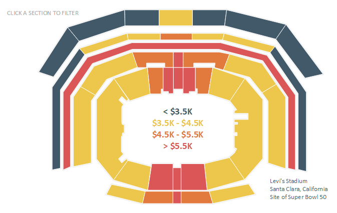
Now, without even knowing the names of the sections, the audience can tap into their existing schemas to make sense of the data. It’s likely that most of my viewers have never been to this venue, but they would expect the ticket prices to be more expensive the closer they are to the field. In this case, I helped them process the dashboard more efficiently. If there were a red section in one of the top corners, that would cause a disruption to the expectation, and provide a starting point for an analysis.
3 Ways to Leverage Psychological Schemas to Improve Your Data Visualization
Explicitly introduce the value of data visualization
Thirdly, I’m going to share my favorite exercise for getting certain audiences to move on from their spreadsheet approach to data analysis. This is a challenge that many data visualization practitioners face and one I address in A Spreadsheet is Not a Data Visualization. I have found the following exercise makes something ‘click’ for participants and sells them on the promise of data visualization once and for all.
![]()
First, I show them this crosstab of sales by sub-category and month from the Sample – Superstore dataset. I ask them the most basic business question possible: what is the highest number? If it hasn’t taken long enough to prove the point, you can also ask the audience to call out the lowest number, which deviously makes them start processing the visual from the beginning.
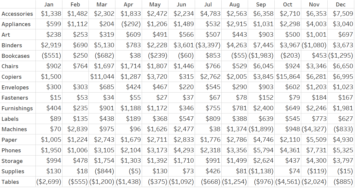
After 30-60 seconds of hearing incorrect answers, I add the pre-attentive attribute of color and show the same numbers as a highlight table.
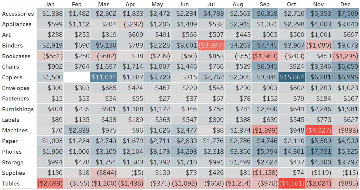
The punchline is immediately apparent, and it is obvious that data visualization has helped reduce the time to insight and increase the accuracy of the insight. Before using this exercise, I was a fan of Stephen Few’s ‘count the nines’ example, but I’ve found more success showing this evolution between a crosstab and highlight table.
My theory as to why this exercise works so well is twofold. First, the crosstab is how most corporate reports look today. I like to think that the audience is having an ‘oh crap’ moment and realizing that they’ve been doing it wrong. If you can’t answer the basic business questions of what are the highest / lowest numbers, how can you expect to find more valuable insights?
Second, the exercise has a way of transferring the burden of convincing from me to the audience. It’s no longer me trying to talk my audience into evolving their approach to analysis, but rather, they are seeing it for themselves and they think about the practice of data visualization differently.
Thanks for reading,
– Ryan


Written By
Ryan Sleeper
Related Content
Introducing the Triple Crown Framework for Data Visualization
This is the first in a series of four posts about my newest strategic framework for data visualization. Subscribe here…
Triple Crown Framework for Data Visualization: Data
This is the third in a series of four posts about my newest strategic framework for data visualization. For previous…
Triple Crown Framework for Data Visualization: Design
This is the fourth and final post about my newest strategic framework for data visualization. For previous posts, see An…