Triple Crown Framework for Data Visualization: Data

This is the third in a series of four posts about my newest strategic framework for data visualization. For previous posts, see An Introduction to the Triple Crown Framework and Triple Crown Framework: Psychology. Subscribe here for future updates.
You can’t have data visualization without data, so we all know this is an indispensable aspect of our practice. I’ve heard many people complain that data preparation constitutes 80% of their data visualization projects; leaving only 20% to the fun part (in my opinion) of making the data engaging and easy to understand. I typically say that data is ‘half the battle’, but I aim to flip the 80/20 ratio so that the data aspect only takes 20% and the rest of the time is left for me to focus on visualization and user experience.
![]()
While this is not a full-fledged data engineering post, I am going to share what I view as the single biggest barrier to Tableau adoption (and it’s related to data), my favorite efficiency tips, and some thoughts on creating advanced chart types.
Triple Crown Framework for Data Visualization: Data
Shape data for use with Tableau
My introduction to Tableau story is not unlike many others. The company I had been working for had been developing recurring reports in Excel since their inception. One day, the boss walked into a room with three of us and said, “I’ve heard of this tool Tableau. Can you three take a shot at migrating our existing Excel reports to Tableau?”. We opened Tableau for the first time, saw that the very first connection type was Excel, and connected to our existing Excel files. “Great – this is going to be so easy!”, we thought. Only to find that the numbers didn’t match, fields were misclassified, and everything was broken.
This is why.
Most existing Excel reports are problematic for Tableau in several ways. Consider the following sample from a typical report created in Excel:
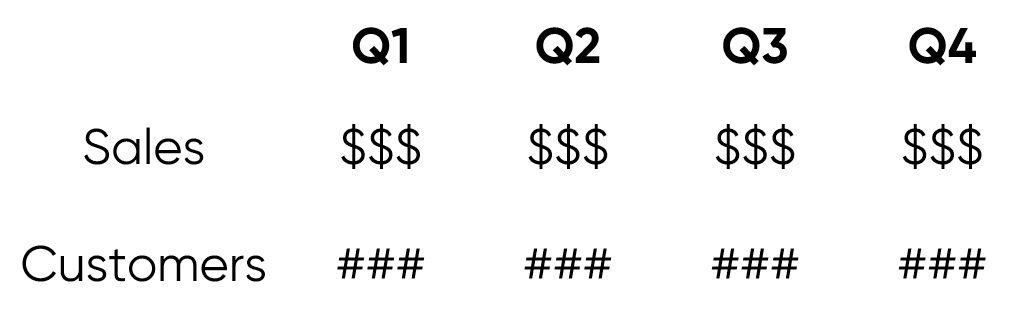
Note that the measures of Sales and Customers are going down vertically in the first column of the table and the dates of Q1, Q2, Q3, and Q4 are going from left to right in the first row. Existing spreadsheets can be even worse to work with in Tableau if they contain totals, which can cause double-counting when aggregated.
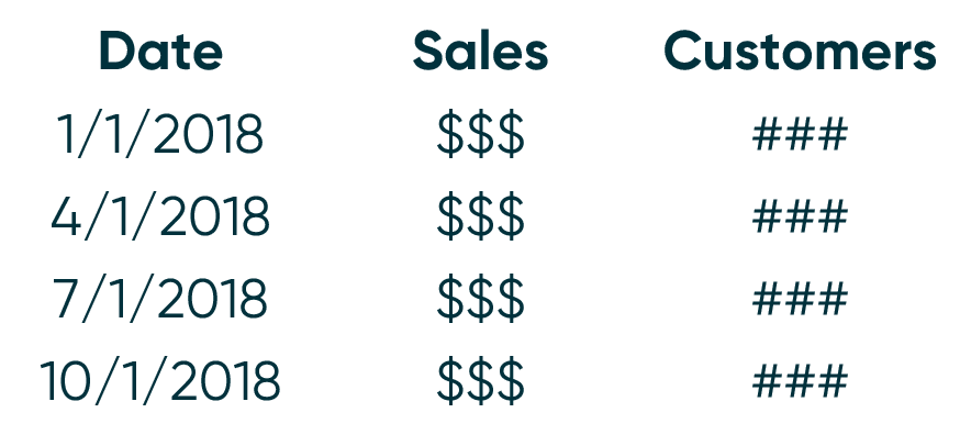
In order for Tableau to easily determine which fields are in your data source and have the ability to classify each field as a dimension or measure, it’s usually best to transpose the shape of the data above so that the source is laid out like this:
Continue reading with a free account, or login.
Unlock this tutorial and hundreds of other free visual analytics resources from our expert team.
Already have an account? Sign In
By continuing, you agree to our Terms of Use and Privacy Policy.
When each column header represents a field, every subsequent row (or record) is a combination of those fields. This is what allows you to take a measure such as Sales, and ‘slice and dice’ it by a dimension, such as Date.
Also note that in the “ideal” data layout, I replaced Q1, Q2, Q3, and Q4 with an actual date. Dates are kind of a special field in Tableau because they have a built-in hierarchy (i.e. Year, Quarter, Month, etc.). If you’re ever in a similar position, I recommend creating a date field in a date format.
Shape data for visualization type
While the suggested data layout from the previous tip isn’t quite a blanket recommendation, it is close. That being said, there are other occasions when shaping the data for a specific chart type will make your life a lot easier. Consider the following examples:
– Sankey diagrams are much easier to create when you add columns that help tell Tableau how to connect the dimension members on each side of the diagram. There is an alternate approach that requires you to duplicate the data source entirely. For more on creating this chart type, I’m going to point you to Jeffrey Shaffer’s blog, where I first learned about creating this chart type in Tableau.
– In order to create unit charts, which are technically stacked bar charts with equally-sized units, you may need to make your data source more granular. For example, if you want to make a unit chart displaying the individual orders as the equally sized units, it’s easiest to have a record for each individual order. When the data source is set up this way, to convert a bar chart to a unit chart, you would simply drag the dimension for your equally-sized units (such as “Order ID”) to the Detail Marks Card. For more on this chart type, see The Case for One Dimensional Unit Charts.
– While it is possible to make funnel charts by using the Measure Names and Measure Values fields, there is a more elegant solution that involves shaping the data in a specific way before you start using it in Tableau. To learn how to make a funnel chart with either approach, see Practical Tableau: How to Make Funnel Charts.
Top efficiency tips
When discussing “efficiency” in the context of Tableau, I’m talking about how quickly data is processed and how efficiently a visualization is rendered. At the Tableau Conference this year, there was a big announcement that efficiency will be dramatically improved with the addition Hyper. So hopefully the following tips won’t be needed for long, but in the meantime, here are some of my top efficiency tips.
Think strategically about the data you need
This is perhaps the easiest tip to implement, but also possibly the most powerful. One easy way to make your workbooks run more efficiently is to reduce the number of records that need to be processed, and one of the easiest ways to reduce the number of records is to only use the data that you need.
As one extreme example, if your historical data includes ten years worth of records, but you’re only going to create a year over year dashboard… you guessed it, only bring in two years of data! This can be accomplished by adding a data source or data extract filter that keeps only the two years of data pertinent to your analysis.
Another way to use only the data you need is to aggregate dates and times at the level needed to do your most granular analysis. For example, if your dates have timestamps but you never plan to analyze the data at an hourly level, aggregate the dates at a daily level. This will substantially reduce the number of records because the granular timestamps that you do not need will be consolidated into days.
Prepare dimensions before using them in Tableau
Generally speaking, I prepare dimensions as much as possible before using them in Tableau. Tableau is a great prototyping tool where you can quickly make calculated dimensions on the fly. For example, you may want to create segments or group dimension members together into a custom dimension. However, these types of calculations often include strings, which are the slowest type of data for Tableau to process. For this reason, after proving the value of a calculated dimension and knowing that I’ll want to use the newly created dimension regularly, I try to move those calculations out of Tableau and prepare the dimensions before connecting to the data source.
With measures on the other hand, I prefer to do all of the aggregation in Tableau. When you aggregate every number before visualizing it in Tableau, you have to know exactly what you’re looking for and your analyses are limited to answering questions you’ve already asked / computed the answers for. By preparing dimensions outside of Tableau and aggregating measures within Tableau, you improve efficiency while also keeping Tableau the most flexible tool on the market.
Use context filters
Any filter can be “added to context” by clicking it on the Filters Shelf and choosing “Add to Context”. Context filters are the highest-level filter after data source and extract filters, making them the highest-level filter you can apply from within the authoring interface. When you add a filter to context, they are processed before your dimension filters, measure filters, and level of detail expressions.
Since the context filters are applied first, a subset of the data is created before subsequent filters are executed. This helps with efficiency and also serves a practical purpose. I’ve seen huge efficiency gains using context filters because the size of the dataset can be reduced on the fly before the additional filters query the rows and return a result. In one such scenario, I added a date filter to context and reduced the processing time on a 65 million record dataset from 20 minutes to 20 seconds!
![]()
I also mentioned that context filters serve a practical purpose for your analyses. Normally, the filters on the Filters Shelf act as AND statements in that every criterion between all the filters have to be met in order for the record to display. But what if you wanted to see the Top 10 product names by Category? If you create filters for the Top 10 product names and Category, the product will only be shown if it is both in the top 10 and one of the categories you select in your Category filter. However, if you add the Category filter to context, the data will be limited to the category selected first, then you will see the top 10 for the category selected.
Thanks for reading,
– Ryan


Written By
Ryan Sleeper
Related Content
Advanced Analytics in Tableau Series: One-Way ANOVA Tests

You may be wondering why we would want to perform an ANOVA test in Tableau, as you can do it…
How to Turn Data Normalization On and Off in Tableau
Data normalization is the process of adjusting values from different scales to a common scale, providing a better “apples to…
The Definitive Guide to the Analytics Pane in Tableau

Adding statistics to visual analytics can be an extremely powerful way to give our audience more insight into the data…