The Case for One-Dimensional Unit Charts
This year I have found myself gravitating towards stacked bar charts as a way to show comparisons. The chart type is featured prominently in both my recent NBA Records by Player and 50 Years of AFC vs. NFC Matchups visualizations. I even used a stacked bar chart as the primary visualization to share how much progress I’m making on the Tableau 201 book project. Something is different about these stacked bars, though. I’m generally not a fan of stacked bars because if the stacks are different sizes, and if the stacks do not sit on the baseline, it can be challenging to compare and contrast the different pieces of the bars. In all three cases I mentioned above, the stacks have equal units. This removes the challenges I have with traditional stacked bars, so I do not think the name gives these charts justice. So that got me to wondering if these should be called unit charts.
How to Make Unit Charts in Tableau
If you’re not familiar with unit charts, here is a well-done example from one of my data viz heroes, Andy Cotgreave. My issue with the multiple column and multiple rows approach to most unit charts – especially when they are showing a part to whole relationship – is that these are pie charts in disguise. Very sneaky. Andy always does an amazing job of eliciting dialog around data visualization in the community so I assume he had a reason behind his chart type selection. Even if he didn’t, I’m not mad at him, we all have guilty pleasures. I once made a donut chart… and I enjoyed it.
Pie charts are different though. Pie charts are terrible. I could not have one of my new favorite chart types associated with a pie chart. So I kept searching.
“What are these charts called?!”, I screamed. (or Googled actually).
The best I could come up with was a paper authored by another one of my data viz heroes, Stephen Few. In classic Few fashion, the paper is unapologetically called, “Unit Charts Are For Kids”. Here’s another sidebar…
Stephen Few has a reputation of being critical, demeaning, and perhaps unkind. I had the privilege of having dinner with him last year, and found him to be exceptionally kind and humble. He introduces himself as Stephen, asks questions about you, and intently listens. Even in the cases where the first sentence in this paragraph is true, I have tremendous respect for his passion about the data visualization discipline and his tireless efforts to educate on the topic.
He even opens up the comments on his own popular site to take on debates from anyone. And I do mean anyone. The person that made this chart could go onto Few’s site and tell him why he doesn’t know anything about data visualization. I find that admirable.
In the paper, Few walks through why you shouldn’t use unit charts. But what really stood out to me is the image of the chart type I was searching for… and a name!
One-Dimensional Unit Charts
Even better, Few almost gives this visualization type praise:
The simplest form of a unit chart displays a single row or column of units, rather than a matrix of both as we saw in the previous example. As you can see, a one-dimensional unit chart is simpler to read than a two-dimensional version.
However, he goes on to say:
Given improved ease of use, are one-dimensional unit charts worthwhile? We can read them much as we read bar graphs, with one minor difference—the segmentation of values into units inclines us to slow down and count, as opposed to the simpler, faster task of comparing their overall heights and then decoding their values in relation to a quantitative scale, which is missing. Not a big problem, some might argue, but significant enough to discourage their use when better means are available.
As promised in the title of this post, here’s my case for one-dimensional unit charts.
Continue reading with a free account, or login.
Unlock this tutorial and hundreds of other free visual analytics resources from our expert team.
Already have an account? Sign In
By continuing, you agree to our Terms of Use and Privacy Policy.
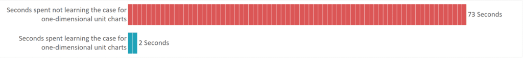
By the way, if I were to make a unit chart about the portion of this post so far showing how many seconds you’ve spent reading while not learning the case for one-dimensional unit charts vs. the seconds you’ve spent learning the case for one-dimensional unit charts, it would look something like this:
So let’s get to it.
I agree with Few that at the highest-level, bar charts communicate data faster than one-dimensional unit charts. He makes a great point that this chart type inclines people to slow down and count the individual units.
![]()
But what if the units each mean something unique? The values are equal, but each unit has its own story to tell. That is the case with all of the examples that I’ve mentioned from my portfolio.
Here is the NBA Records by Player viz:
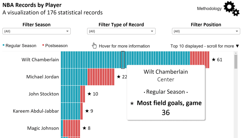
In the interactive version, if you hover over each unit, you are presented with additional information such as which record was achieved, what type of record was achieved, and whether or not the record is shared with any other player. In tools like Tableau, you can take this a step further by linking to additional context. This is the case with my Tableau 201 progress to completion unit chart:

This moves the bar chart from a high-level descriptive visualization, to a prescriptive visualization, which helps add context to why something is the way that it is. Descriptive bar charts certainly have their place with certain audiences, but generally a prescriptive view is always going to be more valuable.
Not only that, in my personal opinion, the units help add context to the scale, even when the final view will be a flat, descriptive chart.
How to make one-dimensional unit charts in Tableau
One-dimensional unit charts are easy to make in Tableau as long as you remember one thing, and that is that each unit needs some type of unique identifier in the data. In the case of the NBA Records by Player viz, the unique ID was NBA record.
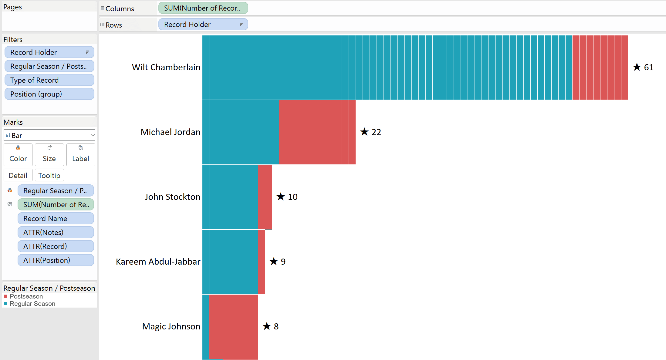
From here, you build a bar chart just like you always do in Tableau, then drag the unique ID to the Detail marks card. Here’s a look at the NBA Records by Player viz under the hood:
If you don’t have a unique ID and are purely going for the unit chart look (sorry Stephen Few!), you can simply add reference lines that will draw a line across the equal units you want to display. This is a manual approach, but has the advantage of allowing you to format the reference lines to your liking.
Finally, people always ask how to add totals to stacked bars (like you see above with the star and total number of NBA records per player). I considered doing a post to cover this topic by itself because it is a valuable capability, but it has been covered regularly and is just plain easy. All you have to do is add a reference line by right-clicking the axis of the measure in question, set the scope to cell, change the label to value, and set the formatting of the line to none.
Thank you for reading,
– Ryan


Written By
Ryan Sleeper
Related Content
How and Why to Use Diverging Unit Charts in Tableau

A diverging unit chart acts in the same fashion as a normal unit chart but adds another layer of insight…

Ryan Sleeper
Learn How to Stack Marks to Create Wilkinson Dot Plots Ryan guides you through the evolution of a traditional histogram,…
How to Make Unit Charts with Continuous Measures in Tableau
Unit charts – or stacked bar charts made up of equal-sized marks – take the benefits of the bar chart…