How to Make Unit Charts with Continuous Measures in Tableau
Unit charts – or stacked bar charts made up of equal-sized marks – take the benefits of the bar chart and add a practical design aesthetic by showing the makeup of each bar. One drawback to this option in Tableau is that your dataset must contain a dimension to create equal-sized values, such as Order ID, in order to stack the values to create a unit chart.
Since this is not the case with any continuous value that you are summing up, such as Sales, your ability to make unit charts is limited – except we’ve got a hack for that! I’ve shown you before how to make unit charts in Tableau (and explained their pros and cons), but this post shows you how to make unit charts even when your values are continuous and you don’t have a field to create equal-sized units.
A trick for making units charts in Tableau with any measure
By the end of this post, you will be able to make a unit chart in Tableau out of a continuous measure with an aggregation of sum. I’ll also share a trick to take this a step further and have multiple colors in both a positive and negative direction to identify outliers and add even more design polish to this chart type.
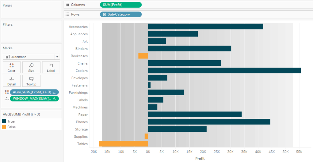
First, make a bar chart. In my example, I’ve placed the sum of Profit measure from the Sample – Superstore dataset onto the Columns Shelf and broke the value down by the Sub-Category dimension.
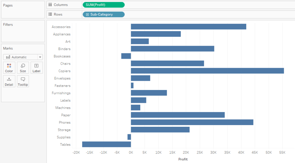
Optionally, there are at least three ways to color the bars by whether the profit values are positive or negative:
- Place the SUM([Profit]) field onto the Color Marks Card and update the diverging color palette to have two stepped colors.
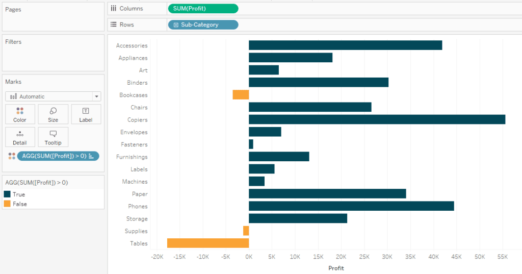
- Create a calculated field with the formula SUM([Profit]) > 0 and place the field onto the Color Marks Card.
- Double-click in any blank space on the Marks Shelf, type the formula SUM([Profit]) > 0; then drag that field onto the Color Marks Card.
![]()
Continue reading with a free account, or login.
Unlock this tutorial and hundreds of other free visual analytics resources from our expert team.
Already have an account? Sign In
By continuing, you agree to our Terms of Use and Privacy Policy.
Here’s how my view looks after taking the third approach and updating the colors to be in-brand:
3 Ways to Use Tableau in the Flow
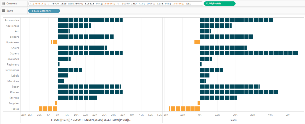
The trick for “stacking” equal-sized units when we don’t have a dimension to create equal-sized units, such as Order ID, is to add reference lines at equal-sized increments. Fortunately, you don’t have to add all of these reference lines individually because one of the reference line options is called Distribution, which allows you to draw lines at percentages of a number.
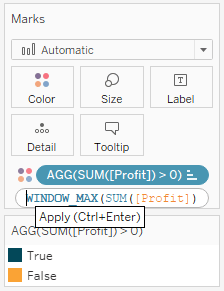
Before we do that, so that our reference distribution is dynamic and will work if the view is filtered, I’m going to add a table calculation to the Marks Shelf that computes the WINDOW_MAX of SUM([Profit]) (i.e the highest value in the view). To do so, double-click any blank space on the Marks Shelf and type WINDOW_MAX(SUM([Profit])) and hit the Enter key. This adds the value to the Detail Marks Shelf so it can be used in a reference line.
An Introduction to Tableau Table Calculations
To add a reference distribution, right-click on the continuous axis and choose “Add Reference Line”; then choose Distribution at the top. The default distribution is 60% and 80% of the average measure on the view – the default for bullet graphs – but this can be changed under the “Percent of:” options.
One option is to hardcode a constant value to take percentages of, but for better results, I am going to draw lines at the percentages of the WINDOW_MAX table calculation I just added to the Detail Marks Card.
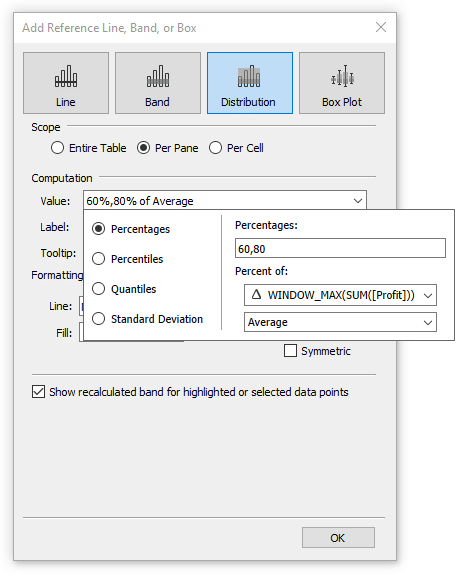
Also, instead of the default lines at 60% and 80% of the highest profit value in the view, I’m going to update those to increments of five percentage points. Before you close the reference line dialog box, make sure you turn off the labels by changing the option under the Labels dropdown to “None”.
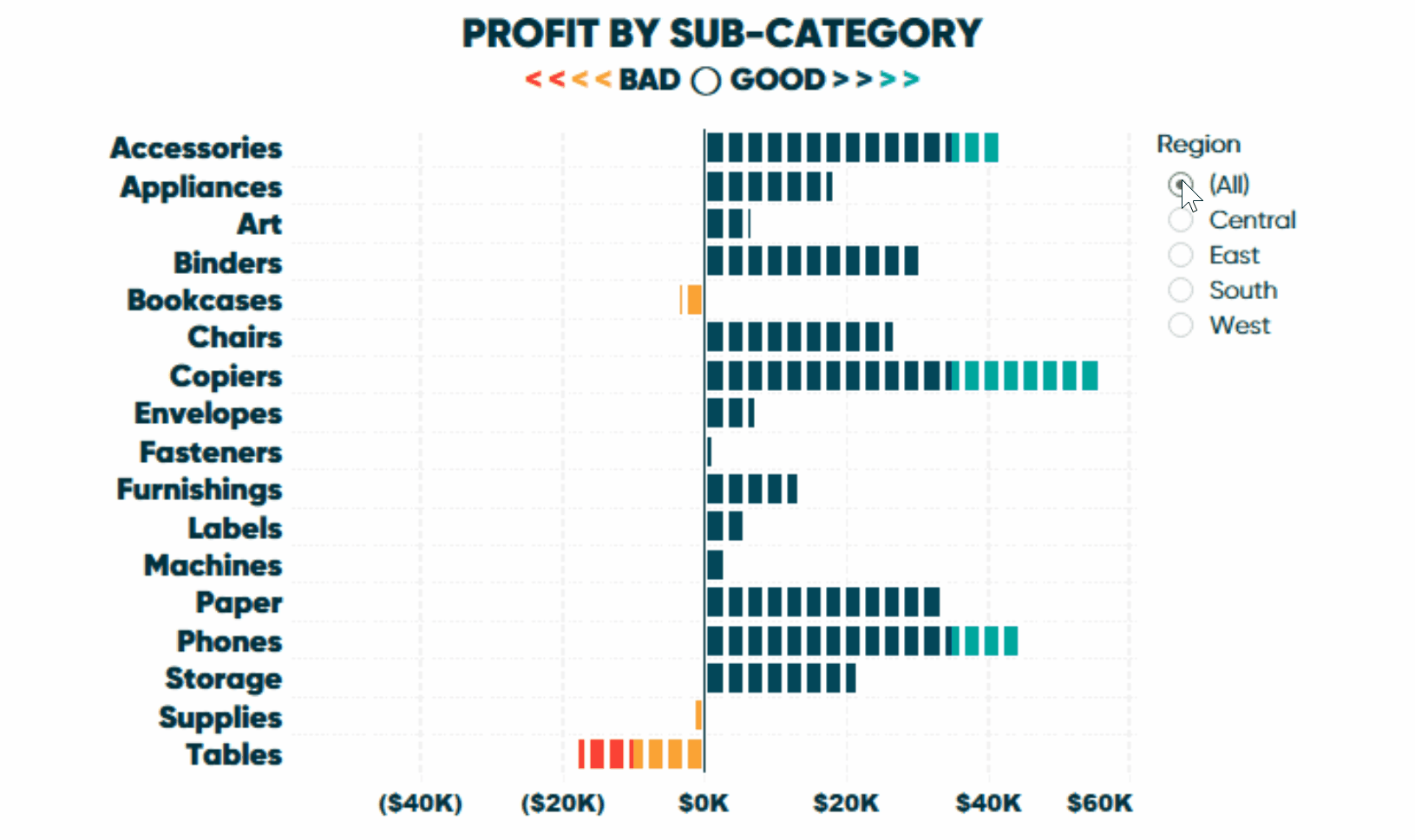
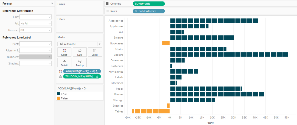
Here’s how my view looks after adding a reference distribution at percentages of -30,-25,-20,-15,-10,-5,0,5,10,15,20,25,30,35,40,45,50,55,60,65,70,75,80,85,90,95 for the WINDOW_MAX(SUM([Profit])).
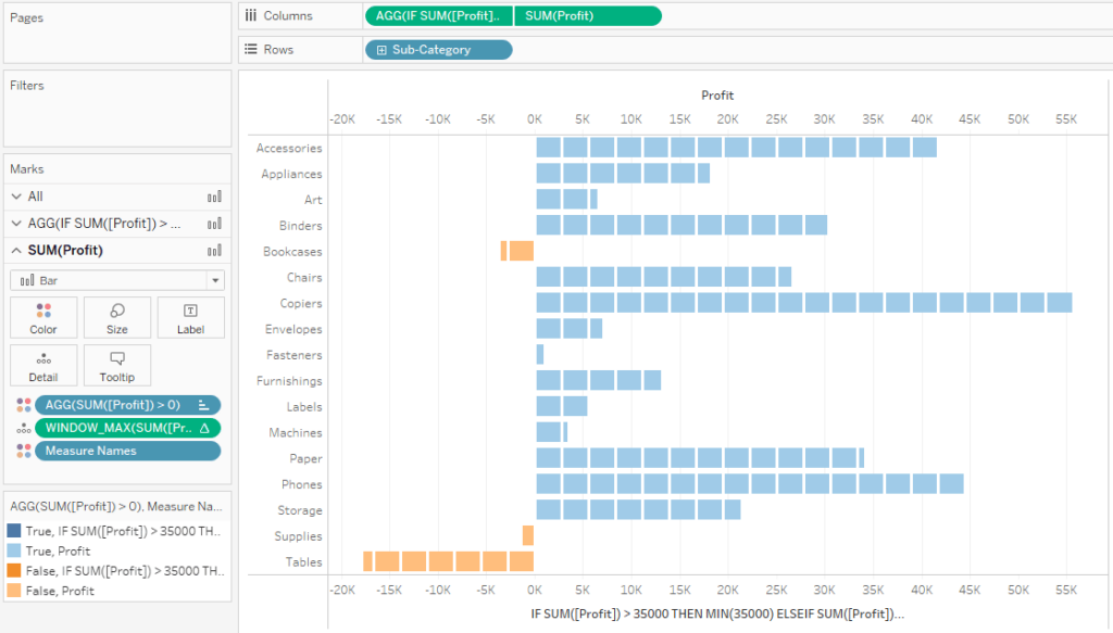
From here, there are two critical formatting updates we need to make to finalize our unit chart built with a continuous measure. To format the reference lines, right-click on any of them – which should be pretty easy since there is a line drawn every 5% of the x-axis at this point – and choose “Format”.
First, change the Line dropdown to a line color and weight of your liking. Second, turn the gray shading off by changing the option under the Fill dropdown to “No Fill”.
A trick for coloring outliers made with continuous measures
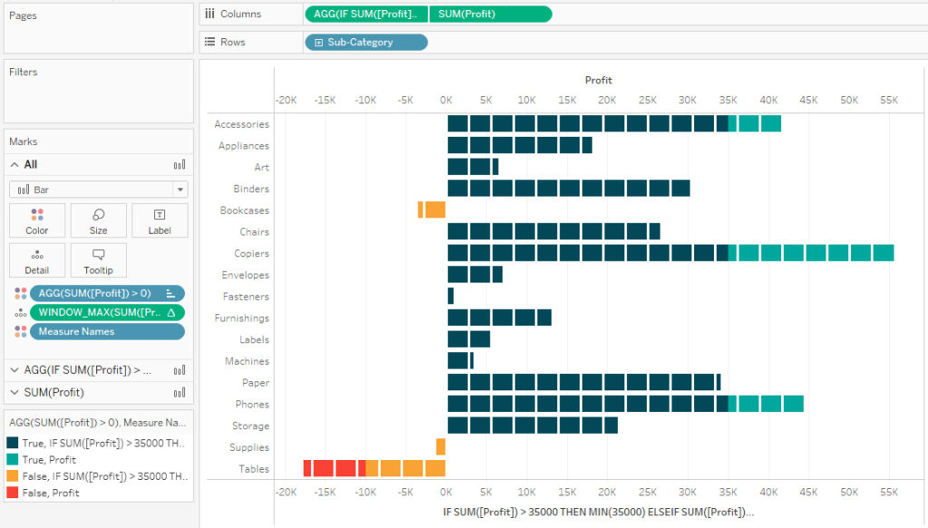
Let’s say that in addition to having one color for positive values and one color for negative values, we want to color values beyond $35,000 a third color and values below -$10,000 a fourth color. The challenge is, we only want the portion of the view that is an outlier to be colored differently (i.e. blue up to $35,000; green for every block above).
Again, we don’t have a dimension to place on the Color Marks Card to stack our profit values to get the desired effect, but I have another trick for you. First, duplicate the measure you’re using on either the Rows or Columns Shelf by holding the Control key while you click and drag the field right next to itself.
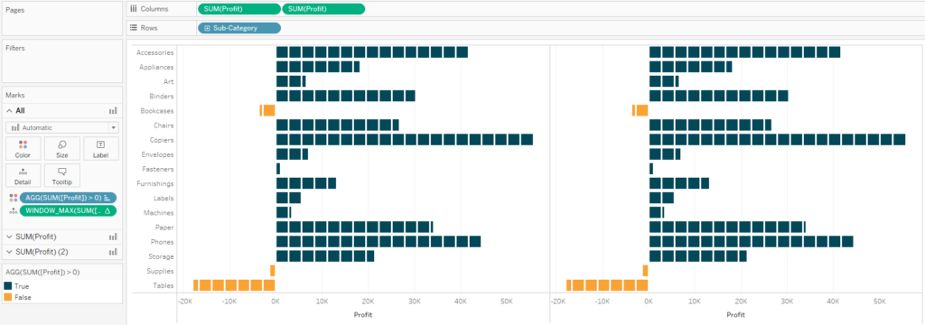
Next, double-click on the first version of the field and add IF THEN logic to truncate the bars at your threshold values. For my example, the formula is:
IF SUM([Profit]) > 35000 THEN MIN(35000) ELSEIF SUM([Profit]) < -10000 THEN MIN(-10000) ELSE SUM([Profit]) END
![]()
This logic says that if a bar goes above 35000 in profit, force it to always equal exactly 35000; if a bar goes below 10000 in profit, force it to always equal exactly -10000. The aggregation of MIN is used because you can’t use a mix of aggregate and non-aggregate fields in a calculation and prevents us from accidentally inflating the value based on the view’s level of detail.
Next, convert this into a dual-axis chart by right-clicking on the second version of the field on the Rows or Columns Shelf and choose “Dual Axis”. Change the mark type of all the marks back to Bar and don’t forget to synchronize the axes by right-clicking on either one and choosing “Synchronize Axis”.
At this point, the bars displaying the full profit values are overlapping the bars displaying the truncated profit values. To reverse the layers, click on the top axis and choose, “Move marks to back”. From here, all that’s left to do is remap the colors which you can start doing by double-clicking any color in the color legend.
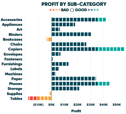
Here’s how my final view looks after adding it to a dashboard and doing some formatting:
Thanks for reading,
– Ryan

Written By
Ryan Sleeper
Related Content
The Beginner’s Guide to Tableau Table Calculations

Tableau table calculations, while very powerful, can be both tricky and confusing to work with. There are some great benefits…
How and Why to Use Diverging Unit Charts in Tableau
A diverging unit chart acts in the same fashion as a normal unit chart but adds another layer of insight…

Ryan Sleeper
Learn How to Stack Marks to Create Wilkinson Dot Plots Ryan guides you through the evolution of a traditional histogram,…