How and Why to Use Diverging Unit Charts in Tableau

A diverging unit chart acts in the same fashion as a normal unit chart but adds another layer of insight to the visualization. With the diverging unit chart, we can use a Boolean (T/F) field to define a divergence between dimensional values (i.e. sub-category values such as chairs, tables, etc.) so the unit chart gets split into two, one ascending unit chart and one descending unit chart.
The Boolean field to define the divergence among units can be anything relevant to your analysis. In our recent, Mobility & Opportunity Trends in the NFL project, for example, we needed to visualize the number of coaches of color and the number of white coaches hired in the NFL each year since 1993. Therefore, we decided to create a diverging unit chart where each circle represents a coach, and the divergence between coaches of color and White coaches was based on a Boolean field where coaches of color equals TRUE, else FALSE.
How to Make Unit Charts in Tableau
Our use of the diverging unit chart allows the user to do a quick left-to-right comparison each year on how many coaches were White versus a coach of color, reducing time to insight and increasing the accuracy of the insights. By the end of this tutorial, you will be able to create a diverging unit chart with any data set that contains the three required components.
Three components of a diverging unit chart
There are three major components that are needed to create a basic diverging unit chart
-
- A dimension that we are measuring
- A Boolean field that determines the divergence of dimensional values
- A calculation that assigns the dimensional values an index
Though those are the basic components, this tutorial will go beyond the basics to add interactivity and user experience styling.
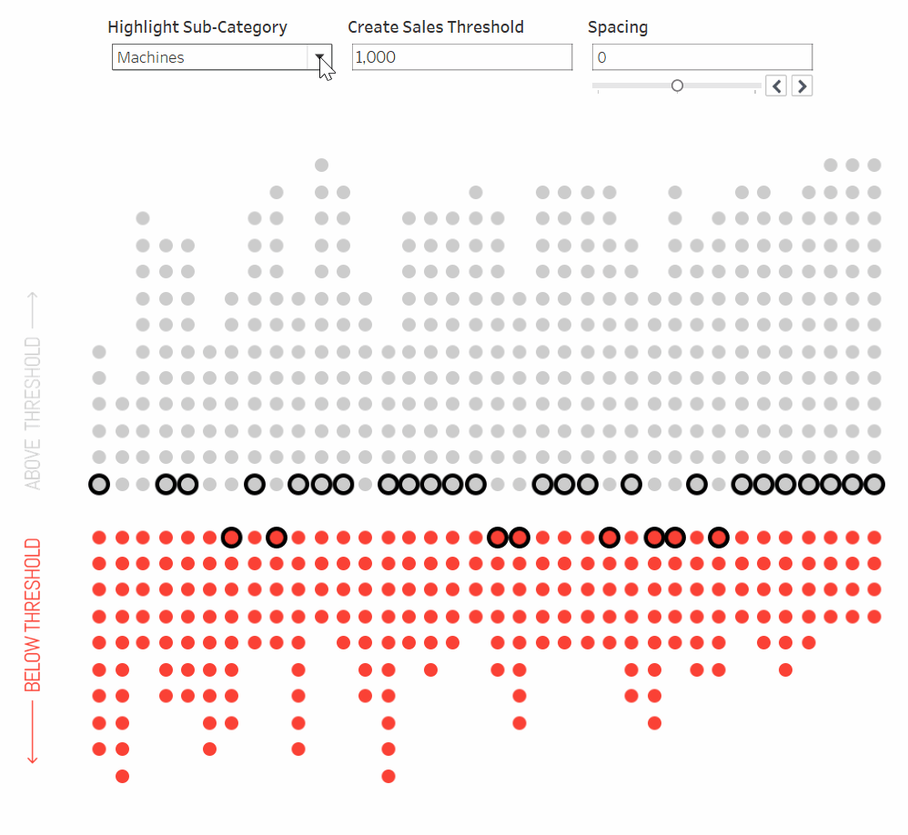
For this hypothetical use case, our stakeholder wants to know which sub-categories have met a sales goal of $1,000 USD each month from 2020 – 2022. To start, connect a new Tableau workbook to the Sample Superstore data set.
![]()
Continue reading with a free account, or login.
Unlock this tutorial and hundreds of other free visual analytics resources from our expert team.
Already have an account? Sign In
By continuing, you agree to our Terms of Use and Privacy Policy.
The first step in our process will be to create a Boolean calculation that will be based on whether or not a sub-category’s sales equals the minimum sales threshold of $1,000 USD.
The most basic way to create this Boolean sales threshold would be to write a calculation as “SUM(Sales) > 1000” (sales threshold), but this logic will cause issues later because the result is an aggregate. This calculation will need to be used in the addressing and partitioning of a table calculation; therefore, it cannot result in an aggregation because table calculations cannot be addressed or partitioned by aggregated fields. To work around this issue, we’ll have to wrap SUM(Sales) in a FIXED LOD.
💡Tip: Aggregated fields cannot be used to address or partition table calculations. To work around this issue, wrap the aggregation in a FIXED LOD.
Let’s call this field ‘c. boolean field’ and the logic should be written as:
{ FIXED [Sub-Category], DATETRUNC(‘month’, [Order Date]): SUM([Sales])} >= 1000
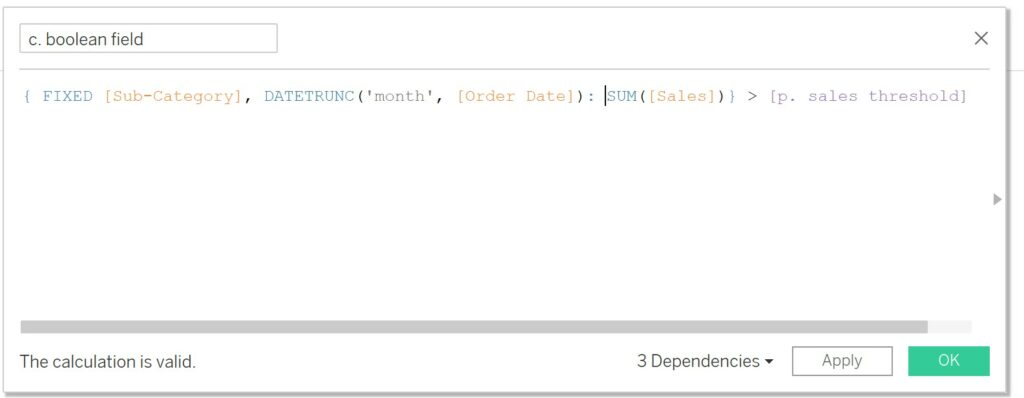
Fixed Level of detail expressions will fix the granularity of the calculation at whatever is defined after ‘{Fixed ‘. We want to fix the level of granularity for Sub-Categories at the month level, which is why we are defining both ‘Sub-Category’ and ‘Order Date’ in the Fixed LOD.
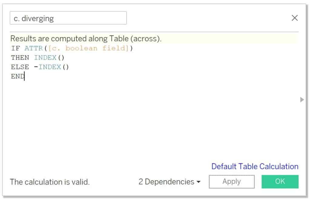
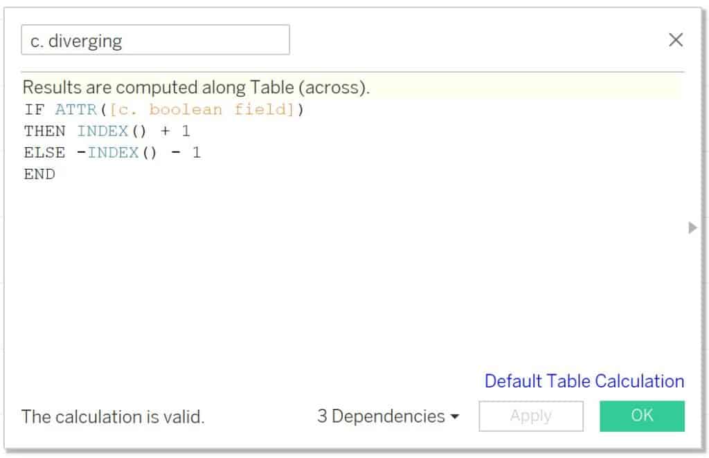
Next, we need a calculation that separates the dimensional values of Sub-Category based on the Boolean calculation by assigning it a positive index if it results in TRUE or a negative index if it results in FALSE. Name the calculation ‘c. diverging’ and the logic is as follows:
IF ATTR([c. boolean field])
THEN INDEX()
ELSE -INDEX()
END
Assembling the view
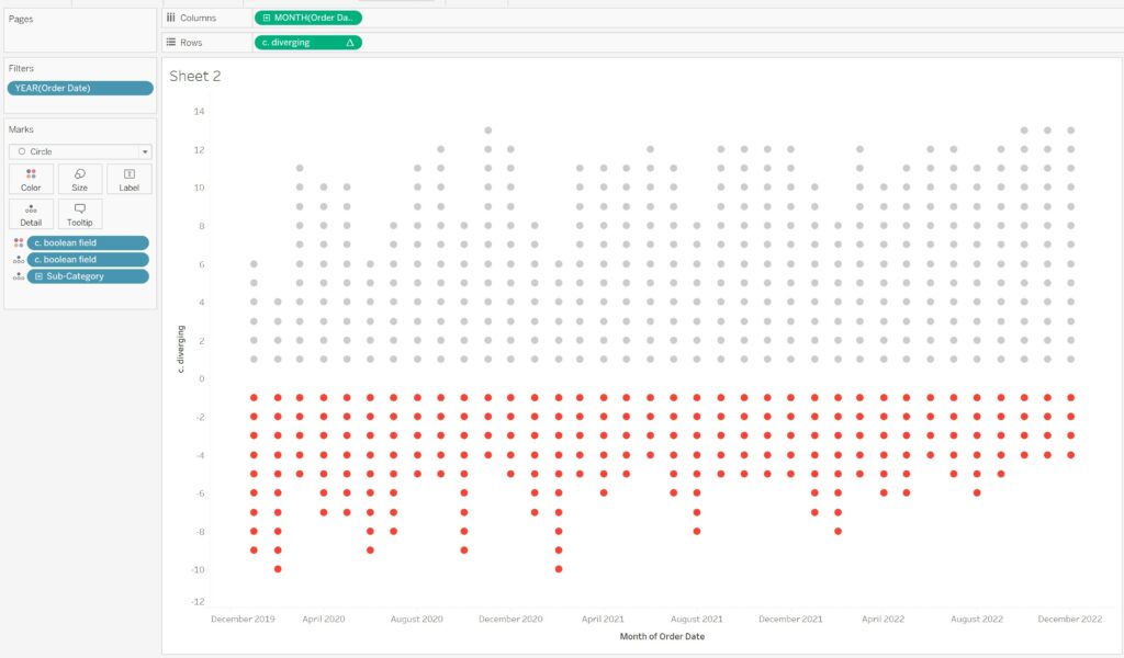
Let’s start assembling the viz. Place Month of Order Date (continuous) on the Columns shelf, filter Order Date to only include 2020 – 2022, place ‘c. diverging’ on the Rows shelf, place ‘c. boolean field’ and ‘Sub-Category’ on the Detail property of the Marks card, change the Mark type to Circle, then change the view from ‘Standard’ to ‘Entire View’. Your visualization should look similar to the screenshot below.
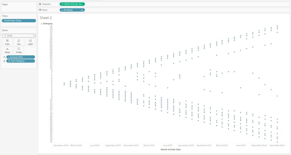
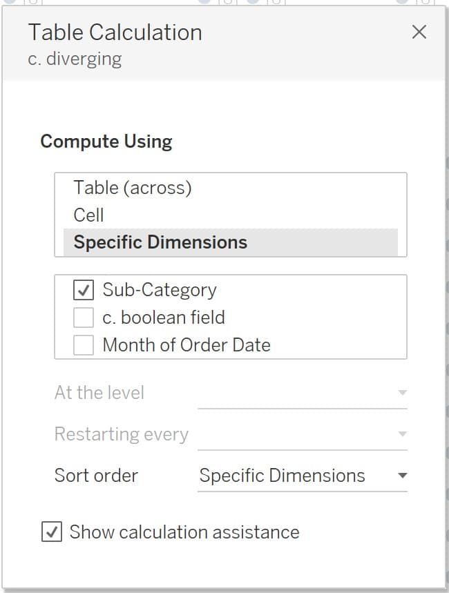
Right-click ‘c. diverging’ on the Rows shelf and select ‘Edit Table Calculation…’. Under Compute Using choose ‘Specific Dimensions’ and only checkmark the box next to Sub-Category, leaving the other fields unchecked.
The Beginner’s Guide to Tableau Table Calculations
Place ‘c. boolean field’ on the Color property of the Marks card and adjust the colors to your liking. Convert the ‘c. diverging’ calculation on the Rows shelf from discrete (blue) to continuous (green). The viz should now look similar to the screenshot below.
You now have a basic, functioning diverging unit chart based on a sales threshold. You can stop now if this achieves the basics of what you need, but if you want to learn a few more tips and tricks to elevate this viz even further, then keep reading!
Two Ways to Make a Diverging Bar Chart in Tableau
Elevate your viz beyond the basics
In this section, I will provide four tips and tricks that will immediately elevate the interactivity and user experience of this viz.
-
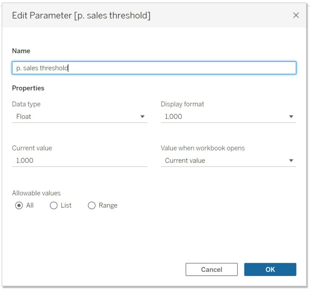
- Make the sales threshold value dynamic with a parameter.
In this fake scenario, the stakeholder is more of the analyst type and will therefore like to do some exploration. Because of this, I want to add flexibility to the analysis by allowing the user to dynamically change the threshold based on a parameter.
Create a parameter, name it ‘p. sales threshold’, make the Data type ‘Float’, change the Current value to 1000, and select ‘All’ for Allowable values.
Open the calculated field ‘c. boolean field’ and replace the hard-coded 1000 with ‘p. sales threshold’. Show the parameter and your user will now be able to dynamically change the threshold to their heart’s content!

2. Adjust the white space at the divergence between the positive and negative indexes.
Maybe you want to add a customized x axis between the diverging units, or would rather have the diverging units closer together. There are many reasons as to why you may want to adjust the whitespace between the divergence of units which is why I want to share how this can be achieved. To adjust the white space between the positive and negative indexes, add or subtract numeric values to your indexes as shown in the screenshot below. Subtracting 1 from the negative index and adding 1 to the positive index will increase the white space, while doing the opposite will decrease the whitespace.
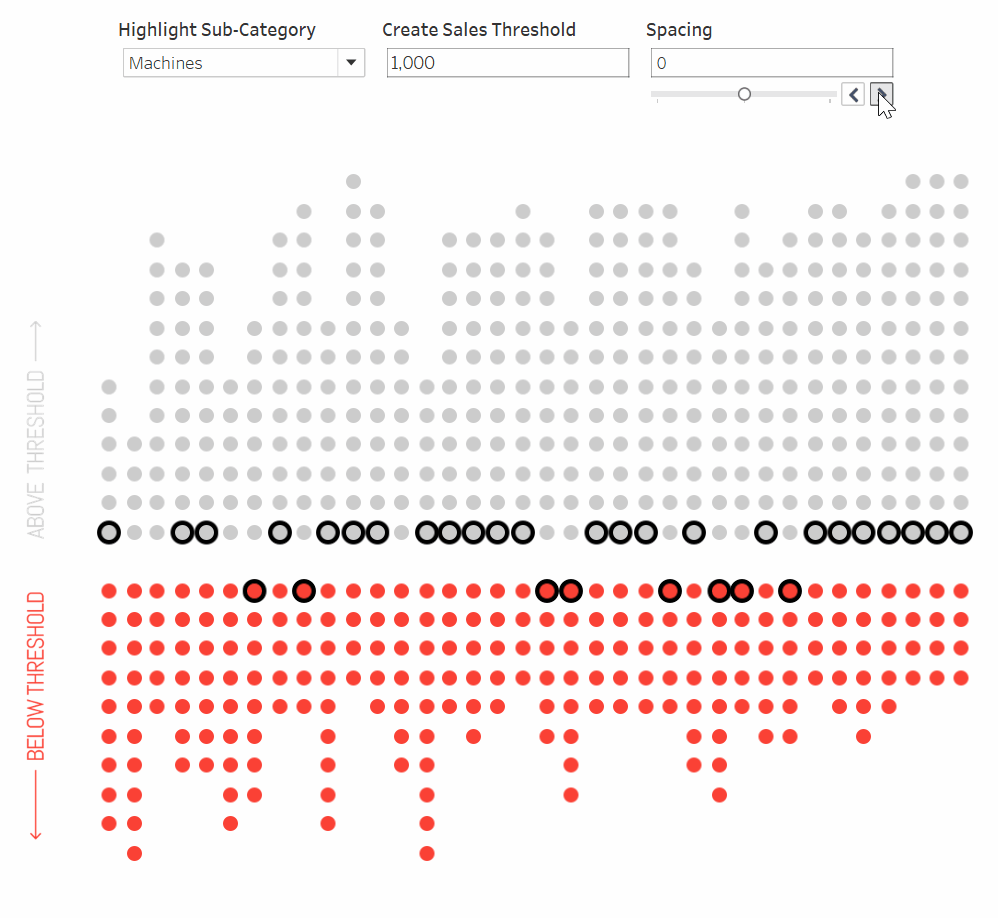
3. Highlight a dimensional value of Sub-Category based on a parameter selection.
Highlighting a single dimensional value based on the user’s selection can vastly improve the usefulness of this viz as it will help the user focus their analysis to just a single dimensional value while still being able to quickly and easily compare the selection to all other values.
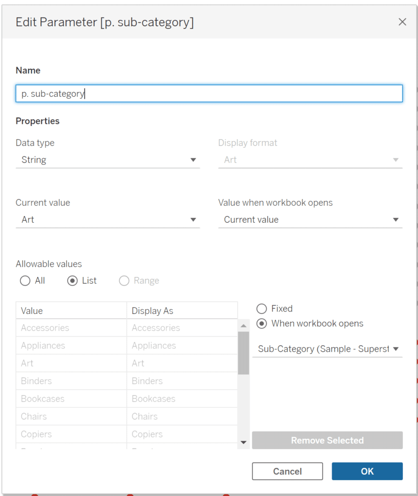
Create a parameter called ‘p. sub-category’. The Data type is String, Allowable values is List, select When the workbook opens, then choose ‘Sub-Category’. Click OK.
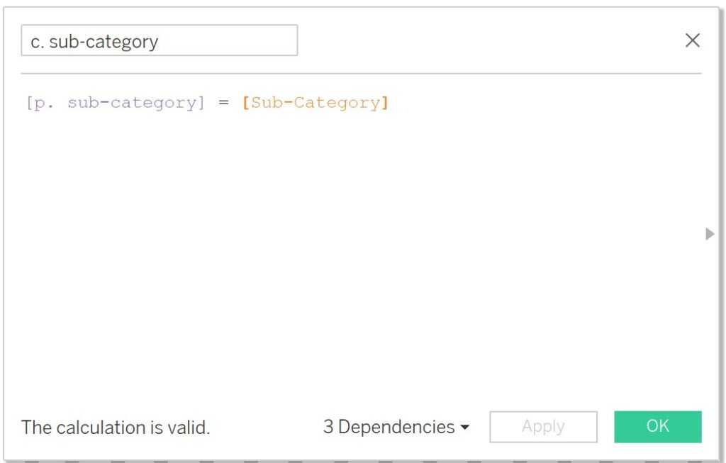
Create a calculation called ‘c. sub-category’. The logic is:
[p. sub-category] = [Sub-Category]
Ctrl + click the ‘c. diverging’ measure on the Rows shelf and drag it to the right to duplicate. On the original c. diverging Marks card, place ‘c. sub-category’ on the Color property of the Marks card. On the Color legend, make sure True is ordered above False.
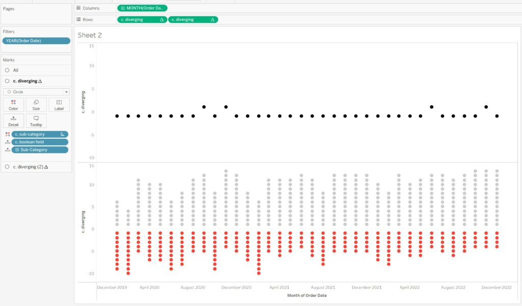
Because we added another field (c. sub-category) to the Detail property of the first Marks card, we have to readjust our table calculation for this card. Right-click the first ‘c. diverging’ calculation on the Rows shelf and select ‘Edit Table Calculation…’. Ensure that the only check marked box is ‘Sub-Category’.
Right-click the second ‘c. diverging’ calculation on the Rows shelf and select Dual Axis. Right-click the axis and select Synchronize Axis. Open the Size property of the first Marks card and bump up the size so the black circle looks forms a halo around the inner circles.
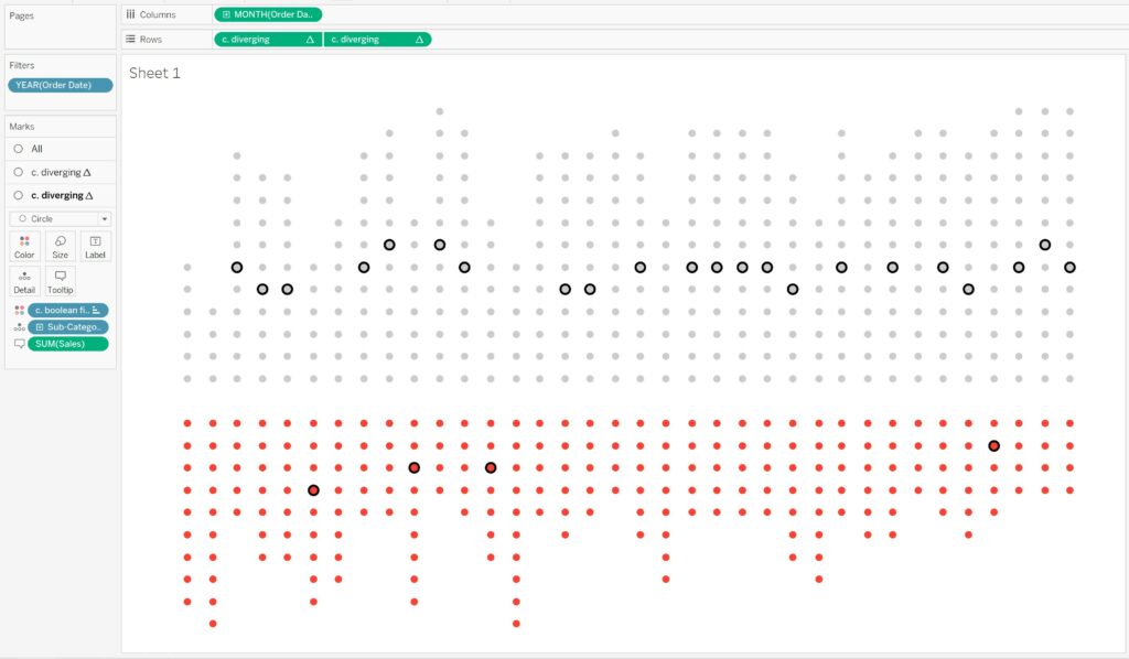
Now the user can highlight a single Sub-Category across the viz, without losing the ability to compare that Sub-Category’s performance to that of other Sub-Categories.
![]()
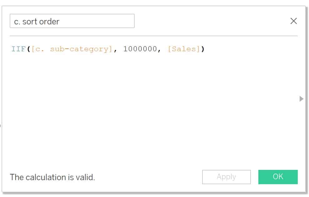
4. Adjust the sort order so the selected dimensional value (sub-category) gets pushed to the zero line for a quick and easy left-to-right comparison across years.
Create a calculated field called ‘c. sort order’. This calculation will tell Tableau that if ‘c. sub-category’ returns TRUE then assign it a value of 1,000,000 ELSE assign it its sales value. This will push the circles of the selected Sub-Category to the middle of the unit chart. The logic for this calculation is:
IIF([c. sub-category], 1000000, [Sales])
How to Reorder Stacked Bars on the Fly in Tableau
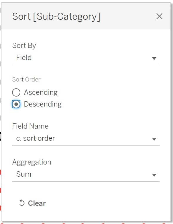
Under the ‘All’ Marks card, right-click ‘Sub-Category’ and choose Sort. From the Sort By drop down, select ‘Field’ then choose ‘Descending’. From the Field Name drop down, select ‘c. sort order’ then choose ‘Sum’ under Aggregation.
Conclusion
And that’s it! You now have all the tools to build a simple or more complex diverging unit chart. As long as you have the three basic components of a dimension, Boolean field, and the index calculation; you will be able to build this chart type with any data set. As always, feel free to reach out to me if you have any questions or comments about this chart.
Happy vizzing,
Dan


Written By
Dan Bunker

Peer Review
Alyssa Huff
Assoc. Director, Information Design
Related Content
The Beginner’s Guide to Tableau Table Calculations
Tableau table calculations, while very powerful, can be both tricky and confusing to work with. There are some great benefits…

Ryan Sleeper
Make Bars Diverge Left Even when Values are Positive You will learn how to make diverging bar / tornado /…
How to Make Unit Charts with Continuous Measures in Tableau
Unit charts – or stacked bar charts made up of equal-sized marks – take the benefits of the bar chart…