The Definitive Guide to the Analytics Pane in Tableau

Adding statistics to visual analytics can be an extremely powerful way to give our audience more insight into the data and make better decisions. Tableau makes this very easy for us through the Analytics pane. There we can find ways to add in visual summarizations or models directly to our data visualizations without a single drop of code.
In this tutorial, I will explain each of the options in the Analytics pane. As an added bonus, I will also present a use case for each option as well.
An introduction to the Analytics pane
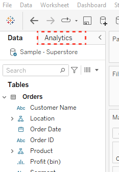
If you are unfamiliar with the Analytics pane, it is located at the top left of the authoring interface.
By clicking on that tab, you will toggle from the Data pane to the Analytics pane. Here you will see three sections; Summarize, Model, and Custom.
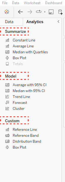
You will notice that the majority of the options in the Analytics pane are available for use in my screenshot. You may see different options available depending on what you have in your view. If you want to use a specific option and it is grayed out, simply hover over that option and Tableau will tell you what the requirements are for your view.
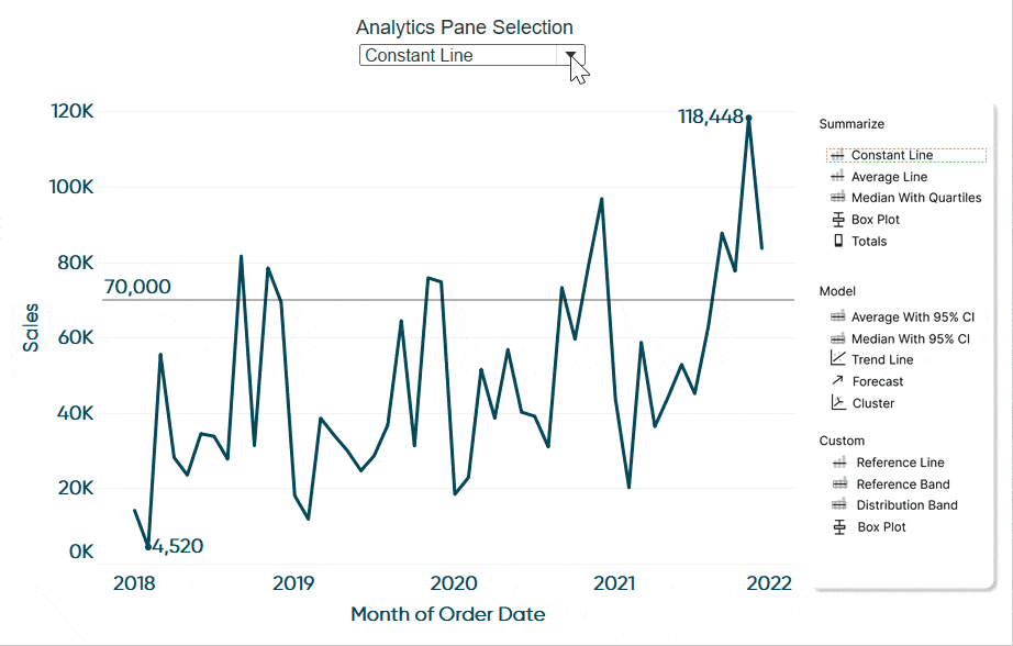
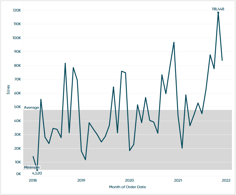
For this tutorial I have created a line chart of Sales by Month of Order Date. This gives me the ability to preview each option with you in detail.
The summarize section of Tableau’s Analytics pane
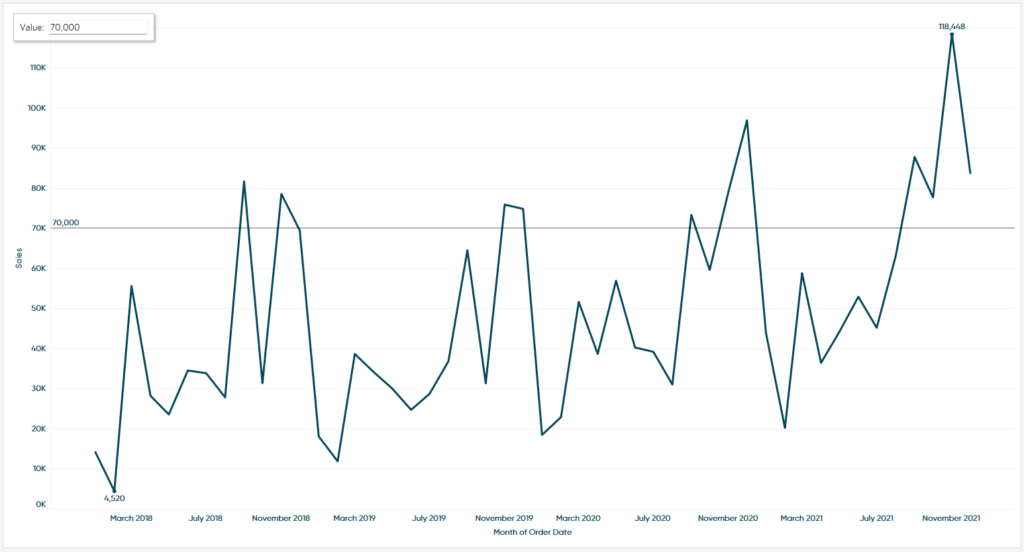
Constant line
If I click, hold, and drag Constant Line into my view without releasing I will see some options pop up in the top left. This is where I ultimately want to drop the option in the view.
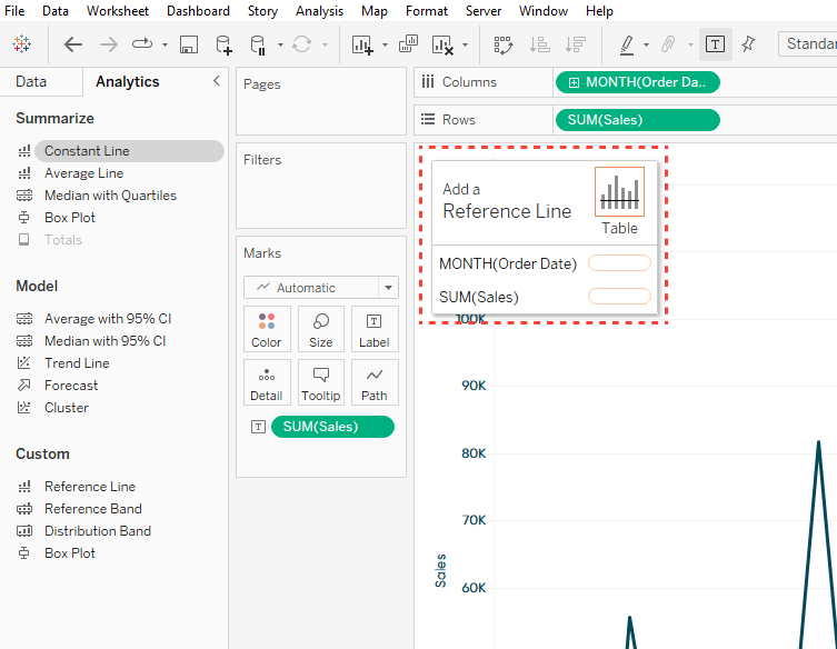
If I drop Constant Line on Table, it will add a constant line to both the x and y-axis. Or I have the ability to choose an axis individually. For this demonstration I will add it to the y-axis by dropping it on the bubble to the right of SUM(Sales). By doing so I will see another dialog box appear in the same place. This time it gives me the ability to type in a value. This will move the constant line on the y-axis to that value.
![]()
To demo a good use case, imagine if I wanted to show a specific benchmark on the view as reference. All I have to do is enter my benchmark value and it will draw a line on the view that represents that benchmark.
Continue reading with a free account, or login.
Unlock this tutorial and hundreds of other free visual analytics resources from our expert team.
Already have an account? Sign In
By continuing, you agree to our Terms of Use and Privacy Policy.
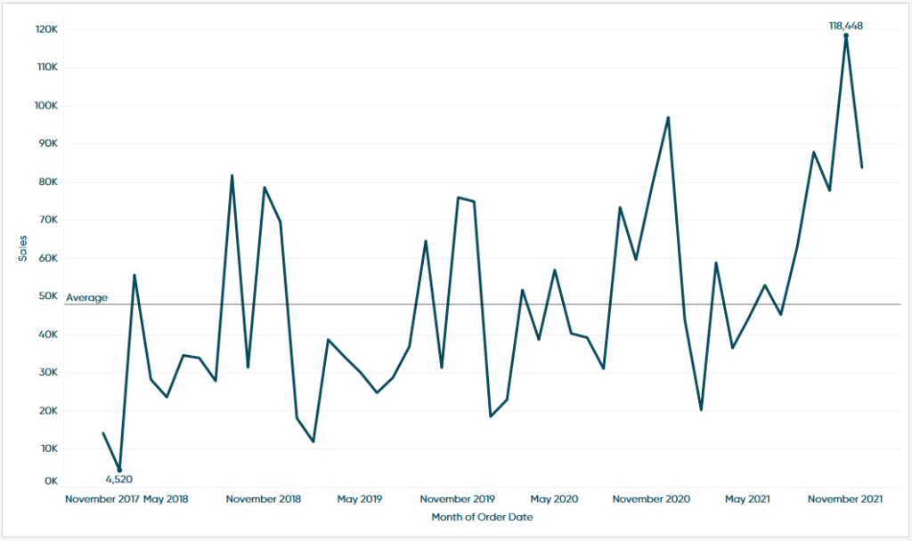
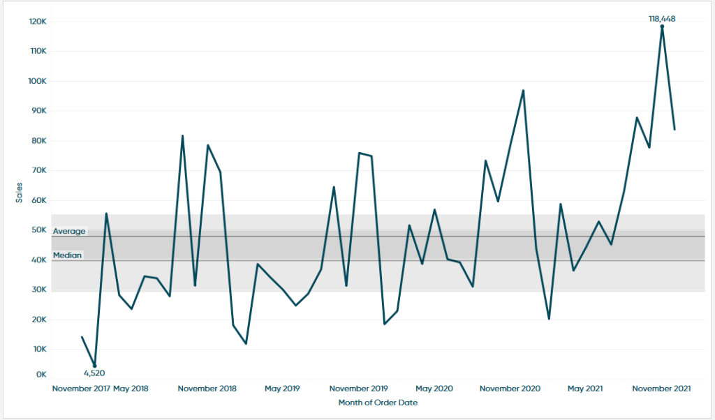
Average line
The Average Line option works very similar to the Constant Line. However, I do have some more options.

These options will draw a line at the level of detail you drop it in. For this demonstration I will drop it to Table which will show me the table average.
This in itself is a good use case. You can add this section to show the user what months fell above or below the table average.
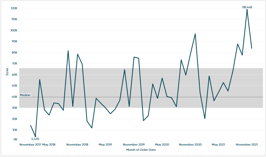
Median with quartiles
When adding this option to the view we are presented with the same three levels of detail from the prior section.
Just like before I will drop this option on Table. In the view we will see that it adds a reference line that represents the Median and some distribution bands that represent the 75th and 25th percentiles. To put it plainly, the distribution band means about 50% of the data falls in that zone.
As a use case let’s say I wanted to visually show everything that falls outside of the interquartile range. Adding this to the view is the quickest way to get that result.
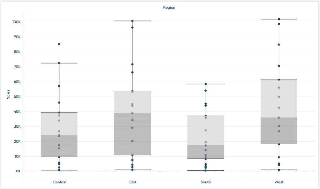
Box plot
When adding this option to the view I only get the individual cell level of detail.
Tableau Box Plots, Disaggregating Measures, and Explain Data
Adding a box plot to the line chart isn’t the best representation of its purpose so for this demonstration I am going to switch my visualization to a dot plot of Sub-Category Sales by Region.
With a box plot we get a similar result to the Median with Quartiles option. We can see the Median and the 75th and 25th quartiles but now we also have the upper and lower whiskers.
Trying to find outliers in your data is a great use case for box plots. We can see that in my view the Central region has a value that falls outside of the upper whisker. With this information I can dive into the data to try and determine what happened there.
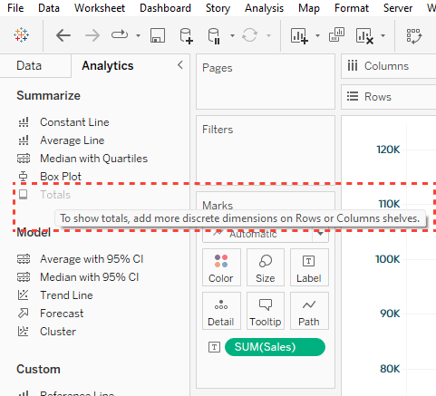
Totals
The Totals option is a quick and easy way to add Sub-Totals, Column Grand Totals, or Row Grand Totals to a view. When dragging in Totals to a view I get the following options.
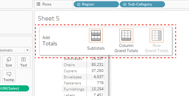
This one is pretty self-explanatory so rather than a use case I will drop in a helpful tip. Adding one of these options can be done multiple ways. One of which is by going to the Analysis menu in the top navigation. Then selecting Totals and picking one of these options. Using the Totals from the Analytics pane can save a little bit of your time and gives you a visual representation of each option so it’s easy to make the right selection.
The model section in the Tableau Analytics pane
Average with 95% CI
This is the first option in the model section of the Analytics pane and is where we can start applying some statistics into our view. When dragging Average with 95% CI into the view we get the following options.
Again, these options are just giving us the ability to choose the level of detail that the average is calculated. For this demonstration I am going to choose Table.
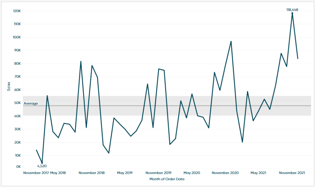
From my table we can see that it draws a reference line that represents the average of the data in the view and a distribution band that represents the 95% confidence interval of the average. To put it plainly, this range means that as we get more data, we are 95% confident that the average is going to fluctuate between the upper and lower limits of that distribution.
It’s also important to note that if you right-click on the average line you can Edit some of the options. For instance, if you wanted to widen the bands you could adjust your confidence level or change how the line is labeled from this menu.
Median with 95% CI
When adding the Median with 95% CI we get these three levels of detail.

I will drop the model on the Table level of detail for this demonstration.
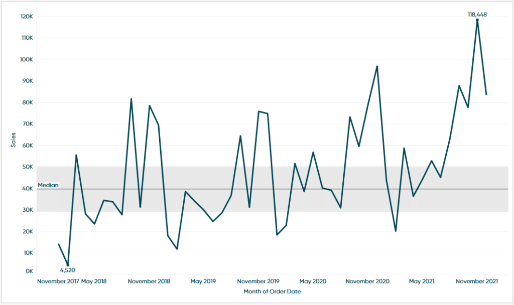
You can see we have a very similar chart as we did with the Average with 95% CI Model except this time, we are looking at the Median. The Median is represented by the line in the middle of the distribution bands. As far as the bands themselves we can make the same assumptions as we did with the last model.
Any interesting use case is to visualize the Median and Average on the same view. This can help with anomaly detection and when searching for outliers. When paired it would look something like this.
Trend line
When I drag the Trend Line model onto the view, we are given some options we have not seen thus far. Rather than choosing the level of detail Tableau is asking us which Trend Line model we want to use. Each of these models are best used in certain situations or when certain assumptions have been made. Rather than getting too into the weeds on that let’s start with the very high-level assumptions that Tableau helps guide us to make on our own.
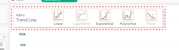
Looking at the different models and the images that correspond to each one we can see that each model is best used when paired with certain trends in your data. For instance, if your data follows a linear trend, moving in roughly a line from the left to right, then the Linear Trend Line would probably be fine. If your data starts off small and exponentially grows then you would want to use an Exponential Trend Line. If your data has clear ups and downs try a Polynomial Trend Line.
Ultimately, Tableau makes experimenting between models so easy. Switch some in and out and compare them using the summary statistics to find the best fit model. To demo the Trend Line, I am going to move a Linear Trend Line onto the view.
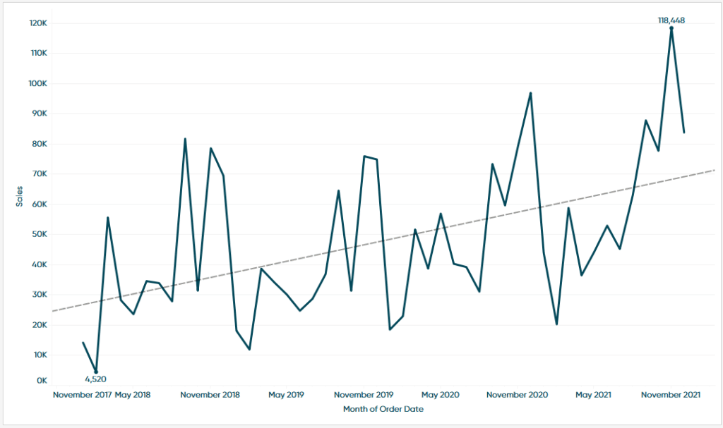
Before we get into the summary statistics let’s just look at the visual for a moment and try to interpret what this is saying. We can see that the line is moving in a positive upward direction as we move through time. Suggesting that Sales are going up over time. If we look at the peaks and valleys of this data, we can confirm that assumption. What does the data tell us though and how can we confirm this model’s accuracy, put plainly are sales truly moving in this positive direction?
If we hover over the line, we will see some values appear.
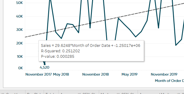
The first line is the regression formula. For now, let’s not worry about that but if you are interested in learning more check out the related content below. The second line is the R-Squared value and the third is our P-value. These values have a lot of technical finesse around them but to sum it up plainly here is what we can find out from these values.
R-squared: This is a value that is between 0-1 and tells us how much is explained in our model. In this case we could say that Month of Order Date explains about 25% of our sales but there is still a lot of error or other factors at play when it comes to sales. We can use the R-squared as a measure of accuracy and the closer to 1 this is the more accurate you can assume your model to be.
P-Value: A general rule of thumb is that if the P-value is less than 0.05 then the model is statistically significant. This is just a rule of thumb though and is determined with how confident you want or need to be with your model. The 0.05 coincides with a 95% confidence.
If you are familiar with statistics and want to get into more detail you can also right-click on the trend line and choose between two different options “Describe Trend Line” and “Describe Trend Model”.
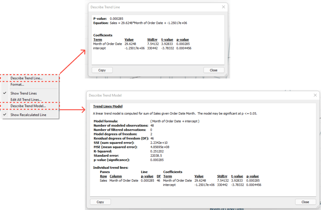
You can see one option has a bit more detail then the other.
Forecast
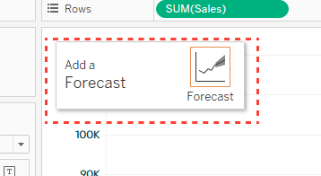
When dragging forecast onto the view we are presented with only one option.
Unlike previous models, when I add Forecast to the view Tableau will add something in the Color Marks card.
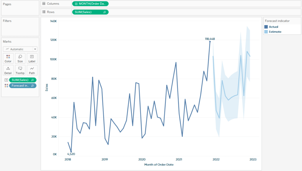
We can now see our actuals vs our estimates or predictions with a 95% confidence. This forecast is built from a model called exponential smoothing. There are several tips when incorporating this model into your view.
If you right-click on the forecast, you will see an option in the menu called Forecast.
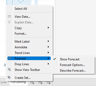
By hovering over that selection you will see three more options appear in the menu, Show Forecast, Forecast Options, and Describe Forecast.
If you select Show Forecast Tableau will remove the Forecast from the view. If you select Forecast Options you will see the following menu appear.
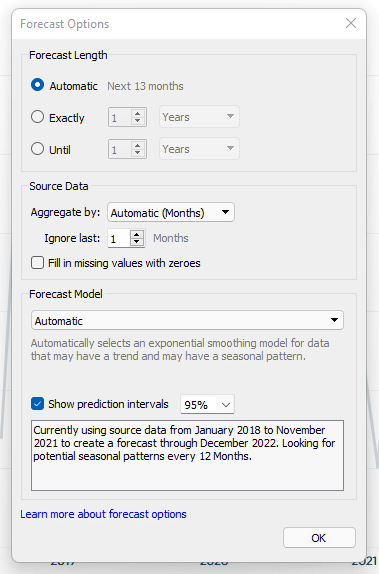
Here you can change the number of periods forward you want to forecast. You can also change the width of the confidence interval. It also has a helpful description at the bottom that you can use to describe what the forecast is doing.
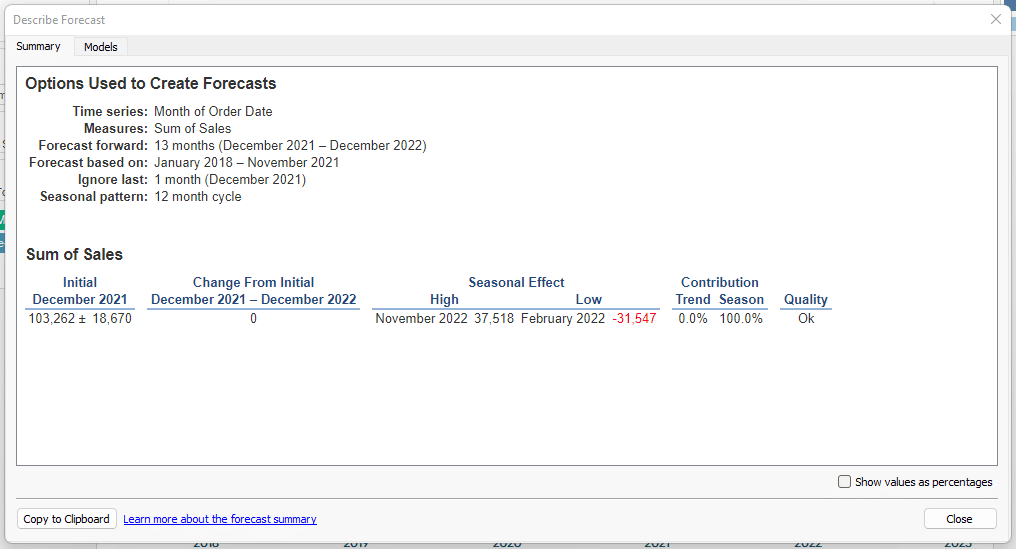
If you click the Describe Forecast option you will see another menu appear with two tabs. The first is going to give you information on the options that the forecast uses by default.
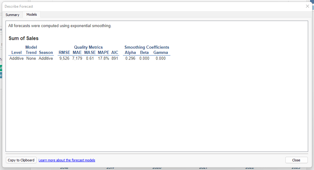
The second tab called Models is going to give you some summary statistics and some quality measures like AIC and RMSE you can use to determine accuracy of the model.
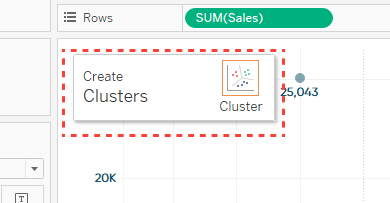
Cluster
When adding the cluster model to the view we are presented with just one option.
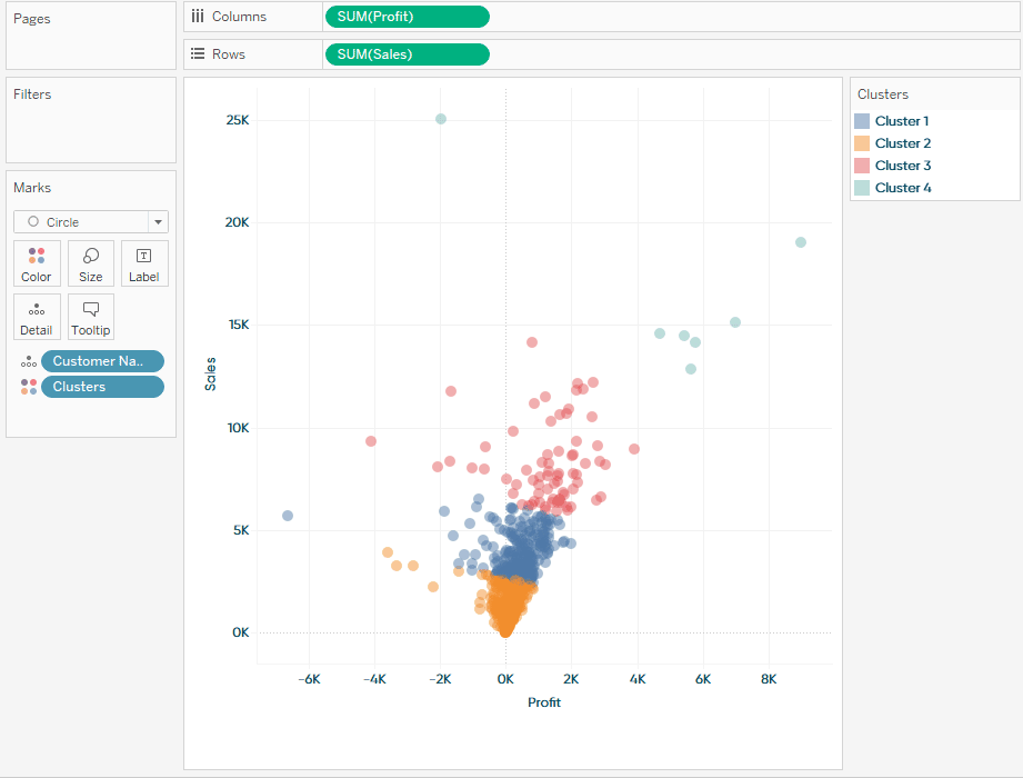
For this demonstration I am going to switch to a scatterplot which will show a better example of this model. In my scatterplot I added the SUM of Profit to the columns shelf, the SUM of Sales to the Rows shelf, and Customer Name to the Details marks card. Dragging a cluster model to the view will add the model to the color marks card.
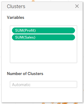
We are presented with these options when you drag the model on the view. From here we can add or remove variables that will be used in the algorithm of the model and we can define how many clusters we want.
For my example I am going to tell Tableau that I want 4 clusters.
3 Ways to Make Stunning Scatter Plots in Tableau
The model that Tableau uses for clustering is the K-Means algorithm. You can view some summary statistics of the model by right clicking the Clusters pill that is in the Colors Marks card and selected the option “Describe Clusters”.
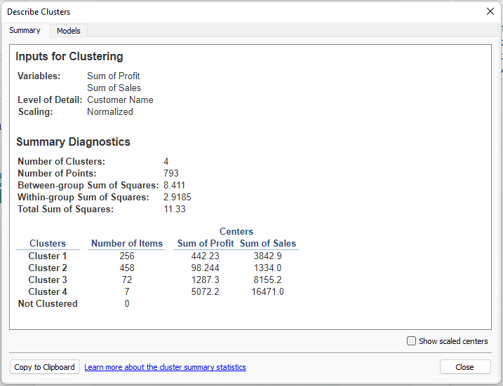
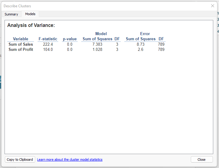
We can see two tabs one is the summary tab see above and the other is the Models tab which will provide us with some more information about our model.
The custom section
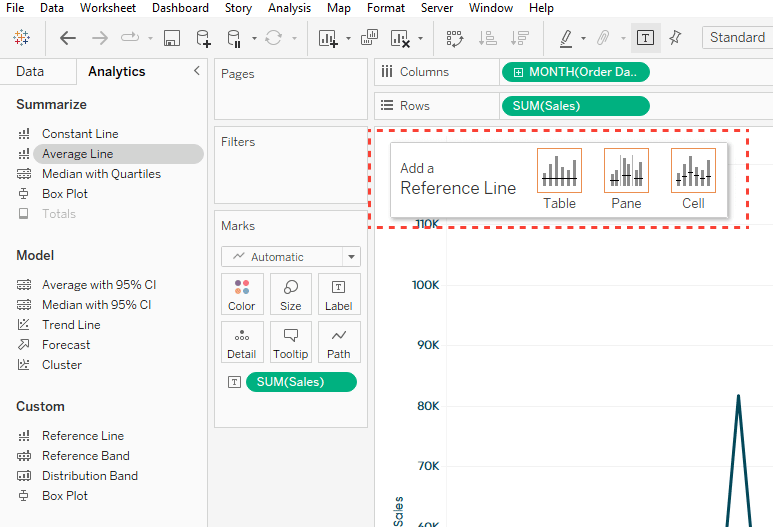
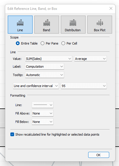
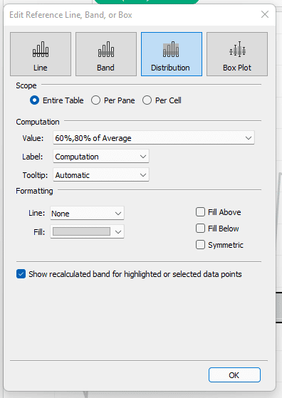
Reference line
If we add a Reference Line we will be given these options.
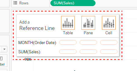
We can see we are given the different levels of detail we could select from which will calculate the reference line on that level of detail. For this Demo I am going to drop the Reference line on SUM(SALES) in the Table level of detail. This will draw a line on my Y-Axis. After doing so I will get a menu that has all of the custom options represented.
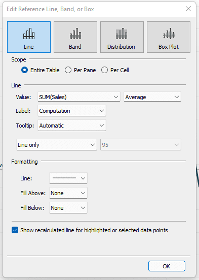
We can see at the top Line, Band, Distribution, and Box Plot. For Line I can change the way the line is calculated for instance by default it is set to average but I can change it to constant, Median, MIN, MAX, and several other options.
![]()
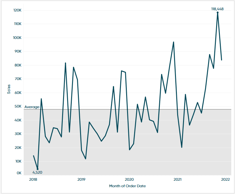
We can also format the line from here. We can change the linetype from solid to dashed, change the color, or even add a Fill below or above the line. Here is an example with an Average line and the Fill below Option turned on.
Reference band
To keep things simple, I will click on Band in the Custom menu and that will change from a line to a band.
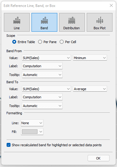
We can see some things change in our menu though. We now have a section for Band From and Band To. This will allow us to set our custom options on how we want this band drawn. We also get similar formatting options as before, allowing us to change the line type, line color, and color of the fill. Here is an example of a Band From the minimum SUM of sales to the Average SUM of Sales.
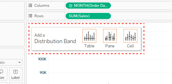
Distribution band
Again, I will click to the next model from the Custom menu. We can see that Distribution Band options are quite a bit different but the results would be similar to the Reference band. Here we are simply defining some logic that will add a band to and from some values.
We can see that rather than defining a To and From we are going to add some logic by clicking on the Value drop down.
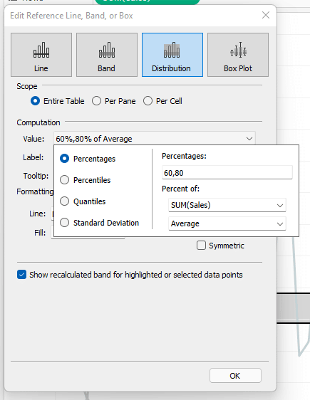
In the value drop down we are presented with several options like Percentages, Percentiles, Quantiles, and Standard Deviations. Each of these options has their own logic. The option I find myself using most often is standard deviation.
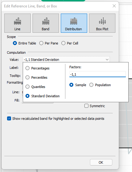
We can see by choosing this option we can add logic that would draw a band from -1 standard deviations to the 1 standard deviation. If we changed those Factors to -2,2 we would draw that band from 2 standard deviations and so on. This technique using standard deviations is a great way to visually show outliers.
In closing there are a lot of options. I highly recommend you play around with them and get used to what is available. What’s more is Tableau makes it so easy for us to add and remove these models so it’s very easy for us to explore.
Until Next Time,
Ethan Lang
Director, Analytics Engineering
[email protected]


Written By
Ethan Lang

Graphic Design
Dan Bunker
Manager, Decision Engineering
Related Content
How to Isolate Linear Regression Equations in Tableau

Tableau has a decent variety of built-in statistical features. One of the easiest to use is the trend line. The…
Statistical Tableau: Using MAD to Detect Outliers in Non-Normalized Data
I recently wrote a tutorial on 3 ways to visualize outliers in Tableau. This tutorial assumes a normal distribution of…
How to Do Customer Segmentation with Dynamic Clustering in Tableau
Tableau has a few different built-in analytics features that allow you to both summarize and model your data in various…